A (Background) Picture is Worth 1,000 Words: Using Photo Backgrounds in Web Design
Using a photo as the background image for a website is becoming more and more popular. Great images are hard to beat. They sell your site, draw in visitors and can be a great way to showcase a product if you are in the business of sales.
But you can’t just use any old image.
And where do you put the type? There are a variety of factors to take into consideration when planning your design around a single image – size and proportion, color, sharpness and room for type.
Big, Bold Images
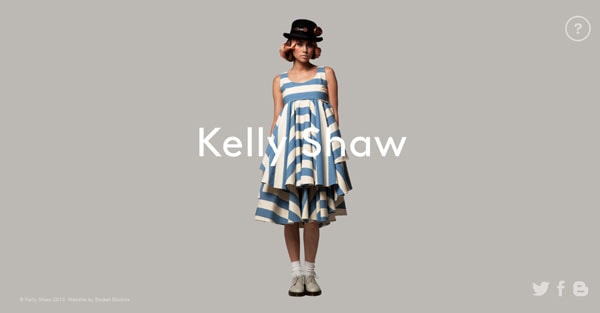
Kelly Shaw
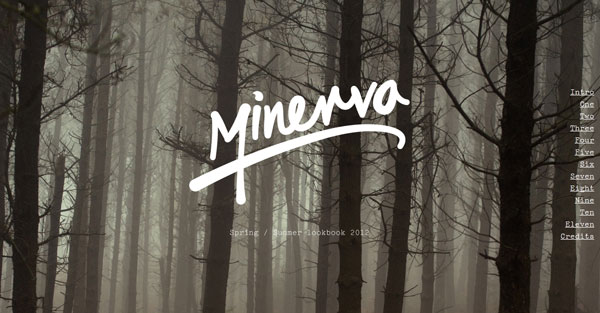
Minerva
neveandhawk
With Postcards Email Builder you can create and edit email templates online without any coding skills! Includes more than 100 components to help you create custom emails templates faster than ever before.
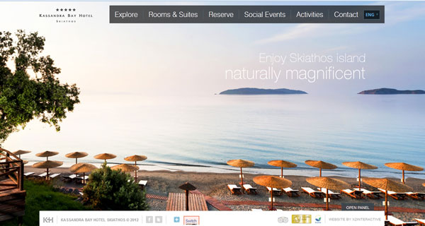
Free Email BuilderFree Email TemplatesKassandra Bay Hotel
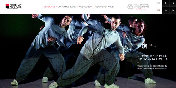
Societe Generale
Fueld Films

The No. 1 rule of using photography, especially big photos, to anchor a design project is quality. Don’t settle for a subpar image. Use only the best, boldest and most suited photographs for a project.
Photos should always be high quality, high resolution (no pixelation). You should however, keep loading times and optimization in mind. Make sure that your images are properly sized and optimized so that your site does not hiccup when someone visits.
Photos should visualize the message your site is trying to convey. Just using a pretty picture is not enough; it must relate to the content on the site.
Think about how you frame the image. Is it something people can relate to? Some of the best photo-based websites feature images of faces, beautiful backgrounds, a company’s product and photos of striking scenes.
The last thing you will want to consider when thinking about a photo background is text and/or logo placement. What other items do you want to display? How will they work with the image? Is there enough room in the image or next to it to place this information?
With Startup App and Slides App you can build unlimited websites using the online website editor which includes ready-made designed and coded elements, templates and themes.
Try Startup App Try Slides AppOther ProductsWhen composing the image, keep these questions in mind. Leave a dark (or light) space for text that is free of wide variances in contrast. In most instances, avoid putting text or a logo on top of faces or action in the photo.
Color
Blind Barber
Friendly Gents

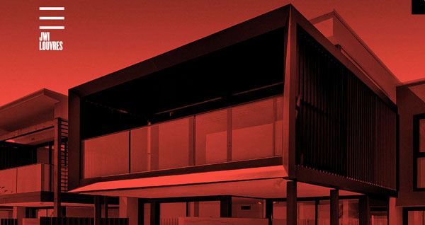
JWI Louvres
Encandle

Deciding on a tone for your photo is one of the first choices along the way.
Do you go with the lively pop of color? Or the more muted tones of a black and white photo?
The answer depends on the mood of your site and the message you are trying to convey. Use color photos to show life, movement and beautiful scenery. Black and white photos can be a dramatic way to showcase people or still frames.
Also think about how bright the photo background may be. You can tone down a color photo, make it monotonal or use sepia to create a high drama background with less color contrast. These types of color effects allow an image to fall more into the background and might make it easier to add text. They do though, have a different feel than black and white. When opting to use a monotone photo, think about the color in terms of subtle context and consider color meanings.
Fuzzy Images
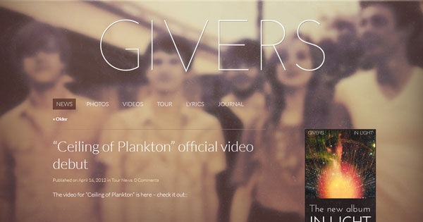
GIVERS
TAG Interativa

GatherContent
Nick Jones
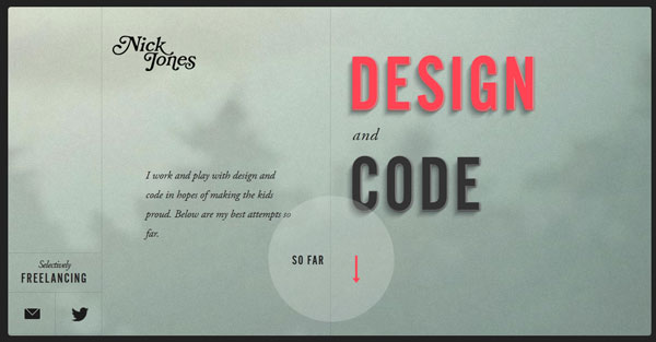
Using blurred photos for background images are a sure 2012 design trend. When done properly, a blurred image can have a lot of impact and draw a user’s eyes to the site.
Blurred images can use a user to stop and think about content and context. An out-of-focus image can also make it easier to add other elements to the design without feeling like you are covering something up in the image.
While using blurred images can be difficult, it can be quite effective. When selecting an image make sure it is still readable when blurred; will users know what is in the photograph? How does it relate to your message?
But don’t use a poor image and consider it blurred for effect. It is still important to use a high-quality photo even if the intended effect is not sharp. A poor-quality image will not hold the attention of website users and lacks professionalism, sending a message most designers would like to avoid.
Zoom In, Zoom Out
A Book of Beards

Inzeit

Lavazza 20Calendars

Onside Sports Agency

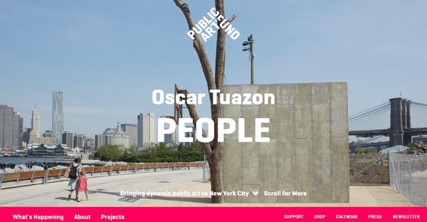
Public Art Fund
It is important to look at images, especially those used at large sizes, at different levels of zoom.
How close should the face/action/scene in the photo be? Is the site’s approach in-your-face or more subtle?
Big, close images can be bold and intriguing. Conversely, they can also be intimidating and overpowering.
Small, distant images can set a scene and paint a great general or overall picture. The risk is that images set too far in the background can lack emphasis and be hard to decipher on smaller screens (especially on mobile devices).
Experiment with images zoomed in and out as you think about placement and design. Also consider what part of an image will appear above the scroll for most users. Try to avoid odd placements that can “amputate” the subjects of photos (missing legs or arms at joints), or make the photo hard to understand without moving the mouse. If you are missing key elements of an image, it might be worthwhile to zoom out somewhat. If faces or key parts of a photo are tough to distinguish, zoom in.
Typography
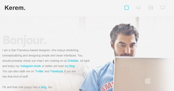
Kerem Suer
Pure Pleasure Design

Royale
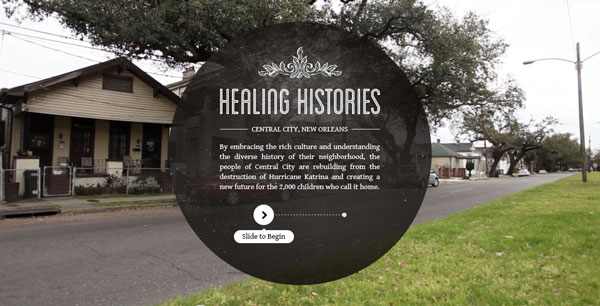
Healing Histories
St. Johns

There are a couple of avenues to choose when working with text on large images – text on the photo, text next to the photo and text integrated into the photo.
The placement and use of text with a photo background is key. You need important parts of the image to be visible and text to be readable.
Look for “dead spaces” where nothing is happening in the image to place text for lettering that will rest on top of the background photo. Also try to create an element of contrast with the color of type so that it grabs the attention of users. Another option is to create a tinted box for text over a certain part of the photo.
Sometimes the photo is just too important to hide. Place text above, below or on either side of the image. This gives the photo and text “room to breathe”, and showcases the photo while giving text a place of its own.
The most difficult approach is to integrate text into the image itself. This can be accomplished during the photo shoot for a more natural look or added to the image using photo editing software. Text that becomes part of the image should not look forced or overdone. Try to keep the image and text element tricks to a minimum when employing this technique.
