The Aesthetics of Wireframes and the Importance of Context
Welcome to the second part of our online course on wireframing and creating design documentation. Hope you enjoyed the first part and you now deeply understand the difference between the common deliverables of the User Experience Design Process: wireframes, prototypes and mockups.
It’s time to take the next step and get our hands dirty (metaphorically speaking). Today we’ll delve deep into the details of the art of wireframing and creating design documentation. Expect step-by-step exercises and stories from my UX Design/UX Manager experience.
To follow my examples and exercise specific techniques, sign up to UXPin App. It’s free. If you need more time to test it, just let us know.
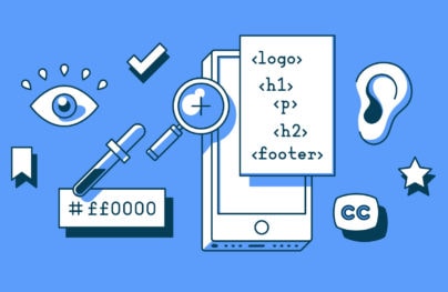
The Aesthetics of Wireframes
The aesthetic value of low fidelity deliverables is often underestimated. If it’s a set of greyish boxes, there’s no difference how it looks, right? Wrong. Terribly wrong.
A badly applied visual side of wireframes can totally disturb the reception of your ideas. It’s like attending an important diplomatic meeting in an embassy wearing a Stormtrooper outfit (explanation for non-geeks – Stormtroopers are Empire soldiers in Star Wars movies). This might be quite fancy clothing at a Star Wars fans rally, but definitely won’t help you get any business done in the embassy.
A Stormtrooper in a diplomatic situation can’t communicate clearly, because his form doesn’t fit the context. This is always the start of dangerous miscommunication.
With Postcards Email Builder you can create and edit email templates online without any coding skills! Includes more than 100 components to help you create custom emails templates faster than ever before.
Free Email BuilderFree Email TemplatesImagine now that you’re handing your project manager a wireframe that looks like an ugly visual design, or you’re giving a visual designer a wireframe with an extensive use of comic sans (which they just purely hate!), or perhaps you’re delivering wireframes to developers without any description… do you think your colleagues will be able to act upon your deliverables efficiently? How will they feel? What will they think about you? Will the outcome of this project satisfy your clients?
Well, I don’t have good news for you. A badly communicated design will bring chaos and misunderstandings to the project. The User Experience Design won’t be valued highly by your PM and the whole team. Attaining a high quality of the final product will be a struggle.
My advice is that you’d better take your documentation aesthetics seriously. The readers of your design documentation are your users – treat them with care and respect.
Yes, I’m serious. It’s the Design User’s Experience of your design documentation.
Wait a minute… does it mean that we’ll be forced to spend even more time on the documenting stage of the project? No! Creating design documentation is a craft which, as every craft, requires the assimilation of a couple of rules and a lot of practice. Once you grow your skills, it’ll accelerate the speed of your projects.
Let me guide you first through the rules of aesthetic wireframes.
The rules of aesthetic wireframes
1. Eliminate all the distractors
Crystal clear communication may be achieved only if we eliminate the distractors.
What’s a distractor in a wireframe?
With Startup App and Slides App you can build unlimited websites using the online website editor which includes ready-made designed and coded elements, templates and themes.
Try Startup App Try Slides AppOther Products- Inappropriate color use
- Wrongly applied level of fidelity
- Ugly images and icons
- Comic Sans and any strange font
- Any signs and codes that only you can understand
…and actually anything which keeps your readers far from understanding your design concept. To cut it short: No ornaments allowed, keep only the essentials on board.
Consider this story: one of the UX Designers that I know used abbreviations on every placeholder (crossed rectangle) to mark what type of image he was expecting. This had a certain meaning to him, but couldn’t be understood by any outsiders.
Is it ok to use such secret signs just for yourself?
No, not if you’re going to share this documentation with your team and clients. These abbreviations distracted readers and disturbed their perception of the design.
2. Use colors carefully
There’s a lot of misunderstandings when considering colors. Should wireframes be a black & white only, visually harsh, set of boxes? Or should they perhaps be colorful endeavors to suggest the visual design?
Neither. Why? Because neither black&white nor rainbowish things, can clearly communicate the design.
I’d rather suggest that you follow these simple rules:
- Use shades of grey for the wireframe structure of the interface and the content
- Visually suggest a hierarchy and set an order in your wireframe by using different shades of grey
- Always set any images and icons to grey (you don’t want them to visually stand out)
- Use an appropriate contrast between elements (especially in the case of text – it must be readable!)
- You may use blue for links, red boxes for alerts, green boxes for confirmations, blue boxes for information and yellow for warnings (it’s especially important in forms; the color of validation messages matters a lot and by setting the appropriate hue, you’re letting your team know about its importance. I’m sorry to say, but in my experience that is not common knowledge.)
- Avoid black – black borders make your wireframe messy, cluttered and really boxy – in some cases this might be a distractor.
3. Don’t over-design it
Over-designing wireframes is a common mistake of fresh User Experience Designers. You must remember that you’re trying to communicate design ideas in a simplified, clear and fast way. Don’t get too fancy.
Spending hours crafting an element of the interface only because it doesn’t look good on a wireframe is a waste of time. Whenever you face a dilemma as to whether a certain element is ready or not, ask yourself:
- Does it make sense in the context of user scenarios of this particular product?
- Does it clearly communicate its sense and value?
- Will your teammates understand it?
Do not ask yourself if it’s pretty; ask if it’s clear and reasonable.
Consider early guerrilla tests – show your wireframes to people in the local cafe.
4. Use real sizes (approximately)
You have to set a real size canvas for your design (e.g. if the width of the web application is 980px, you should wireframe on a 980px canvas) and wireframe all elements of the interface in a proportional way.
Why? It would be way too easy to place a lot of broad elements on 1200px, while the visual designers would be forced to squeeze them into 980px.
You must be aware of constraints. Using imaginary sizes on your wireframes is a direct route to product development disaster.
Don’t risk designing something that is unreal.
5. Affordances matter!
Back in 1988 the father of User Experience Design – Don Norman used a psychological term coined by James Gibson – affordances, to describe the possible actions suggested by a thing that are perceived by human beings.
Buttons in software interfaces look like they’re designed to be pushed; tabs suggest the act of switching between chunks of content; inputs suggest typing in, etc.
To clearly communicate your ideas – your buttons must look like buttons, tabs like tabs, inputs like inputs… I would even risk saying that affordances matter in the final product, just as much as in the wireframe. In the final product, they suggest a certain action, in the wireframe, a certain meaning.
Affordances will let your wireframes speak properly.
Wireframes in the context of the design story
We’ve gone through a set of rules for wireframes and if you follow them, I’m sure you’ll create great deliverables. Be careful though, without the context of the whole story, even aesthetic wireframes don’t properly communicate the design.
I’m using the term ”story” intentionally. Exactly like in your favorite books, in design you have:
- A protagonist (your users)
- A plot (use cases)
- A problem (users’ problems)
Your nicely crafted wireframe tells only part of the story. It partially represents a use case and a problem, but it’s not really precise and it does not tell anything about a protagonist. Your readers will have a hard time grasping the whole picture.
Imagine Lord Of The Rings without any heroes, just a short mention of the ring, a war with Sauron and lots and lots of description of Middle Earth… I bet you wouldn’t want to read it and it would be really hard to get an idea what is it all about.
It may sound counter-intuitive. Nowadays, pretty often User Experience Design is thought to be all about wireframing. Well… it’s not.
User Experience Design is… about designing experiences (surprising, huh?). To design an experience means to plan and act upon a certain set of actions, which should result in a change in the behavior of a target group (when interacting with a certain product).
To do that you need to ”write” the whole design story and tell it to your team and stakeholders in a persuasive way that will actually encourage them to take action. You have a whole bunch of tools and techniques at your service:
- Personas (an appropriate template and instruction is available in UXPin App)
- User stories and use cases
- User flows
- Conceptual diagrams
- Business Model Canvas
- …
How and when to use them is a completely different story, but remember: appropriate deliverables to accompany your wireframes help you tell a consistent and engaging design story.
You aim at describing who the user is, what the problem is and what the solution is. You can’t do it with a mere wireframe.
First design: the story and the basic wireframe layout
All right. You mastered the rules of aesthetic wireframes, you know the importance of context in the design story… now is the time to put it all into practice and communicate a design.
Bear in mind that the situation below is widely simplified just to provide you with some tangible learning material.
Ready? Steady? Go!
Let’s imagine that a local pencil vendor rushed into our office and demanded a website that will sell lots and lots of pencils. Of course he wants it for tomorrow, which unfortunately doesn’t give us a lot of time for preliminary research and a solid project kick-off.
Should we run to the wireframing editor and start drawing some kind of conception then? No. Hold on soldier.
Firstly, we need to make sure who the users are. You can’t miss that step in the process. Gather the whole team and interview your client. Try to spot the main target groups of his business. Concretize them by creating personas – representations of groups of users who share behavioral patterns, attitudes, motivations and usually basic demographics. Personas give a human face to your target group and help you and your whole team focus on users’ problems, not features.

You may use the template in the UXPin App to create your first persona.
The next step is pretty obvious – you need to describe the problem you’re going to solve and set solid foundations for the whole project. Your client assumes that the problem is trivial. ”I need to sell more pencils!” he screams. Well… that’s not the problem that you’re going to solve. This is the outcome of the project. The result. The problem lies on the user’s side.
Try to clarify why your possible clients, represented by personas, may want to buy pencils. Think about the problems they may encounter. Consider their motivation, goals and attitude.
Then discuss the business side with your client. Make sure that you understand the constraints.
I know it seems like a lot of stuff to discuss and think through. Bear in mind though that the time spent on these activities will let you better understand the project and create the story that will lead you, your team and your client to success and satisfaction.
A great tool that you may use for this part of the project is a Project Canvas created by James Kalbach. An editable template can be found in the UXPin.
We could (and actually we should) prepare the project with even greater care and collaboration between all members of the team. Unfortunately, our client is rushing us. We quickly write down a story of our users battling with their problems (yes, a real narrative!), sketching basic conceptions on paper and, having really missed the conceptual diagrams and user flows, we head to the wireframing editor.
Let me guide you – step-by-step through the creation of the basic layout
1. Prepare the canvas first. Set your grid and the width of the website. It will give you a proper perspective of the project and its visual constraints. 980px is a pretty standard width of a website nowadays. I also set up a classic 12-column grid to help me get UI elements aligned, but consider it optional.

2. Plan the architecture of the site and create a sitemap. From a conversation with your client and your user story, you know that on this simple landing page there should be:
- a main page with descriptive content,
- a cart page,
- an order form,
- a confirmation page,
- a shipping page explaining all the delivery details,
- a contact page, about us,
- a terms of service page.

Create all the pages and form a simple sitemap by adding new pages in the wireframe editor. Then drag and drop them till they represent a hierarchy of your site.
This is a vastly simplified sitemap that doesn’t represent a complete hierarchy and links (one could actually write a book on sitemaps), but it’s a good start in these circumstances.
3. Plan the main structure of your first site. You decided to go with navigation at the top. Draw a box for the main content and a footer. You have a basic layout ready to fill in with your creativity.

4. Create the navigation. Start with the top menu. Make sure that the page we’re on right now (home page) is visually marked with a white background to avoid the user’s confusion. Your cart and Terms of Service are also important parts of the navigation.
I used blue and underline to clearly communicate that these elements should link to specific pages (you can actually link them and the whole navigation straight away to reuse these elements later on). I also used different shades of grey to mark the visual hierarchy in a nice aesthetic way.

5. Set up the main content chunks. Keep it real with content that will be actually used on the site. It gives you the right perspective and shows the constraints. This also makes quick guerrilla tests much easier.

Bear in mind that the aesthetic part of the wireframe plays an important role here. It can’t be mistaken with the visual design, but it looks professional. The visual hierarchy is clearly visible through shades of grey. Humble typography doesn’t distract readers. I used a grid and guides to keep the elements aligned.
6. Final refinements. To finally refine this simple wireframe I added a button with a clear affordance. It actually looks like a button and suggests pushing it in. Link it to the cart page, to make it easier for your readers to understand simple interactions.

You may also add a couple of project notes (bottom right) to add a description for developers. It will make the communication of this wireframe even clearer.
7. Tell the Design story. When you upload your personas and Project Canvas to UXPin, they will create a context for your wireframe. Every design document in one place will let you tell the whole story of your design.

Sum up
In this lesson you’ve learnt about the importance of aesthetics and context in design documentation. You know now that to communicate a design clearly you must follow certain rules and that in order to tell the whole design story you need more than just a wireframe.
User Experience Design is usually more complex and requires much more deep consideration of users problems and motivations. We used a simplified example to set a path for your own adventure in the UX world.
Remember though: the work of a UX Designer should not be judged by deliverables, but by the final experience of users.
In the next article you’ll learn how to engage your team in the process and iterate on the design.
If you didn’t sign up to UXPin yet – it’s about time.