Using backface-visibility and CSS Animations
There are so many fun and interesting design possibilities with backface-visibility. When you turn an element over, what do you want to see?
By default, we see a mirror image of an element when it is turned over. While this effect may sometimes be desirable, other times we may want to see a different element in its place entirely. With backface-visibility:hidden; we can make an element disappear completely as it turns and have another element waiting behind it to become visible as they rotate together.
The possibilities are endless … and backless. We will focus on some creative ways for using backface-visibility to flip around some images related to donuts and coffee. Yum!
What is backface-visibility?
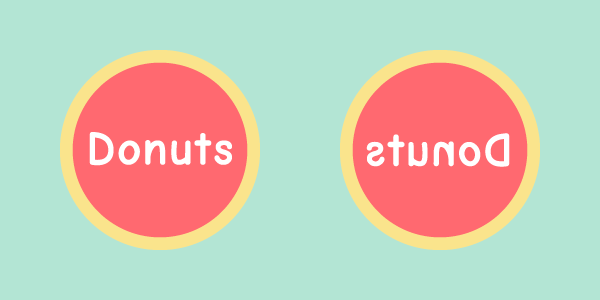
The backface-visibility property relates to 3D transform effects and determines whether or not the back of an element is visible when facing the user. If we were to spin a circle containing “Donuts” around, for example, we would see a mirror image of the front of the circle. The back of an element is essentially clear, allowing us to see through to the front. This is the default action.
Browser Support
Browser support for backface-visibility is strong across modern browsers, with Chrome, Safari, and Opera requiring -webkit-. IE support exists for version 10 and up. Concerning animations and transforms specifically, Can I Use should be able to clear up any questions. IE support will not be strong for the fourth demo because of the use of 3D transformations. The code sections below are prefix free.
With Postcards Email Builder you can create and edit email templates online without any coding skills! Includes more than 100 components to help you create custom emails templates faster than ever before.
Free Email BuilderFree Email TemplatesDemos
We will be looking at the details of four demos:
Spinning Donut
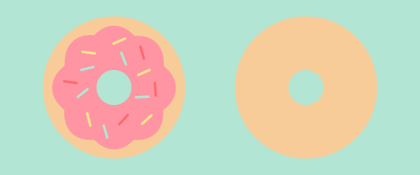
The donut spin is a perfect example of how useful backface-visibility can be. When we turn an image of a donut over, we don’t want to see the front again; maybe someday donuts will be frosted on both sides, but not today. So, we need another image, an image that represents the back of the donut.
We will position the “front” image in front of the “back” and give them the exact same positioning. Our fun-filled side with sprinkles will have backface-visibility: hidden; added to it, while the other side will not. As they turn in sync on the y-axis the “front” will disappear, leaving the “back” image hiding behind it visible.
img {
  position: absolute;
  animation: turn 2s infinite;
}

.donut-front {
  z-index: 5;
  backface-visibility: hidden;
}

@keyframes turn {
  to {
    transform: rotateY(360deg);
  }
}
The two images are assigned the same animation, but as the donut turns the “front” image disappears revealing the “back,” which is set to backface-visibility: visible; by default.
Spilled Coffee
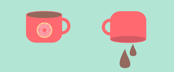
We have two coffee cup images here: one for the front of the cup that is decorated and full of coffee and one for the back that is without both decoration and coffee. The idea here is that the coffee cup will turn over and spill.
The coffee drips are a separate image and do not initially appear on the screen because it starts out at a 180 degree rotation on the x-axis and has backface-visibility: hidden; declared. This starts us out already seeing the “back” of the element, but it is invisible. This rotation is reversed through the animation, making the drops become visible once they turn over, revealing what is the “front.”
With Startup App and Slides App you can build unlimited websites using the online website editor which includes ready-made designed and coded elements, templates and themes.
Try Startup App Try Slides AppOther ProductsSimilar to the donut spin, we will be flipping the coffee cup over (but on the x-axis this time) to reveal a different image.
img {
  position: absolute;
  animation: turn-over 2s 700ms infinite;
}

.cup-front {
  z-index: 3;
  backface-visibility: hidden;
}

.coffee-drip {
  position: absolute;
  transform: rotateX(180deg);
  backface-visibility: hidden;
  animation: spill 2s infinite;
  animation-delay: 700ms;
}

@keyframes turn-over {
  to {
    transform: rotateX(-180deg);
  }
}

@keyframes spill {
  to {
    transform: translateY(200px);
  }
}
Shop Door

The image of a door opening would generally be an ideal example for when you wouldn’t want to use backface-visibility: hidden;. A mirror image of the door would be exactly what you would expect to see, but that wouldn’t make for much of a demo. So let’s make things a bit tricky by assuming some details on the “back” of the door are different. We also have to keep in mind that the “Shop Hours” sign needs to maintain backface-visibility: visible;.
There are a couple ways we could do this. We could create two illustrations, with one appearing to already be a mirror image of the front but with the change in colors, or we can use three images and let backface-visibility take over. We need one for the front without the sign, one for the back without the sign and with color changes, and one for just the sign.
Our door images contain a frame for the window, allowing the window image to show through on both sides, regardless of which door image is visible. This arrangement allows for us to make changes to the “back” of the door, without interfering with the window where we want to remain backface-visibility: visible; (default).
img {
  position: absolute;
  transform: perspective(600px) rotateY(45deg);
  transform-origin: right;
  animation: open 4s infinite;
}

.front {
  z-index: 2;
  backface-visibility: hidden;
}

@keyframes open {
  50% {
    transform: perspective(600px) rotateY(-140deg);
  }
}
When the door opens, the “front” disappears, the “back” is exposed, and the window remains untouched.
Donut Box
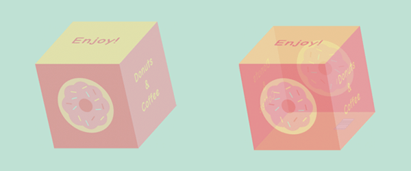
Now, what happens when backface-visibility meets more complex 3D dimensions? Let’s take a look at a rotating donut box for a different perspective. There is a container element .box that contains six sides, or faces, which are positioned appropriately through translations and rotations on the x, y, and z axis points. There is then a rotation @keyframes assigned to the container.
The faces of the box have an opacity of .6, meaning that without backface-visibility:hidden; we can see right through to the backs of all the other sides. While this would not generally be the desired effect for a box, it allows us to take a peek at what is going on back there when the box is rotated in our animation.
The faces start out with backface-visibility:hidden; and when we click the “backface-visibility” label we are triggering backface-visibility: visible;.
.box {
  position: relative;
  transform-style: preserve-3d;
  animation: rotate 4s infinite;
}

.face {
  opacity: .6;
  backface-visibility: hidden;
}

@keyframes rotate {
  to {
    transform: rotateY(360deg) rotateX(360deg);
  }
}
Utilizing Perception
backface-visibility presents a creative opportunity for us to explore and use this perceived extra space we have created. We can create fun and meaningful experiences through what we choose to be on the backface of an element, enriching the user’s experience as much as possible.
Hopefully, these demos help you understand the possibilities of this property and inspire you to use it in CSS animations.
Happy flipping!


 siter.io
 pulsetic.com
 static.app
 mailpost.io