Use of Huge Sliders in Website Design: Best Practice
Being one of the main conditions of creating website designs, multi-device support is a definitely hot trend and must-have nowadays. But when we are speaking about responsiveness we usually mean adaptation for mobiles and tabs, and only at the end recall widescreen monitors that actually permeate into offices by leaps and bounds. And since they are no longer luxury, more and more people will eventually change their standard monitors into something bigger. So, it’s our task to take care of this type of audience. Thus we have to make sure that essential components of a website not only decrease in size but also increase when it’s necessary, and today we are talking about big sliders that are frequent guests in website designs and one of the first should undergo changes.
I suppose those who intend to showcase their works will properly appreciate all the opportunities of widescreen sliders. They are big, they are sophisticated, they are modern and they definitely draw users’ attention. Also, they can easily shed a light on your photos, artworks and illustrations, and it’s all including representation without reducing image quality. As for the overall look and aesthetic pleasure, widescreen sliders certainly recreate feelings of full value and plenum. The whole design does not seem lopped, and as a consequence, it looks refined and finished.
In a collection below you will find marvelous examples of full-screen slider utilization’s. You can take a look at how carefully and accurately designers were able to implement this approach in order to make website design exceptional and attractive.
Examples of Huge Sliders in Web Design
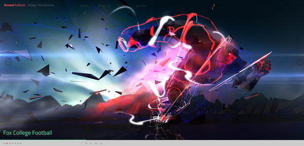
Renaud Futterer uses a responsive full-screen slider with vibrant and captivating images.
Eden unobtrusively advertises wooden iPhone case, demonstrating it as a part of a natural environment.
With Postcards Email Builder you can create and edit email templates online without any coding skills! Includes more than 100 components to help you create custom emails templates faster than ever before.
Free Email BuilderFree Email Templates
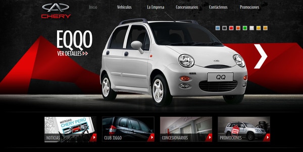
Chery creates from a slider unusual podium in order to familiarize users with its range of cars.
Arthelps supplies every slide with a highly detailed picture and brief descriptions with links to articles.
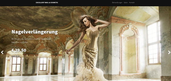
Excellent Nail and Cosmetic looks sophisticated and modern with a note of glamour that is achieved by slider with professional fashion images.
eGorilla applies semi-transparent slider that generally includes only text data over video background.
With Startup App and Slides App you can build unlimited websites using the online website editor which includes ready-made designed and coded elements, templates and themes.
Try Startup App Try Slides AppOther Products
Wetwilly is an amazing photo-based website with horizontal parallax effect; each section is represented as a slider with spectacular shots.
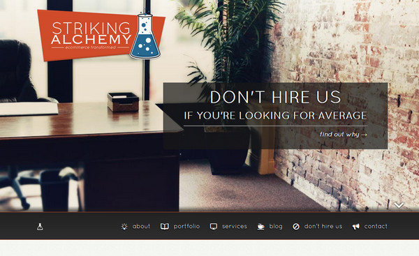
Striking Alchemy bets on standard slider with vertical transition that occupies the entire welcome screen.
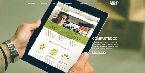
Bakken and Baeck is a one-page website that conveys a warm experience due to set of marvelous soft images in a slider.
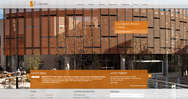
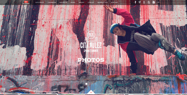
Shildan employs rather narrow in height but extra wide slider (with orange as the main color) that is full of urban photos
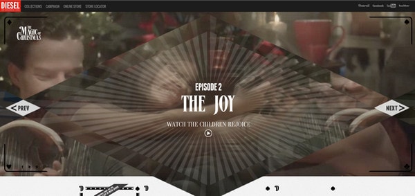
Diesel utilizes video slider with uncommon representation and decorative elements that resembles card layout.
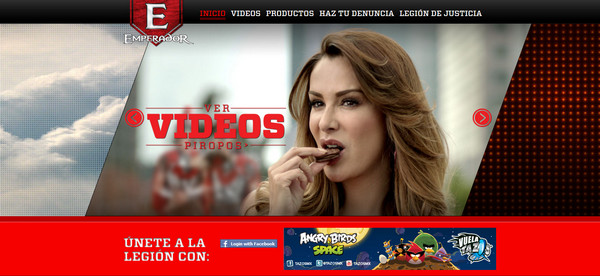
Emperador divides slider into 3 visual parts in order to simultaneously demonstrate 3 sections: previous, current and next.
Cropp looks advanced and exceptional. Being a fully photo-based website, it charms its users with a great deal of high-quality urban shots that are centered around a whole design. Every page includes uncommon slider that separates image into 3 lightly movable parts.
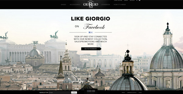
Giorgio welcomes visitors with huge slider that consists of only 3 slides; each of which shows a high-quality absolutely stunning photo.
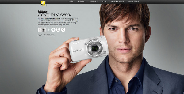
Nikon promotes its product line by means of an amazing interactive slider.
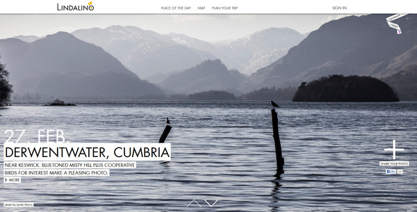
Lindalino mimics vertical parallax effect, representing each slide as a picturesque shot of natural sights, connecting it to map page.
Sandra Lovisco has a truly fashion vibe with dark color palette and a whole bunch of sophisticated photos that are demonstrated via slider.

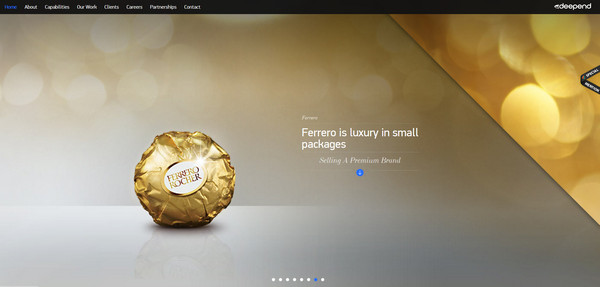
Deepend – At first glance, it seems that a designer uses the conventional horizontal slider, but if you take a closer look you will notice that every slide is harmoniously complemented by an optional upper triangle with extra image.
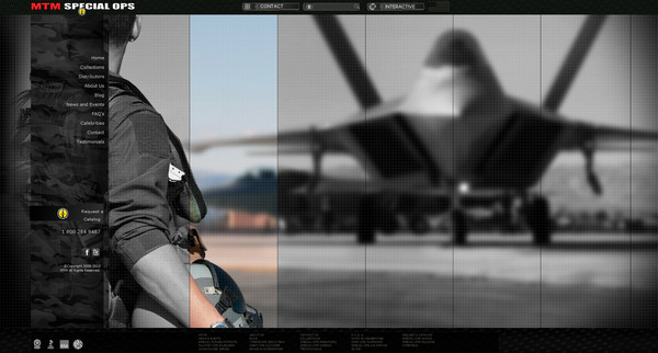
MTM Military Watches recreates a military atmosphere with slides divided into columns and gentle grayscale color.
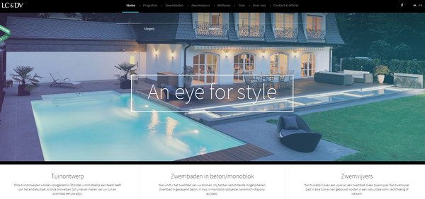
LC and DV has an elegant look. Widescreen slider with smooth and clean images goes perfectly well with the overall design, adding a note of style and mildness.
Coffee Surfing Illy features extraordinary slider that is split into two halves, each of which moves in opposite directions.

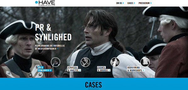
Have Kommunikation utilizes rather average, full-screen slider with noise effect, representing navigation system as a set of small circular images.
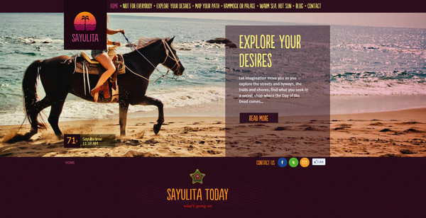
SayulitaBeach sets a slider in auto mode, infinitely showing spectacular seaside sights in order to give an impression of luxury rest and renewal.
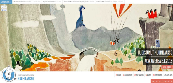
Muumilaakso depicts remarkable watercolor illustrations via slider, thereby showcasing all the power of creative natures.
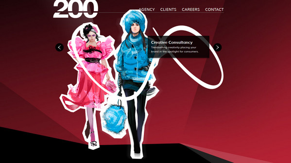
200 Creative breaks the drab of dark website background by resonating image slider that features bright geometric layouts with captivating scenes.
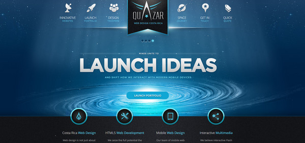
Quazar makes use of adaptive slider with fully transparent background. Every slide includes only text data with light gradient touch and huge titles, making it harmoniously collaborating with header content.
Reflection
As you may have noticed, wide-screen sliders are different, they can be narrow or vice versa occupy all free space, they can be transparent, content or multimedia oriented, but one thing is certain – they uniquely attract people, focusing visitors on visual aspects of a website. And if you can skillfully take advantage of this opportunity you will definitely transform your website into something memorable and exceptional.
And now, tell us what do you think of widescreen sliders and its utilization in website design? Are they attractive? Do they do their job well? Is this a good tool to showcase your artworks?


