What Designers Need to Know About Bootstrap 4
Since August 2011, when Bootstrap was first launched, it has gained popularity in the web design and development world. From entirely CSS-driven style sheets to a powerful, mobile-first, responsive, front-end framework with lots of new features added including host of JavaScript plugins, tools and icons that go hand in hand with forms and some more components, it’s safe to say that Bootstrap has come a long way.
As of this writing, we have Bootstrap 4 with an alpha version which is an incomplete release and not suitable for production. With this version there are major changes in store. Lots of new features are added and customization options will be available.
Although there might be some argument about which is the best CSS framework to use, almost every designer can build pretty much anything with Bootstrap, and critics could too if they took a little time to reconfigure default Bootstrap styling.
Why Designers Love Bootstrap
If you are a designer, you probably enjoy creating designs based on the Bootstrap framework. Here are some reasons why designers love Bootstraps:
- FREE: Bootstrap is open source. There’s no need to pull out your credit card.
- Powerful Grid System: Bootstrap has the best responsive, mobile first grid system available. It’s easy to use and flexibility that allows you to produce prototype layouts and make customization easy.
- Customization: Bootstrap is fully customizable. That means you can create a different design from it, abandoning the basic look of Bootstrap templates. All CSS and JavaScript can be overridden so there’s no trouble working with it.
- Rapid Development: Bootstrap offers reusable CSS and JavaScript components that can help designers to easily create the functionality and elements they need for their designs.
- Excellent documentation: Bootstrap has exceptional documentation which can help you understand any part of the framework whether you are a beginner or pro.
Things Designers Need to Know About Bootstrap 4
As a designer, it is worth studying the news features and updates. To design websites for Bootstrap you might think differently, but I don’t think it’s a waste of time to know and understand the things you need to consider when designing Bootstrap-based websites.
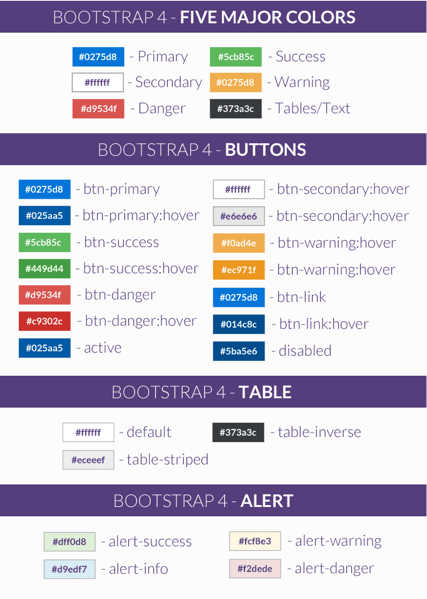
Color
Bootstrap 4 comes with five major colors inside. These colors comes with their respective classes and prefixes which can be re-used across different components such as buttons, links and alerts. Check out the image below.
With Postcards Email Builder you can create and edit email templates online without any coding skills! Includes more than 100 components to help you create custom emails templates faster than ever before.
Free Email BuilderFree Email TemplatesNote: In Bootstrap 3, the “btn-secondary” class is the “default” class.
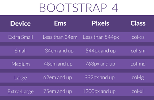
Grid System is Not in Pixels Anymore
In Bootstrap versions 1-3, grids are measured via pixels. However, in Bootstrap 4, grids are measured via ems and rems. So if you are working on a Photoshop layout design of a website it’s quite helpful if you are going to see what the equivalent measurement of ems to pixel.
The Gutter
Bootstrap usually comes with 30 width gutter, 15px on each side of a column. This means padding left and right for column will be 15px each side, where as margin left and margin right for row is 15px. That gives you an idea how you will put spaces on each columns on your designs.
One good thing about Bootstrap 4 is that allows you customize and compile your own build based on your needs. This includes color, container sizes and gutter padding. Often you want to select the column and remove the padding with CSS. You can create your own utility class helper to attain this quickly. Check out the sample code below.
.no-gutter > [class*='col-'] {
    padding-right:0;
    padding-left:0;
}
The hardest and most tricky thing about using Bootstrap 3 is the navbar. It’s tough to figure out because you need to add a lot of classes just to create it. Moreover, you also need to go to your CSS to customize the colors and some styles.
In Bootstrap 4, there are a lot of classes that were removed and more options to color schemes are added. This gives more options to control the layout of the website’s navigation. You can check the documentation here if you want to learn more.
With Startup App and Slides App you can build unlimited websites using the online website editor which includes ready-made designed and coded elements, templates and themes.
Try Startup App Try Slides AppOther Products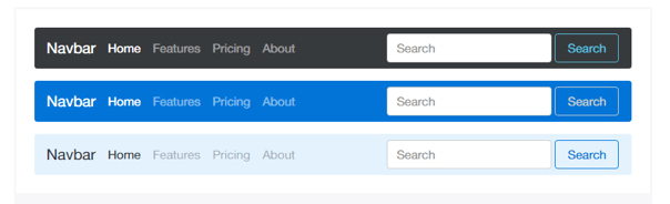
Opt-in Flexbox for Responsive Design Can be Activated
Bootstrap 4 enables users to use the CSS3’s Flexbox Layout mode. Flexbox is a layout mode that offers arrangement of elements on a page for responsive purpose. It provides a flexible container can expands or shrinks the elements size on different viewports.
While this is a great thing about designers trying to make their design responsive, this will only work on browsers higher than Internet Explorer 9.
Optimize Styles Using SASS Instead of LESS
Bootstrap 3 used LESS as its main CSS pre-processor, but due its popular front-end developers contributor it has switch to SASS via Libsass Sass Complier written in C/C++ Bootstrap 4.
Now you can customize styles such as color, spacing, link styles, typography, tables, grid breakpoints and containers via _variables.scss file.
Conclusion
Although Bootstrap is only one of many available frameworks for creating responsive, mobile-first websites, it offers a lot of possibilities for designers. Knowing about updates and new components will make these builds that much easier.
We hope you’ve enjoyed reading this article. Sign up for our newsletter to receive regular updates and some cool stuff in your email.


 siter.io
 pulsetic.com
 static.app
 mailpost.io