Bootstrap Navbar Guide and Free Navigation Examples
Every good user experience begins with well-thought-out navigation. It is the heart and soul of the website that stands behind the comfortable presence of the visitors. It is a glue that holds everything together. That is why Bootstrap navbar is a baseline component in the Bootstrap community that regularly undergoes enhancements.
Read about Bootstrap grid, Bootstrap buttons, and Bootstrap modal.
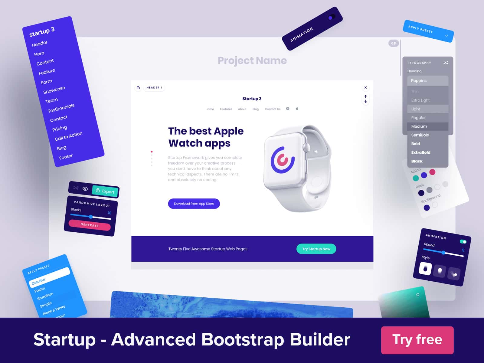
Looking for a Bootstrap online builder?
- 👉 Try our Bootstrap Builder and create unlimited projects for unlimited clients.
- 👉 Start to build a website using our Bootstrap Templates.
First, it provides important gateways. It should function no matter what. Whether you use a mobile phone or a huge monitor, the behavior should stay consistent to avoid confusions and misinterpretations. The situation is exacerbated by the growing diversity of screen resolutions in the gadget market; nevertheless, Bootstrap navbar has it. It is just a small component that occupies nearly tenth of the screen, yet it does its duties perfectly.
If you’re looking for Bootstrap templates, take a look at this collection.
Bootstrap navigation is a flexible and powerful instrument. It comes with a range of utility classes, a bunch of supported elements, and mobile-first behavior. As for design, not only does it have a nice and clean appearance, it is also provided with two themes (dark and light) to meet general needs. The team has undoubtedly thought it through.
With Postcards Email Builder you can create and edit email templates online without any coding skills! Includes more than 100 components to help you create custom emails templates faster than ever before.
Free Email BuilderFree Email TemplatesThere is one catch. To enjoy the benefits of the component as well as fully exploit its possibilities, there are some essential rules.
- Use only supported content: Logo (aka brand), menu links, a toggle for collapsing, buttons, dropdowns, inline forms, and text.
- Avoid using grid rows and columns inside the navbar.
- Use utility classes to modify the look and behavior of the component.
Everything is on the surface. Even though Bootstrap navigation and its accompanying arsenal of instruments are self-explanatory, sometimes it can be pretty challenging to handle, especially for newbies. We have allocated three general issues that young developers stumble upon.
By default, the Bootstrap navbar has two themes: dark and light. For the majority of cases, it can be enough since both options are neutral, thereby going well with various environments. What’s more, they have a right level of readability, ensuring users single out menu links from the rest of the content. However, when it comes to interfaces with unique color schemes special design features, it might not be enough.
In this case, you need to create a custom class and define the preferred color. The styles should look like this.
.navbar-custom {}
/* change the brand and text color */

.navbar-custom .navbar-brand,
.navbar-custom .navbar-text {}
/* change the link color */

.navbar-custom .navbar-nav .nav-link {}
/* change the color of active or hovered links */

.navbar-custom .nav-item.active .nav-link,
.navbar-custom .nav-item:hover .nav-link {}
If the navbar has dropdowns then you need to alter some additional classes as well.
    .navbar-custom .navbar-nav .dropdown-menu {} .navbar-custom .navbar-nav .dropdown-menu>li>a {} .navbar-custom .navbar-nav .dropdown-menu>li>a:hover,
    .navbar-custom .navbar-nav .dropdown-menu>li>a:focus {}
Insert inside any options you need: color, background, font-size, etc.
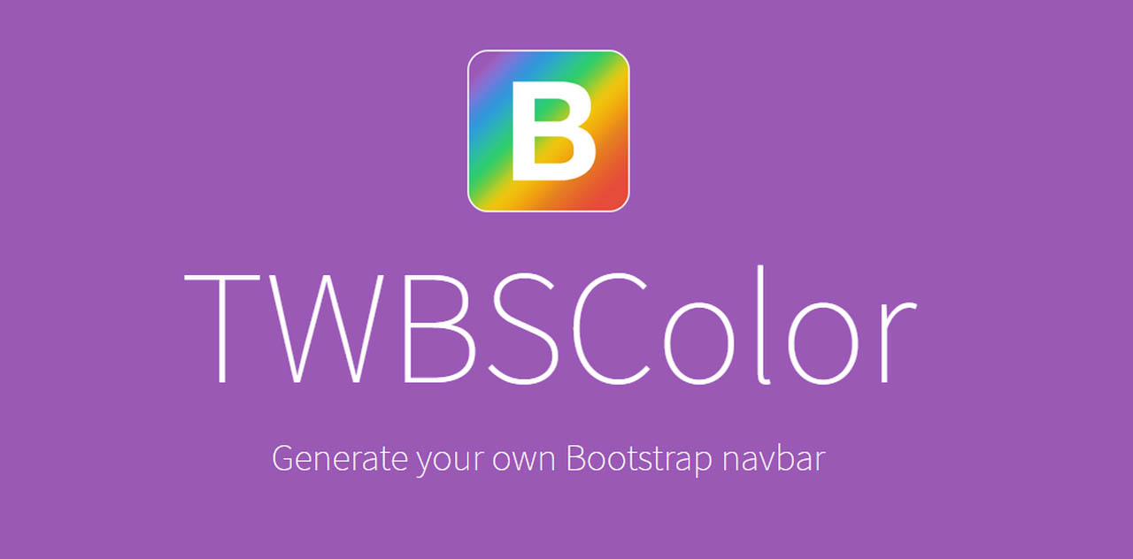
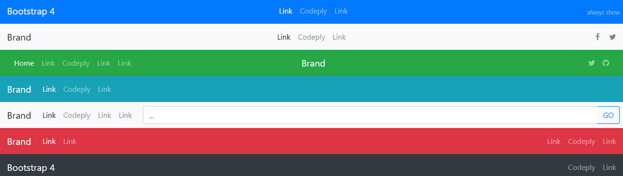
In addition, if you seek a quick solution, you can always try TWBSColor. This small playground allows you to generate Bootstrap navbars with any colors you want. Just choose the framework version and set the tones for default and active backgrounds and text. Copy the generated snippet available in SCSS, SASS, LESS or CSS, and paste it into your file with styles.
Everyone knows that alignment can be a nightmare. Or until Flexbox. Bootstrap is no alien to improvements in CSS, so its fourth version makes the most out of it. Along with justify-content-end, justify-content-center, align-items-end you can use mr-auto or ml-auto that are new utility classes for right and left margin.
With Startup App and Slides App you can build unlimited websites using the online website editor which includes ready-made designed and coded elements, templates and themes.
Try Startup App Try Slides AppOther ProductsAlso, check out the Codeply project that includes various scenarios to find a quick solution for arranging the elements inside the navbar.
This one is for sophisticated developers. Changing the breakpoint is not as difficult as it may seem at first. Of course, it requires overriding some default functionality, yet with Bootstrap, everything is clear.
By default, the collapse breakpoint is 768px. However, if you think that your navbar should be transformed into the hamburger menu in larger screens, then the Bootstrap 4 offers a small range of predefined utilities. Just use navbar-expand-* class to modify the behavior. It should look like this:
<nav class="navbar navbar-expand-sm">..</nav>
You can choose from several variants:
<ul>
   <li>navbar-expand-sm- mobile menu on screens less than 576px.</li>
   <li>navbar-expand-md- mobile menu on screens less than 768px.</li>
   <li>navbar-expand-lg- mobile menu on screens less than 992px.</li>
   <li>navbar-expand-xl- mobile menu on screens less than 1200px.</li>
</ul>
For never using mobile menu add navbar-expand. Conversely, if you want a menu to be mobile all the time, add this class (no expand class).
For those who want their breakpoints to be the exact number, say 1000px, you can specify a media query like this
@media (min-width: 1000px) {
	.navbar-expand-custom {
		flex-direction: row;
		flex-wrap: nowrap;
		justify-content: flex-start;
	}
	.navbar-expand-custom .navbar-nav {
		flex-direction: row;
	}
	.navbar-expand-custom .navbar-nav .nav-link {
		padding-right: .2rem;
		padding-left: .2rem;
	}
	.navbar-expand-custom .navbar-collapse {
		display: flex!important;
	}
	.navbar-expand-custom .navbar-toggler {
		display: none;
	}
}
While all the previously mentioned workarounds are lifesavers for those who have lots of time and enthusiasm when it comes to everyday projects, the navbar should be one of your least worries. Bootstrap’s ideology implies quick prototyping. So predictably, there are ready to use navbars that not only work well but also easily blend into your project.
One of such outstanding solutions is a Navbar designed by Designmodo. It has a clean, neat, and elegant appearance that fits many projects. It includes necessary elements for branding with a menu settled right in the center of the page, search form, and two buttons for signing in and registration. You are welcome to change fonts, colors of the text, and background.

20 New Bootstrap Navbars
If you like it, there is a whole range of vigilantly designed and professionally coded Bootstrap navigations in the builder. Starting with a compact mini version and ending with navigation that has it all Startup is undoubtedly a thing to explore.
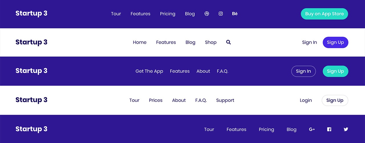
Startup Bootstrap Navbars
Another fantastic option is Bootstrap 4 Navbar with Icon Top.
Created by one of the Bootsnipp’s contributors, this subtle dark-themed navbar arranges all the elements on the ends, leaving the central part empty and spacious. There is a logotype, search field, button, and even a small dropdown. The key feature of this solution lies in the utilization of menu items with icons so it can come in handy for admin panels or interfaces of various online services.
Transparent Navbar & Hero by Allen Pavic
Inspired by Cloudflare, Allen Pavic was managed to recreate its iconic transparent navbar. It looks sophisticated. It does not have anything unusual, yet its commonness makes it so popular. It is a regular topbar that includes a logo, main menu, and social media icons. I bet you were searching for something like that yesterday or last week. The solution is an answer to various projects.

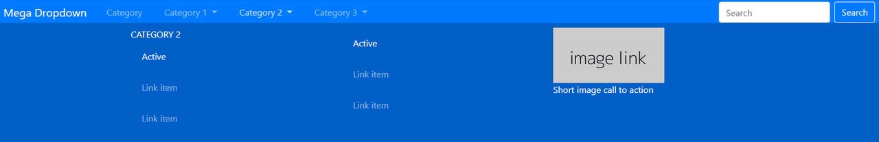
While all the previously mentioned solutions feature single line navigations, Navbar by Jacob Lett lets you create a mega dropdown menu. Each sub-menu can include several columns of information. You can even add an image with a link to make it not just informative but visually intriguing.
Bootstrap sticky navbar by Ondrej
The component speaks for itself. If you need a navbar that follows the users throughout the page, this solution is right for you.
It offers a traditional sticky menu that is attached to the top of the browser and stays there all the time. It already includes the brand, three-item menu, search area, and even a “sign-in” button. It also has an excellent design, though you can easily change it via CSS.
Now UI Kit is a Bootstrap 4 toolset designed by inVision and coded by Creative Tim.
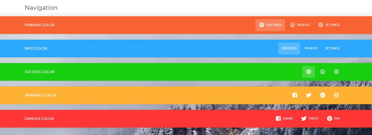
It comes with a range of elements, and navbar is one of them. You will find in here eight outstanding navigational headers including not just colorful versions but also the transparent one. Two compact options have in-built dropdowns and six full-width options that embrace the baseline elements such as logo, buttons, and social media icons.
Material Dashboard
Material Dashboard is another free product released by Creative Tim. Unlike the listed above solutions, this one features a sterling admin dashboard.
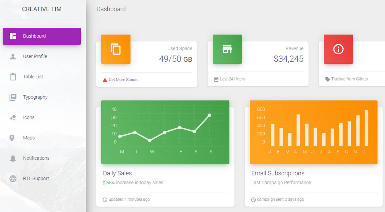
Here, the navigation is presented as a traditional sidebar. Although it does not hide nor slide out, yet it is a valid alternative to conventional top headers. In addition, it can accommodate lots of useful stuff. This one features a relatively wide panel with menu items accompanied by the icons. The design produces a quite pleasant impression.
If you need the previous solution to have a sliding effect, try Bootstrap 4 sidebar by Ondrej. For those who are still stuck with the 3D version of the framework, this is a real lifesaver.
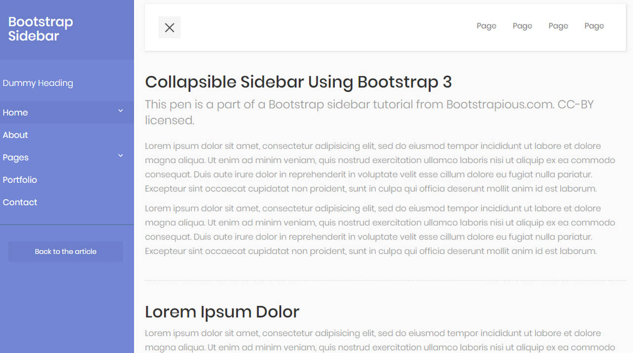
Not only does it have a beautiful design and classic functionality, but it is also enriched with a small animation that makes things exciting.
Conclusion
Bootstrap navbar is an integral element of design. Good user experience depends on it, so it should be treated appropriately. Even though the team behind the framework has done a great job, there are still some issues that should be overcome before reaching the desired result.
Nevertheless, with the right tools like these vigilantly crafted navbars, everything can be done without much trouble.


 siter.io
 pulsetic.com
 static.app
 mailpost.io