How to Combine Typefaces
I recently finished reading Tim Brown’s new book “Combining Typefaces.” It’s 63 pages. You can buy it for less than $5 on FiveSimpleSteps, as a pdf or epub.
Combining Typefaces is a dense book. It goes through a lot of concepts very quickly, but I’m a fan of that. The book may be primarily about combining types, but I think it serves as a great introduction to typography as a whole. It goes over anatomy and general terminology, but the book primarily approaches typography as a form of artistic communication, instead of just a set of guidelines and formulas. This is important, because that means it accepts subjectivity. There is no one answer to type, no winning approach; all we have are the techniques and patterns observed and used by of artists and designers throughout centuries. It challenges you to think about typography in your own way: how will you create what you want to communicate? What will you use? How will you use it?
Brown also packs the book with links to essays and books written by people I have much respect and admiration for. The book has good information in itself, but it’s also a good relay towards wider insights from various people.
So the book is good. I fully recommend it, and it costs as much as a pack of Weather’s Candies at a grocery store. I want to go over some of Brown’s ideas over here at Designmodo, and try to answer the question of what really is the best way to combine typefaces effectively. I will admit that it is a tricky task, as Brown also acknowledges; I definitely have not mastered the task. But the more you do it the more comfortable it becomes. Practice!
“The act of bringing different typefaces together to convey a message is challenging, inspiring and fun. And it gets the job done – finding good type combinations can give form to our emotional goals and serve the practical needs of our compositions in ways that sticking with a single typeface cannot.”
Communicate Ideas, Finding Proper Roles
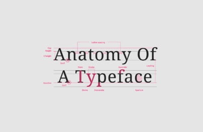
We can take almost any print, cover, or webpage and reduce its use of typography into various functions. Different parts of a print yield different roles, and methods of communication, and therefore require different kinds of typefaces.
With Postcards Email Builder you can create and edit email templates online without any coding skills! Includes more than 100 components to help you create custom emails templates faster than ever before.
Free Email BuilderFree Email Templates
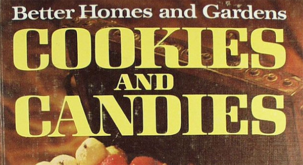
If we take the average book cover, we can reduce its use of type to a few elements: a title, a byline, the author(s), the back text, the title on its spine, and some kind of central artistic object. It’s important to understand what each of these elements exist to do. The back text is there as a ‘pitch’, to summarize what the book is and give an attractive hook , but it’s still concrete information that needs to be read thoroughly, so it should probably use a very readable typeface, maybe a traditional serif, or just a sans-serif that looks good on in a dense paragraph. Titles, on the other hand, don’t need to be read in the traditional sense; I don’t have to know exactly what the text is saying, and that opens the way for more expressive or flamboyant letterforms. Some books just replicate the title type on the spine but others will make the spine text more legible, in case you actually do want to know what the hell the title is.
Some covers ‘combine’ typefaces by using only using one typeface in different sizes, styles or colors. Many titles have determinants (“the”, “a”, “of”, “and”) that are smaller than the words. Other prints combine very similar typefaces, and try to bring out their subtle differences. I did this with a print of mine last year using Georgia, Palatino, and Minion Pro, with varied success.
“Is the chunk you’re typesetting supposed to be read comfortably? Or is its purpose to catch and direct readers’ attention? Is it informational, meant for readers to pore over and reference?”
Choosing a Typeface
I’ve written about choosing typefaces here before – you should check out that column. Brown isn’t the first one to suggest that you have specific goals – a concrete idea of what you want to communicate – before you choose a typeface. I want to stress though, that you’ll never really understand what works if you don’t try it. With every print I’ve made, I found that the typeface I thought I wanted wasn’t the best one for the job once I started playing around with the types and InDesign bounding boxes. Experimenting and playing is key to choosing a good typeface. Goals and concrete ideas are useful because they narrow down what you want, which is why I also stress understanding basic typographic classifications.
One of my favourite concepts in the book regards what Brown calls an “Anchor,” which involved choosing a ‘main’ typeface that other types will reference. This keeps the design work ‘connected’ aesthetically. Brown suggests using the body text as the anchor in the appropriate settings (websites, magazines), which I find to be curious, as body text tends to be the least expressive typeface in a composition. I like to think of good body text as ‘transparent,’ something that should allow you ignore the type itself and focus on the text says. What distinguishes body text is that it normally contains the bulk of the content, though, so we shouldn’t ignore what it does.
Space and Harmony
“Squint at your typeset text, or back up a bit. Distance yourself from it enough that you stop seeing words, and instead see gray masses that vie for attention in the composition by taking up space, being very active or exhibiting contrast.”
Low-Code Website BuildersWith Startup App and Slides App you can build unlimited websites using the online website editor which includes ready-made designed and coded elements, templates and themes.
Try Startup App Try Slides AppOther Products
This is the point where “Combining Typefaces” gets really exciting. Brown starts discussing space, texture, rhythm, and proportion. Texture involves the way you observe dense blocks of body text from various perspectives. How the text looks when you move away from the screen, as opposed to when you move close. Rhythm refers to the negative space between letters and blocks of text (which includes words and sentences). He argues that there is a feel created by the relationship with whitespaces between letters, words, and lines, and that combining typefaces well involves understanding what this rhythm communicates.
“It’s feasible that typefaces could be combined purely on the grounds of compatible rhythm – a speedy, syncopated heading with a steady paragraph underneath, like layers of music. Or a dry display face with lively text.”
Combining Typefaces is good because it challenges. It’s ideas range from the basic and the concrete to the abstract and fluid, and it’s exciting. If you’re looking for an introduction into thinking of typography and lettering in deeper levels, I highly recommend the book.