Preparing Your Conference Website (And What to Include)
Meta Refresh is the official website of a conference that is focused on the important topic of “The Construction of User Interface on the Web,” offering various workshops. Though it was successfully held, the website for this event serves as an excellent example of how to properly inform regular users about the upcoming event as well as attract as many visitors as the auditorium can seat.
Why Is It Important to Announce Your Conference Online?
Some naively believe that the time-proven ways of promotion such as leaflets, massive posting on the forums and even Google AdWords will be more than enough to draw people in for events. However, methods of drumming up interest are also evolving. What seemed to be a win-win solution several years ago nowadays will flop. In order to keep up with the fast-moving world, you should adapt to desires of the most and pay respect to their current thinking.
Moreover, you should always remember to establish a trustful atmosphere, since not everyone is ready to give money even for a popular event. A good conference simply cannot do without a website. Having an official website is also a ground rule of etiquette for those who are conscious of the harsh realities of the internet.
Official Website and How It Should Look
We don’t accidentally stop on the Meta Refresh site; it is an excellent and truly representative example of how to properly inform users about an upcoming event. Though it definitely won’t impress you with flashy design or instantly grab your attention with brilliant effects, it has everything to carry out its primary function more than swimmingly. It is a comfortable and pleasant place (if I may say so with respect to the online page).
Let’s break the site into pieces that perform crucial roles and are fundamental bricks of this well thought out construction.
The website comprises such logical divisions as a welcome area, introduction block, section with pricing table, section with special offers, box with featured speakers, schedule, location and sponsor information.
With Postcards Email Builder you can create and edit email templates online without any coding skills! Includes more than 100 components to help you create custom emails templates faster than ever before.
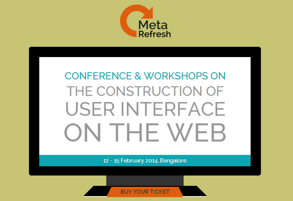
Free Email BuilderFree Email TemplatesWelcome Area
The most viewed part of the website — as someone will say “the cover of your book” — should look memorable, or at least, intriguing. Meta Refresh takes on a fresh approach of using flat-style graphics. The goal of the conference is obvious thanks to a massive clean title placed in the heart of the screen. Moreover, organizers didn’t forget about a quick way of booking tickets by providing users with a relatively huge call-to-action button, also fixed in the center.
Description Block
This section is fundamental; it answers such questions as what, who, when, where and what to expect. The information is presented quite briefly but lucidly. The block is wisely guided by the wisdom “brevity the soul of wit,” and it efficiently covers major points and doesn’t overload users with extra information.
Pricing Table
This section, in a majority of landing pages, is omitted or is simply represented with a link. Such inadvertence happens all the time despite the fact that the price tag is almost the first thing potential participants want. Showing the cost right away helps demonstrate openness and transparency that are really vital for web.
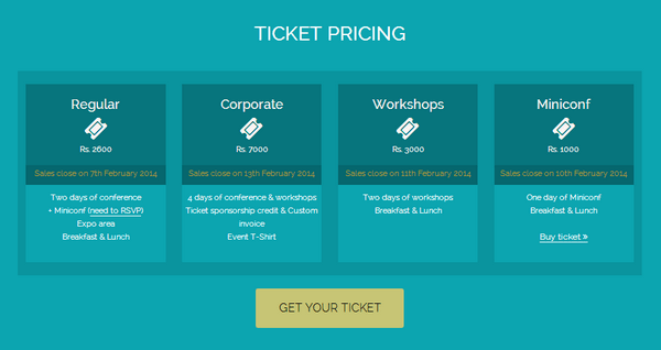
Special Offers
Let’s rope in doubters. Discounts and special offers are lovely magnets for people, so don’t forget about them. The official website features three various options that are aimed to make the conference to look even more appealing and desirable. The team resorts to a clean and plain presentation, since the options should be a centerpiece rather than a textual filling.
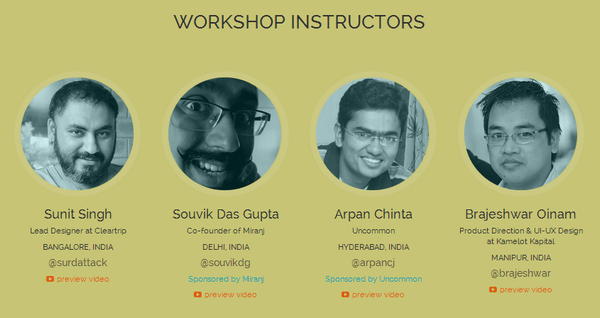
Guests, Speakers or Workshop Instructors
Who are those gurus that will teach us? People must know the heroes, so a visual representation via a rigid grid that is populated with photos of speakers bolstered by short bios and even small videos is an excellent choice. A great deal of organizers lose sight of incorporating a human component that breathes a life into an artificial website, and it is theirs tactical blunder.
With Startup App and Slides App you can build unlimited websites using the online website editor which includes ready-made designed and coded elements, templates and themes.
Try Startup App Try Slides AppOther ProductsSchedule
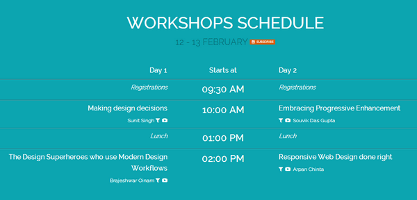
The schedule is split into three parts that cover the miniconf, workshop and conference. The team has planned an exciting, eventful program for participants, so why not show it off. Moreover, every professional wants to manage his or her time, so knowing in advance exactly when and what to expect allows participants to to draw up their own timetables.
‘Previously at Meta Refresh’
This is an optional section. It is also aimed to contribute to the goal of the website, aka entice as many users as possible into an upcoming event. Here, users can learn more with interesting videos from previous conferences that should demonstrate the skills and experience of speakers.
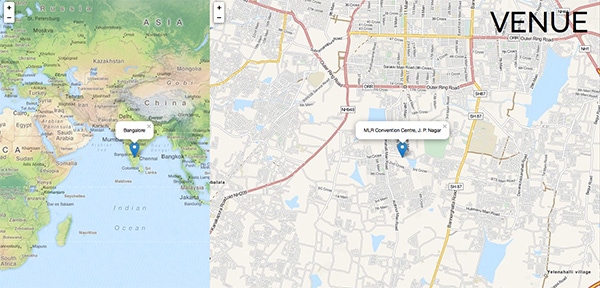
Location
So after successfully “catching users on the hook,” it is time to answer the question “Where is the magic is going to happen?” The location is presented with the help of a huge, detailed map that will lead you to the front door.
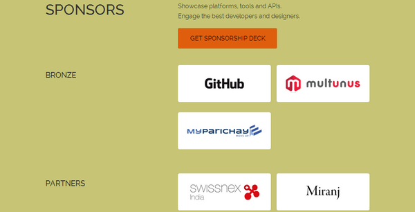
Sponsors
It is more than a simple tradition or expression of gratitude to show people and companies that have taken care of all the problems relating to money issues; it is a must-have. This area doesn’t imply that this is a low-level conference; it means that lots of professionals and competent and experienced companies have trust in this event and believe that it should benefit the community at large.
Conclusion
The team has taken into account all major points, briefly and truthfully answering on all key questions that interest ordinary users. Of course, the landing page turned out to be quite long, yet it is easy to look through. The horizontal stripe layout that is supported by a harmonious color differentiation and flat style helps carefully distinguish main sections as well as highlight content. The team adheres to the rule of making the web page look open, transparent and straightforward in order to establish trustful relationships with online audience.
You don’t have to reinvent the wheel in order to properly inform users about an upcoming event. All you have to do is provide answers to the fundamental questions: What, who, when, where and how much.


