Tricky Balance: Great Examples of Content Heavy Website Designs
In the world of information overload, content-heavy website designs are slowly but surely becoming the usual thing. And this feature is not only typical for eCommerce and news-related websites, but also for a great deal of other regular websites such as online portfolios of creative agencies that frankly abuse the use of extensive data.
Even despite the fact that content-intensive layouts are famous for its problematic and complex nature that produces a whole bunch of challenges during a creation process, website owners continue providing users with more and more information. Of course, sticking to expert guidance and abiding ground rules will help you to achieve a properly-balanced and well-organized structure, which manages to keep a website from unnecessarily clutter.
Today we have covered a list of complex website designs that ably accommodate the load of content and have managed not to lose a pleasant and organized appearance.
Content Heavy Website Examples
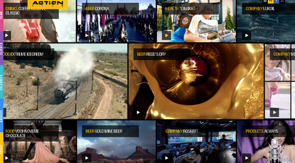
Action Film is rather complicated website that skillfully demonstrates a bunch of miniature videos dedicated to various professional Russian commercials. The landing page is divided into several lines, each of which serves as a comprehensive multimedia slider.
Salon’s homepage neatly exhibits different photo artworks that are compactly arranged on one page. Small and large images wisely cooperate with each other, breaking up monotony of a setting.
With Postcards Email Builder you can create and edit email templates online without any coding skills! Includes more than 100 components to help you create custom emails templates faster than ever before.
Free Email BuilderFree Email Templates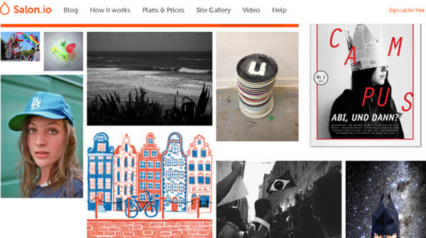
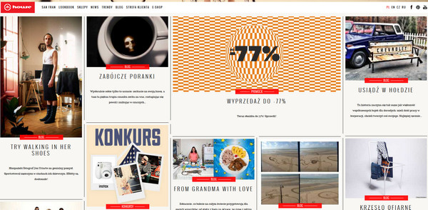
House. Designer leverages grid-based layout that easily puts everything in its place. The home page looks tidy and quite legible even despite of a noticeable difference of heights of post blocks and thumbnails.
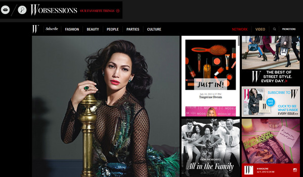
W Magazine has a stylish and sophisticated design. White content boxes, bright contrast images and light regular type ably stand out from a dark single colored background.
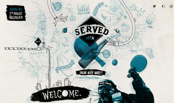
Served MCR has a strong hand-drawn vibe and design heavy appearance. The main page is rich in details that simply fascinate onlookers by means of rustic outline sketches, slight watercolor effect, several hand-written fonts and muted color palette.
Butterfly is a compact and rather informative online portfolio. Although designer abuses the use of visual data in the featured work section, he skillfully dilutes the landing page with plain graphics and clean monochrome backgrounds.
With Startup App and Slides App you can build unlimited websites using the online website editor which includes ready-made designed and coded elements, templates and themes.
Try Startup App Try Slides AppOther Products
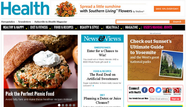
Health is a popular online magazine that is aimed to bring a colossal amount of fresh data to its users. Since the website is quite frequently updated, Designer properly builds visual and information hierarchy and establishes it on a clean white background.
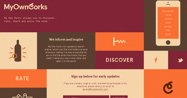
My Own Corks goes for a very neat and elegant flat style to its design. Designer beautifully aggregates a subdued coloring and simple plane graphics. A tiny font imposes a sense of extra room to vivid rectangular blocks.
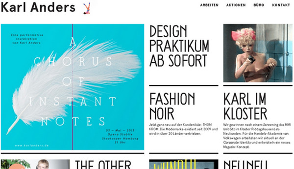
Karl Anders’ home page is marked by a strong, rigid structure that is realized by means of standard tiled layout. Designer relies on a black-and-white color palette that naturally keeps an optimum balance between content and background.
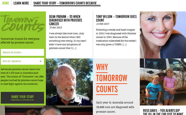
Tomorrow Counts includes a bulk of contextual and visual information that is meticulously adjusted for better readability. Soft green and lively yellow, which are used as secondary colors, bring a note of optimism to a website.
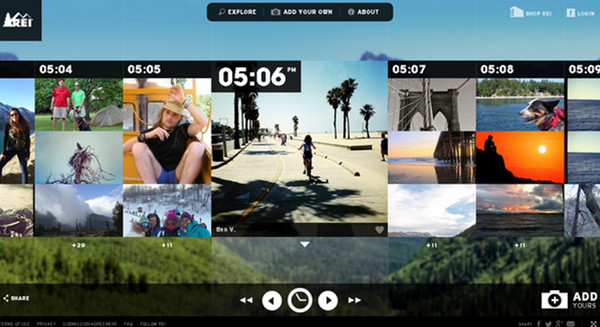
REI 1440 Project is a really unique, exciting and conceptual website that shows off numerous picturesque images via narrow thumbnail slider.
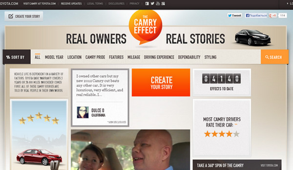
The home page of The Camry Effect capably mixes together blocks of statistical data, videos with a real life stories and standard widgets. The website has also a set of filters that gives users an opportunity to sort all the information the way they want.
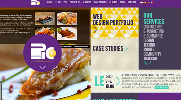
Phillips Internet Consulting leverages a standard image slider that occupies only half of a screen in order to showcase the brand and, at the same time, provide more room for a navigation system on the right side. Although, abstract backgrounds of menu items and relatively huge typography make landing page look a bit messy.
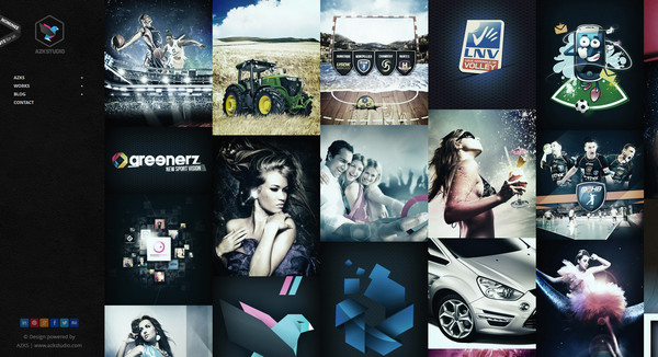
Accuel AZKS is an online portfolio that instantly, briefly and efficiently familiarizes users with featured artworks. A darkening effect, which is applied on every miniature, helps to carefully highlight every item. A strong and stable column layout prevents a front page from visual confusion.
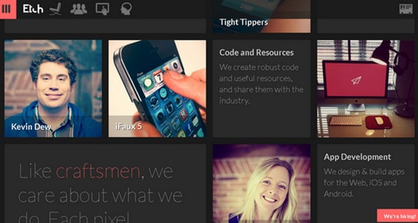
Etch. Despite of predominant dark coloring throughout the website, the latter radiates rather warm vibrations mainly due to images with slight lomography touch and light complementary color scheme. Relatively wide gutters between content areas maintain an orderly feel.
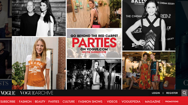
Vogue is undoubtedly one of the most massive and all-embracing fashion observers. Its website does not deviate from magazine traditions, chiefly demonstrating fashionable photos that flawlessly stand out on a monochrome white background. Designer wisely utilizes 3-column layout, making content area wider than sidebars to focus onlookers on primary information.
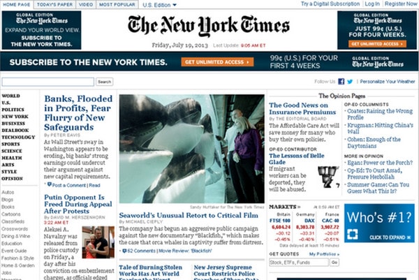
The official website of The New York Times is a great example of a well-thought-out content heavy website that closely resembles habitual newspaper. Although, at first sight, a homepage looks quite busy, actually the news flow is broken up into easily-digested sections.
How Cool is another fashion-related website in our collection that primarily grabs onlookers’ attention by means of visual aspects. Again, the landing page looks surprisingly roomy due to moderate number of displayed posts and a lot of blank white space.
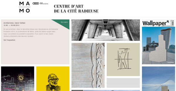
Mamo. Designer has skillfully organized the home page, including only images and a small logo with a tagline in a header. An absence of additional captions, which become visible only when you hover over images, allows making website look clean and clear.
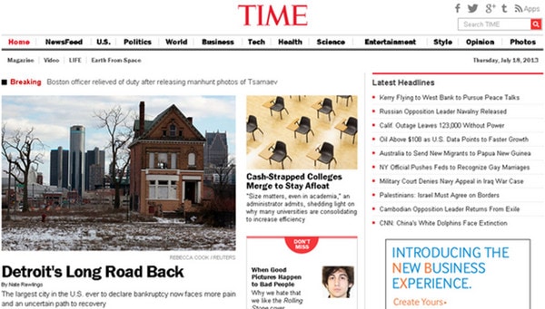
Time’s home page chiefly represents information via 3-column layout that occasionally transformed into 4 columns in order to orderly accommodate all necessary stuff.
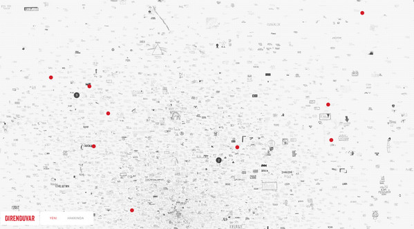
Direnduvar is an exceptional and truly unconventional website. It wonderfully illustrates a great deal of various subtle doodles that are spiced up with ambiguous handwritten fonts. A convenient drag-and drop technique along with a possibility to bring a setting much closer ensures a pleasurable exploring experience.
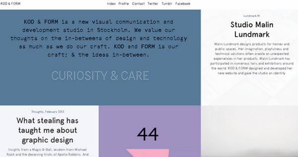
Kod and Form closes out our roundup with a delicate organic design. Roomy content boxes are capably supported by a pastel coloring, smooth intelligible type and several subdued and soft close-up images.
Reflection
Generally content-rich websites keep data within a rigid grid layout that is capable of establishing a consistent visual and information hierarchy. Such a conventional and time-proven approach of employment coherent structure saves website from an unwanted overload and overwhelming look.
What are your favorite examples of websites that effectively cope with high volumes of content? What are the main challenges of creating content intensive websites?
Use our comment section to share your point of view.


