Dark Mobile App Interfaces Examples for Inspiration
The dark interfaces that always differ from others by its mysterious and sometimes a slight brutal appearance always invite designers’ attention. As color theory implies, such UIs convey their own compelling and mighty spectrum of feelings that are really hard not to notice. Although in the real world black is generally associated with something bad, in design it manages to produce a quite opposite impact.
Black, is like white, is a quite powerful, influential and authoritative color that successfully interacts with a lot of shades. It goes perfectly well with light and vibrant hues. The white color, here, has been given a special place since white and black are thick as thieves from time immemorial. There are a bunch of tones that will stand out from a dark background and will effectively complement the rest components. Obviously, the more contrasting colors are applied the better, because the optimum balance that is achieved due to such color manipulations adds necessary readability.
Thus designers prefer to leverage unconventional color combos such as black and yellow, black and blue or black and any neon hue that look simply enthralling, topnotch and quite advantageously.
The list below comprises exceptional dark mobile app interfaces
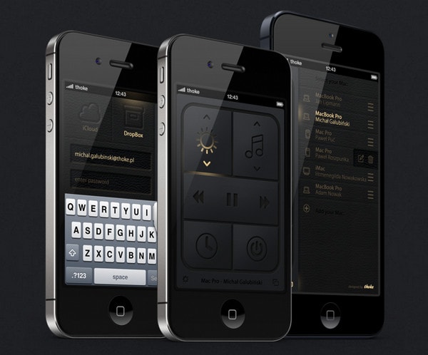
Simple mac remote. The UI is based on a dark coloring that is wisely diluted by bright golden highlights. The main screen is divided into several chief areas, each of which features a huge control icon. The designer effectively attains a simplicity feel.
Metronome app redesign by Dimiter Petrov is a music-oriented application that comprises habitual controls inherent to such types of devices. The designer ably incorporates polished metallic textures and neon backlight that perfectly interact with a dark color scheme.
With Postcards Email Builder you can create and edit email templates online without any coding skills! Includes more than 100 components to help you create custom emails templates faster than ever before.
Free Email BuilderFree Email Templates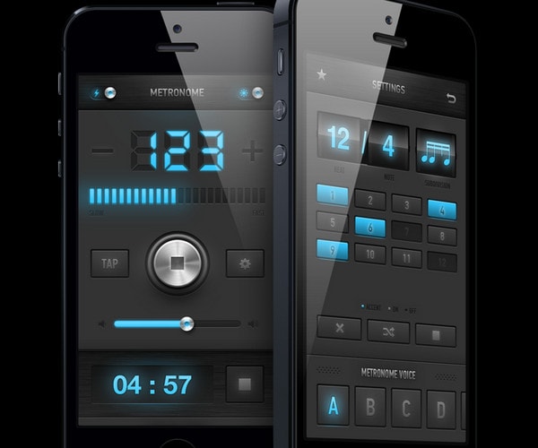
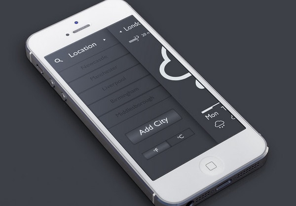
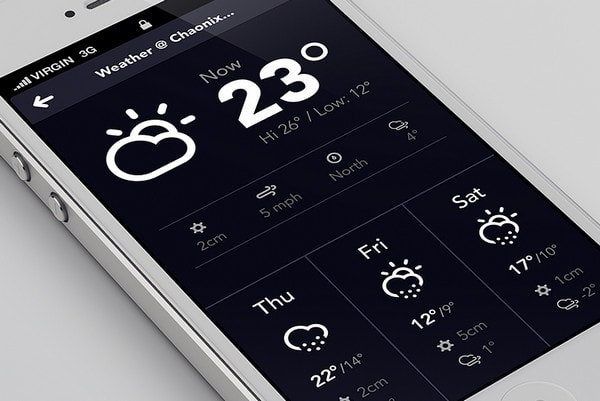
Weather App by Barry Mccalvey. The designer leverages the two-tone color palette that heavily relies on a contrast between the dark background and light lettering. Thus most of the content looks rather conspicuous, and the UI has a discreet and well-balanced appearance.
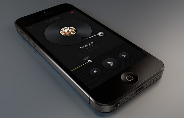
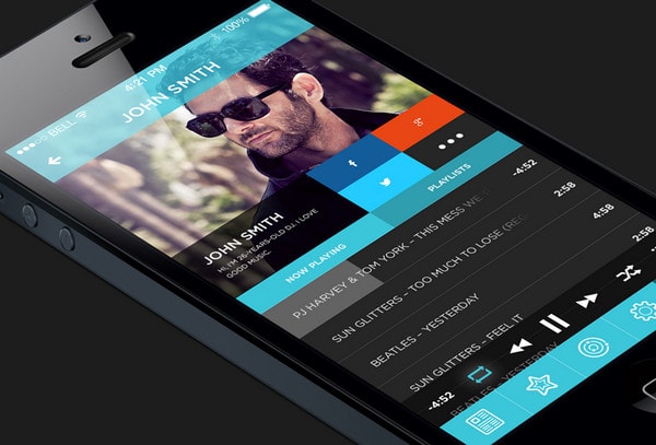
Music Man by Livin. The screen demonstrates a standard music-focused interface with regular controls, realistic vinyl turntable and bright loading bar. All the components look harmonious and appropriate; the dark coloring gives the UI a slight sense of sophistication.
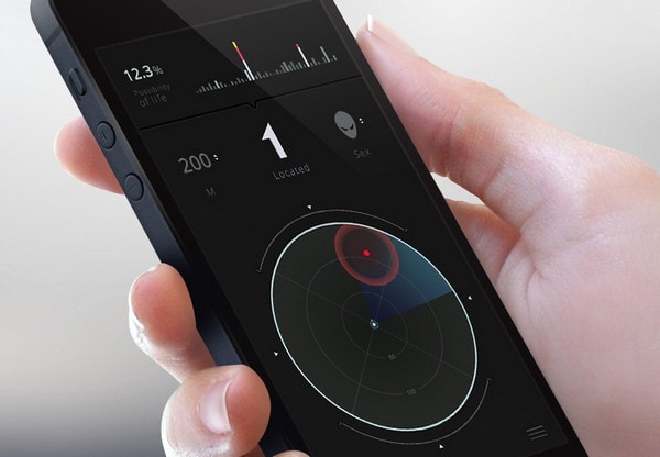
If you’ve been exiled on the mars by Ramble Ren. Here the dark background serves as a firm base for main foreground elements. As usual, white color is used to emphasize lettering, chart and radar. As a result, the interface has a lovely high-tech and slightly military outward.
iOS 7 Data Usage App by Raven Yu. The neon blue perfectly cooperates with a lean black solid background. The designer makes use of ultra-narrow type and thin graphics that are nicely complemented by vibrant backlight in order to give the interface a refined and even sci-fi look.
With Startup App and Slides App you can build unlimited websites using the online website editor which includes ready-made designed and coded elements, templates and themes.
Try Startup App Try Slides AppOther Products
Sound Around App by Ilya Dmitruk. The interface is based on a rigid horizontal stripe layout. The designer splashes a bright blue throughout the design in order to put accents on selected areas, thus the navigation and title have been effectively highlighted. The dark background together with grey lettering nicely collaborates with vibrant tones.
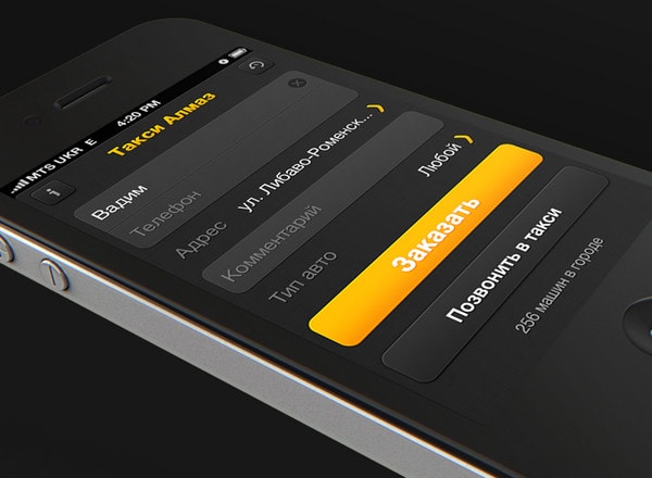
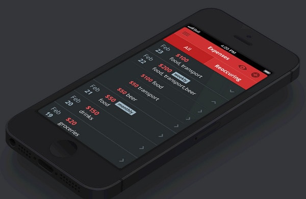
Taxi Almaz App by BLASTAROCKS. Yellow in conjunction with dark grey always looks eye-catching and noticeable. While moderate dark tones play a role of a solid foundation for content, yellow is incorporated for reinforcing buttons, arrows and titles.
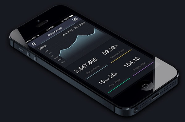
Analytics Redesign by Jan Losert. This high-tech and businesslike interface ably familiarize onlookers with statistics that is neatly dished up. The designer mainly plays on the contrast, leveraging gaudy thick lines to establish focal points and draw attention to a top chart that easily fascinates users by its subtle execution.
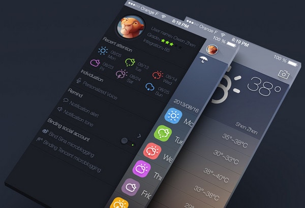
Weather application for iOS7 by Zhen You. The colorful icons with slight 3-dimensional touches are the perfect choice for this dark interface. The garish weather glyphs get the users’ attention and immediately give the notion about a forecast.
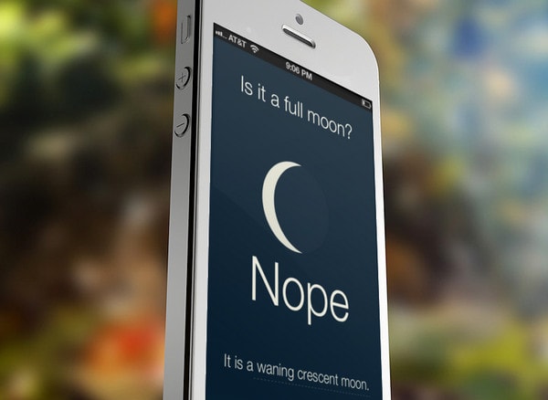
Is it a full moon? by Chris OBrien. The app’s interface looks minimal and spacious. The color scheme completely corresponds to a nameplate and greatly enhances the theme. The interface features only a couple of letterings and one huge figurative icon.
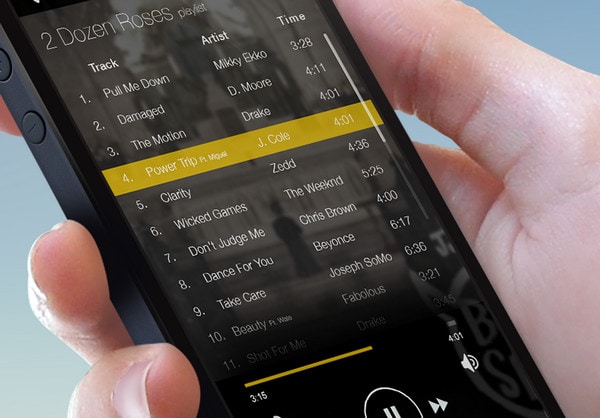
iOS 7 Music Player Concept by D. Moore. The designer quite successfully tries to simulate features that inherent to iTunes. The dark polished image background, as usual, is combined with white text and icons that perfectly stand out from it; the secondary color is yellow – it effectively highlights selected items and draws attention to the progress bar.
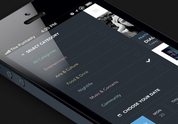
Web app by The Funtasty. Here the example features a neatly-organized side menu. It is based on a dark single-colored background that is capably bolstered by elegant tiny vibrant letterings.
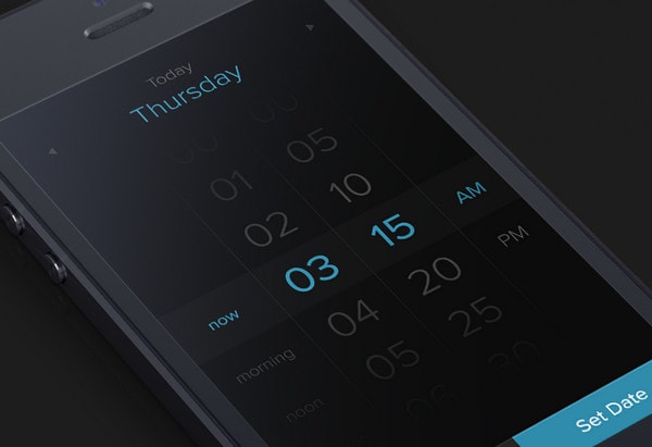
Pick Time by Jakub Kittler. The UI looks subtle and tidy. The black backdrop is brightened by blue tone that makes text and buttons easy-to-scan. The dark fading gradient adds a slight note of a third dimension to the picker.
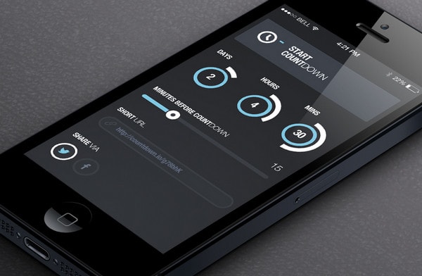
Start Countdown by Matt Litherland. Here the graphics look noticeable, easily distinguishable and neat. The flat style – that is ably implemented – effectively works basic components into the layout, leaving enough space for breathing.
Weather bit in the app by Murat Mutlu. The UI has a quite information overloaded layout, but the designer manages to cope with this challenge effectively. The huge icons as well as relatively huge typography in tandem with a snow-white content push the eye towards the weather forecast.
Ski tracker by Murat Mutlu. Neon colors give the UI its unique and eye-catching look. The conventional black and white color scheme that is nicely supported by these bright colors easily separates selected elements from the dark backdrop as well as helps to express movement.
![]()
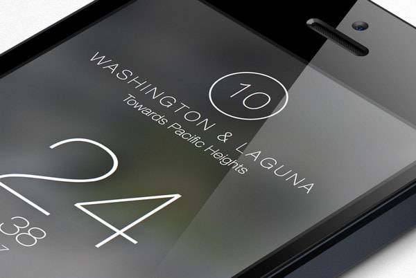
Transit by Spencer E Holtaway. The smooth polished dark background provides a perfect contrast to the content, efficiently emphasizing it. Although the designer switched to a light version, this dark interface with an elegant compactly-arranged type looks fantastic.
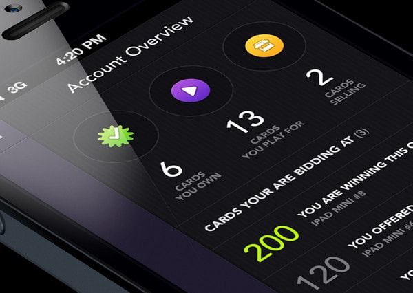
Account Overview by Martin Karasek. The riot of gaudy colors is properly paired with a dark background. Bright gradient icons, neon green numeric values and pure white content beautifully flow into the layout.
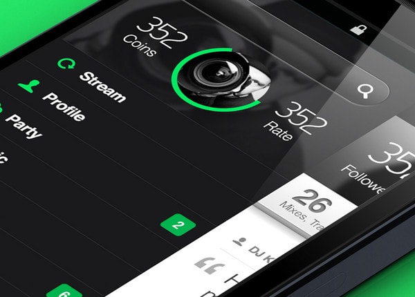
Party Phone menu screen by Dim Alex. This is another example of stylish crisp side menu. The designer resorts to leveraging a contrasting color palette that perfectly livens up the text and icons.
Transitions by Pavel Maček. The bright complementary colors such as red, blue and green wonderfully match the tone of the UI, effectively giving the content superior position. Neutral grey serves as an instrument for adding signatures and descriptions.
Reflection
Generally the black interfaces are skillfully diluted with either bright or light colors that naturally achieve a proper balance and offer a sharp contrast. Majority of such UIs are based on a classic black and white color combination that is ably complemented by striking secondary colors.