Designing Airbnb’s Website: An Interactive Mockup Exercise
When you think of a good website design, what comes to mind?
For me, it’s Airbnb. I like its design not just because it has a pretty color palette or an eye-catching video on the front page, but because it was built with good user experience in mind.
But how do you define good user experience for a website?
For one, it has to be both easy to navigate and easy to search. Websites for businesses, by and large, provide information for customers and potential customers. If your customers don’t understand the information or can’t find the information that they’re looking for, then your website will have failed.
To design a great website, both the structure and the content need to work together to present valuable information at the right time and the right place. There’s a lot of coordination involved, and often times things go wrong. You can’t rush it. You have to build your website to fit the content from the ground up.
How do you start designing a great website? Build a wireframe, then iterate into an interactive mockup.
With Postcards Email Builder you can create and edit email templates online without any coding skills! Includes more than 100 components to help you create custom emails templates faster than ever before.
Free Email BuilderFree Email TemplatesWhy Wireframe?
Wireframing is a great way to quickly communicate concepts and experiment with multiple iterations of any design.
Wireframes are not full-blown coded prototypes with actual visual design. They are just low-fidelity static designs that allow you to test iterations quickly and get feedback. The best wireframes are also interactive, allowing for more insightful testing of how the design actually works.
Every website serves a purpose. A wireframe helps designers focus on that purpose and ensure that all of the framework, content, and visual design align to that purpose.

For example, Airbnb is a travel website.
Its singular purpose is to help people travel by finding great places to visit and great places to stay. That’s how they make money. Everything on their website is optimized for that goal, from the style of their header to the way they display their listings.
Content is the heart of design. People use products and visit websites for the content – not because they want the design. And when you wireframe, you allow yourself freedom to experiment, fail, and improve the structure of your most important design asset.
Timeless UI Design Principles
Before we dive into the wireframe and mockup design exercise, let’s first deconstruct how Airbnb’s website works.
With Pulsetic you’ll be instantly notified the moment your website, API, or server becomes unavailable. Monitor uptime from multiple global locations and respond to incidents before your users are affected.
Create beautiful status pages in minutes to keep customers informed during outages and build trust with transparent communication.
Start Monitoring for Free1. Bring Attention to Stunning Imagery
When you’re thinking of a place to travel, you’re probably not thinking of your travel itinerary or your rental car information.
Whatever you’re thinking of, it’s likely visual. Pictures of where you’ll be staying. Images of all of the cool sights to see. When you want to travel, you’ll want to see pictures.
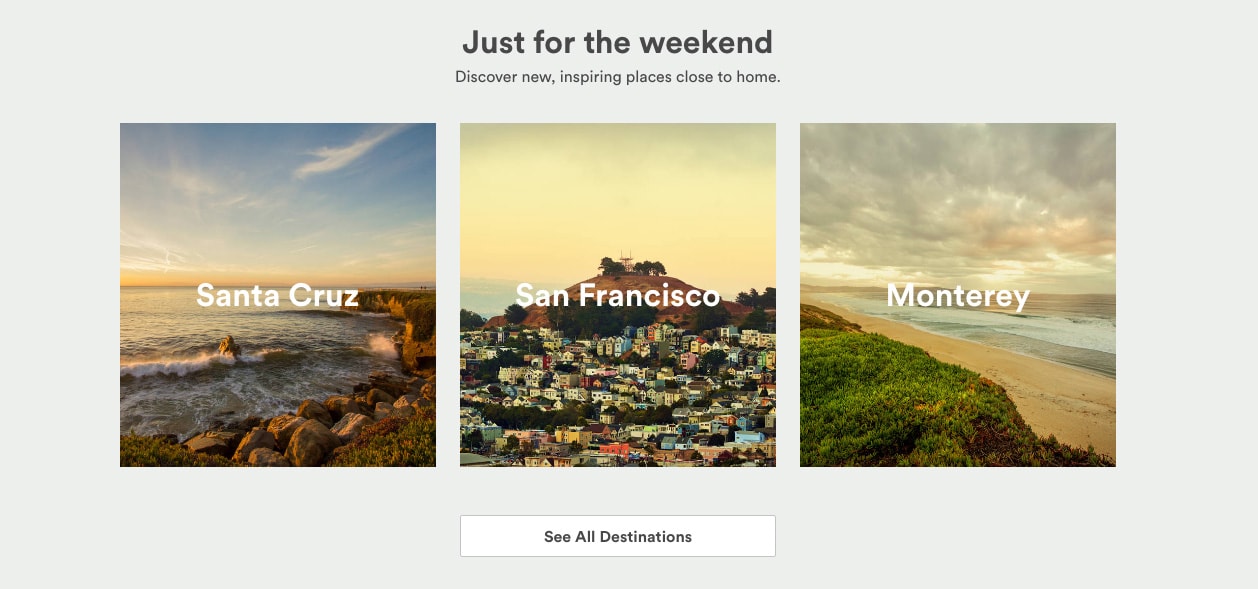
That’s exactly what Airbnb did on their website. Every element is highly visual.
All of the content, meaning the house listings and suggestions for places to travel, prioritize images over text. The picture frames take up most of the space, leaving a couple of bold words and a button aside for the user to act on.
The entire header is a video of Airbnb travellers experiencing different cultures and environments around the world. That’s what people want to see in a travel website. They don’t want to just fill out some plain text forms and book a home. They want to travel while they’re planning to travel.
Purposeful imagery is always more powerful than mere words.
2. Simplify Your Content
Unfortunately for people wanting to travel, the process is often very complicated.
You have to scout out the places you want to visit, decide on your trip’s location(s), find a place to live, plan at least some of your time there, buy plane tickets or plan a driving route, and so much more. It’s just a big hassle.
The last thing anyone wants to add to their travel experience is more complication.
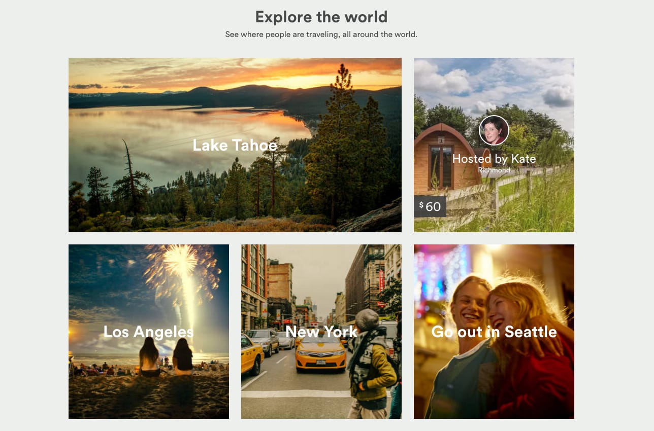
Airbnb’s website cuts out all other distractions from their page, leaving only the most relevant pieces intact. There’s a simple bar for very simple travel data inputs, a button for hosts, and a clean, neat-looking list of listings for you to browse. There’s white space on either side of the listings, not ads or any other unnecessary information.
The fonts stand out against their backgrounds and the words and sentences are relatively simple language. Rather than endless descriptions of each site in the feed of listings on the front page of the website, each content block is a simple picture and a bold name.
3. Emphasize the Most Important Functions
Above all, you want the most commonly used functions of your website to be the most easily accessible.
What do people come to your site for?
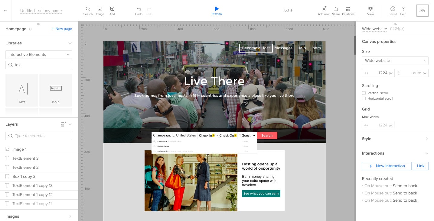
For Airbnb, people mainly come to find housing for travel. That’s why the biggest, most noticeable call to action element on the website is the booking details bar in the center of the front page. The “search” button is colored pink-red to stand out, and a black transparent bar crosses the background behind the call to action to emphasize the call to action element.

Other parts of the website are notable as well.
The big play button in the center of the header takes you to a video that shows people travelling and exploring the world, inspiring those who come to the website looking to travel. The “Become a Host” button in the right corner of the page and the big content block right below the header that shows “what you can earn” help users interested in hosting an Airbnb.
All of these call to action elements are emphasized to expedite the user’s journey to their goal.
Mocking Up Airbnb’s Website: 5 Clear Steps
Building a wireframe identifies those different pieces and allows you to see how everything works together. Using what we’ve learned, let’s create a static wireframe for Airbnb, then layer on a higher fidelity mockup.
I’m using UXPin to quickly create our design, but feel free to use whatever tool you like best.
The Basic Structure
I like to start by crafting the general barebones outline of all the content on a page.
Known as a content wireframe, these boxes just represent the different elements of the page. We’re only focusing on information and visual hierarchy.
We carve out blocks for the navigation bar, the header, and the primary content. This skeletonized structure gives me a good idea of where everything will be placed without actually prescribing any sort of visual design yet.
Once you create a content wireframe, you can iterate to a more detailed wireframe or dive directly to a high-fidelity mockup.
If you’re working on a new design, you want to iterate to a detailed boxes-and-arrows wireframe so that you can test the full content structure. If you’re working on a small redesign, you can proceed straight to a hi-fi mockup since you already have the core visual design elements.
For the sake of expediency, we’ll move straight to a hi-fi mockup.
The Headline and Header
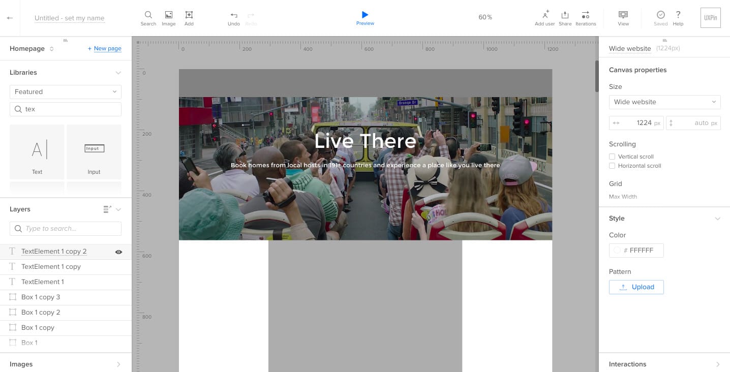
In the next step, I form a headline and the header. Both elements are vastly important and shouldn’t be underestimated.
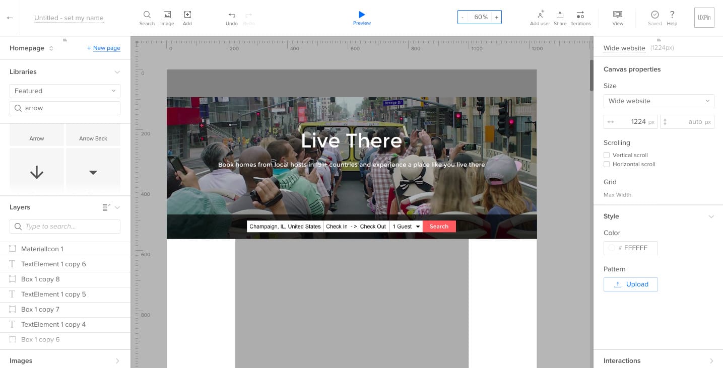
In the headline I’m looking for something bold and expressive that will catch the user’s eye immediately. “Live There” is different from “travel there” or “visit there”. Airbnb is about an experience that’s home away from home, and their copy reflects that.
Then look at the sub-headline. “Book homes from local hosts in 191+ countries and experience a place like you live there.” With this statement, I’m both telling my user that Airbnb is available everywhere and what the experience is like.
The header image is the first thing that the user sees. If it conflicts with the headline or is too distracting, then you have lose the user. Pictures are worth a thousand words, so you’ll need the right header image to fit your page.
In Airbnb’s case, they have a video, showing off people exploring all of the fantastic sights and experiences around the world. It’s inspiring, and that’s what it does for the user.
The Primary Call to Action
A call-to-action should be the main thing you want your users to do and the main thing that your users want to do. It must be decisive. Don’t use vague language like “continue”. Create a sense of urgency.
For Airbnb’s website, the call-to-action is both concise and specific. It asks for the main information in the “location”, “dates”, and “number of guests” fields and then ends it with a “search” button, highlighted red-pink for emphasis. Very quick, and very relatable within the context of the website.
The element itself generally fits below the headline, but for Airbnb’s website, it makes more sense to leave it at the bottom of the header. It’s still very noticeable, but it still allows users to first absorb the value proposition through the header video.
The Primary Content Block
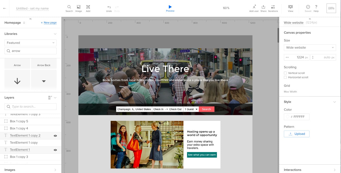
Next, we create some of the content on the page. It would take forever to do the whole website, so we’re just creating the first block of primary content on the front page. It should suffice for our purposes.
When creating a website where the header alone doesn’t take up the full screen, the first block of content must draw the user’s eye. It’s almost part of the header.
For Airbnb, a multi-sided platform, they have two main types of users: the travellers, and the hosts. So, for the first content block, they have it completely dedicated to their hosts. That’s why there’s also a “mini” call-to-action within the block.

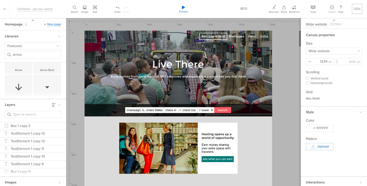
Now let’s clean up that gray box at the top.
Don’t let the navigation bar’s relatively small size fool you. The navigation bar acts as a guide for the user. If they’re looking for something that’s not immediately present on the page, the navigation is their first stop.
Note that the navigation bar only has 4 items. To start with, the bar has limited space. If you put too many items on the bar, you run the risk of the user encountering “decision fatigue”. Additionally, it will look crowded visually. Put only the most important items on the navigation bar that will help the user “navigate”.
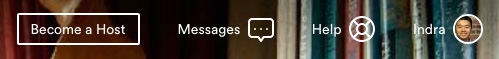
For Airbnb’s website, they have four buttons:
- The “become the host” button, which is relevant to half of their users.
- The “messages” button, which will let the user know of any important notifications or notices.
- The “help” button, which is for practically anything else they may be looking for.
- Lastly, the “account” button, which allows the user to manage their information.
Making It Interactive
Finally, we’ll make it interactive. User interaction with your product is the core of user experience. You can’t test your product if it doesn’t actually work.
There are a lot of different interactions on the website, but for the sake of time, we’ll just add interactivity to the most important element on the page: the call-to-action. When prototyping, always prioritize the on-page actions that most impact the business.
When adding interactivity to your mockup, you don’t need to make every single little detail work. Add enough interactions and reactions to make the product feel real. At that point, you can test the design with a minimum of 5 users for useful feedback.
For Airbnb’s website, the process of making it interactive is relatively simple. Just add drop down menus to the screen and have them pop up and disappear when you click or move your mouse away from the buttons. I also added a light coloring to the search button whenever the mouse hovers over it. That minute reaction indicates to the user that the button is indeed a button, and it can definitely be clicked on.
It’s pretty simple to do this. I just add interactions to certain elements, like the “destination” field, and hit the preview button to see what it would actually look like, as you can see above.
Next Steps
That’s it everyone!
One quick content wireframe iterated into a hi-fi interactive mockup. Now that you’ve learned how to wireframe and mock up a website, put your skills to the test with other exercises.
If you found this lesson useful, feel free to practice your skills in UXPin with a free trial. You can also apply the same learnings to these other tools:
- Sketch App
- Affinity Designer
- Origami
- Pixate
- Atomic
- Adobe Photoshop
- Adobe Illustrator