Beautiful Examples of Sliders in Website Design
Sliders in web design are one of the most controversial user interface units. Some people love them; some people hate them. The same goes to web developers: some developers cannot imagine a website without them; others never use them.
The main reason for such disagreement is that while websites sliders are great instruments for displaying lots of information within small space, at the same time, they can be SEO-killers, user experience blunders, and destroyers of marketing strategies. Therefore, with such strong arguments for and against, using sliders in web design is always a case of personal preferences.
Export Figma Designs to Live Website – No-Code
Read more:
- How to Create a Responsive Image Slider in jQuery and CSS3
- How to Create an Image Slider using jQuery and CSS3
- Create a Full-Screen Slider Using HTML, CSS3 and jQuery
- How to Create a Stylish Image Content Slider in Pure CSS3
Let us consider the essentials and pros and cons of sliders in web design as well as beautiful websites sliders examples so that you can decide on our own whether to use carousels in your next project or not.
With Postcards Email Builder you can create and edit email templates online without any coding skills! Includes more than 100 components to help you create custom emails templates faster than ever before.
Free Email BuilderFree Email TemplatesWebsites Sliders: Essentials
In essence, a website slider is just a carousel for displaying well-organized pieces of information one by one in a cycle. Its main constituents are:
- Container, a box that covers everything.
- Slide, a place where the content sits. Here you can add your piece of information: images, videos, titles, text, buttons, and much more.
- Navigation, a tool for guiding through the slides. It can be left and right arrows, plain “prev” and “next” located on the sides, or even classic music player-inspired controls that let people control autoplay and pause options.
- Pagination, aka additional navigation. It can be traditional bullets or numbers placed on the bottom of the box, or some modern solutions like a set of short lines arranged in a stack.
On top of that, sliders in web design have a range of transition effects to avoid abrupt and overwhelming shifting between blocks of information. Modern websites sliders examples are also populated with dynamic effects, interactive features, and various pioneering tricks.
There are many ways to create a slider. You can use Bootstrap, jQuery plugins, or simply build everything from scratch. In this case, consider these helpful tutorials:

Good Reasons for Using Slider in Web Design
Although a large share of developers talks colleagues out of using sliders in web design, there are some good reasons for using carousels on your website.
First, if you do not have much space but want to deliver lots of information, then carousels are just irreplaceable. No one likes to read long pages. With a compact and neat structure, carousels help to create a comfortable user experience. When the information is dished up in bite-sized portions and occupies a relatively small area, it is much easier to zero in on it, digest it and get real value.
Secondly, website sliders can be critical in achieving goals in the marketing strategy. Imagine you have an e-commerce store. Chances are you have a series of photoshoots of products. Predictably, you want to show these products under various angles or create a product tour so that your clients can fully appreciate the potential and value of the offer. A slider will demonstrate all these shots and keep prospects engaged despite their short attention spans.
Finally, there are many websites sliders examples with testimonials that build trust and credibility in the online audience. Instead of creating a long page with numerous clients’ feedbacks, it is much better to gather everything under one roof, set a comfortable pace for cycling, and auto-play the carousel.
There are many other compelling reasons for using sliders in web design, such as
With Startup App and Slides App you can build unlimited websites using the online website editor which includes ready-made designed and coded elements, templates and themes.
Try Startup App Try Slides AppOther Products- Make an impression on the hero area.
- Reinforce the impact of the overall design and experience.
- Show highlights engaging users before the main content.
- Provide helpful visual material for the content.
- Demonstrate not one but two or three new additions or popular offers.
- Draw the user’s attention and focus it on one section.
- Display text snippets elegantly and unobtrusively.
- Enrich content with information right inside the reading flow.
- Create a promotional landing page.
- Power modern storytelling experiences, especially those that need to cover lots of information.
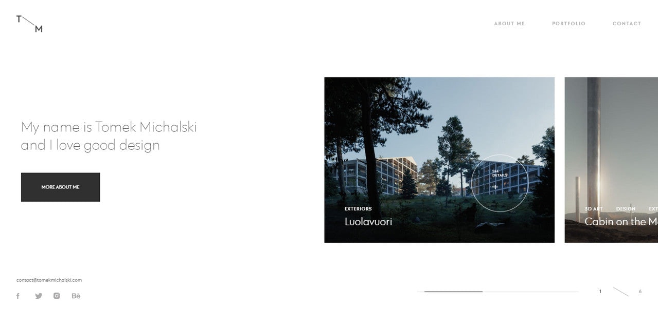
Personal portfolio of Tomek Michalski
Cons of Sliders in Web Design
We have already outlined some strong reasons for using sliders in web design. It is time to throw some cold water on everything since there is a number of valid cons:
- The poorly-made slider is considered bad by search engines. It can easily ruin your SEO scores.
- The slider may slow down the website. Not only does it negatively influence user experience, but it is also bad for search engines since Google considers the website’s speed as weighty criteria for ranking.
- According to statistics, people do not like to click on carousels or CTAs in slides. Therefore, they are almost useless for increasing conversion rates.
- Too many options may confuse customers and make them even more indecisive.
- The slider may work incorrectly on small screens due to poor optimization. This can scare away mobile audience that is prevailing these days.
- In a small screen, content in the slider may be challenging to interact with. Therefore, the carousel requires special styles and behavior for mobile telephones and tablets.
- Some people consider sliders as advertisement banners, ignoring them completely.
- If the browser does not support JavaScript or some modern CSS features, then the slider may break the entire design and structure.
- Majority websites sliders do not meet accessibility requirements making them blind spots for disabled people.
Some of these disadvantages are serious, like, bad ranking in Google or poor accessibility. However, there is no obstacle insurmountable. For instance, if your slider affects page load speed due to heavy jQuery scripts, then it should be revised and properly optimized. The same can be done with the majority of items in the list.
When the slider is well-thought-out, there is no reason to avoid it. Let us consider some good tips on how to use sliders in web design along with good websites sliders examples.

How to Use Sliders in Web Design: Tips
The web is teeming with websites sliders examples, but not all of them bring benefits to the projects.
The deal is, your slider may have an impressive design or mind-blowing interactive features that make it look like a top-notch user interface element. However, if it does not bring value to the audience or even worse if it conflicts with marketing strategies or upsets the user experience, it will be useless or even harmful.
Consider two sliders examples that demonstrate how you can fail the mission even with an awesome idea in the core.
Panamaera is a digital agency with creative juice flowing. The company has a single screen website that is a popular choice these days.
Predictably, the horizontal slider is a heart and soul of it. It comfortably accommodates all the favorite works presented as short videos. It is spiced up with inspiring transition effects and mouse-based interactivity.
Without a doubt, the carousel does its job well: it displays content and draws attention with its modern look, but it lacks in good user experience. The reason for that is banal: navigation is a real nightmare.
There are no apparent ways to move through the slides. You will not find here customary left and right arrows as well as prev and next buttons. The bullets-based pagination is also missing. All you have is just a microscopic serial number that indicates the current slide. To make matters worse, the speed of cycling is high; you have to switch your attention all the time.
The rule of thumb: users should always be in control, and a way to gain this control should be evident from the get-go. No navigation – no user experience.

The same goes to the personal portfolio of Rik Wanders.
Again, we can see a one-screen promo page where horizontal slider underlies the aesthetics. Unlike the previous example, it does not have any intricate features or modern tricks. Though, it certainly does have a sense of style.
What about navigation? Well, it is here where the shoe pinches. If you want to shift between slides manually, then you need to guess how to do this since there is no navigation nor pagination nor thumbnails, whatsoever. The catch is you need to use the keyboard to shift between slides. Therefore, for regular people who are accustomed to using a mouse for surfing through the web, it can be a true challenge to figure out that.

To deliver result with the slider, stick to these basic rules:
- Always provide navigation. Do not rely on user’s instincts on figuring out how to deal with the component by themselves. Navigation is must-have—the more obvious, the better. Side arrows are commonly used for this purpose. Stick to this convention since it will save you from lots of misunderstandings and disappointments.
- If it fits your design, add pagination. Although it is not critical to have pagination, nevertheless, it is highly recommended to have an extra type of navigation in a bank.
- Navigation should meet touch-screen devices. Specifically, your users should be allowed to drag slides or swipe through slides.
- Set the delay time properly. If your users do not have enough time to read the information on the slide, they will be gutted and just skip this section or even worse go away.
- If you want to say something important, say it on the first slide. Due to the short attention span and banner blindness, users may simply ignore interaction with the website slider. However, one thing is for sure; they will certainly see the first slide, so chances are they will get its message.
- Do not overdo with the effects. If you have an impressive transition effect, maybe WebGL-powered interactive features inbuilt in each slide will be a little too much. Use only one intricate solution.
- Use WebGL, Three.js, and other high-end libraries with caution. Remember, not all users will be capable of seeing them in action. Not only because their browsers may not support them, but also because these solutions may slow down their PCs or laptops.
- Make slider accessible for all groups of people. For example, set alts for images, supply HTML blocks with additional information for read-only devices, etc.
- Test a slider across all screen sizes, browsers, and devices to provide a consistent experience for users.
Types of Sliders in Web Design
Sliders in web design can be classified according to various criteria. For example, depending on a purpose, we can break them into several categories:
- Hero area sliders to enhance the first impression.
- Presentation sliders to display portfolio pieces.
- Text snippet carousels.
- Showreels, sliders that include short videos of the most impressive works.
- Informational sliders to support the content with accompanying visual material as well as provide extra data neatly and compactly.
- Testimonial sliders to reinforce the brand and company.
- Product sliders, etc.
Depending on the design and experience, we can break them into other categories:
- image sliders;
- video sliders;
- dynamic sliders;
- interactive sliders;
- 3D sliders, etc.
However, in general, we outline just two main types: horizontal sliders and vertical sliders.
Horizontal Sliders in Web Design
Though it is hard to say when the first slider was born, however, it all started with the horizontal one. It was and still is a top choice among web developers. Therefore, we can see a whole range of horizontal sliders examples on the web. Let us consider some of them.
Examples of Horizontal Sliders in Web Design
The first one to consider is the Personal portfolio of Yannis Yannakopoulos. The portfolio is mind-blowing. It is impressive and original. It seems that Yannis perfectly knows how to get the most out of a slider in web design
The slideshow provides a solid foundation for the artist to show off. It has modern tricks and extravagant solutions, including mouse-based interactivity that makes it look incredible. Also, the artist has taken care of handy navigation, putting the user in the driver’s seat.
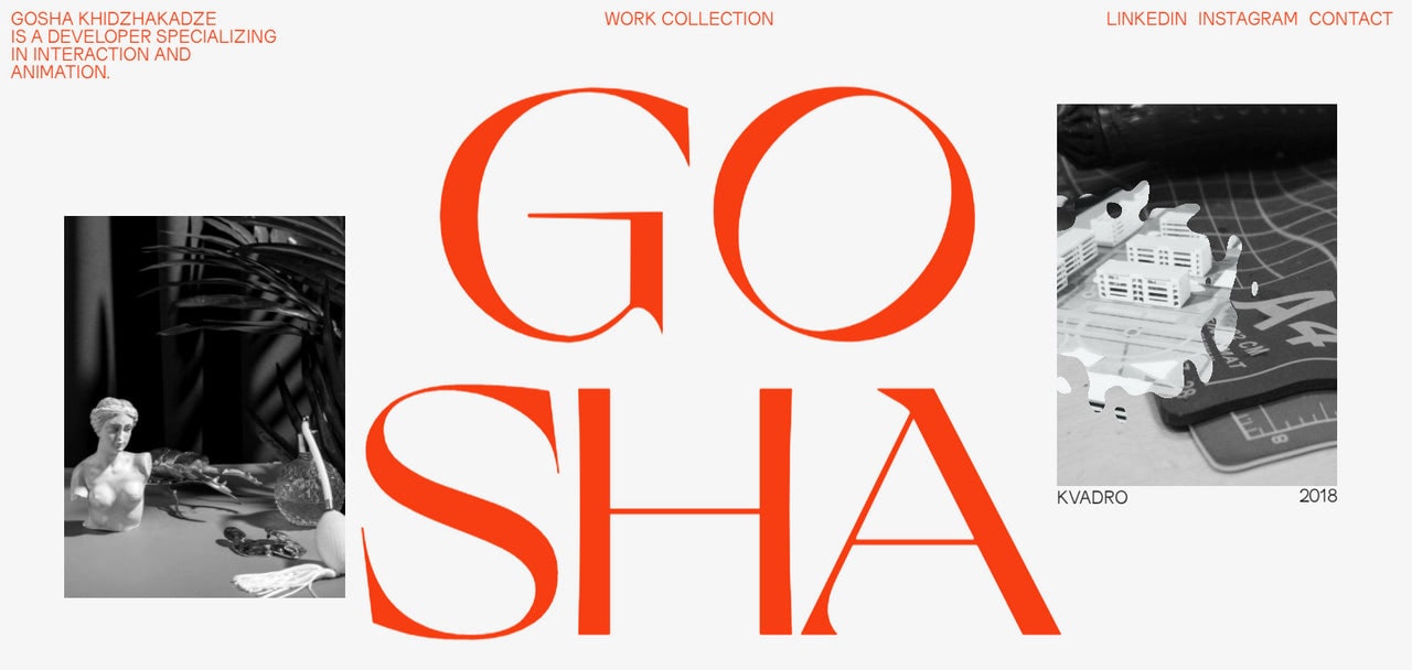
Another case in point and another personal portfolio; this time it is a personal website of Gosha Khidzhakadze. Unlike Yannis, Gosha has gone for bite-sized slides. As a result, we can see two and even three different slides simultaneously. However, they do not interfere with each other. On the contrary, they complement each other reinforcing the idea.
What’s more, even though slides have intricate hover effects, still the carousel is used as a supporting device. Placed on the back, it gives way to the overwhelming title “Gosha,” thereby contributing to the overall aesthetics, supporting the brand identity, and hinting about the artistic and professional level of an owner.
Vertical Sliders in Web Design
Although vertical sliders in web design are not as popular as horizontal ones, though they have certainly carved a niche for themselves. Consider some everyday situations when vertical sliders are top choices.
- A vertical slider is a great solution when the developer wants to surprise the audience with an unexpected twist without reinventing the wheel. In this particular case, shifting between slides along Y-axis may easily do the work.
- A vertical slider is an excellent basis on which you can build on extravagant solutions for hero areas. As a rule, this approach can be seen in personal portfolios whose welcome screens are jazzed up with modern interactions and fancy dynamic effects.
- The vertical sliders power many modern storytelling experiences, especially those that need to tell a story in small, easily digestible and appetizing portions.
- A vertical slider is used to create single-page microsites.
Consider two representative vertical sliders examples.
Examples of Vertical Sliders in Web Design
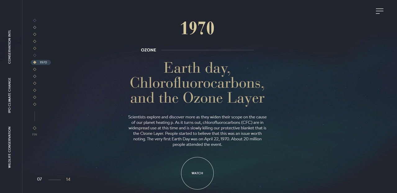
Climate History is a typical website slider example of nowadays that lures in the online audience with a splendid storytelling experience. The website aims to raise awareness about the burning issue without scaring people away. Therefore, the vertical slider where the content and dynamic solutions create a perfect symbiosis is just what the doctor ordered.
Here you can see 14 slides. Can you imagine a horizontal slider with the same amount? I bet it will kill the mood instantly. However, this is not a case. A vertical slider deals with this situation flawlessly. It tells the story and, at the same time, keeps people engaged.
Although the official website of Cloudforce cannot boast of the same impressive amount of slides, it has just 6; still, it is enough to create an impression.
Here a vertical slider is used to create a small, compact yet impressive microsite. It introduces a story behind the brand in a stylish manner. Each slide effectively represents the company. You can even see here a carousel on one of the slides. The user experience is engaging and intriguing. The idea is smart and well-realized.

Cloudforce, Climate History, personal portfolios of Yannis Yannakopoulos, and Gosha Khidzhakadze are fantastic websites sliders examples of nowadays. Let us consider some more modern sliders examples so that you can see the diversity of solutions and approaches that are used to take this fundamental UI element to the next level.
Modern Sliders Examples
The interactive presentation is what makes the statement these days. Everything static is boring. Therefore, the web developers delight the online crowd with a sheer diversity of dynamic solutions.
The current state of technologies allows developers to let their imagination run riot. As a result, we can see an accelerating trend of improving carousels with the help of pioneering techniques. Sophisticated transition effects, fancy mouse-based interactions, hotspots, 3D scenes are some of those incredible things. Consider some real-life websites sliders examples with inspiring ideas.
Bite-sized Sliders
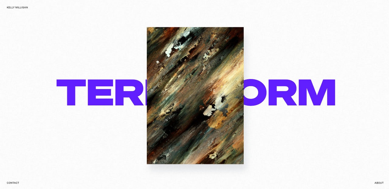
Personal portfolio of Kelly Milligan is one of those sliders examples that will surprise you with its clever usage of whitespace. You will not see here an overpowering full-screen drama. The hero area features just a relatively small rectangle placed at the heart of the page.
However, it does not mean that the solution is modest and uncompetitive. Indeed, it is just the reverse. Such an unusual capsule approach instantly catches an eye. On top of that, it has a remarkable transition effect and mouse interactions that transform it into a mere delight to explore.
Mouse Wheel Navigation
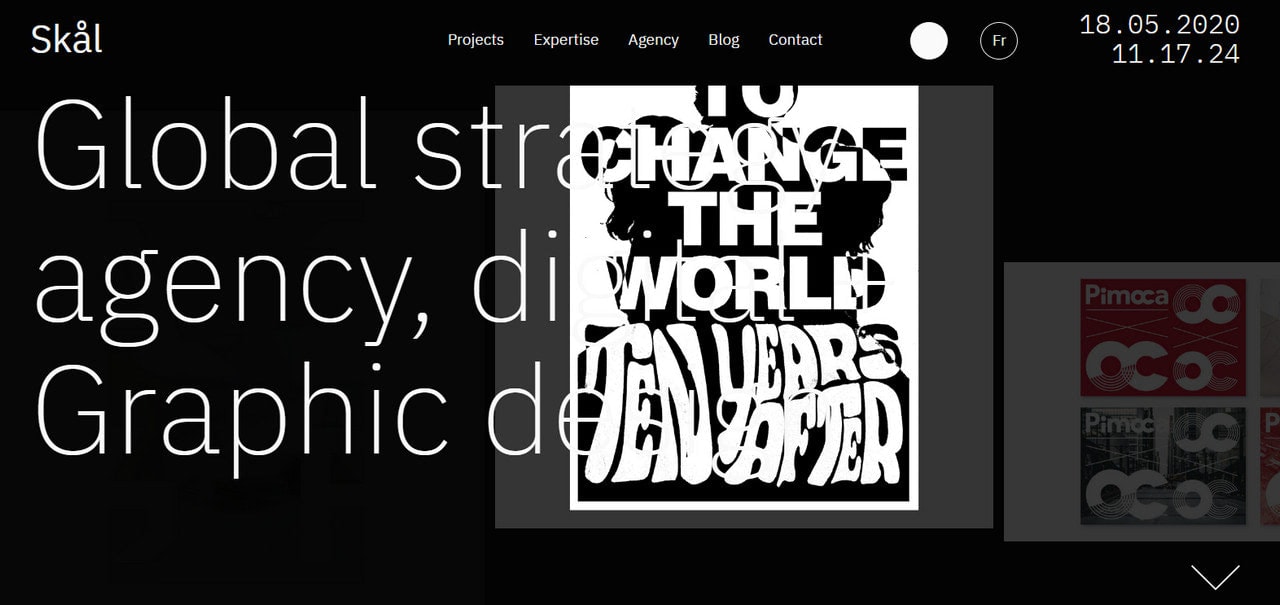
Skal is another website slider example where the content is displayed in small portions. We saw this kind of traditional carousel a million times at the dawn of horizontal sliders. However, this one was reimagined with the help of modern solutions. As a result, we can enjoy a blast from the past that brings positive emotions and, at the same time, pleases the audience with some creative tricks.
Note two things. First, the slider keeps a low profile that lets the main tagline shine.
Second, you will not see here traditional navigation nor pagination. You should switch between slides with the help of mouse wheel. At some point, it may be confusing; however, the team has taken care of this issue by making navigation blatantly obvious.
Mouse Interactions
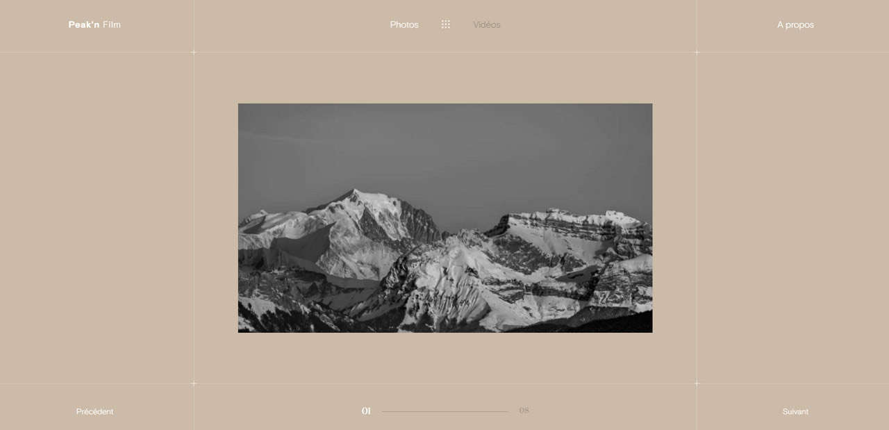
Mouse interactions have become an integral part of modern websites. This fast-growing mainstream is particularly evident in hero areas. Therefore, it comes as no surprise that sliders in web design are packed with such features. Consider Peak’n Film, an excellent website slider example, as a vivid proof.
The homepage carousel delights users with its compact arrangement. There are no full-screen images, whatsoever. Each slide occupies half of the available space sitting right in the heart of the screen. At first, it seems that there is a bulk of fresh air due to the generous amount of whitespace on the sides. However, everything changes when you start to move your mouse cursor.
First, you can see that the slider area is much bigger since the previous and next slides can be seen on the sides when you hover over them. Secondly, the mouse is in charge here. It activates captions and movement. Besides, it becomes a call-to-action button. Smart.
Cool Transition Effects
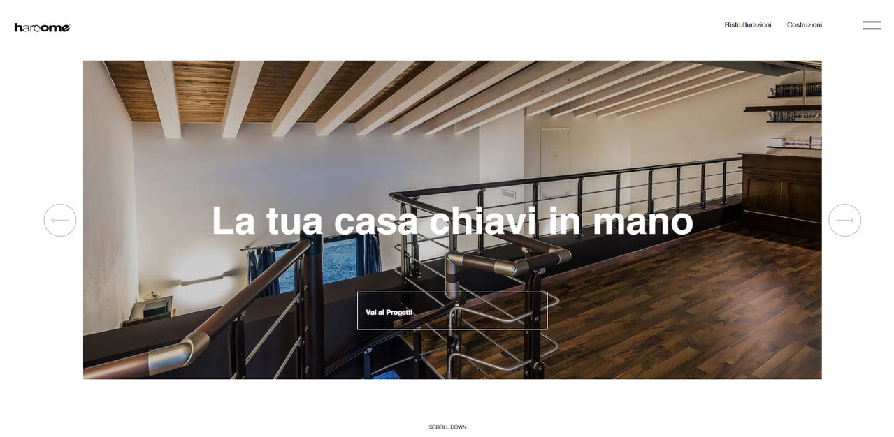
Fancy transition effects are another vast area to explore. It is here where developers reveal all their creative potential. Although these effects may cardinally slow down the website and make user’s PC go wild, nevertheless, when done right, they bring nothing but a pleasure to the experience. Consider Harcome as a fantastic slider example where block reveal animation produces a powerful impression. Note several things. This is a horizontal slider with a classic sliding effect. However, it does not look outdated; on the contrary, it looks refreshing, stylish, and modern. The thing is the team has improved this old-school approach with several tricks. So what have they done?
- They have added airy feel by using huge margins.
- They have opted in favor of elegant line style graphics that give a sense of subtlety to the aesthetics.
- They have reimagined the trivial sliding effect with the help of block reveal animation.
Fantastic.
Content Sliders or simply sliders as we call them have become an almost integral part of web designing. While we all know that the concept of web designing is based on adding an attractive visual effect to the web page, these sliders help a lot in the business. Now, the question is what are these sliders? Content sliders are a set of an exceptionally resourceful variety of navigation tools that are utilized to present different types of information (images or pictures, posts or blogs, variety of news as well as information about different types of products and their features) in the web pages.
Various forms of sliders are available to make your web page look more attractive. They range from sliders that automatically present a slideshow to those which get activated through the usage of a specific tab or button. The high popularity of the modern web pages and blogs can be attributed to the successful usage of the sliders which act as focal points on the web pages and are indeed one of the smartest ways of online interaction between the users across the globe.
In this article, we will discuss the different types of sliders used. With more and more competition in the virtual world of online business, new designs and concepts of sliders are being innovated every day. There are sliders that contain stylish and gorgeous layouts. The user can navigate through these sliders and change the images by using arrows. Certain sliders contain highly textured backgrounds containing excellent color designs which attract the users easily.
As discussed earlier, apart from the conventional sliders, there are certain sliders that change automatically from one image to another. However, the images in these sliders can also be changed by clicking a tiny button. There are some sliders that present a slide show when activated. These sliders have an extremely beguiling as well as a pleasing effect on the user. You can also move from one image to another by a simple click of an arrow or tab. Certain sliders contain images or descriptions of painting or drawing, museums, and other forms of human craftsmanship. They contain a series of images or information that can be gone through by simple clicks of the mouse.
Other Examples of Sliders in Web Design
StackSlider: 3D Image Slider
The slider is tailored to the fun. Coming with a lovely 3d feeling and some catchy twists, it will definitely become a highlight of your project, which in addition is aimed to place your multimedia content on a prominent place.
Grow Interactive
")
Grow Interactive’s slider has to cover lots of content both multimedia and textual and display it in a non-intrusive way. Not much white space worsens the situation. However, compactly arranged and neatly formatted blocks with data on the right, and a series of thumbnails are managed to save the day.
Mark Dearman
")
Mark Dearmn’s portfolio incorporates a plain yet elegant content slider that skillfully combines areas for image and description. The design aesthetics perfectly echoes with the overall theme, while simple control buttons provide users with an intuitive tool for browsing through the work section.
Bitfoundry
")
The layout of Bitfoundry’s main slider is anything but conventional. There is a distinctive area for HTML content supported by a set of circular graphics that serve as a navigation. What does strike the eye is a design that has a strong dose of creativity and refinement. Soft coloring, ornamental details, neat structure, sleek shadow, and gradient buttons handle the fantastic appearance.
BigEye Creative
")
BigEye Creative has a seamless slider that ideally fits the overall design and complements the general feeling. It offers 2 plain arrows for navigation that is quite sufficient to move comfortably through the small number of items.
Büro Maisengasse
")
Büro Maisengasse’s front page is marked by a unique content slider that at first glance seems to be conventional and boring. However, everything changes when you hit a next or previous button, and the new portion of data appears. The information is broken into digestible pieces that are beautifully framed. The transition is accompanied by some lovely effects that make the component look a bit alive.
Mathieu Clauss
")
Mathieu Clauss leverages a classic, elegant image slider that takes up the whole browser screen and adapts to its dimension, providing users that come from tablets and cell phones with an optimal experience. It skillfully sheds light on the best works of the artist, preventing them from overlooking even tiny detail.
Elless Design
")
The website shows the consistency in design. It is constructed from components that are made in the same style and fashion. Thus, the slider is based on a primary 2-tone coloring, uses some extras decorative tricks that spice up text and images, and has distinctive bold borders that set it apart from the environment.
Marco Rotoli
")
The content slider has the same illustrative aesthetics as the whole website. Subtle pattern, nifty circular controls, densely packed together text and lots of space for visuals seize the user’s attention and direct it to the important points.
Banneton
")
Banneton’s homepage features a marvelous slider that boasts of an artistic nature and a certain charm. With its ribbon-style block for displaying description, a sophisticated textured backdrop that mimics a pile of old papers, tiny square-shaped buttons for navigation, it easily puts the selected content above everything else.
Instrument
")
Instrument’s landing page has a clean and crisp appearance, so does the chief slider. It employs standard circular buttons for moving between items and has a solid dark box for showing extra information that thanks to its relatively wide size does not go unnoticed.
Jérôme Détraz
")
Jérôme Détraz’s personal portfolio omits needless things, and as a result, the huge content slider instantly catches the eye. It has a flat style appearance and beautiful coloring that lets the component naturally blend into the composition. Each slide is split into two parts to showcase the information in a straightforward way.
Boerdam
")
Boerdam makes use of a regular full-screen slider that gives the featured content the top priority. For better readability, the designer utilizes solid stripes that stand in sharp contrast to foreground captions, bluish buttons that look eye-catching, and flat plain arrow-shaped buttons for simplifying navigation.
DigitalConvulsions
")
Digital Convulsions employs a seamless content slider well-suited to the composition. Tiny circular buttons with a glossy surface and emboss touch go well with semi-realistic device mockups. The background with the highlighting effect reinforces the composition.
HyperX Media
")
HyperX Media has a slider that looks simple yet functional. The structure is neat and sleek, double borders make the component more prominent and vivid, and the footer provides users with the aid panel that includes links to the other slides.
Doopsuiker Poppies
")
Doopsuiker Poppies’ slider works well with the whole environment. Surprisingly, it has a pretty plain design with no decorative elements at all, yet this only benefits it, allowing providing users with a comfortable experience. In such a complex and intricate composition, this oasis of simplicity and straightforwardness is exactly what is needed.
Philadelphia
")
Philadelphia makes use of a huge responsive slider that puts the content to the center stage. As befit, the title and description are supported by the solid and monotone backdrop that offers an optimal contrast for great readability.
TravelBuzz
")
TravelBuzz slider keeps with the style and occupies the leading position. Much like the previous example, it is a responsive component that does not have any clear boundaries. Set of tiny thumbnails on the bottom acts as navigation, while semi-transparent dark canvas is used to hold and display the extra data.
Wearesignals
")
Wearesignals’ primary slider takes up two-thirds of the browser screen width and is adjacent to the accordion. The latter slightly lessens its importance, yet it still seizes the attention and directs it to the images. The interesting detail is pagination that is performed as a set of solid squares that have an original active state.
Malcolm Reading Consultants
")
Malcolm Reading Consultants has a content slider that is broken into 3 even parts. Such a solution enables us to embrace more data simultaneously. It is also stretched to the top to act as a backdrop for the header section. The red backdrop for displaying description is an excellent choice here.
Rottefella
")
Rottefella’s slider employs the same coloring as the main website, ideally complementing the aesthetics. Huge bold titles look prominent and distinctive thanks to drastic pink shade. Darkened images allow the main text on the left to be easily readable and scannable.
Jax Vineyards
")
Jax Vineyards’ slider does not have much to boast of, yet it certainly looks elegant and stylish. The transparent backdrop makes the component an integral, almost inbuilt detail of the composition. Ultra-narrow arrows on the top may look a bit seamless; however, they fit like a glove.
relogik
")
Relogik’s slider does not break away from the whole theme line. Grayish coloring makes it look more elegant. Although gradient style CTA is too small for such area, yet due to a ton of white space, neat arrangement and scarce amount of text it does not get lost.
Design Royale
")
Design Royale has an ultra-narrow slider that barely excels from the overall content flow. This is not a standard solution, yet it has its benefits. The navigation is straightforward, and nothing distracts the user’s attention from images and descriptions.
Purple Rock Scissors
")
Purple Rock Scissors has an enormous, almost overwhelming slider where the content seizes the central stage. Small arrows that sit in the lower right corner, tiny graphics and lots of white space point out that the content has the first prerogative.
Back Yard Burgers
")
It is hard to delineate boundaries of the slider, at least at first glance, since it ideally blends in, becoming an essential detail of the theme. It is a bit content-heavy, nevertheless, plain and clear arrows save users from getting lost.
FOX Classics
")
Fox Classics opts in favor of traditional image slider with an additional set of thumbnails on the bottom and tiny numeric buttons for navigation. It has a retro appeal and demonstrates skillful manipulations with color and typography that contribute to readability and make the component perfectly suitable for the layout.
Converse
")
Converse adopts a sophisticated and intricate take on a basic slider that treats HTML content as a piece of art. With a grunge background, rough frames, extra ornamental details it gets a creative endeavor and looks simply exceptional.
Tea Round App
")
Tea Round App showcases the featured content through a skeuomorphic-inspired slider that enables users to read and navigate comfortably. Such tiny artistic details as a paper note, gradient buttons, handwritten type and sketchy objects are the main visual force.
These Are Things
")
These are things’ has an elegant and fancy slider that matches the tone of the website. It incorporates distinctive traits such as ribbons, primary coloring, neat edges, clean borders and a subtle shadow. Light semitransparent wide stripe used for titles always stays in focus.
Little Black Dress Society
")
Little black dress’ slider helps engage users with relatively huge images and exquisite designs. An arc used as a top border paired with soft light coloring adds a required touch of femininity. The navigation bar presented, as usual, as a range of circles and additional play/stop/pause buttons for the infinite slideshow are nice features that are distinctive and well-marked.
La Masa Mimatta
")
La Masa Mimatta’s slider meets the overall design theme and intensifies the content. The transparent background lets it feel natural and native. Text and image do not interfere with each other, establishing a focal point on the screen.
Conclusion
Whatever controversial, sliders in web design deserve special attention. Of course, they have many cons, but still, they have many pros. What’s more, in some cases, they are even irreplaceable. Therefore, as a rule, using carousels is a matter of taste and personal opinion.
We have considered outstanding websites sliders examples where the user experience is flawless. Sometimes, these intricate slideshows pushed our PCs to the limit; still, they produced a favorable impression, requiring just some good optimization to be impeccable.
Tell us, what do you think about our collection of beautiful sliders examples? What is your favorite solution? Do you use sliders in web design?
If you feel the urge to familiarize users with the important content from the first seconds of their staying on the website then the slider can come in handy. It is easily perceived by users and in majority cases becoming the first component that seizes the attention. Although it does not cover a bulk of data, yet it dishes it up in digestible portions that are much more efficient.
Moreover, like the owners of the above-listed examples, you can always play with the design and layout, transforming it from a simple plain box that just shows images into a masterpiece with strong aesthetics and animation effects that liven up the content and strengthen the whole impression. However, you should always remember about the functionality and clear navigation tool.