Font Psychology: Here’s Everything You Need to Know About Fonts
There are over half a million fonts in the world. While most of the web is built upon a handful of popular font types, there’s lots of room to pick a unique path. Since fonts are also visual elements, you can use them as psychological elements to paint a narrative that supports your site’s efforts.
Like other design elements, fonts influence how readers perceive the text, a product, or even the entire website. Therefore, proper font choices fuel your site’s user experience and ultimately affect the design side of your conversion rate optimization.
Export Figma Designs to Live Website – No-Code
Nailing the font choices isn’t an easy feat. In fact, it can take months or years of trial and error with persistent experimentation, and even the slightest tweaks can increase or decrease the success of your site.
With Postcards Email Builder you can create and edit email templates online without any coding skills! Includes more than 100 components to help you create custom emails templates faster than ever before.
Free Email BuilderFree Email TemplatesTypography is an essential aspect of visual communication, influencing the way we perceive and interpret information. Font psychology, a sub-discipline of typography, is the study of how different typefaces impact human emotions and perception. This field of research aims to understand the psychological effects of various fonts to improve the efficacy of design and communication. By examining the subtle cues and connotations associated with different typefaces, designers and communicators can make more informed decisions to evoke specific emotions or reactions from their target audience.
Let’s take an in-depth look into how fonts work on a psychological level and how you can choose the right font for your design.
Basics of Typography
Typography is the art and technique of arranging type to make written language legible, readable, and appealing when displayed. One part of typography includes typefaces which are a collection of letters. Each typeface includes a number of fonts that follow the set of rules that make them a part of a particular typeface category.
Fonts are visual elements used to pass information or display a message to the reader. Like with every visual input, fonts also carry a hidden message that changes how the reader perceives the text regardless of the content itself.
Each font is a unique set of letters with various weights, widths, and styles. However, some fonts share similarities in these attributes and therefore make up a typeface, a family of related fonts.
Let’s look at what makes a font and how it can be used in the modern digital world.
Anatomy of a Typeface
Some typefaces can have stricter limitations on what factors you can change while remaining in the specific family, and others have more relaxed rules.
A typeface consists of various distinguishable parts, such as serif, sans-serif, aperture, ascender, baseline, cap height, descender, leading, letter-spacing, stem, stroke, and x-height.
With Startup App and Slides App you can build unlimited websites using the online website editor which includes ready-made designed and coded elements, templates and themes.
Try Startup App Try Slides AppOther Products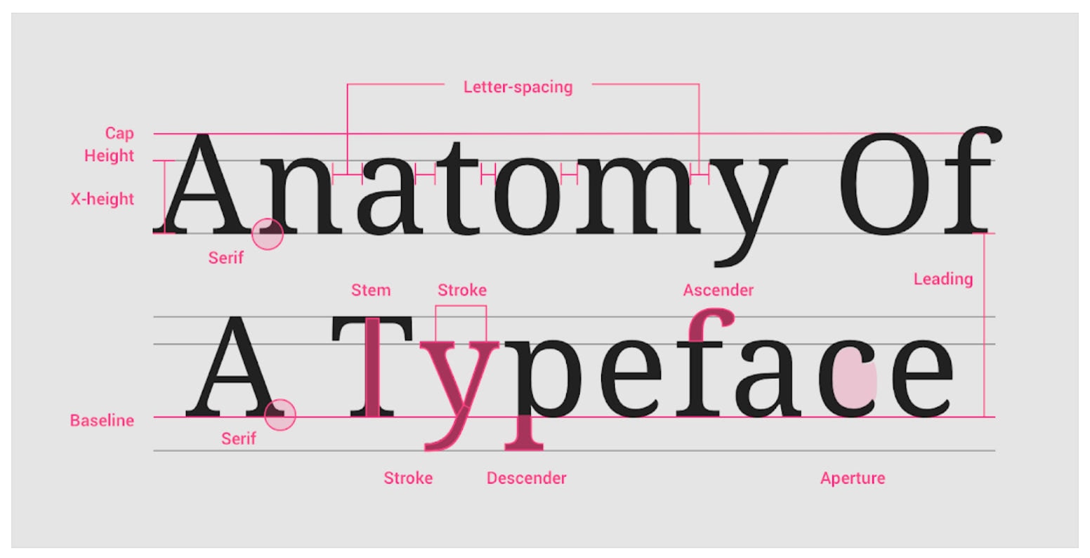
Let’s take serif typeface as an example. For a font to fit under the broad serif font family, it must have serifs on the letter designs. Sure, there are multiple subcategories under one typeface with various rules down to the details, but if the font style uses serifs, it can fit under the prominent font family.
Why Does Typography Matter?
Typography in the digital world is more than just picking a pretty font. Choosing a proper typeface for your web design influences the readers’ decisions subconsciously. Furthermore, an excellent typeface can create a solid visual hierarchy, compliment the graphical balance, and be the centerpiece of the design.
You can find that a dedicated typography strategy aims to either:
- Create unique branding
- Empower user experience
- Influence people through emotion
- Direct attention
Therefore, just as your site’s overall design serves the purpose of telling a story to the user, fonts are elements that further support the narrative. And it’s not only what you want your users to see; it’s also about how they feel when reading your copy, and fonts help create an emotion you need to serve your site’s purpose.
Major Font Styles and Psychology
Research in The British Psychological Society back in 1989 found a correlation between adjectives and various fonts perceived by the study subjects. The subjects were shown multiple typefaces and were asked to rate the perceptual qualities they may possess, such as heavy, light, fast, and slow.
Another study, which broadened the study subjects’ adjective choice, found the highest correlation with Times New Roman and Helvetica fonts and the adjectives “formal” and “legible,” respectively. It’s also interesting to note that these fonts are on the opposite sides of the typography spectrum, with Times New Roman being a serif font and Helvetica being sans-serif.
Furthermore, these major font styles are widely available within content management systems and website builders. Having multiple choices with straightforward ways to change fonts allows you to quickly test out different variations and see which works best with your site’s design and psychological traits you’re after.
So, let’s take a closer look at significant font styles and how people typically perceive them.
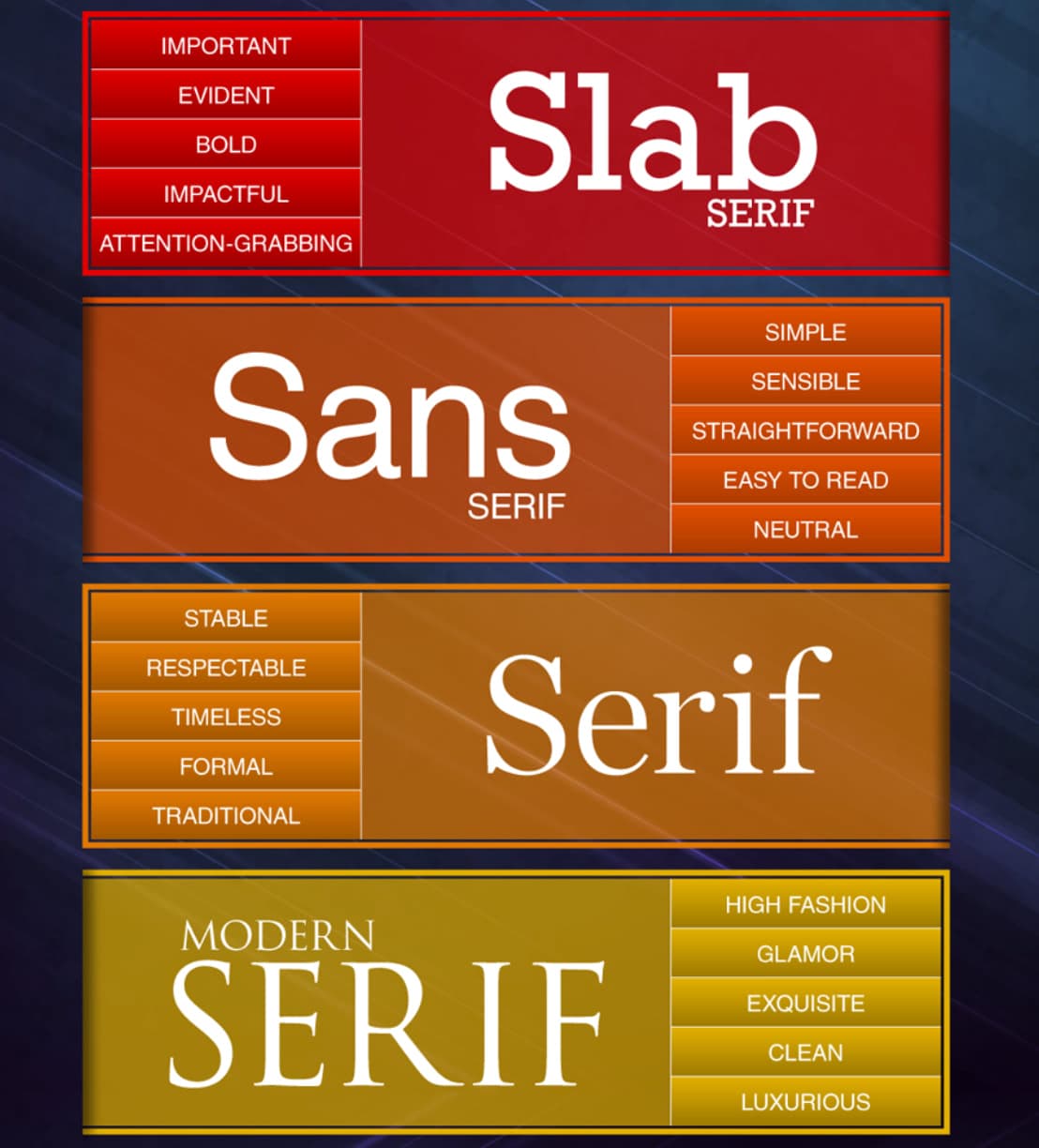
Serif
Subcategories: Old Style, Slab, Transitional, Modern, Glyphic
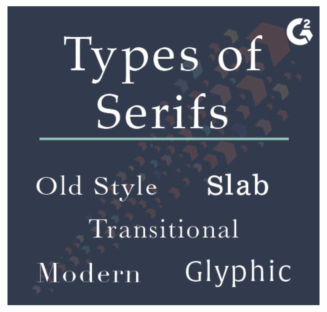
Serif font styles are almost synonymous with books and other physical media. The popularity comes from the elegant “serifs” that give this font style its unique name. It’s a classic typeface with years of tradition and usage among the formal institutes and academic circles due to its conservative nature and respectable appearance.
Which adjectives typically describe serif fonts?
- Traditional
- Respectable
- Reliable
- Elegant
- Sophisticated
Some of the example fonts include Times New Roman, Garamond, Georgia, and Palantino.
Sans-serif
Subcategories: Square, Humanist, Grotesque, Geometric
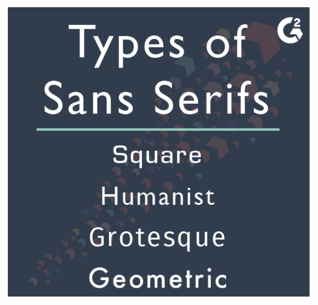
Sans-serif fonts lack the “serifs” that the serif font styles have. Therefore, sans-serif fonts can be efficiently used in modern devices because the letters require less space. However, these fonts also embody cleanliness and clarity, which mainly shows for companies that have straightforward agendas and no fluff around them.
What typically describes sans-serif fonts?
- Clean-looking
- Clarity
- Modern
- Efficient
- Straightforwardness
Some examples of sans-serif fonts are Arial, Helvetica, Futura, and Calibri.
Script
Subcategories: Formal, Casual, Blackletter, Calligraphic
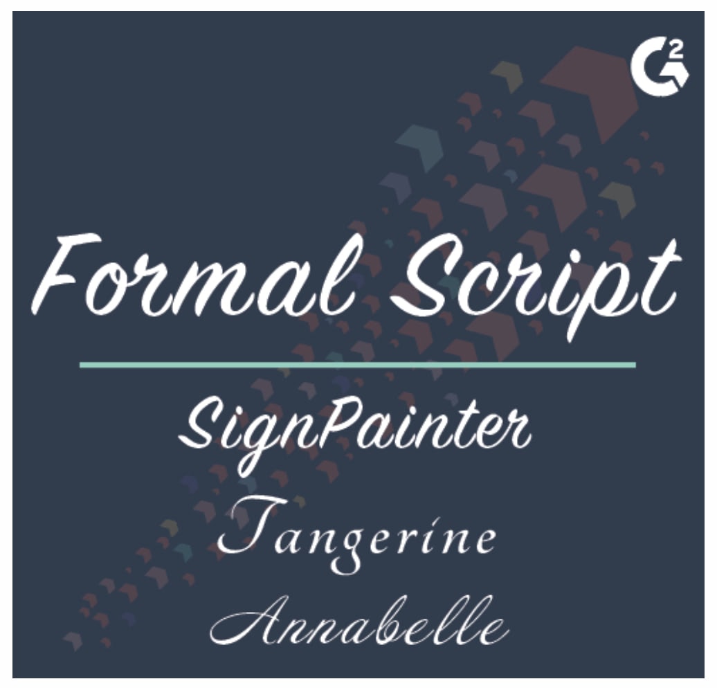
Script-type fonts are more casual and creative in nature. While they often aren’t suitable for body text due to legibility, they’re perfect for displaying messages due to their unique design. Script fonts are also considered personal and elegant as the general look itself promotes a dedicated approach and familiarity. Since these fonts look more like calligraphy art, there are a vast number of distinctive fonts you can choose from.
What typically describes script fonts?
- Elegance
- Creativity
- Uniqueness
- Personal
- Emotional
Some examples of script fonts include Alex Brush, Pacifico, Lobster, and Tangerine.
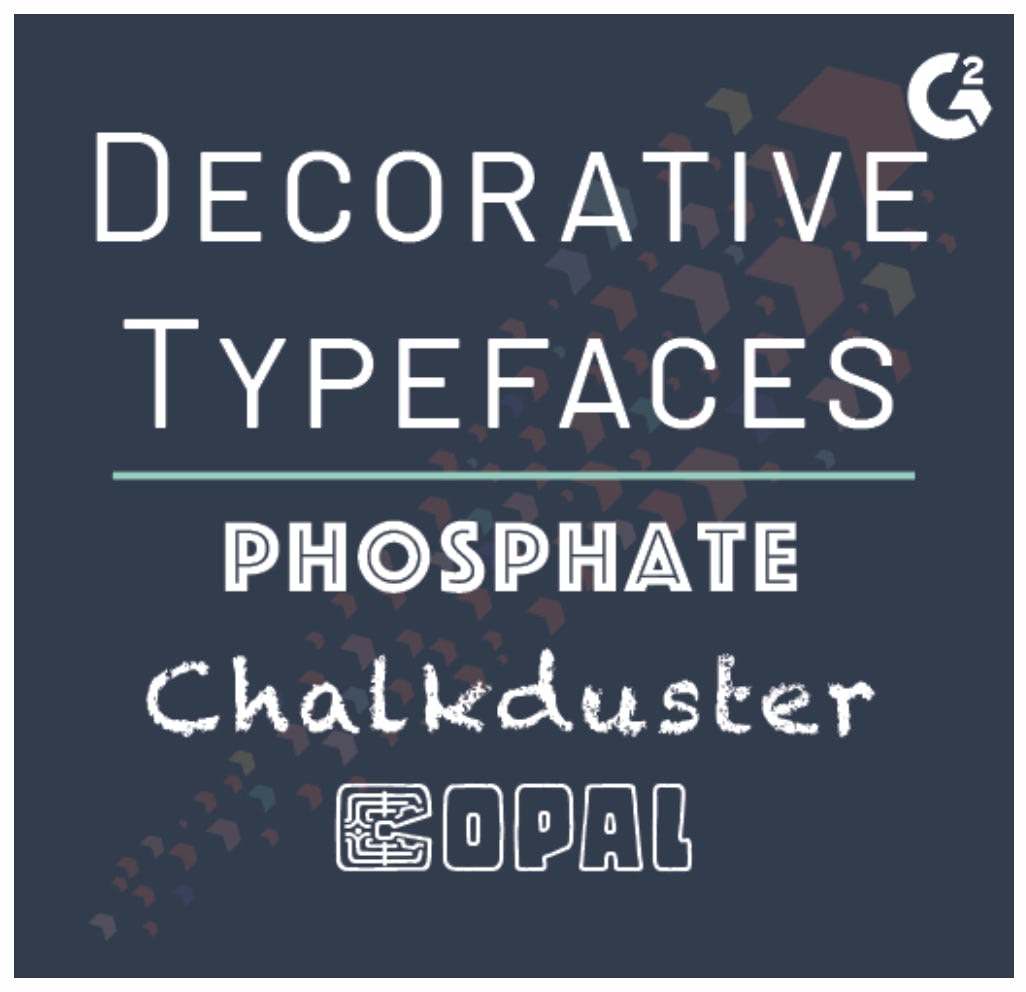
Decorative
Decorative fonts are uniquely created mostly for advertising purposes. Therefore, this font style doesn’t have an official categorization as some of the previous font styles do. Typically, decorative fonts take elements from major typefaces and creatively mix them to create a unique solution for a specific outcome. The creative nature and unique characteristics make this font family an option to explore if your brand really wants to stand out from the crowd.
Typical characteristics of a decorative font:
- Casual
- Creative
- Original
- Flexible
- Urban
Some examples of decorative fonts: Phosphate, Chalkduster, Graffiti, Grunge, and Stencil.
Additional Factors Driving Font Psychology
Apart from the overall perception of specific font families, there are other factors that you can consider to put further emphasis on the fonts’ psychological effects. While the font you choose lays the ground for the general style, the following elements help direct attention, guide the visitor through the site, and help you structure your site efficiently.
Let’s dig in.
Typographical Emphasis to Draw Attention
One of the most straightforward ways to direct readers’ attention is to emphasize specific words, sentences, or paragraphs. The most common way to add emphasis is making the text bold and therefore widening the letters to naturally attract attention. The other used means include Italics, Underline, and Strikethrough. It’s also not unheard of to change the font and size to bring certain parts to the visitors’ attention.
If we get even more specific, some fonts using typographical emphasis are also named separately, such as Helvetica Bold and Times New Roman Italic. However, with modern text editors and site-building tools, you won’t need to change the font as you can use commands to insert emphasis elements.
Colors as Another Psychological Layer
Color psychology is another branch that focuses on how different colors work on various levels in the human psyche. While the majority of the color psychology field focuses on graphical elements and visual recreations, fonts can also benefit from colors and their respective perceptions to the user.
Combining your site’s design, fonts, and font colors isn’t an easy task. While you can leave the font color as default, you could get better visual results with some more experimentation.
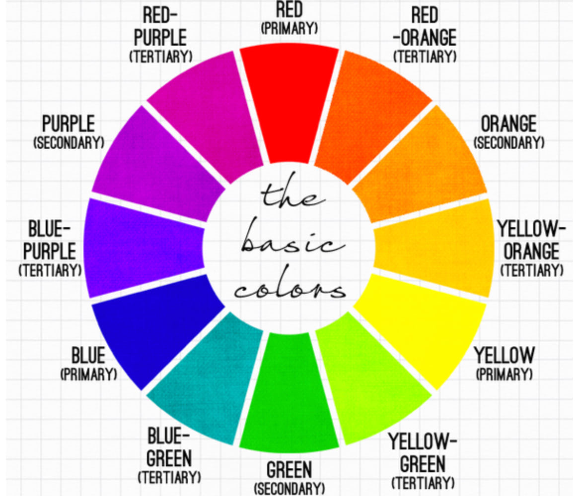
Without getting too deep into color psychology, here’s how people perceive primary colors:
- Red – passion, love, excitement, strength, aggression, danger
- Green – balance, security, environment, growth, productivity
- Blue – calmness, refreshing, confidence, authority, haunting, cold
Of course, there are loads of other colors on the color wheel, creating a different perception in the viewer’s mind. But, for the sake of keeping this guide primarily around fonts, we won’t go deeper into color psychology.
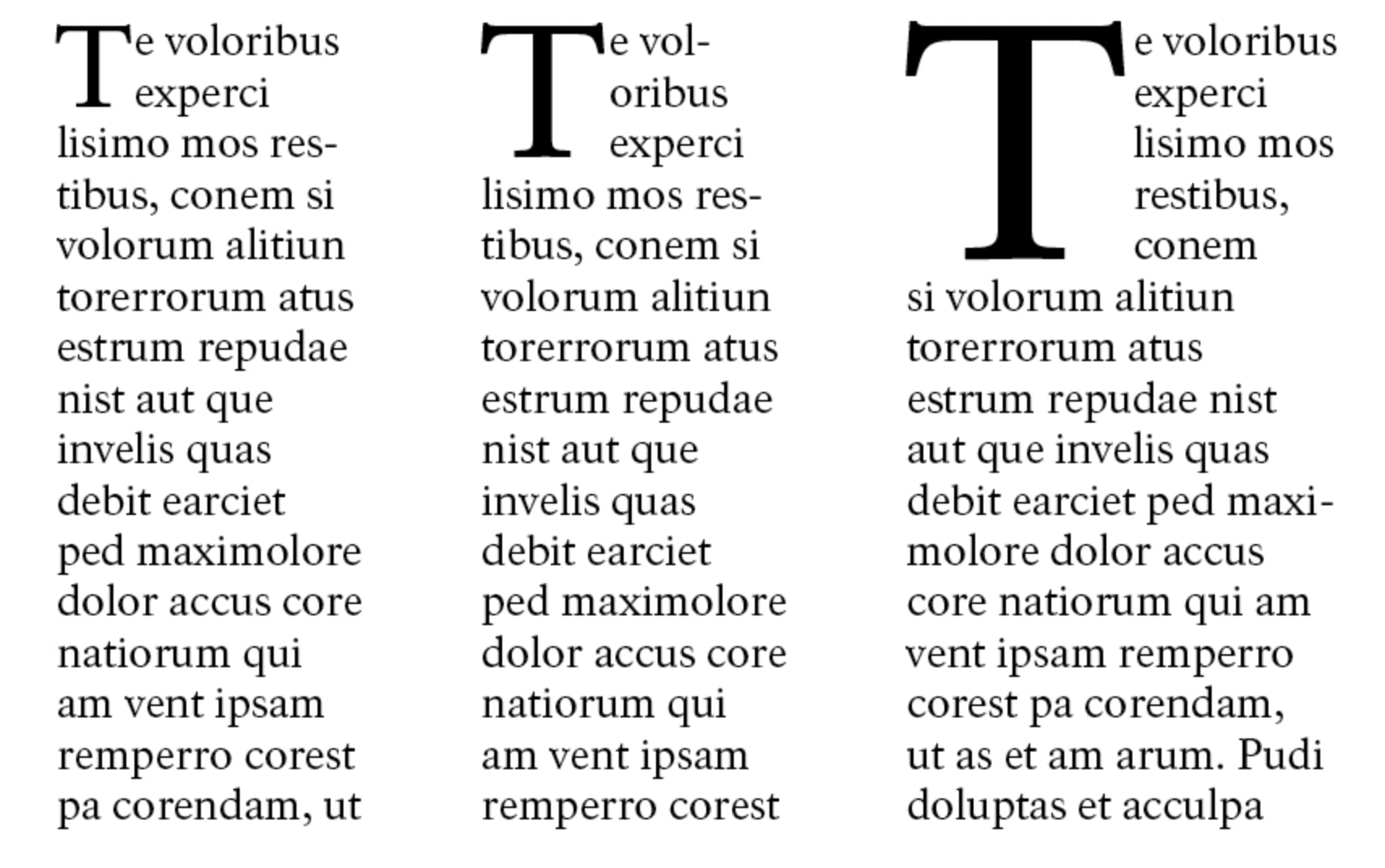
Font Hierarchy Increases Readability
The most common element for creating a font hierarchy is size; the larger the font, the higher the headline is on the page hierarchy. Take into consideration that headlines typically use larger font sizes than subheaders, and the latter usually has larger font size than the body text. Structuring your page by using multiple headers increases the readability for the viewer. You can also modify the hierarchy by changing the color, contrast, and alignment of the fonts.
Aside from headlines, you can also point out different elements to the reader using the same hierarchy technique. For example, a Call-to-Action is one of the most critical aspects of a landing page. Therefore, it makes sense to make the font stand out from the rest of the text on the page by giving it a different color and increasing the font size.
Research also shows that for common typefaces, increasing the boldness of the font increases the ease of reading and directs attention. Thus, it’s easier to use bold and larger letters in a few places rather than switching out the entire font.
Additional Traits to Create Uniqueness
Fonts possess various traits that also come to play when considering the psychological story they tell to the reader. While it might seem that the minor tweaks aren’t giving a significant effect, adding it all together boosts your site’s user experience and provides depth to your overall design choices.
We’ve already covered the typographical emphasis elements, but there are additional traits to consider when choosing the fonts for your design:
- Round vs. Angular fonts
- Lowercase vs. Uppercase fonts
- Condensed vs. Extended fonts
- Short vs. Tall fonts
Furthermore, there are also various decorative elements that you can add to your fonts. The most typical you can see across physical and digital text are drop caps (or large first letter) and quotes. While you can directly add quotes with modern text editors, you can also easily add the drop caps design elements using simple CSS coding.
All these details together contribute to the readability of your text. The use of either of those elements highly depends on the overall web design features you’ve chosen.
Choosing the Right Fonts for Your Web Design
Picking the proper fonts mainly comes down to your overall web design and the message you want to send to your visitor. A uniform style can contribute towards higher conversions and overall user experience, while an offbeat style can seem quirky and confusing.
Another aspect is the target audience you’re seeking and their habits. You can use different fonts to make a clear distinction between designs meant for a more conservative audience or a more modernist one. Getting the impact of your font right, therefore, requires some testing.
Here’s what else you should consider when choosing fonts for your web design based on font psychology.
Font Availability in Browsers and Applications
Not all fonts are readily available across different platforms. This means that if you’re going with an obscure font, the reader’s browser or device might not be able to display your content properly.
There are a few ways to stay on the safe side when choosing your fonts:
- Use system and web-safe fonts
- Go with a widely-used font library service
- Create fallback fonts within your site’s code
Let’s take a closer look at these options:
Choose a system or a web-safe font
System fonts are a pre-installed selection of fonts on your computer or device. However, depending on the operating system that the device uses, the available fonts may be different. For example, Android uses Roboto as the system font, and iOS apps use Apple’s San Francisco font.
However, the downside of using system fonts is that it’s challenging to stand out if everything looks the same. This is where web-safe fonts come in handy, which are a collection of common fonts available across platforms and systems. They are supported in multiple languages, there are no licensing costs, and they unite the application’s look and feel.
Another way, especially on the web, is to use a font library, such as Google Fonts or Adobe Fonts. These services are widely supported across multiple platforms and broaden the range of font choices beyond default system fonts. You can upload fonts directly to your site from the library or use a plugin that allows font insertion.
Go with a widely-used font library service
Font libraries, such as Google Fonts, operate by inserting a stylesheet link to your HTML document. From there you can refer to your chosen font in a CSS style and the Application Programming Interface (API) renders the fonts to your visitors.
When a user accesses your site, the font library’s servers send the font file automatically to the user’s browser-based on which technology it supports. Thus, you minimize the risks of your chosen fonts not rendering for your visitor.
Add a fallback font
Finally, create a fallback to the default system font if the user’s browser or a device doesn’t have your chosen font installed. This way, you can make sure that, in any case, your site’s visitor will be able to access the information and minimizes the risk of an error. Therefore, the fallback font kicks in when the user’s browser isn’t able to render the site’s font.
The Branding Aspect
The choice of fonts primarily comes down to your branding and how you want your visitors to perceive your site or product. Do you want your site to seem environmentally friendly, authoritative, welcoming, and creative?
Considering the main goal, you can opt for the appropriate fonts that reflect your main attributes and create the necessary basis for inciting emotion.
Furthermore, the font choice might directly impact the success of your product or service as well. One study into font appropriateness and brand choice found a direct correlation between a proper font and consumers’ choice in purchasing a product. The related field study showed that customers are more inclined to buy a product with an appropriate font rather than an inappropriate one. In that case, they tested their hypothesis with a box of chocolates and found that appropriately chosen fonts influence consumer decisions 75% of the time.
Overall, consider which emotions and attributes you want your visitors to have when you’re choosing the fonts for your web design. As demonstrated, not only do fonts influence moods but they also drive choices, so the proper fonts may boost your site’s success.
Combining Font Styles
Depending on your web design, you might want to experiment with combining fonts to emphasize distinctive messaging. For example, if your site is about environmentally-friendly technologies, you want your site to look green and modern at the same time. You can certainly do that with your font choices by going with decorative display fonts for logos, major headlines, and other significant elements and use sans-serif fonts to convey the modernistic look.
However, avoid going overboard with using different fonts across your site. Using more than two or three different fonts might make your site clunky and disorganized for the reader. Furthermore, try to avoid picking contradictory fonts, such as serif and sans-serif fonts, as both send different messages to the user, and combining those can look unprofessional in the end.
Also, avoid using multiple fonts from the same font family. While the fonts look similar, the minor differences can throw your users off and make your site look cluttered.
Consistency
Last but not least, once you’ve chosen your appropriate fonts, use them consistently across your site. If you feel that you want to experiment with different styles, change the fonts within the entire site to keep everything uniform and clean.
Like with the overall web design, you want your visitors to build a particular opinion of your content and products. But creating inconsistencies with your font choices can negatively influence how people perceive your site. Therefore, it’s better to stay consistent with your design to avoid confusion and keep visitors within the range of emotions you want to encourage.
Keep in mind, though, that you can use separate landing pages to test out font combinations and see how they work for your visitors without compromising the integrity of your site’s design.
Historical Context of Font Psychology
The history of typography dates back to the invention of the printing press by Johannes Gutenberg in the 15th century. The development of typefaces since then has been influenced by cultural, social, and technological factors. Early typefaces, such as Old Style and Transitional, were designed to mimic handwritten manuscripts, while later styles, such as Modern and Sans Serif, were developed as a response to evolving tastes and printing technology.
One of the most significant distinctions in typography is between serif and sans serif fonts. Serif fonts have small decorative strokes or lines at the end of the main strokes of a letter, while sans serif fonts lack these embellishments.
Serif fonts, such as Times New Roman and Garamond, are often associated with tradition, authority, and formality. They are commonly used in print materials like books and newspapers, as the serifs are believed to enhance readability by guiding the eye along the line of text. Serif fonts can evoke feelings of trust, stability, and reliability.
Sans serif fonts, such as Helvetica and Arial, are associated with modernity, simplicity, and clarity. They are often used in digital formats, as the clean lines and lack of ornamentation make them more legible on screens. Sans serif fonts can convey a sense of minimalism, innovation, and straightforwardness.
Emotional Impact of Fonts
Fonts can evoke a wide range of emotions, depending on their design characteristics:
- Elegance and sophistication: Fonts with thin strokes, such as script or calligraphic typefaces (e.g., Bickham Script or Edwardian Script), often convey a sense of luxury, refinement, and exclusivity. They are commonly used in high-end branding, wedding invitations, and upscale packaging.
- Playfulness and fun: Display or decorative fonts (e.g., Comic Sans or Lobster) have unique and unconventional characteristics that can communicate a playful, informal, or whimsical tone. These fonts are suitable for children’s products, casual events, or artistic projects, but should be used sparingly and with caution in professional contexts.
- Strength and power: Bold, heavy fonts (e.g., Impact or Bebas Neue) can evoke a sense of strength, stability, and assertiveness. These typefaces are often used in headlines, logos, and promotional materials to create a powerful impact and command attention.
- Friendliness and warmth: Rounded, soft fonts (e.g., Varela Round or Nunito) can convey a sense of warmth, approachability, and friendliness. These typefaces are suitable for informal communication, social media, and brands that want to establish a personal connection with their audience.
Examples of Font Psychology in Action
To get your creative juices flowing, let’s look at a couple of great examples of how font designs are used to convey particular perceptions and emotions.
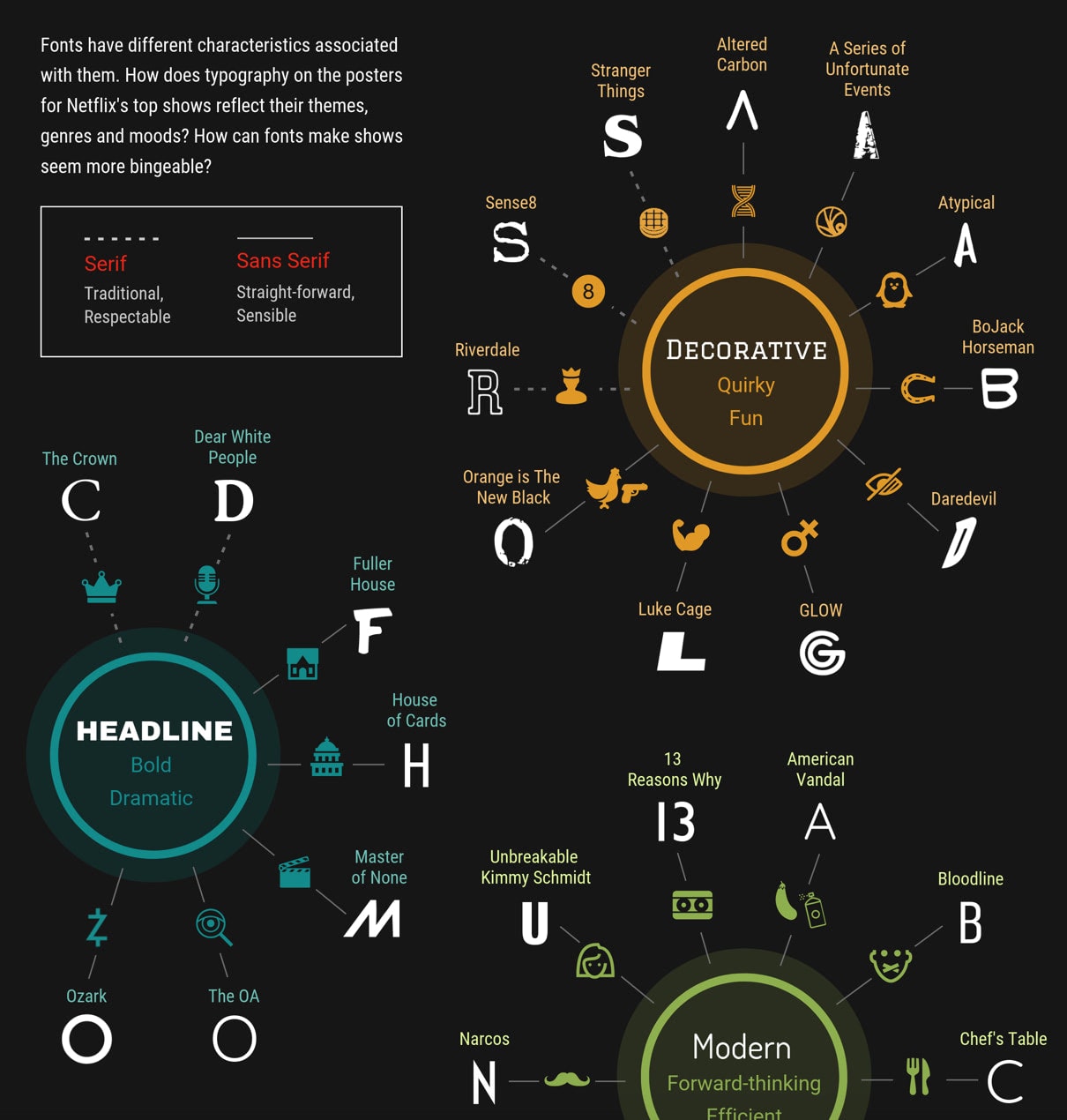
Netflix
One of the best examples of showing emotions, a general direction, and a theme with fonts is Netflix. The shows on the platform use different fonts based on the genre of the series – and with great success.
A font analysis into Netflix’s headlines shows a distinct categorization in different typeface usage depending on the characteristics of the show. In fact, the most used font for shows was sans-serif, which enforces boldness, modernism, and directness, which embodies most of Netflix’s program. Furthermore, you can find direct relations between creative and obscure shows using script or decorative fonts and historical shows using serif typefaces.
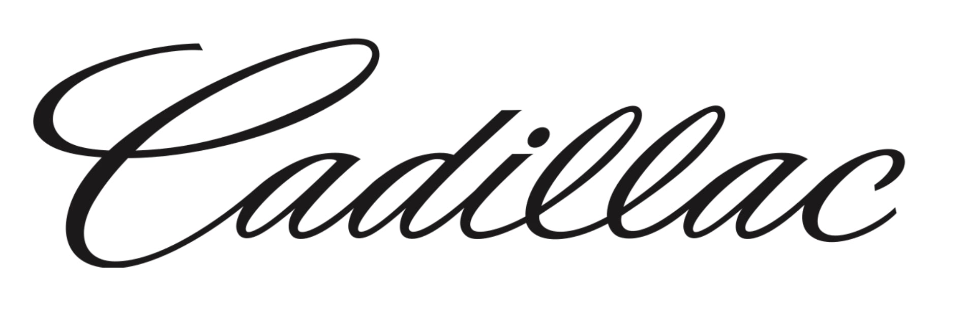
Cadillac
The well-known car manufacturer Cadillac aims to produce vehicles that are elegant, luxurious, and modern. Therefore, it’s not a coincidence that they’ve used a script font to design their logo.
Last but not least, LinkedIn is considered a business-oriented social media platform. It breathes modernism and cleanliness without being cluttered, which sends a clear message to its users.

If you look at their logo, you can instantly recognize these traits. The font is sans-serif, which gives a modern look. They also use the color blue, which sends a message of confidence and clarity.
Use Font Psychology to Empower Your Web Design
Fonts are potent elements within web design that can provoke emotions, direct attention, or even guide the user towards action. Using font psychology to build upon your site’s design can drive user experience and improve conversion.
There are multiple aspects to finding an appropriate font, which can range from selecting the general font family (serif, sans-serif, script, or decorative) to choosing the specific look (condensed, angular, or other). However, when considering the fonts for your web design, the most important aspect is presenting your content in a way that matches how you want your visitors to feel about your site.
Still, it’s equally essential to not go overboard with the font choices and remain within the commonly used font families for the most part. However, to stand out from the crowd, experimentation with creative fonts can further develop your site’s subconscious messaging.
Font psychology plays a crucial role in shaping human emotions and perceptions. By understanding the psychological effects of different typefaces, designers and communicators can make more informed choices and enhance the effectiveness of their visual communication. Whether it is to evoke a particular emotion, communicate a brand’s personality, or improve the readability of text, the power of typography should not be underestimated.
Let us know in the comments: which fonts are you using and do they serve your purpose considering the psychological effects behind them?