Grid-Based Design Theory
Grid is an important tool for graphic design. Commonly people used to think that grid is related to engineering and architecture, but this is not true. Today the graphic designers use grid extensively for website design. It is a very popular tool in present times.
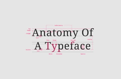
Grid is not just about squares but proportion. This is the most important element of grid theory. Art historians are of the opinion that the famous Dutch painter Piet Mondrian should be regarded as the Father of graphic design because it was he who used grids in the most sophisticated way yet classical. It is believed that artists have been highly influenced by classical grid theory for thousands of years. The conception of dividing the components of a theme can be traced back to days of mathematical concepts developed by Pythagoras and his followers. They used to define numbers as ratios rather than single units. The followers of Pythagoras believed that mathematical patterns evolved by Pythagoras must have been divine as they occur so often in nature. They called this pattern as the Golden Ratio or Divine Proportion.
Using the Golden Ratio a line can be cut by dividing its length by 1.62. This wizardly number 1.62 is in reality 1.6180339 which is quite irrational and represented as symbol (Φ), Or “Phi”. Don’t worry, I am not going to discuss the details of this theory or explain it, for it’s too complicated and I myself am a bit weak in math. The most important matter is that all these will not make you a better designer, so it is better to leave the topic right here and move on with our discussion.
But here the question arises as how does this ratio help in graphic design? Well it is believed that compositions divided by lines that are proportionate according to the Golden Ratio has an aesthetic appeal. The Renaissance artists of 15th and 16th Centuries used divine proportion to create their paintings, architecture or sculptures. In the similar fashion the designers today use this ratio while developing posters, layouts and brochures. Designers are of the opinion that instead of relying simply on artistic ideas, divine proportion is more useful in giving logical guidelines for developing layouts which are not only attractive but has unique appeal.

The Rule of the Thirds
There is also a simplified version of the Golden Ratio. It is the Rule of the Thirds. Using this rule, a particular line cut by the Golden Ratio is being bisected into 2 sections, whereby one section is about twice the size of the second one. Thus it is a simpler way to apply divine proportion without the help of your calculator. Here the composition is divided into thirds.
With Postcards Email Builder you can create and edit email templates online without any coding skills! Includes more than 100 components to help you create custom emails templates faster than ever before.
Free Email BuilderFree Email TemplatesFor a simple and quick layout experiment of the idea, let us start by drawing some simple rule of thirds grid with pencil and paper. Draw a rectangle, and then divide it into two-thirds both vertically and horizontally. Now draw a line every vertical line to make 6 columns to work. Now having done, we have six grids in front of us to start off with our composition. The big main rectangle here represents the container, which has been described in the section-“Web Page Anatomy”. Using this particular method of layout design, let us place the largest block first. This largest block will represent the content. Then according to my first rule -of –the- thirds grid, let me keep the content block within the two-thirds of the layout at the bottom right, then I keep my navigation block in the middle third block from the left side column. Next I keep the text portion of the identity block across the left side of the content, while the image portions of the identity across the menu. Ultimately, I put the copyright block below the content that is the right sided column of the grid.
The 960 Grid System
The 960 Grid System developed by Nathan Smith has been one of my desired tools for laying out website components. The templates and the sketch sheets are simply wonderful. This 960 Grid System is mainly a CSS framework that has been developed after being highly inspired by articles published by famous web designers Mark Boulton and Khoi Vinh. The widths of the templates have been inspired by the words of Cameron Moll. Speculating as what width would be the best to fit within 1,024px wide displays, Cameron Moll decided it to be 960px and mentioned that the number was divisible by 3, 4, 5, 6, 8, 10, 15 and 16 – which makes it a perfect width for grids. Nathan Smith mixed this notion into a framework and thus developed three layout foundations:
1) 12 columns
2) 16 columns and
3) 24 columns

I however like to use the 12 column layout as it helps me to easily divide my content into quarters in four columns; thirds by spanning three while halves by spanning six.
You have the option to use different arrangements for your own layout work. Use the columns of the chosen grid as alignment guides for the identity, content, navigation and footer blocks. You may wish to keep all your elements in one or two blocks, but I will advise you to avoid it as this will not look good. Rather try to keep some elements in another column or off from the grid altogether. Many designers opine that in using grids the composition somewhat looks boxed and unattractive. The red columns that you find are from the 16 column (960 Grid System) template but it doesn’t exist in the real website. The columns are invisible in the real website so there is probably little chance to realize that it has been created using a grid.

Famous graphic designer and author of Grid Systems in Graphic Design, Josef Muller Brockmann says,” The grid system is an aid, not a guarantee. It permits a number of possible uses and each designer can look for a solution appropriate to his personal style. But one must learn how to use the grid; it is an art that requires practice.”
With Startup App and Slides App you can build unlimited websites using the online website editor which includes ready-made designed and coded elements, templates and themes.
Try Startup App Try Slides AppOther ProductsIt has been proved that human mind responds well to structure, grids and ideal proportion and love to use them in different creative medium. Often it is seen that layouts that is looking unattractive or “doesn’t look quite right” can be easily fixed by resizing or moving a few elements here and there on the grid.
The American football field is laid out on a grid with a base unit of one yard. Every five yards, the hash marks are replaced with a gridline that crosses the entire field, making it easier for players, spectators and officials to understand where the play is taking place, no matter where they are standing.

Therefore, if you have problems with a particular layout, simply keep on experimenting. Remember Robert Bruce? Yes try, try and try till you succeed. You will find at some point of time that everything in your layout is fine. All is balanced.