Line by Line Website Designs based on Horizontal Stripe Layout
Although, it is widely believed that every project calls for unique solution, there are long established and time-tested approaches that can effectively arrange content on your website and work perfectly well for vast number of cases. For example, grid-based layouts are fairly common and are involved in almost every second project.
There are different kinds of layouts such as fluid, fixed, elastic, absolute, relative, equated, and those, which utilize fixed sidebars, boxes, full screen photos etc. Today I want to consider horizontal stripe layout that has found favor in the eyes of many designers recently; and this is not surprising, since sequence of presentation – is what unites almost all websites around the web. It has a lot of benefits: revealing data step by step does not confuse users, provides balanced interface and gives optimal viewing experience. So, designers massively try to organize data in well-thought relatively small portions that are literally lined up. This principle includes simply sticking to horizontal alignment, mainly structuring your content through positioning, in order to make website outward more distinctive and vivid. Usually designers identify sections by means of ordinary color and background differentiation that give websites really impressive and trendy look.
Examples of website designs based on horizontal layout
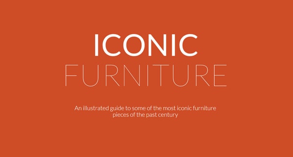
Iconic Furniture beautifully takes on minimal style, mostly utilizing bi-color palette that employs white as a primary color.
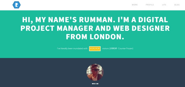
Rumman Amin briefly and efficiently familiarizes onlookers with himself, placing every essential aspects of his portfolio in separate lines.
With Postcards Email Builder you can create and edit email templates online without any coding skills! Includes more than 100 components to help you create custom emails templates faster than ever before.
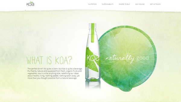
Free Email BuilderFree Email TemplatesKOA Water has a lively nature vibe, based on muted organic colors. Due to slightly blurred boundaries between sections, it seems that they harmoniously flow into each other.
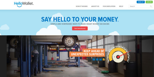
HelloWallet welcomes users with comprehensive landing page, which introduces agency line by line.
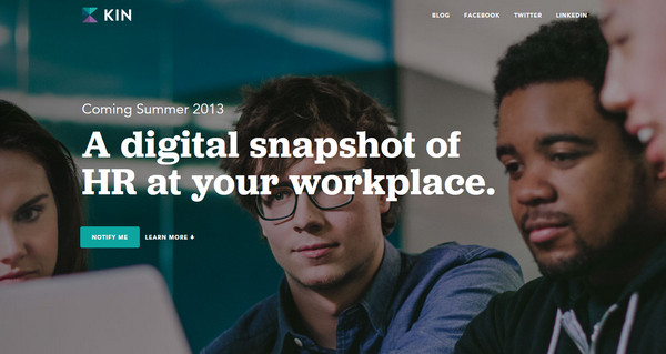
HR Software represents powerful coming soon page that extensively acquaints potential customers with upcoming software.
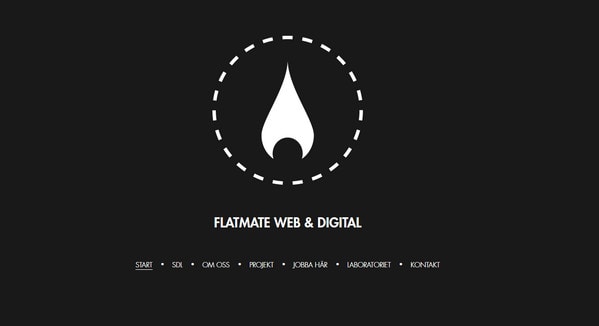
Flatmate Web and Digital makes nice use of vertical parallax, compactly arranging all necessary data into 6 subpages that open consecutively along down way.
With Startup App and Slides App you can build unlimited websites using the online website editor which includes ready-made designed and coded elements, templates and themes.
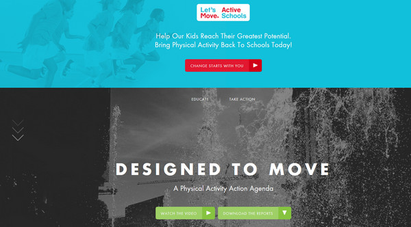
Try Startup App Try Slides AppOther ProductsDesigned To Move has a truly diverse and thorough website that includes several extensive sections and plays heavily on 3 colors scheme: green, orange and white.
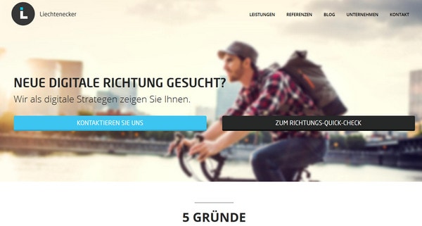
Liechtenecker wonderfully utilizes flat style and vivid colors to make website look refined and accurate.
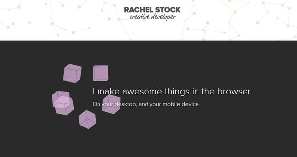
Rachel Stock leverages standard and contrast black-and-white color palette, which easily and quickly draws a visual line between areas.
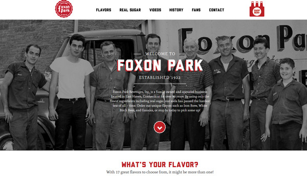
Foxon Park establishes a barely visible contrast between sub pages by means of background that is based on only one color. Rough bold type and injections of defiant red color add to website lively zest.
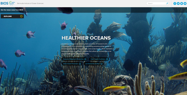
Bios features picturesque underwater photo backgrounds that serve not only as a tool for grabbing users’ attention, but also as a motivational instrument.
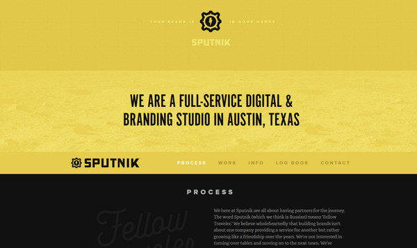
Sputnik leverages powerful and energetic black-and-yellow scheme that recreates sharp contrast diluted with white and black font.
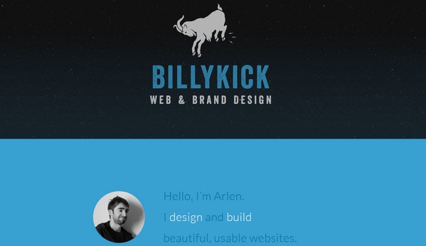
Billy Kick is pulled by minimal and flat styles that work together perfectly well. Predominant blue and white colors add to design seriousness, whereas sharp type with slight grunge touch adds a bit of friskiness.
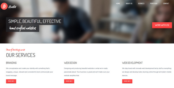
Bright Byte Studio looks really clean and neat due to light clear monochromatic backgrounds, a lot of free space and regular typography.
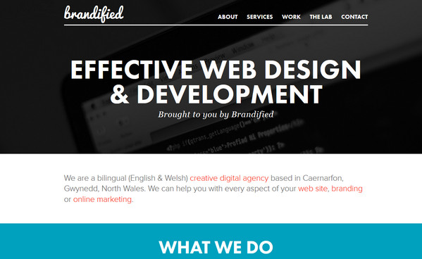
Brandified skillfully and clearly divides landing page into various sections. Plane graphics and circular elements look modestly and tidy.
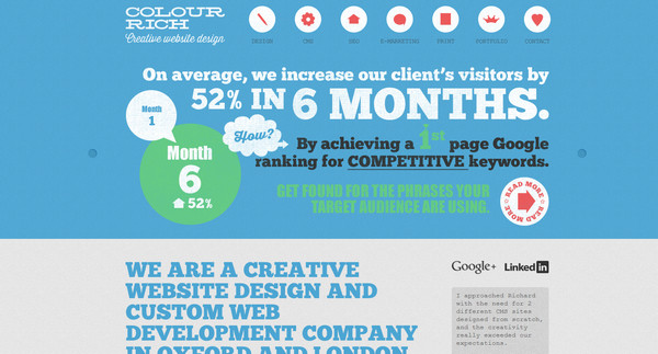
Colour Rich is a content heavy website, which strongly relies on combination of different types that are embellished by different shades and have a slightly worn look.
Pupil is a vector-driven website that has heavy and rough appeal thanks to enormous typography, huge illustrations and a lot of text.
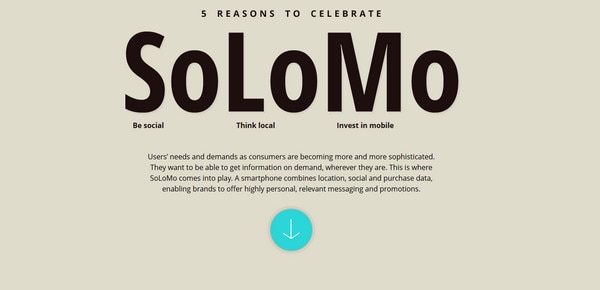
Solomo ably demonstrates statistical data via infographic that is beautifully divided into several vibrant and vivid parts.
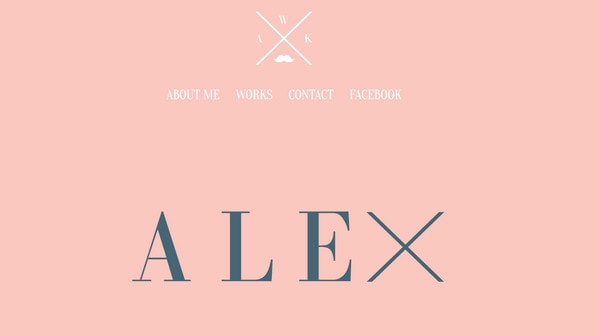
Alexandra Kuban Web design nicely breaks the molds of muted color background by slightly stretched type, white elegant navigation system and X-style logo.
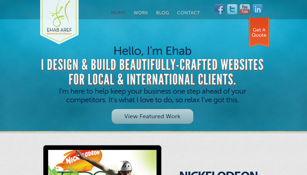
Ehab Aref naturally recreates striping effect by identifying each section with various background colors, and leveraging calm blue, white and grey colors.
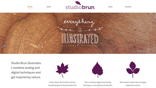
Studio Brun gives an impression of light, airy, clean website thanks to employing pure white background. Nature-inspired illustrations and violet color throw in layout organic feeling.
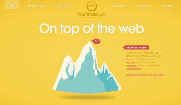
Multimedium has a restrained home page that depicts only 3 various sections. Each area has its own one-colored lightly noised background and inner set of complementary colors.
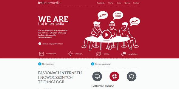
Trol colorfully highlights slider, footer and portfolio sections, selecting light grey color and dark casual font for content area.
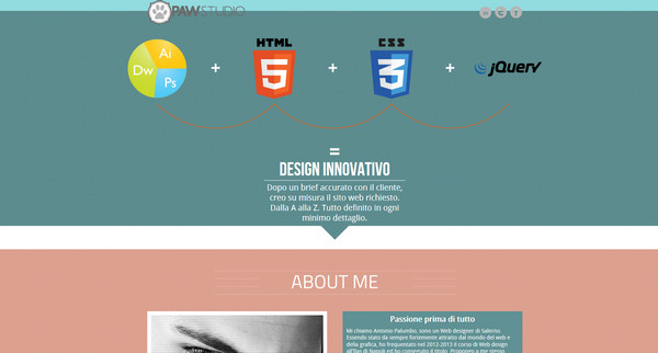
Paw Studio is marked by vivid muted color palette. Every menu item gets its own retro feel with bright graphics and elegant type.
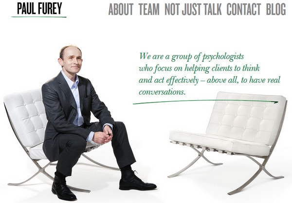
Paul Furey – At first glance it seems that website has holistic structure without division on stripes. But if you take a closer look and scroll down a little bit more you will notice, that designer separates rest of functional blocks by means of thin green line.
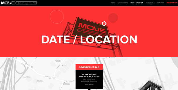
Move Dance Convention is visibly brightened by spirited photos with dancing appeal. Designer wonderfully outlines integral sections and ably combines together red, white and black colors.
eTecc welcomes users with amazing blurred background, which nicely complements tagline. Contrast between sections is achieved only by color differentiation.

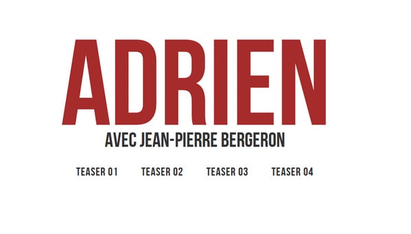
Adrien Serie is a clean and comprehensive website dedicated to popular serial. Designer neatly sheds a light upon a story, capably arranging number of videos.
Reflection
Majority of minimal online portfolios, one-page websites and those, which are based on vertical parallax effect utilize wide screen horizontal stripe layout in order to make design look organized, contrasty and vivid, ably making use of all the available screen space. Employing only color differentiation allows easily and quickly to split long highly informative page into sections, kindly adding to whole design more readability and usability properties.
Which example is your favorite? Does approach of utilizing full screen stripes look fresh and modern? Does it make website feel organized? Let us know your opinion in the comments below


