How to Create a Sleek iOS App Icon in Photoshop
This is something you need in your design toolkit — the ability to create a great iOS App icon. And this tutorial will help you learn to do just that.
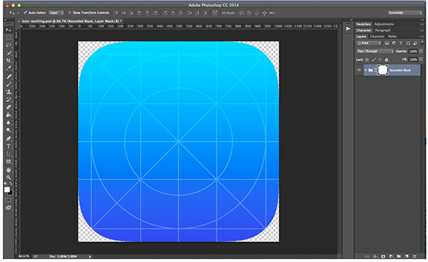
To start, you’ll need the iOS App Icon template. You can get one from iOS Icon Template or App Icon Template; I’m using the latter. As you can see my screen only includes the big 1024px icon. That’s because I didn’t want to deal with the other elements.
You can crop the App Icon Template file to just include the 1024px icon or deal with the remaining elements within the PSD – it’s up to you.
Step 1 – Create the Basic Shape of iOS App Icon
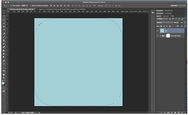
Create a new layer and give the whole document a background color. I’m using #acced6. Press G to use the bucket tool and color in the new layer.
With Postcards Email Builder you can create and edit email templates online without any coding skills! Includes more than 100 components to help you create custom emails templates faster than ever before.
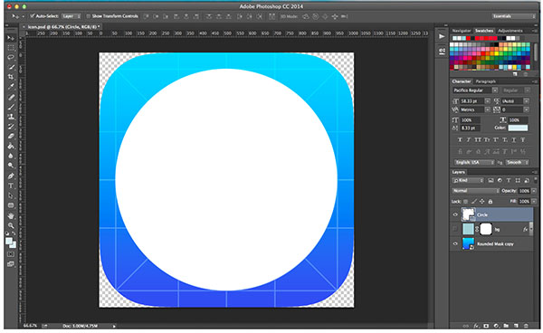
Free Email BuilderFree Email TemplatesNext, add a mask around the background color in the shape of the icon. Technically this is not necessary as Apple rounds off the corners for you when you upload the image. However, to get a better visual of how the icon is shaping I suggest using the mask.
To do this press COMMAND or CTRL and click on the mask of the Rounded Mask layer. Now there should be a marquee selection of the icon shape on your blue background.
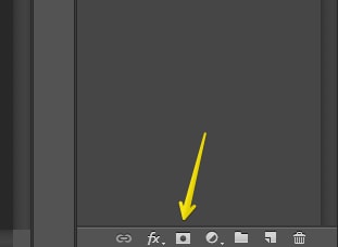
To create the mask, select the mask icon at the bottom of the Layers Panel.
Step 2 – Add a Gradient
Next, right click on the icon’s background layer and select Blending Options. We want to add a slight gradient to the background. The starting color should be #acced6 and the end color should be #7cbece.
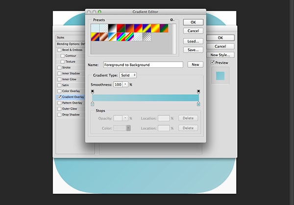
The gradient needs to be linear. In order to get it to be diagonal, set the angle to be at 135 degrees. The gradient needs to be set to go from the darker blue in the left top corner to the light blue in the right bottom corner. If you mixed up the colors, simply rotate the angle to -135 or 315 degrees.

With Startup App and Slides App you can build unlimited websites using the online website editor which includes ready-made designed and coded elements, templates and themes.
Try Startup App Try Slides AppOther ProductsStep 3 – Create an Inner Circle
A big part of this icons design is a white circle in the middle. Follow the iOS icon grid to create one. You want to use the Elliptical Tool which is under the button U. Create a circle roughly 890px tall and wide. You can adjust the size of it in the Properties panel if it’s not perfectly aligned with the grid.
Step 4 – Style the Circle
Now that we have the circle, we need to style it. The circle should have a stroke, shadows and gradient added to it; so let’s add one by one.

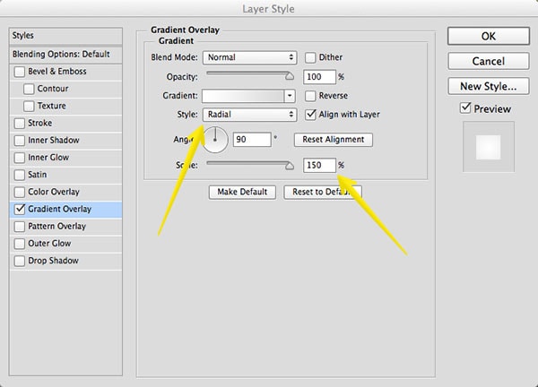
Add a gradient
The gradient in the circle is straightforward. The gradient is formed from #ffffff and #d9d9d9.
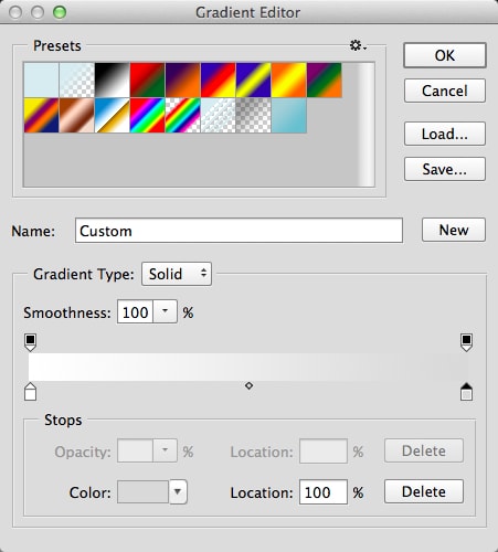
This is a radial gradient because we want to give the middle of the circle some shine. Make sure that the white is in the center and the light gray on the outside of the gradient. Also, max out the Scale and set it to 150%.
Add a stroke
The stroke around the circle is supposed to look like a thick border. Set the stroke to be positioned inside and make sure it’s thick. I’ve set my measurements to 30px. Additionally, the stroke will include a gradient.
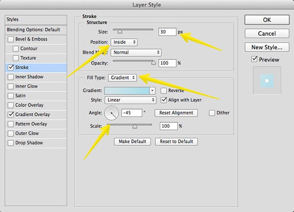
The colors used for the gradient are a lighter version of the background gradient of the icon. The gradient starts with lighter blue #d1e4e8, and ends with a slightly darker and more saturated hue, #a9deeb. The gradient needs to be set diagonally with the lighter blue atop and darker blue towards the bottom. Set the angle at –45 degrees to achieve this.
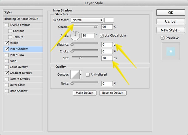
Add an inner shadow
Technically the inner shadow is a white glow – you’re welcome to use an inner glow instead. Set the Blend Mode to normal decrease the distance to 0px. The white glow should be peaking outside of the stroke a bit so set the size of it to something like 140px.
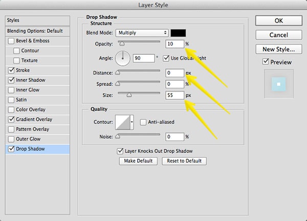
Add a drop shadow
The very last thing you need to do is add a drop shadow to the circle. This will give the thick border (stroke) more definition. It will make the circle, as a whole, stand out from the blue background. Within the drop shadow, change the opacity to 10%. Next, decrease the distance to 0px but increase the size to something slightly larger. I chose 55px.
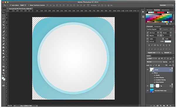
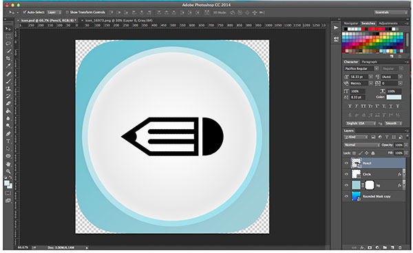
You should have something like the image below.
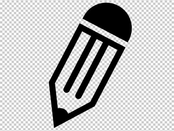
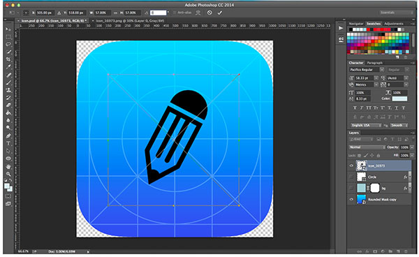
Step 5 – Add a Pencil Icon
The last thing this icon needs is an icon. I’ve chosen a pencil. Find an icon on Sliceberry or the Noun Project and throw it into your PSD. Make sure the icon is big because the file we are working on is more than 1000px tall and wide.
If you want to use the pencil icon I chose, you can download it from the Noun Project. It was created by Molly Bramlet and you can download it here.
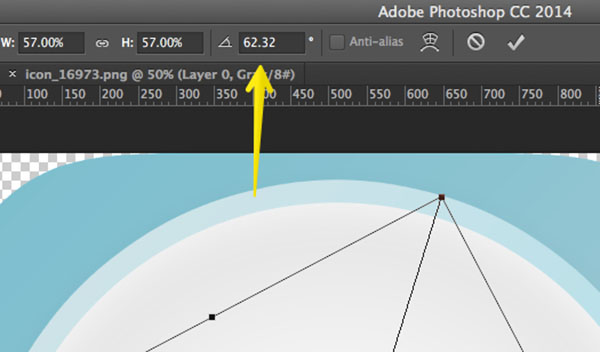
Import the icon into your file and resize it. If you are using the same pencil icon as me, you’ll want to resize the icon down around 50%. Use the iOS template guide to help you size the image into the smallest circle.
In order to get the icon to be vertical rotate it by 62.32degrees. To do that, press COMMAND or CRTL + T. In the upper bar enter 62.32 degrees by the small triangle icon. (Although that is totally optional.)
Step 6 – Style the Pencil Icon
The last two steps in designing the iOS App Icon are styling the pencil icon. Now that you have imported and positioned the pencil icon let’s style it. The icon will need to have an added gradient overlay, as well as an inner shadow.
Add a gradient
Open up the Blending Options of the pencil layer to add a gradient overlay. The gradient we will be adding is going to the exact same gradient as we applied to the blue background of the whole icon in the very beginning of the tutorial. Start the gradient with a light blue hue #acced6, and end it with a darker blue #7cbece. The gradient should also be at diagonal. However, this time, the lighter blue will be at the top left while the darker blue will be at the bottom right. Set the rotation at –45 degrees to achieve this gradient angle.

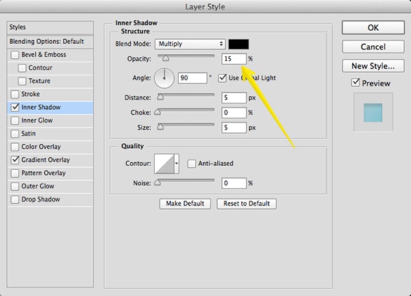
Add an inner shadow
The last thing we need to add is the inner shadow to the pencil icon in order to give it some depth. What you’re going to do is keep everything the same except you should decrease the opacity to be much lighter. I set my opacity to be 15%. The shadow will still be there but it shouldn’t be too pronounced as the whole icon is based on light colors, gradients, highlights and shadows.
The Final Product
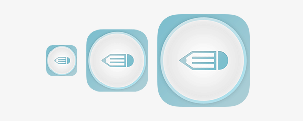
Once you’ve finished adding the inner shadow you’re all set. iOS App Icon tutorial was meant to show you what it takes to create a stylish iOS icon – and as you can see it isn’t very much. The final app design is a sophisticated icon, which you could use for many apps.