Collection of Modern eCommerce Websites
Today it is tougher and tougher for eCommerce website to stand out from one another as there are simply so many of them. However, some find a way to do any anyhow by implementing modern and cutting edge designs that fit their brand and their target audience.
Below I have gathered a short list of amazing eCommerce websites out there today which demonstrate superb high end design styles. There companies understand that design is truly important in making their business work online.
Examples of eCommerce Websites
Saturdays Surf NYC
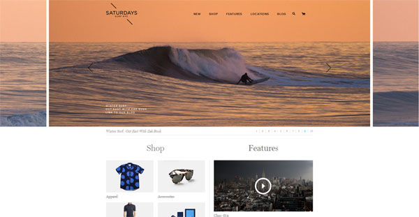
This website’s design is very clean, like the others on this list. The full width header is simply spectacular, especially because it hints that it is in fact a slideshow with the image breaks – even though the images are the same. That’s a good thing because it keeps the user focused on the current slide. And of course there are other elements like the arrows and pagination that make it obvious it’s a slideshow.
Budnitz Bicycles
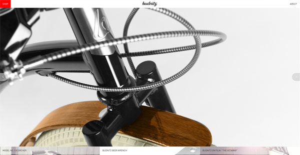
Talk about background images, this online bike shop uses imagery as its main focus on the home page. The bicycle shines on this home page till the next slide image comes though but there is nothing else in its way, literally too, as the image is full width and height for the most part. Yes, there are links and navigation but it is tucked away because it’s the simple yet powerful photography that sells.
With Postcards Email Builder you can create and edit email templates online without any coding skills! Includes more than 100 components to help you create custom emails templates faster than ever before.
Free Email BuilderFree Email TemplatesEastworks Leather
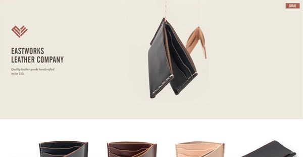
Once again we have minimalism, cleanliness and images at play here. However, that animated wallet is not only unexpected, it is so refreshing. It is a totally new way of showcasing a product; because it is not only a 360 degree showcase of the item, it is a unique way of showing it too – hanging off the top of the window and spinning, how often do you see that? Also the colour scheme, the beige is very warm unlike the common grays of minimalism.
The Windmill Club
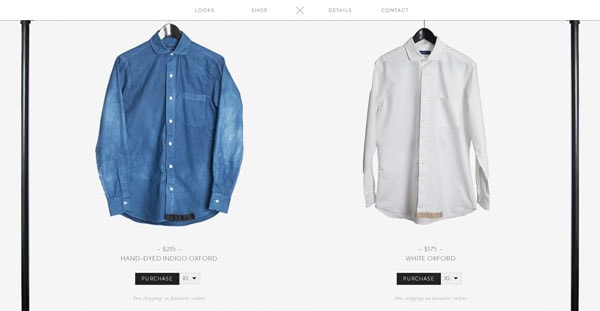
This home page is a delight to go through as it is unlike most other online appearance retailers. As you scroll down you have a real image of two shirts just hanging off a pole. It is not skeuomorphism, it is not flat either. It is different – for sure – but mature and high end. Overall the page is not cluttered; it’s sophisticated which represents the brand very well and in a very good light on top of that.
Harry’s
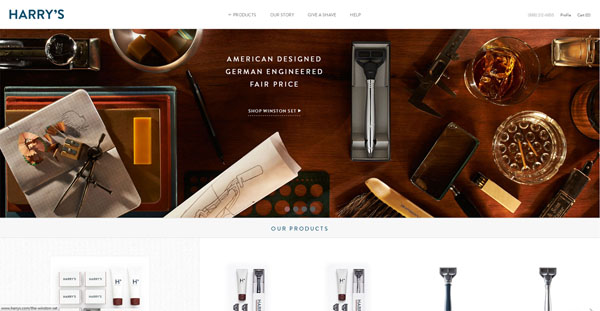
I was so thrown by this site – in a good way – I actually purchased a set for my father. Their display of product and overall layout of elements is incredibly pleasing. Of course the spectacular product design help – as it should! The brown and blue accent colours add richness into the design that only helps this modern layout be spectacular.
OWL
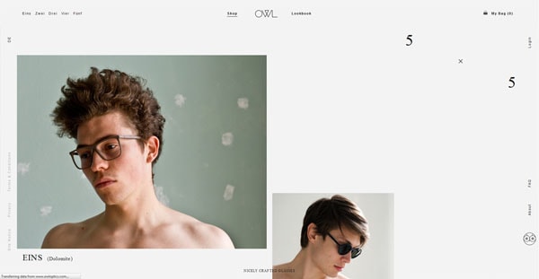
I think Owl’s site might as well be called modern art. It is minimal to the extreme and it uses layout – and video – in a different ways then a common website; it is breaking the rules because the pictures are overlapping, the elements are overlapping too, and the spacing is uneven. At first this layout may seem stupid or a mess but there is a preservation of balance here that makes it work. This type of design is truly dedicated to their brand and their specific target audience.
With Startup App and Slides App you can build unlimited websites using the online website editor which includes ready-made designed and coded elements, templates and themes.
Try Startup App Try Slides AppOther ProductsADA Blackjack Goods
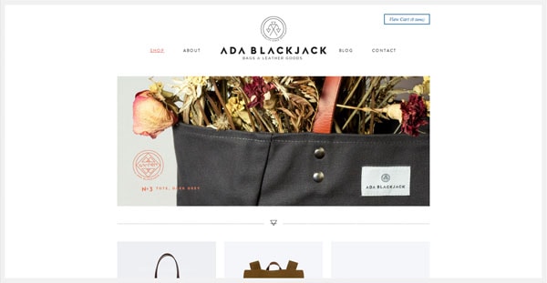
This little website is just simply delightful. Yes, it is minimal but it is so personal too. To me, this is a website replica of a little high end boutique from the hip part of town. That is why it comes off personal – it represents the small boutique and the designer owner who is passionate about handbags, fashion and great design. What else could you ask for from a boutique!
Keizo
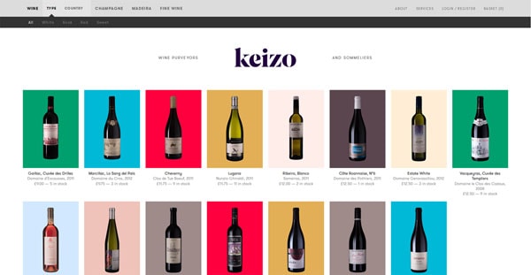
I must say I am sick of wine websites having these strange and cliché Italian country side themes – all of them do. Except this one, this site is not about the wine stereotype. It is about a person who appreciates wine as an art; someone who loves wine, simplicity and colour. The different colour blocks under each wine make me think that each of these bottles has some sort of unique personality; which they should as they are different types of wines and therefore should taste differently. Talk about an online metaphor done right.
Big Cartel Shop
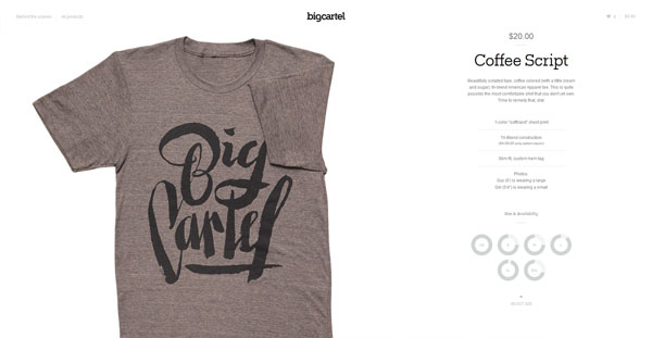
Although BigCartel is quiet know, it is well to be so as their online store is so elegant. The overall experience is bliss. They are not afraid of using big images to show off their product; as they shouldn’t be. When you showcase your product well, it will sell. On this particular page there is no clutter, there is nothing to distract you. Here you have the shirt, front and center. The supporting information about this item is just that, supporting.
Minimals
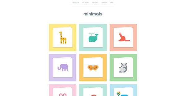
This is too a very clean and minimal website, as the name suggest. However, it is also sweet. The play between those adorable little animals and the pastel colour blocks is marvelous. They set the playful and sweet tone which is perfect for the type of product being sold. You can’t really ask for anything else here.
Mah Ze Dahr Bakery
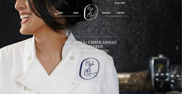
Talk about buying with your eyes, this is one snazzy bakery website. It is using images and pictures of the product and of the company’s environment to demonstrate to the visitor how delightful this bakery is. You can learn a lot about a company this way, you can tell that this baker is run by people who believe in quality and believe that product design and presentation is so important. Just look at typography use here.
Rare Device
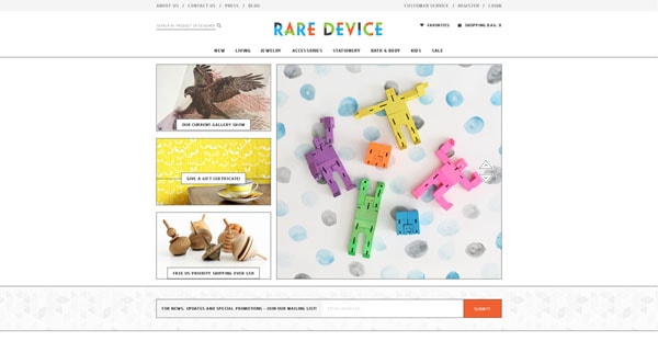
I find this simple website to have a lot of character. It has these simple but well defined 1px borders everywhere which give it definition. You also see this nice crisp font that is just a bit but enough funky to add onto the personality of this website. And then you also see the use of colours through images. They are carefully chosen, and they work very well together and therefore bringing this website together. And not to mention the awesome products they showcase which is just a cherry on top.
Your favorite modern eCommerce website?
Do you know of any websites that are amazing and would fit perfectly on this list? Share them in the comments!


