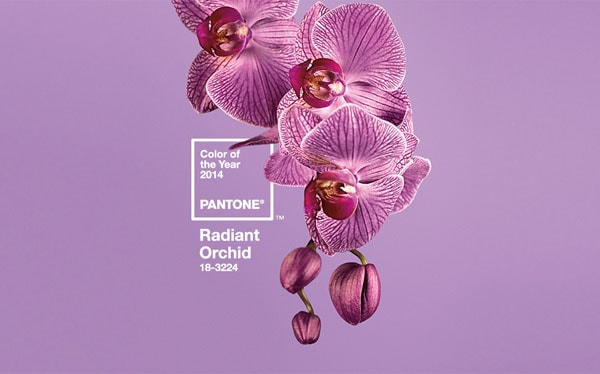
Pantone Color of the Year 2014 – Radiant Orchid: Perfect Accent Color
In the daily world, we live in, and especially so in design, color influences us greatly. When it comes to design, color is a very meticulous thing that can make or break your whole design if you choose the wrong hues. This year Pantone has selected Radiant Orchid 18-3224 as the 2014 color of the year. I think it is only fair to celebrate the use of this purple-pink hue in web design.
“Radiant Orchid blooms with confidence and magical warmth that intrigues the eye and sparks the imagination. It is an expressive, creative and embracing purple—one that draws you in with its beguiling charm. A captivating harmony of fuchsia, purple and pink undertones, Radiant Orchid emanates great joy, love and health.”
Radiant Orchid, the Accent
As a design element, color is such a deep topic. Each individual hue has its own personality and therefore evokes specific emotional responses from us. The Radiant Orchid hue is a bit tricky to use in web design as it is very much a feminine color. However, it is still a magnificent color even if it is not too popular as the main color in website color schemes. Additionally, it is a vibrant choice as an accent color.
Radiant Orchid can be found in the following color systems:
HTML Values: #B163A3
RGB for TPX: R-177, G-99, B-163
Plus Series RGB: R-200, G-107, B-168
CMYK for TPX: C-33, M-72, Y-0, K-0
Plus Series CMYK: C-19, M-70, Y-0, K-0
If you take a look at the examples in this post, all of them have wonderful color schemes which feature this type of purple-pink hue as an accent color very well.
With Postcards Email Builder you can create and edit email templates online without any coding skills! Includes more than 100 components to help you create custom emails templates faster than ever before.
Free Email BuilderFree Email TemplatesWebsites Examples

This is a very interesting website, I think you should check out because it is an online memoir. On its home page, you have a very big and unfocused background image of a woman. What I love about that picture is the filtered styling of it, which has a purple hue to it that is exactly like Radiant Orchid.

Si digital has an online portfolio with a home page that tells a very interesting story as you scroll down. That one thing that is very prominent throughout is the pink liquid going through the glassware all along the page. That hue is a very good choice and good use of the new color of the year.

Engage interactively is another agency who has a very colorful and bold portfolio, actually. What stood out to me were the pink accents in the header’s image; I’m talking about the pink chairs. What a way to throw this hot hue in just a little bit to make a great color composition in the office space and visual design of this page.
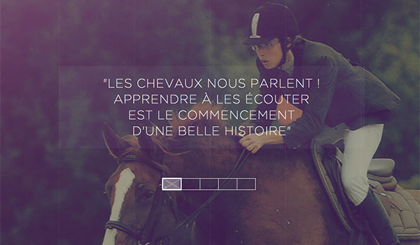
Julie Lavergne is a French horse trainer who has a very modern and magnificent website. Throughout all of her site, you see big images – some of which are slideshows. But in just about every single image you also see the purple Radiant Orchid hue thanks to some sexy filter action. Having so many pictures with the same color scheme really brings the whole website together.
With Startup App and Slides App you can build unlimited websites using the online website editor which includes ready-made designed and coded elements, templates and themes.
Try Startup App Try Slides AppOther Products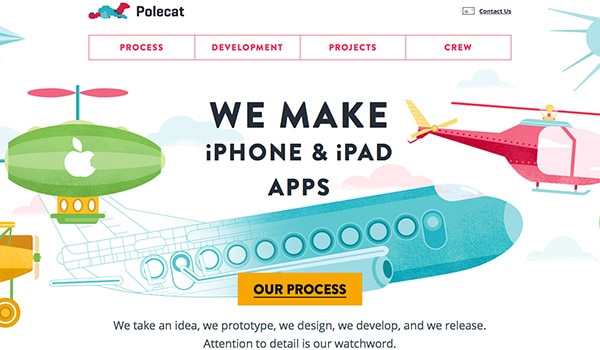
Polecat is an agency which specializes in making iPhone and iPad apps. I find their home page to be very much cute and friendly. The vector graphics you see right away reflect the Radiant Orchid color well – especially being paired with other hues such as the blues, yellows and greens. I also appreciate the aero motif that is going on.
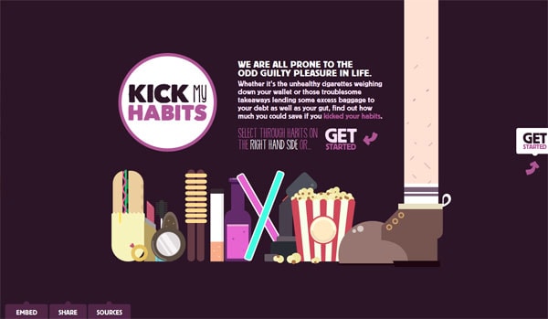
This is a very adorable website actually, that helps you determine how much money you spend weekly as a means to determine which spending habits you should brake. You can see the Radiant Orchid color all over the interface from the background to the links.

Out of this whole collection, this is definitely one of my favorites. The overall layout, and composition of this page is spot-on brilliant but also the vibrant colors, they look so good. The vivid and strong yellows, oranges and greens work so damn well together especially with the Radiant Orchid hue put into the mix. This website is a very well thought out explosion of the rainbow.
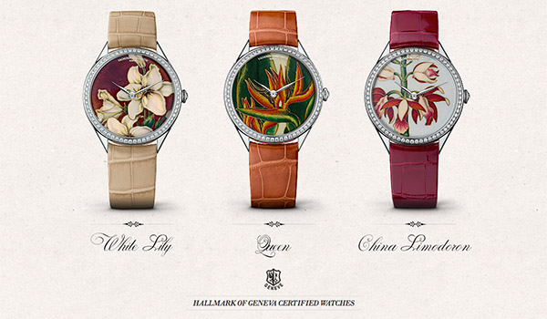
I’m using this website as an example because I feel it is an excellent showcase of an accent color at play. As you scroll through this page you see there is the very little color to being with and then you have this eye-catching pink watch which just draws you in. That is how you nail an accent color!
Compared to the rest of the examples this is a very light pink but I still feel like it has the essence of Radiant Orchid in it. The loading screen background is very in your face but given the lack of content, I do think this is a very big splash of an accent color. Damn, this screen just draws you in.

Once again, a good execution of an accent color in terms of proportions. There is so little pink on this site – especially compared to the example above. It is also refreshing to see a dark website using the pink hue of the Radiant Orchid as their accent. I think this is a well-executed color scheme and a pretty cool JavaScript plug in too.
I appreciate the minimalistic approach of this website; it is just so to the point. I also think the overall darker color scheme is a bit refreshing as minimalism often goes hand in hand with white, light and bright colors now a day. Just look at the Radiant Orchid fitting right into the website’s flow; well done.

This is such a cute website! The storyline execution of this long page is marvelous and so is the theme, of course. There is nothing like scrolling through ice cream. Although this is a fairly flat and minimal design, the colors are vibrant and work extremely well together. The paring between the Radiant Orchid and the red and green of the watermelon ice cream stick was a good choice.

Ah, here we have another cute vector website; however, this one is much busier than some other minimal examples in this collection. But then again, we also have another website with a great color selection; this is only because Radiant Orchid is being featured in this scheme, of course.
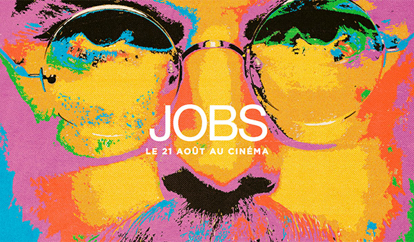
And lastly we have a beautiful illustration of Steve Jobs for the French website about Steve Job’s movie. The combination of Radiant Orchid, yellow, red, green and blue is so well done; it is an extremely well executed illustration. I also love the fact that his image is blow up and zoomed in; it makes it appear grander as if it was a smaller more typical portrait picture.
Conclusion
So there you have it, Pantone Radiant Orchid 18-3224 as the color of the year 2014. Please let me know in the comments your thoughts about this hue as I think it is an interesting choice. And, of course, show off links of websites you know that use this hue very well in its color scheme!