Use of Ribbons and Tags in Web Design – Inspiring Examples
It was not long before creative layouts become popular not only for portfolios or online design agencies but also for any other regular website. Creative approach and high attention to details dictate modern criteria of creating website outward, from year to year updating the list of current trends. Something disappears without a trace, something becomes habitual so it’s really difficult to notice, and there is a special category of design techniques which essentially remains the same, but every year it surprises us with its different faces.
One of the prominent representatives of this category is the use of ribbons and tags that initially come in web design from a world of merchandize. Despite of being essentially related to web designs of clothes online shops it has found its place in other types of websites. A lot of designers utilize ribbon as a background for main menu or set it as an ornament for titles and captions of different widgets and blocks of data.
Tags, in its turn, are responsible for attraction and concentration of users’ attention on small details such as call-to-action buttons, social media icons, sales, deals and others. Undoubtedly, there are different ways to integrate these graphic elements that usually depend on the effect you want to achieve.
Below you will find a collection that depicts various implementations of ribbons and tags.
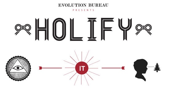
Holify looks clean and nice. Black and white ribbon typography with bows and outline graphics perfectly complement each other.
With Postcards Email Builder you can create and edit email templates online without any coding skills! Includes more than 100 components to help you create custom emails templates faster than ever before.
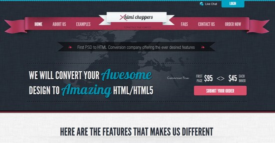
Free Email BuilderFree Email TemplatesXHTMLChoppers – Although 3 ribbons in a row placed almost together look a bit messy, the difference in color and shape is definitely capable of grabbing users’ attention.
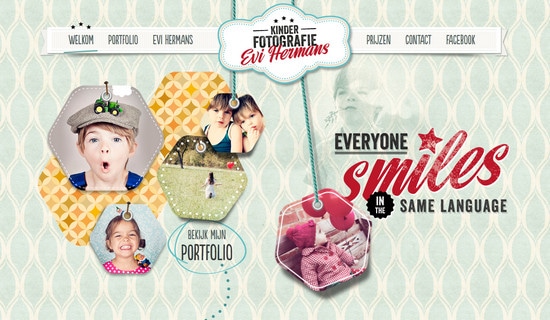
Kinderfotografie has an appealing delicate style that is implemented by stitched image tags hanging on a rope, childish turquoise background and light accurate menu ribbon.
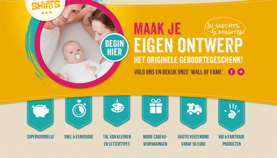
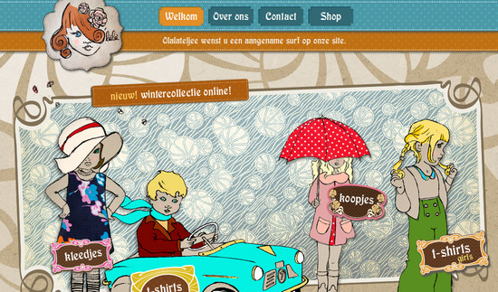
Baby Shirts presents every menu item in a separate tag.
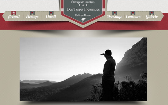
Des Terres Inconnues combines ribbons and tags in order to make strong with slightly grunge touch header.
With Startup App and Slides App you can build unlimited websites using the online website editor which includes ready-made designed and coded elements, templates and themes.
Try Startup App Try Slides AppOther ProductsO’lala is an ecommerce clothes website with a harmonic combination of different textures such as soft cardboard and painted fabric that perfectly echoes in various design elements like tags or buttons.
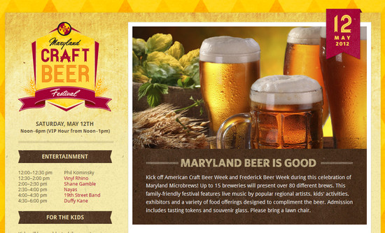
Craft Beer Festival has a bunch of ribbons-like elements. You can find them in a logotype, caption ornament, table canvas, date widget background and even in typography.
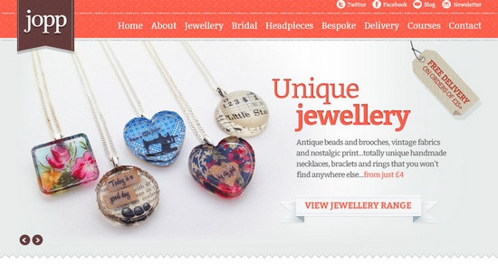
Jopp Design uses a realistic tag illustration as a call-to-action button that immediately attracts users with its profitable proposition.
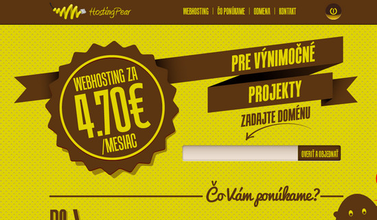
Hosting Pear sets the eye movement of viewers on the main page, leading them to a tagline message.
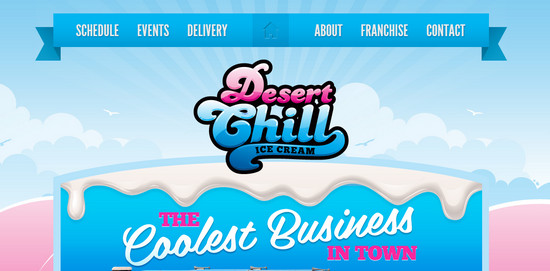
Desert Chill has a less formal design with fresh main menu that due to its saturated background perfectly blended into the blue sky in the header.
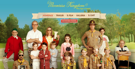
Moonrise Kingdom makes use of beige polished heavy textured ribbon as a menu background that helps to define menu items.
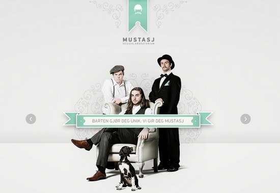
Mustasj creates a serious business-like look utilizing subtle grey color palette in conjunction with neatly designed ribbon and tag logotype.
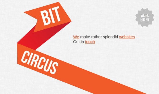
Bit Circus has only one bright really simple but at the same time impactful illustration that manages to lead our eyes from top to bottom.
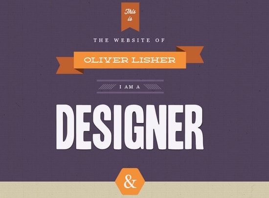
Oliver Lisher has a standard combination of ribbon and tag in a header which are made in the same style and color scheme.
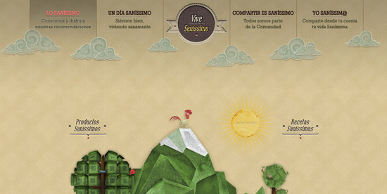
Sanissimo is a truly sophisticated design which is assigned by complicated logotype with accurate shadows and neat emboss effect.
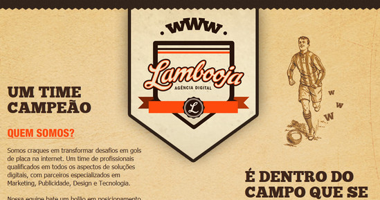
Lambooja stands out with its accurately crafted logo that is combination of 2 tags and 1 ribbon.
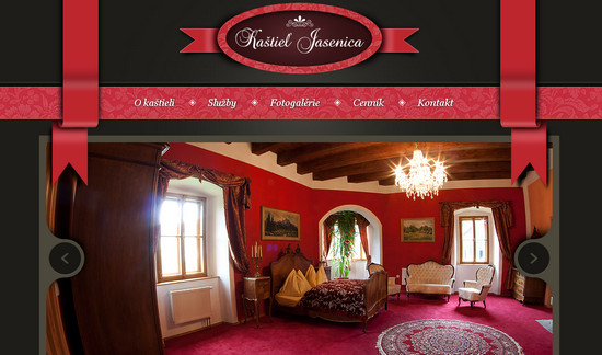
Kastiel Jasenica – silk maroon ribbons work wonderfully with dark color scheme and menu band with flower pattern.
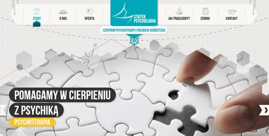
Statek Psychologia lively uses maritime style that is accomplished by bilateral white tag and ropes as a main menu background and blue tag in logotype.
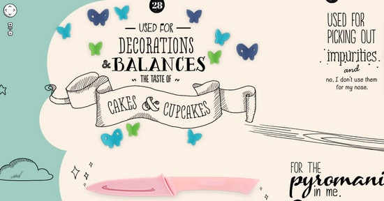
The Production Kitchen – I could not but add to our collection an illustrated hand-drawn ribbon since a lot of designers use them as an impressive ornament that can easily emphasize taglines or short messages.
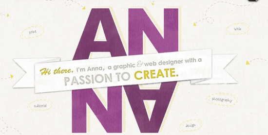
Anna Monroe manages to pull of light clean appearance which is achieved by a spacious noised white-smoke background and a huge well-defined ribbon that perfectly cooperate with an illustrated owner’s name.
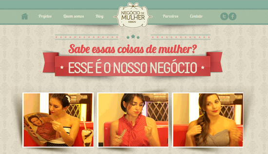
Negocio de Mulher is a heavy textured website design. Use of green header and huge red ribbon with tagline upon grey background with monograms makes a whole appearance extremely attractive.
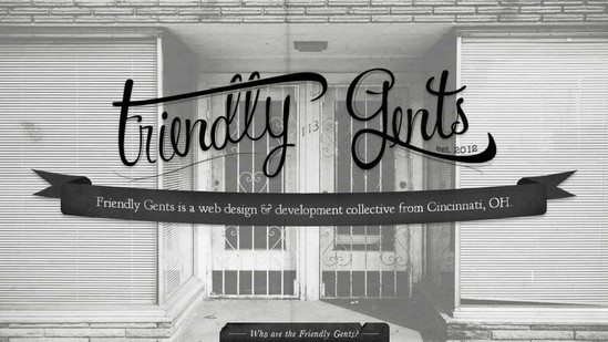
Friendly Gents has charming black and white color combination which is perfectly complemented by photo and black graphical ribbon.
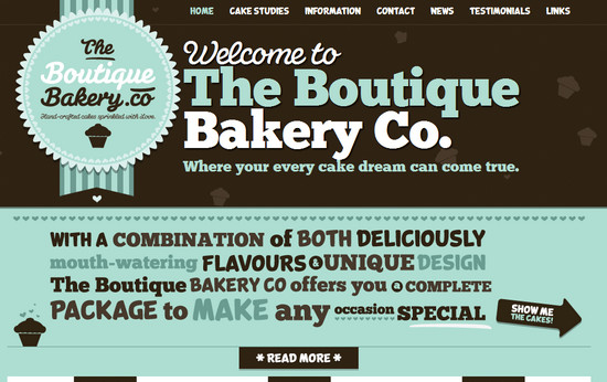
The Boutique Bakery instills a sense of enjoyment with blue striped ribbon and charming circle tag with tasty typography.
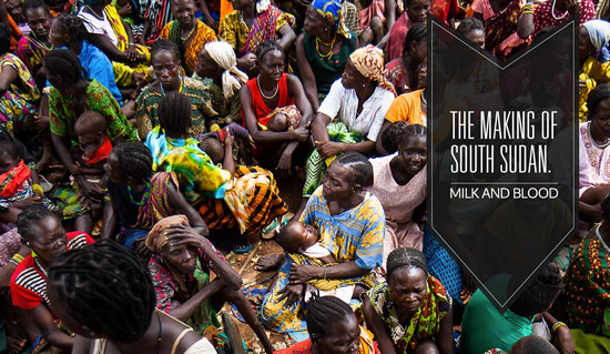
Milk and Blood conveys truly dramatic emotions with vibrant image and a huge semi-transparent black tag that plays role of logo.
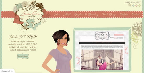
Savoir Fair Media has a strong artistic feel with a collage-like hand-drawn logo and exceptional red delicate ribbon.
Despite of being more decorative elements rather than functional, ribbons and tags are capable of providing its owners with an excellent tool that allow easily grab attention. Moreover, you can install them in different types of design adding a bit of artistry and loveliness.
What do you think of usage such graphical elements? Do you find them appropriate in business-oriented websites? What example do you like most?


