Slab Serif Fonts: Most Popular Typefaces, Best for Webfonts
The early 1800 saw the birth of the Egyptian typeface, technically known as Slab serif. The term Egyptian was deemed by others as a misnomer, in which it was derived from the craze the country made after the 3 year expedition of Napoleon. It seemed like it was the most convenient term and because of its popularity, has become the nomenclature for the typeface. The birthplace of Slab Serif was Britain in which print advertising was still very popular. The radical advances in advertising strategies inspired this bold new typeface.
Typeface was initially geared towards long stretches of texts like in newspapers and in books, but with the changes in innovation as well as increase in the prevalence of advertising; the need for a typeface that shouts at the person and stands out amongst the crowd became essential. Posters have to shout and billboards have to scream. Even if slab serif was a young innovation compared to other typefaces, it also is one of the constantly changing and innovating typefaces, adapting to consumer need and changes in aesthetics.
Defining the form
Slab serif carries a very prominent form: slab-like, bold, and square cut fonts. In the first few decades of the 19th century, radical developments in typography would result to three prominent typeface varieties including sans serif, fat faces, and the slab serif. The actual origins of this typeface are hard to determine but experts agree it came from signwriting. Based on an analysis by James Mosely, it wasn’t until Figgins’ first Egyptian printing type appeared that a true slab-serif typeface existed. The first iteration was in upper case letters only and the serifs are thick as the main letter strokes.
Based on an 1823 specimen by Figgins, experts believed that slab serif was indeed based on fat faces. The capital letters may carry consistent modulations but with small letters, the modulations were varied, loosely based on the fat faces. Like many other revolutionary and unique typographies, the slab serif met disdain and callous remarks from critics. Even those from typefoundries felt that it may be too much.
Figgins continues development of slab-serif in which italics on capital letters were introduced in 1821 while further developments of the small letters have been introduced in 1825. A few years on, the slab serif has become commonplace as emphasis for typographic data such as headings or as bold type within texts.
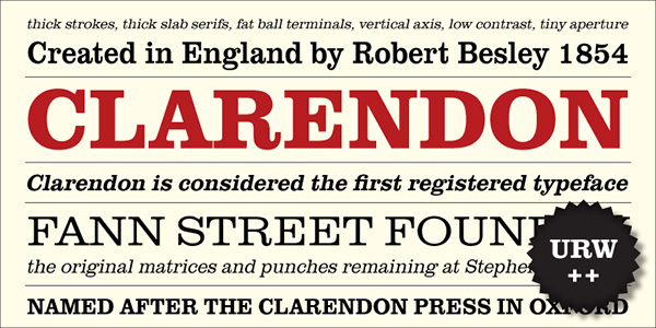
Slab Serif began gaining traction in the industry. By 1845, the Clarendon, a sub-category of the Slab-serif has emerged and carries a distinct appeal due to its gentler form. The modulations between thick and thin are present as well as bracketed serifs and stress on verticals. Another popular version was the Ionic which carries a robust appeal which is why it was preferred for news printing.
With Postcards Email Builder you can create and edit email templates online without any coding skills! Includes more than 100 components to help you create custom emails templates faster than ever before.
Free Email BuilderFree Email TemplatesAt the end of the 19th century, there has been a considerable disuse and unpopularity towards the use of Egyptian Slab serif. During the early 20th century especially the 1920s, sans serif became the typeface for its no-nonsense, utilitarian appeal. It was until the 1930s when slab serif would become visible again.
Revival phase
The Golden Type by William Morris can be attributed as the seed that would reincarnate the slab serif. While Morris claim that the roman type from Jenson was its basis, the slab serif was very much present on the typeface.
In 1929, Eric Gill would create Solus which would firmly plant Slab serif revival. While the creation of Solus was to try and balance readability and design issues of Slab serif, the advertising market still snubbed the said typeface since it did not carry that Egyptian blackness and it was not able to fully transfigure the 19th century form for 20th century needs.
Compared to the 19th century ones, the 1930 Slab serifs have modulating thin and thick strokes with more humanist proportions. Sadly, since the focus of Gill’s work were for readability, they tend to be more ideal for texts compared to advertising.
If Gill did not appease the advertising market, the Germans would have a profound interest in it. With a different approach, particularly of a modernist kind, Slab serif would enter a different type of type with the Memphis, created by Stempel. This style is monolinear in form but with slight curves along the adjoinment to prevent the areas from becoming too black. This unique approach to slab serif made it successful. During the 1930s, the Germans dominated in reviving the slab serif with Britain and America following suit. The new slab serif styles were designed for both continuous and display texts. However, their popularity was still overshadowed by prominent sans serif because of the popularity of modernistic design.
Shortcomings
Monolinearity and geometric forms present in slab serif were more reminiscent of the machine age than contemporary age and that is why some consider that it cannot be relevant for continuous text.
Most Usable Slab Serif Fonts
Sanchez
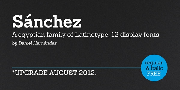
Sanchez was created on the basis of one of the most popular funny typefaces, called Rockwell. The author has improved square letterforms with the help of smooth rounded edges thereby striking the optimal balance that contributes to contrast and readability. The family can be broken into two groups (Regular and Condensed). Together they embrace twelve weights, from slim to bold, upright and italic variants, and a ton of glyphs.
With Startup App and Slides App you can build unlimited websites using the online website editor which includes ready-made designed and coded elements, templates and themes.
Try Startup App Try Slides AppOther ProductsSchwager
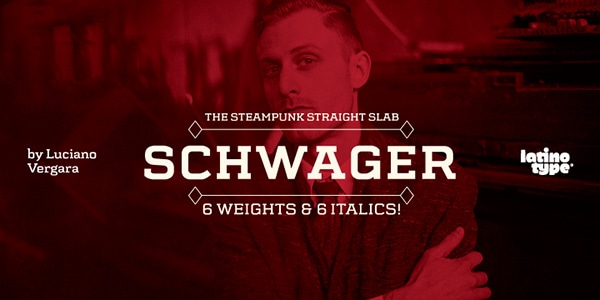
The font is an alliance of squared and rounded forms that result in an outstanding typeface with piquancy. It is saturated with an industrial vibe and has a subtle steampunk note and masculine appeal. Although it fits like a glove into Victorian style artworks, however, it can go perfectly well with modern projects.
The product includes twelve variants covering regular and italic styles, and several weights. As for glyph coverage, you can be sure that it will be enough to satisfy your needs.
Kettering 105
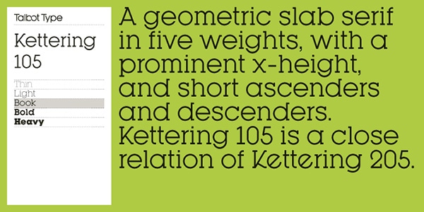
Kettering 105 is a classic geometric typeface with optimized kerning and well-thought-out spacing. Thanks to some enhancements made in ascenders and descenders, the lettering that is set in this font looks compact, natural and eye-pleasing. It is also quite universal, coming in handy for both text and titles. You can manipulate with five weights (Thin, Light, Book, Bold, and Heavy), and a vast amount of symbols, in which you can find ligatures, an essential set of characters, punctuation marks, and some others.
Karnak Pro
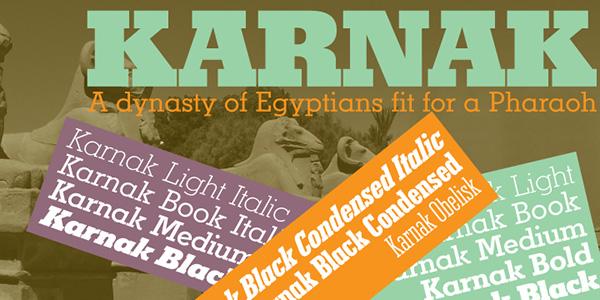
Originated from the 30s, this beautiful slab-serif typeface is defined by elegant shapes and art-deco tone. While the bold version is well-suited to put emphasis on headlines, the light version can be used to display long copy. It also has an upright and italic version. The glyph coverage enables you to write in numerous languages, including CE ones.
Saxophone
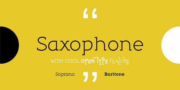
This traditional slab-serif font is enriched with some original touches that add to its decorative nature. It is elegant, geometric and monoline. Its main advantage lies in its OpenType features that are full of surprises. You will find in here original and inventive alternates, ligatures and numbers. There are two primary weights: Regular and Bold. It is applicable for both headlines and content.
Kinghorn 105
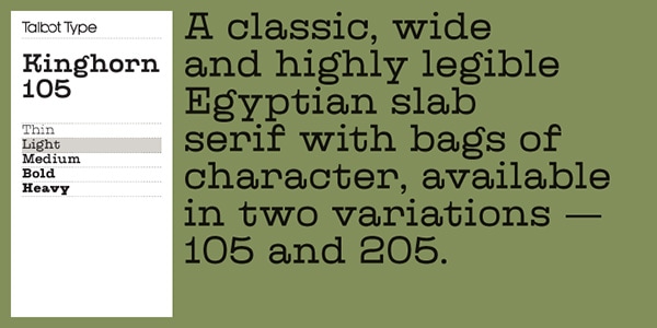
The artist tries to achieve equal weight in letters, so that the typeface can boast of a bit wide, rough yet harmonious appearance. It also looks well-balanced, hand-crafted and increasingly legible even in a small size. You are welcome to use it for showcasing text of various lengths. It comes with
- five weights (Thin, Light, Medium, Bold, and Heavy);
- two variants (105 and 205);
- a core set of Latin letters;
- extra set of accented symbols;
- digits;
- punctuation marks.
Sanchez Condensed
This is a condensed version of the first example in our collection. While its roots also lie at Rockwell Type family, it still has its characteristic traits, which make it excel from the others. Ranging from the ultra narrow to extra bold, it has weights for every taste. It is also presented in upright and italic version. As you can see, the author has prepared lots of room for improvisation.
Madawaska
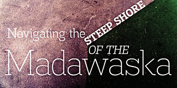
Madawaska is marked by some lovely serifs that instantly catch the eye. Though, these finishing touches are available not in every version. The product ships with
- eight weights, from ultra light to heavy;
- several extra decorative options (Jeans, with a subtle grunge appeal, and River, which looks noisy and distorted);
- two styles (regular and italic);
- and a collection of glyphs that comprises small caps, numerals, ligatures, accented characters, fractions and others.
Trivia Slab
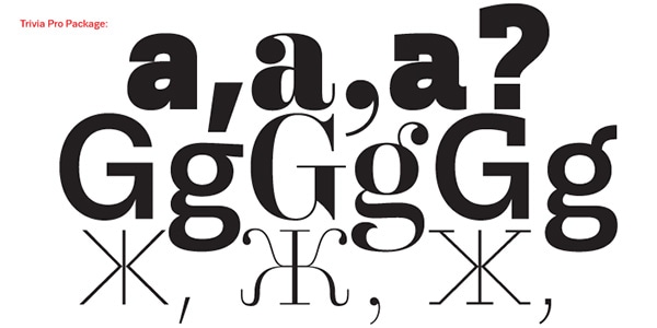
Trivia Slab magnetizes with its unique typographic features that embrace various versions of letters. Some of them bear a businesslike nature while others are bursting with artistic flavor. Unlike the majority listed above, this product thanks to an extended set of glyphs (which includes Greek and Cyrillic symbols) is able to support numerous languages, including Central and Eastern European ones both presented in uppercase and lowercase modes. And that’s not all, there are numerals and scientific figures as well.
Kettering 205
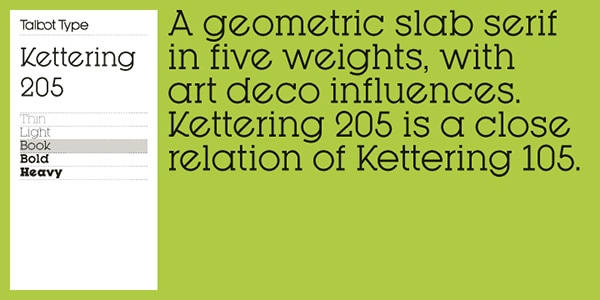
How about a typical geometric slab-serif typeface with a twist? The Kettering 205 is one of such kind. Although it is a standard font composed of sharp shapes and circles, it has a spirit of Art Deco era that gives it a particular charm, letting blend into an environment with retro-futuristic, artistic and even techno air. It is also pretty versatile so that you can apply it to titles and content.
There are five weights that are available in Regular and Oblique styles.
Kinghorn 205
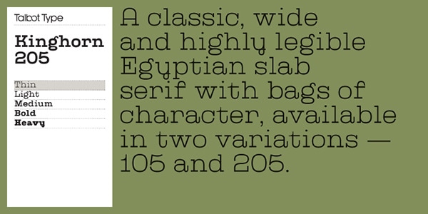
This is another wide typeface in our collection that is defined by a balance between every constituent, harmonious and robust geometric appearance, excellent legibility, boxy vibe, and meticulous attention to details. Although it is supposed to work as a display font, yet it may also benefit short copy. It is delivered in
- five weights (including two for light version and two for bold version);
- a core set of Roman letters;
- digits;
- accented characters in uppercase and lowercase;
- punctuation marks.
Non Solus
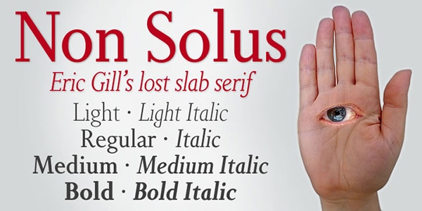
Non Solus delivers a distinct first impression that is appropriate for letterings that are in need of being stressed out. However, it is also suitable for demonstrating long copy since characters look legible and sharp in a small size and have an optimal spacing between each other. It ships with
- seven standard weights, from light to bold;
- several italic versions;
- and an enormous pack of glyphs that comprises accented symbols to speak in Western European languages.
Museo Slab
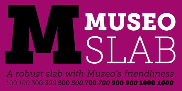
Museo Slab exudes an image of very friendly typeface that can add warmth to artworks. Set in bold, it produces an overwhelming effect, naturally highlighting any title and giving it an extra visual weight. It is presented in six weights and upright and italic styles. It possesses all the standard OpenType features and supports various Latin-based languages.
PF Centro Slab Pro
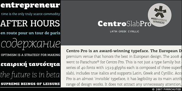
The product drives home the point of good and exquisite typeface. It pulls its identity from several factors that result in elegant and refined letterforms. It has a distinctive personality that leaves an unmistakable stamp on any design. It is a huge family that has forty items with 1519 glyph each. Among such a gazillion of characters, you will be able to find
- stylistic alternates;
- twenty OpenType features;
- symbols for supporting Greek and Cyrillic alphabet;
- true italic version.
Adelle
Adelle was created with an intensive editorial use in mind. So that it is an ideal instrument for displaying texts in magazines, brochures, flyers, books and others. It offers
- various styles including light, medium and bold;
- more than nine hundred glyphs, including alternatives, ligatures, accented characters, old style and lining numbers, inferior alphabet, small caps and others;
- several weights.
As a result, you can write in over 40 languages.
Museo
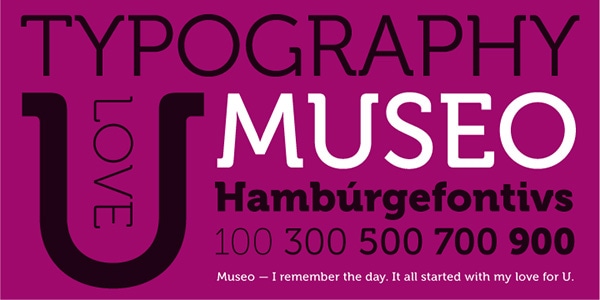
Museo is a sleeker, more delicate and polished version of the Museo Slab, that is featured several points higher. The type is clean, modern and fashionable. With a carefully adjusted kerning and spacing, the letterforms look elegant, balanced and legible, fitting to various projects. It has
- ‘case’ features for case-sensitive forms;
- contextual alternatives;
- stylistic alternates;
- fractions;
- tabular figures.
With such a huge arsenal, it is not surprising that it supports a majority of CE languages.
Brix Slab
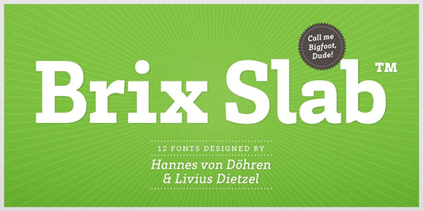
Brix Slab is a family of more than twenty fonts that can be divided into two main groups, Slab and Slab Condensed. It is intended to deal with complex typographic tasks, complying with various sorts of requirements. It has a contemporary appearance with geometric nature. You are welcome to use
- seven hundred glyphs;
- five versions for numerals;
- OpenType features;
- small caps;
- arrows;
- fractions;
- case-sensitive features;
- alternates and much more.
It provides owners with a multi-language support.
Shelton Slab
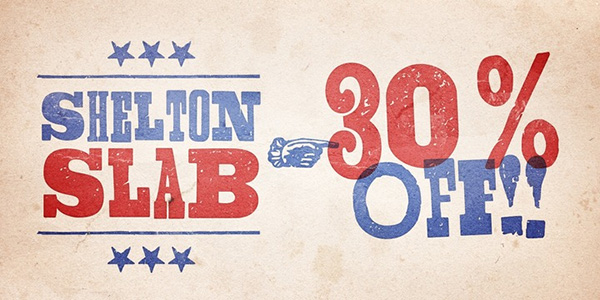
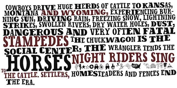
Shelton Slab is a traditional authentic geometric slab serif typeface that was skillfully enriched with grunge touches, bold forms, and whimsical notes. As a result, it has a robust architecture and bizarre behavior. It is also saturated with old-fashioned look and feeling of Wild West. Its characteristic trait is that all letters do not look alike: in such a way author has added to the product a playful mood. Although it ships just in one option, yet it is sufficient to give any poster design a nice old-timey spice.
Sketch Block
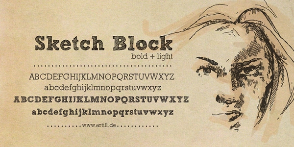
Sketch Block is a hand-sketched typeface that mimics human writing. It is a bit decorative, and at the same time, brutal. There are two weights. When used in tandem, they are capable of producing an outstanding result. Although they are applicable just for headlines, however, they do their job perfectly well, placing any title into a dominant position. Each one is available in two formats: OTF and TTF, and five licensing options.
Cassia
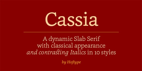
The typeface charms you with its elegant traditional look that exudes an image of refinement and subtlety. It was created to work consistent with any amount of text displayed in any font size. So that it is quite universal and multipurpose. Among ten styles you can always choose the light version or bold italic. The family consists of
- tabular lining figures;
- proportional old style figures;
- discretional ligatures;
- currency symbols;
- scientific numerals.
Inlove
Inlove is a refreshing take on a standard slab-serif typeface. Although the product preserves its geometric nature, yet it looks increasingly delicate and exquisite. It is slim, elegant and a bit fancy thanks to diagonal lines that mark several letters. It is delivered in two weights (light and bold), and one style. As for typographic features, they are pretty standard.
URW Clarendon
URW Clarendon lets instill a subtle sense of nostalgia in the artwork. It combines traits of retro and modernity resulting in a typeface with a twist. It works excellently as an ordinary and display font. Thanks to relatively wide letterforms, each character looks legible and sharp. There are almost fifty styles that can be broken into two categories: regular and oblique, and a lot of glyphs.
Serifa
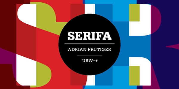
Created by Adrian Frutiger, this massive and bulky typeface is enriched with a retro feeling of the 60s. Paired with bright flat coloring it is able to achieve the greatest output. The family has almost twenty items each of which has a ton of standard and special glyphs that let the product support different languages. Along with basic styles that include regular, thin, bold and others, there are several decorative and offbeat variants that take titles to the whole new level.
Posterizer KG
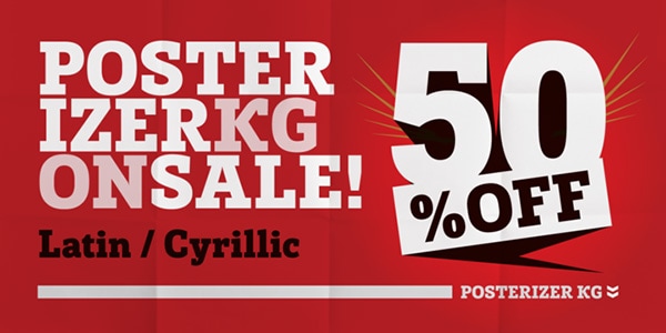
Any lettering set in this typeface will jump out at you with its heavy and solid look. The aesthetics of the font is centered around European industrial period so that it is a bit rough and rustic. However, it is not deprived of beauty.
It consists of all the letters of Latin and Cyrillic alphabet as well as digits and punctuation marks. It is available in two basic formats (OTF and TTF) and one regular upright style.
Lab Slab Pro
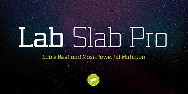
The font screams futuristic minimalist style on all fronts. Although it is super thin, yet it has a strong urban and techno appeal. Even in bold weight, it preserves its fragile nature, looking remarkably good and sleek. It is presented in
- eight weights, including UltraLight, Medium, Black and others;
- true italic version for each weight;
- alternate characters;
- small caps;
- old styling and small caps figures;
- fractions;
- ligatures;
- scientific symbols etc.
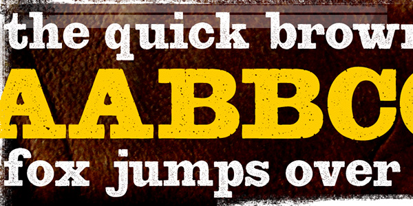
Oklahoma
The product gets the feel of Wild-Wild West period from its rustic, quirky, whimsical and a bit strange letterforms. It may only seem that font was not optimized. Indeed, everything was carefully planned and made with attention to detail. The author offers five versions (Deputy, Sheriff, Blend zone, Blend Two, and Pictures), each of which has its personality and a mixture of characters. The only drawback is that the list of typographic features is pretty poor so that you can employ it only for limited projects.
Bootstrap
Much like the previous example, this bulky typeface has a spirit of Wild West. This characteristic trait goes perfectly well with designs for outdoor restaurants, BBQ restaurants, and others. It feels comfortable on the top of natural textures, such as wood. The author has prepared two versions that are available in OTF format and include characters to write in Eastern European and Baltic languages and a small collection of old-fashioned figures and signs to finish off projects.
Suite Slab
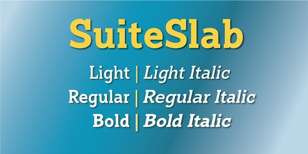
Although the typeface is not destined to bring readers’ attention to titles, yet it works great as a font for displaying long texts. It looks smooth, soft and radiates of warmth. It is offered in two styles (upright and italic) and three weights (Light, Regular, and Bold). The glyph coverage is standard; it means that you can write mainly in English and several Roman-based languages.
Sina Nova
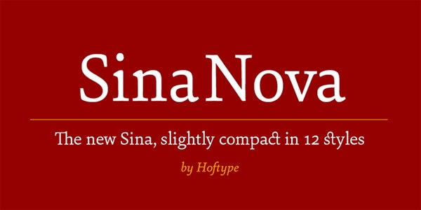
This is another first-rate slab serif typeface created by Hoftype in our collection. It is elegant and slim. The author was very conservative with sizes and proportions, so that the typeface has got compact yet slightly elongate letterforms. Delivered in OpenType format, it equips owners with all the vital symbols to freely write in various European languages as well as use some interesting alternates. You will also find
- matching currency symbols;
- fraction numerals and scientific numerals;
- old style figures;
- discretionary ligatures etc.
Today’s take on slab serif
One of the best slab serifs used today is the Archer which is good enough for extended texts. The Officina serif also carries a robust appeal that would look well on paper. A very popular one, used by Milton Glaser, was the ITC American Typewriter, used in the iconic I Heart New York Logo. The great thing about these types is that they work well even on poor quality paper.