Using Style Guides as Your First Step in Web Design
Time is a valuable part of a designer’s life, and there never seems to be enough of it for a web project. That’s why it’s so important to use design time optimally in order to produce the most work possible in limited time. In an effort to become more efficient with their time, many designers are embracing agile practices employed by developers.
One development method that can be applied to design is Continuous Integration. It encompasses an iterative process that requires developers to frequently integrate their work to prevent bugs and continually produce a working product. By applying this system to design, designers are able to produce work faster and more cyclical. Turning out solid work quickly and often can also benefit a designer-client relationship by encouraging open communication throughout the process, as it promotes a flexible workflow.
A great way to implement this efficient approach and agile state of mind is to create a website style guide as your first step in a web project. By doing this first, you create a valuable tool for use throughout your design process. For a web style guide, you write the code for all the major page elements so you can easily implement them into your layout. This differs from the traditional approach of first spending time on static mockups that don’t initially produce anything usable, and may not translate into the vision that was intended.
What Is a Web Style Guide?
A style guide tells the story of your design solution. It sets up general design principles that dictate the direction of the project. It demonstrates the image, identity and style of your product to outline a cohesive design that remains consistent in its use. Most importantly, it develops the product first, so that the site is built from the content up, rather than the layout in.
To illustrate this, consider how you would normally start a project. By building a mockup in Photoshop? By perfecting the layout and placement of elements that haven’t been designed yet? Neither of these approaches produces anything, but rather build a skeleton of a site without really filling it in. You spend a lot of time working, but have nothing to show to your client for that time. Once you’re finished, you might only hope that their vision is effectively translated to your product.
A style guide, on the other hand, is a way of developing a tangible product as an initial step – in the brainstorming phase, no less. To create one, you write the code for the interface elements; so you quickly translate the vision to digital content. After creating the substance of your site, you then start constructing the layout of the content. And since it’s all already coded, you can easily experiment with the way you present it. As you build the site, you don’t have to worry about consistency, as you have already developed it in the brainstorming phase, freeing you to be flexible throughout the design process. Your client can even give feedback as you work, so you eliminate the possibility of miscommunication and dissatisfaction.
With Postcards Email Builder you can create and edit email templates online without any coding skills! Includes more than 100 components to help you create custom emails templates faster than ever before.
Free Email BuilderFree Email TemplatesHow Do You Create a Style Guide?
There is no must-follow formula for a style guide, but there are some important aspects to include in order for it to be effective in creating something usable.
- Layout – As described, your layout is likely to change often as you build your site, so this section simply defines general principles of grid patterns, positioning and spacing.
- Branding – This establishes the identity of your product by outlining color palette and graphics.
- Typography – You’ll have flexibility in sizing your type as you test out different layouts, but you should decide on font choices here to set up type style.
- Navigation – Code everything that will be used for interaction and navigation throughout your site here, like buttons, links and menu and sidebars.
- HTML – Aspects like copy, various header styles, search fields and accompanying text is defined in this section, as it is an important detail to build consistency.
- Images and Video – If there are certain proportions you’d like to stick to when inputting video and images, identify that here, and any other details like cache settings.
- Assets – Flesh out any unique details in this section, like how elements will be dealt with in cases of exceptions or unexpected results.
- Interface Harmony – If you feel that you need to outlay all your elements to ensure cohesiveness in your design, you can place them all on an HTML page with their code snippets. This makes for easy reference while you’re building your pages, and ensures harmony in your interface.
These are some effective solutions that other designers/companies have come up with for style guides.
Twitter Bootstrap
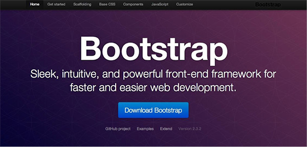
This is a well-known style guide that outlines all aspects of its internal framework, including responsive layouts, plugins and typography components. And it also has a host of add-ons, like the Flat UI pack, to offer variability.
BBC Global Experience Language
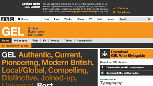
This is a great illustration of solidly defining content so that it remains consistent in every element.
Bringing Agile and Style Guides Together
The Agile approach of Continuous Integration is reflected in the use of style guides, because creating content first and then using it to build a flexible framework reflects the iterative and cyclical nature of Agile development. The iterative format comes from the ability to experiment, test and tweak the way the coded elements are used in a layout. The product produced by the end of each iterative cycle is evaluated, and if the direction it is going is unsatisfactory, it’s a simple process to alter it because the code snippets are written and easy to integrate.
With Startup App and Slides App you can build unlimited websites using the online website editor which includes ready-made designed and coded elements, templates and themes.
Try Startup App Try Slides AppOther ProductsMuch like Cascading Style Sheets (CSS), a web style guide functions by a similar “cascading” concept. Begin by defining the code for the larger, major page elements. You can then move to the definition of the more detailed aspects of your site. Each time you finish a code, you can apply it to the site’s entirety; thus, enabling you to quickly build the page without having to recreate elements as you go.
Agile development also encourages open communication, which designers can apply to interaction with clients through style guides. By revealing something solid to them right away and by producing more at each cycle, you can keep them in the loop to make sure you’re both on the same page. This process enables an adaptable workflow that continually progresses, which your clients can give feedback on throughout.
To Conclude
Using web style guides can completely change the way your design process works. It can greatly improve the fluidity of your workflow, as well as your productivity. Develop this progressive and measurable method by beginning with style guides. By coding first, building second and experimenting last, you’re sure to quickly get the results you want.


 siter.io
 pulsetic.com
 static.app
 mailpost.io