10 Type Rules for an Excellent User Experience
When it comes to websites and apps, good typography is more than just a pretty typeface. Letting has to be highly readable – and scannable – while providing a solid visual connection to the content.
It’s a pretty tall order, but something most designers can do with a little practice.
Today, we’re going to look at 10 “rules” you can follow to help create an awesome typographic user experience. (And each comes with an example of a website that’s nailed stellar typography.)
Readability Rules
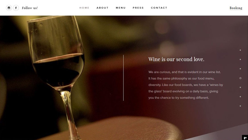
The idea that you have to use a sans serif for web typography is dated, but the idea behind it is very important: Text must be easy to read.
You’ll want to avoid typefaces that are difficult to read, often those in in the script, novelty or blackletter families. (The exception here is when it comes to using a more embellished style for “art.”)
With Postcards Email Builder you can create and edit email templates online without any coding skills! Includes more than 100 components to help you create custom emails templates faster than ever before.
Free Email BuilderFree Email TemplatesThe most readable typefaces are scannable, and don’t draw a lot of attention to themselves. These almost “invisible” typefaces are so readable that users won’t think about the lettering much at all … simply because it works.
Leave Plenty of Room Between Lines of Type
One of the keys to creating an experience users will love is line spacing. This is particularly important for mobile reading, where almost exaggerated line spacing can contribute to ease of reading.
The amount of space between lines of type comes with plenty of variables:
- Text size
- Amount of text
- Lettering style
- Screen width
There’s no major formula – sorry – but there are some things you can do:
- For most websites, set line spacing around 125 percent of the text size
- For mobile devices, set line spacing around 150 percent of the text size
- Use a loose paragraph spacing – equal to a “return” – to make paragraphs easier to scan
- Apply the eye test to see how text looks on the screen and loosen or tighten based on “feel”
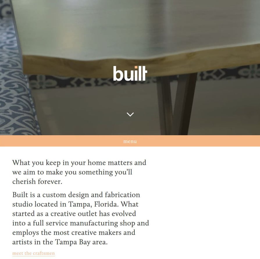
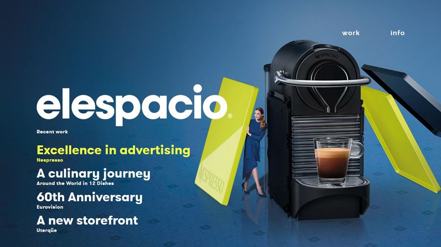
Opt for Big Bowls and Rounded Letters

Big round letters are easier to read. So are letters with large bowls – that space inside letterforms, such as the circle inside of an “o.”
Tightly packed, condensed typefaces are a lot harder to read. Wider styles, such as the typefaces used in this post, are easy to read because letters are easy to differentiate from one another. Rounder letterforms are more like the shapes children are exposed to when they are learning to read and write; that aesthetic sticks with users for a lifetime.
With Startup App and Slides App you can build unlimited websites using the online website editor which includes ready-made designed and coded elements, templates and themes.
Try Startup App Try Slides AppOther ProductsGive Type Some Size

When in doubt, go a little bigger with the text than feels comfortable. How big or small your text is depends on how much text you have to work with; pay particular attention to long blocks of text.
While different designers have different ideas of how much text you should use, most agree that the optimal number of characters falls somewhere between 45-60 characters per line. This shrinks considerably for mobile typography where about half that is more commonly accepted.
Look for Taller X-Heights

The height of letters – particularly lowercase letters – can greatly affect how easy it is for users to move through your content.
The x-height is how tall a lowercase “x” is, hence the name. Typefaces with taller x-heights are generally easier to read, meaning that lowercase letters are closer in height to uppercase letters. Look for character sets where the x-height is two-thirds to three-quarters of the height of capital letters.
Learn to Kern Display Text
Good kerning equals good typography.
You will not have time, nor do you need, to kern body copy. But when it comes to display type, kern away. You want every letter pair to set together like they were made for each other. This detail will help set your display type apart from all those websites that forget this vital step.
Think in Proportions
When creating type styles for a project, it can help to think about everything proportionally. While this might sound like a lot of math, it can make your job that much easier.
Go back to line spacing; that’s a proportion. Think about the sizes you select for body type, subheads, headlines and big display copy. Link them proportionally for easy to determining what size to make lettering and to create a sense of visual harmony. This can be a little complicated at first, but Tuts Plus has a cool tutorial to help you make sense of it.
Uniform Strokes Are Ideal

When it comes to letterforms, stroke widths are important. Letters with super-thin strokes can be difficult to read due to a lack of contrast; overly thick stroke widths can present a similar problem because they are harder on the eye. Similarly, letters with dramatic contrast between thick and thin stokes can also present issues.
The solution: Stick to letterforms with relatively uniform stroke widths. These styles are easy to use, don’t limit your background choices and much and are generally reliable in terms of readability.
Limit Typeface Usage
Two typefaces. Say it one more time: Two typefaces.
That should be the goal for any project. Too many typefaces will drive your users insane. It’s hard on the eyes. It makes reading difficult. And it’s just plain annoying.
Pick up to two typeface families – you can have one more typeface for art elements, if necessary – and stick to them. Map out how each typeface should be used. This includes determining color, size and placement of typefaces in the design. They should be consistent from page to page and for each device type.
Amp Up the Contrast
There are a handful of trendy designs out there with minimal contrast between the background and lettering. While it might look cool, it’s not user friendly and it makes reading difficult.
Your content is what makes your website special and important. Amp up the contrast between the background and type so that users can read every word on the screen with ease. (This is why white or light backgrounds with black or dark gray type are so popular.)
The more text your site includes, this more important this becomes. If you have to squint at all when looking at the text, the contrast is probably off (or the letters are too small). Color Safe is a great tool to help you create color combinations that include near perfect contrast ratios. (And it is a pretty cool looking website, too!)
Typography is just one of the many elements that goes in to creating a fabulous user experience.


 siter.io
 pulsetic.com
 static.app
 mailpost.io