Hot User Input Design Patterns for Mobile
For any mobile application, nothing will ever happen without some initial and ongoing input from the user. It is, therefore, critical that mobile product designers, developer and product managers understand the best ways to allow them to do so.
Although mobile applications – and the users who use them –are often unique, there are many common patterns (new and old) used solve this particular problem.
6 Objectives of User Input Design
Before we dive into the patterns themselves, it’s important to understand the six main objectives of user input design – I’ve detailed them below:
- Select a suitable input and data entry method
- Reduce input volume
- Design attractive data entry screens
- Use validation checks to reduce input errors
- Design required input documentation
- Develop effective input controls
An Overview of The Patterns
Keeping in mind the design objectives above, here’s an overview of the design patterns we’ve detailed in this article and at even greater length in our e-book, Mobile UI Design Patterns 2014:
- Smart Keyboards
- Default Values & Autocomplete
- Immediate Immersion (or “Lazy Signups”)
- Action Bars
- Social Login
- Huge Buttons
- Swiping for Actions
- Notifications
- Discoverable Controls
- Expandable Inputs
- Undo
1. Smart Keyboards
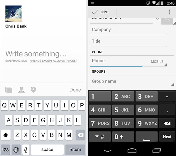
Facebook Paper, Android Contacts
With Postcards Email Builder you can create and edit email templates online without any coding skills! Includes more than 100 components to help you create custom emails templates faster than ever before.
Free Email BuilderFree Email TemplatesProblem
The user wants to enter information quickly.
Solution
Give users the keyboard that’s relevant to the data they are entering when they tap into a section of the app that allows for entering information. This saves them from having to move between the alphanumeric screens to find the right buttons, or taking an extra step to access the keyboard. Not only is this convenient for the user, it also serves as an indication of what kind of input is expected from them. Mobile platforms allow text fields to be marked accordingly and this allows for some flexibility in terms of which buttons are displayed more prominently.
For example, when entering phone numbers in address books or dialers, the user doesn’t need the full keyboard. When they tap on these fields, the numeric keypad pops up instead of the full keyboard, making the process more streamlined by doing away with the distraction of unnecessary buttons. Similarly, tapping on a URL bar in the browser brings up a slightly modified keyboard in which the “/” and “.com” buttons are displayed next to the spacebar instead of behind the symbols key. By hooking into these smart keyboard types provided by the system, your UI can adapt according to what the user is currently trying to do.
2. Default Values & Autocomplete
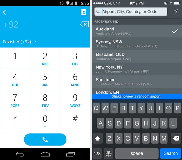
Skype, Flightboard
Problem
The user wants to complete actions quickly.
Solution
Anticipate frequently selected items and make data entry easier for the user by providing them with pre-populated default values or prompts based on previously entered data. This can be paired with autocomplete functionality like in the Google Play Store search, significantly improving the user experience by speeding things up. This pattern can be particularly useful in standardizing user input and anticipating problems before they occur. Skype, for example, automatically pretends entered phone numbers with the country code. This makes sense from the user’s perspective because they aren’t used to entering this information on a regular basis, but it’s important in this context because Skype is an international calling app.
Another way of implementing this is by saving the last item entered by the user and presenting these recently used items when the user goes to enter or search again. For example, Flightboard lists previously used locations below the search box to save users from having to type it in again. Most map or directions apps also implement this pattern, saving the user a few taps by automatically entering the user’s current location when searching for directions because that is simply the most common occurrence.
With Startup App and Slides App you can build unlimited websites using the online website editor which includes ready-made designed and coded elements, templates and themes.
Try Startup App Try Slides AppOther Products3. Immediate Immersion (or “Lazy Signups”)
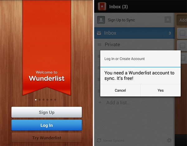
Wunderlist
Problem
The user wants to try things out before making a commitment.
Solution
More applications are letting users immediately immerse themselves in an app before anything else — even signing up or logging in.
Remember, they can only do one thing at a time, and have limited time to test every new product out. With the growing specialization of apps, it’s increasingly important that you find quality user or customer leads before nurturing them — they may hate your product or quickly realize it’s not what they wanted. Asking users for the information you need to register their accounts can be a tough ask, and lower signup conversion rates even for qualified visitors. On a positive note, by letting them immediately experience your product, they may get more hooked because of how deeply they were able to explore the app on the first experience. This can work better than the onboarding walkthrough UI pattern we cover next, because it shows the user instead of telling them how things work.
Allowing late registrations doesn’t make sense for apps like Carousel or Duolingo, which rely on user data to function, but apps like Wunderlist or Houzz can allow their users to come in and use the app before asking them to identify themselves. Oftentimes, registration comes with an added benefit which makes it more attractive, like cross-device syncing in Wunderlist or creating an idea book in Houzz. Late registrations may not always be a good idea, but the option to “try-before-you-register” can a great way to increase engagement with your app.
4. Action Bars
Facebook Paper, Behance
Problem
The user wants quick access to frequently used actions.
Solution
Provide quick access to important actions from the app’s action bar (or “toolbar” in iOS terminology). While navigation bars have dominated web and early mobile application design, the use of other patterns like drawers, slideouts & sidebars, links to everything, button transformations, vertical and content-based navigation have allowed for more simple app views that can focus on primary and secondary actions, and less on secondary navigation. Common actions are: search, share and creating new content within the app. This persistent menu helps users become familiar with the UI but also clears away some clutter by focusing on the important actions that are relevant to the user.
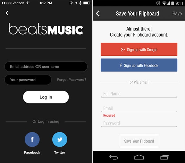
Beats Music, Flipboard
Problem
The user wants an easier way of signing up and logging in.
Solution
Integrate social sign in methods that allow users to login through their existing accounts. This means they have one less username/password combination to worry about, and at the same time, you don’t have to worry about password security as much. Facebook, Twitter and Google are the major OAuth login providers and depending on the platform and target audience, you can implement all or either of these in your app instead of having users set up a separate account that they may or may not end up using in the future. Using this signup and login pattern can also provide you with some basic data about the user (which feeds into data auto-population as they use the application), all the while making it easier on them by not forcing them to type their details into the strange new app they just downloaded. This simple feature can go a long way in drastically improving your UX, and no wonder this pattern is well on its way to becoming an expectation.
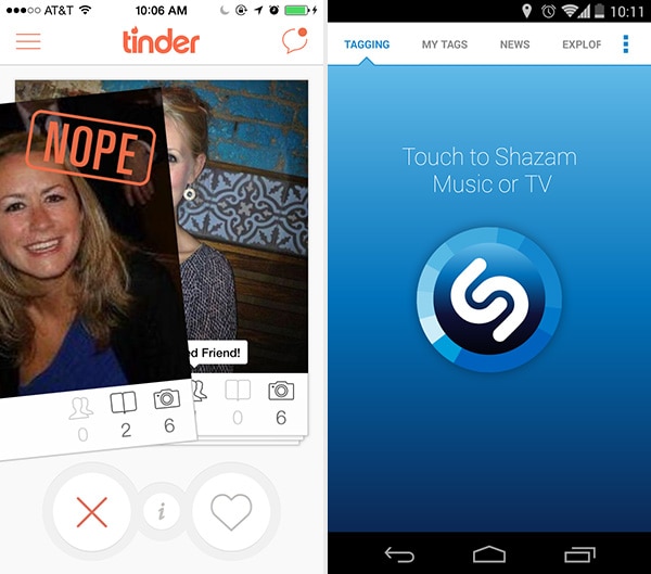
Tinder, Shazam
Problem
The user wants to know immediately which actions they can take.
Solution
The ideal touch screen tap target size may be 72px, but some apps like Tinder also give you huge buttons so you know exactly what to do and can do it quickly wherever you are and whatever you’re doing — it’s pretty hard to miss these massive buttons, even if you’re not looking. This is particularly valuable in more simple applications where there are limited actions a user needs to take and, thus, more reason to make it easier for them to take those actions in various contexts. Shazam for example, is meant to be used while watching TV or listening to music, and it really only does one thing. The huge buttons are a great improvement for the user who’s trying to multitask in this distracted state.
7. Swiping for Actions
Carousel
Problem
The user wants to focus on particular content.
Solution
Allow content to be swiped or moved out of the way. This provides users with a very intuitive way of handling the information on screen. For example, the “cards” in Google Now can be swiped away when you don’t need them to clear up the clutter; similarly, profiles in Tinder can be swiped to the right or left to indicate a positive or negative response. This pattern is different from the swipe views we talked about in navigation patterns. Here, the swipe gesture is being used for an action rather than just browsing. Some apps combine the two kinds of swipe patterns, for example Carousel, which lets you browse through multiple photos by sliding them to the side, as well as manipulating them by swiping upwards or downwards to share or hide them. Mailbox popularized the side-to-side swiping actions for email clients, allowing you to mark emails as read and schedule them for follow-up by swiping right or left, respectively. Secret let’s you discover new actions the way it let’s you discover new menus. Swipe left on a secret and you like it.
8. Notifications
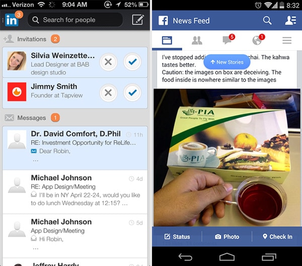
LinkedIn, Facebook
Problem
The user wants to know about new activity or actions they should take at a glance.
Solution
Highlight recent activity by visually marking new content. There are several implementations of this pattern. For example, placing a numbered badge on the label was popularized by iOS but can be seen in many other apps now such as LinkedIn, Facebook or Quora. Twitter does this as well for the notifications button but also has a small dot on top of the timeline icon to indicate new activity in a more subtle way. Another way to display notifications is with a banner that drops down within the app to show new activity. The Facebook app does this as well, showing a small popup when there are new items in the newsfeed.
9. Discoverable Controls
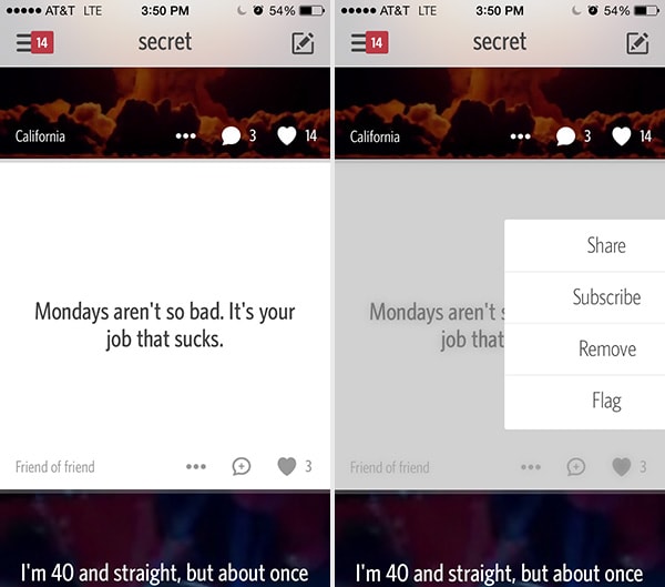
Secret
Problem
The user wants quick access to controls that are secondary or only relevant to specific sections or content in the application.
Solution
Clear up the clutter and let users discover particular actions only when they need them. These invisible controls can be accessed by any gesture – swipe, tap, double-tap, long-press etc. (which we talk about in the gestures pattern). This gives you the ability to keep these actions off-screen, saving some valuable real estate. Secret, for example, uses gestures instead of visible controls. Swipe right and you’ll expose an action menu, which is a minimalistic version of a drawer pattern which we’ve covered earlier. When creating content, users can swipe horizontally or slide their finger vertically across the background to change its color and pattern, or in case a picture is being used, its brightness, saturation or blur. There are no other controls that let you do this — nor should there be. This UI design pattern is so intuitive and clean that you’re bound to see a lot more of this type of interaction. Pinterest is another app that uses gestures to hide action buttons. A long-press on an image reveals buttons that let users pin or comment on it by dragging the pop-up control to the button.
Uber is an alternative implementation of this design pattern. Uber also let’s you toggle between booking a ride and seeing the fare estimation by tapping the slider button once you’ve chosen which ride type you want. This is a simple yet important UI design pattern that makes me smile every time I’m doing five things while trying to get a ride somewhere, but want to make sure Uber isn’t ripping me off with surge pricing. Snapchat and Facebook Messenger let you access features when you need them by swiping any friend left.
10. Expandable Inputs
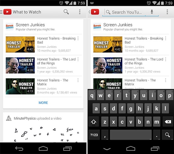
YouTube
Problem
The user wants to focus on the content instead of sacrificing screen real estate to controls.
Solution
Design controls that expand when the user taps on them. This keeps most controls out of the way until the user needs them. For example, YouTube and Facebook conserve screen space by hiding the search bar behind an icon that expands into a search bar when the user taps on it.
11. Undo
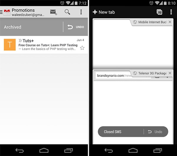
Gmail, Chrome
Problem
The user wants to take actions quickly without interruptions (ex: confirmations) but with the option of reverting accidental actions.
Solution
Provide an easy way for users to undo their actions instead of just asking them to confirm beforehand. Situations where an action can cause inconvenience or loss of data if done by accident or in haste, for example deleting an email or editing some text. The user may have completed an action because they didn’t know what to expect; a forgiving UI that let’s them experiment can be more engaging and friendly. The ability to undo is also great for power users, who will appreciate feeling more in control without the UI holding their hand throughout the process repeatedly asking if they’re sure they want to proceed. A confirmation popup can be useful at explaining what’s about to happen, but user’s may not understand the implications until they see the result of their action. In cases like these it’s best to get out of the way while providing a safety net in case of mistakes.
Get Your User’s Input
Keep track of where you’re supposed to be getting input from your users, whether they ever view those input areas, how often they use those input controls, where they’re coming from and going to in the application (i.e. the user flow) and so on. Keep rearranging, re-sequencing, re-sizing, and tweaking those controls until you get more of the desired actions. And, of course, think deeply about how the user is actually using your mobile application when they’re able to give inputs – make sure you’re not missing something obvious when designing your app.
For a deeper look at how some of the hottest companies are implementing new and existing user input design patterns as well as 45+ other patterns, check out UXPin’s new e-book, Mobile UI Design Patterns 2014. Use what you need and scrap the rest – but make sure to tailor them to solve your own problems and, most importantly, those of your users.


 siter.io
 pulsetic.com
 static.app
 mailpost.io