The Ultimate UX Design of a Google Glass App
This episode is special as instead of going through web and mobile apps Marcin explains the meanders of Google Glass Design – the first meaningful wearable computer.
1. Glass? Why should I care?
When I heard about the Google Glass project, I couldn’t have been more excited. A wearable computer created by a major company with the apparent goal of creating a platform-based environment full of dedicated apps. Could there be anything more exciting for an interface and gadget geek? Hardly.
Google Glass holds great promise. A wearable computer that unobtrusively improves our everyday life with dedicated applications and a great experience. You’re lost in a new place – you’ve got a map in front of your eyes (actually in the upper right corner, but it still counts). You’re cooking a meal from a recipe? Have it in front of your eyes all the time. You have your mobile phone in a backpack and you get a text message? Check it on Glass.
There are so many use cases in which Glass could be a great and really useful device. A kind of addition to your smartphone, but still a useful addition.
The last time I was that excited was when I heard the first rumors about the iPad. It was supposed to be called the iSlate and use MacOS X as an operating system (from today’s point of view those rumors were simply silly). Still, though, we all knew that it would be something, but nobody knew how big the dent in the universe caused by its launch would be.
When I bought my first iPad I was immediately sold to the whole idea and ecosystem. After the first hour of using of this device I couldn’t imagine life without it.
With Postcards Email Builder you can create and edit email templates online without any coding skills! Includes more than 100 components to help you create custom emails templates faster than ever before.
Free Email BuilderFree Email TemplatesWhen I first tried the Google Glass (in a pub in San Mateo) my reaction was quite different. I simply felt disappointed.
Unfortunately, Glass doesn’t hold to its promises. While Glass is a decent, nicely designed device, “the screen” quality is sub-standard and the ease of use is far from a good user experience. It simply doesn’t feel like a finished product (and it’s not, since we’re using the developers edition now). The metaphorically rough edges can really cut your fingers.
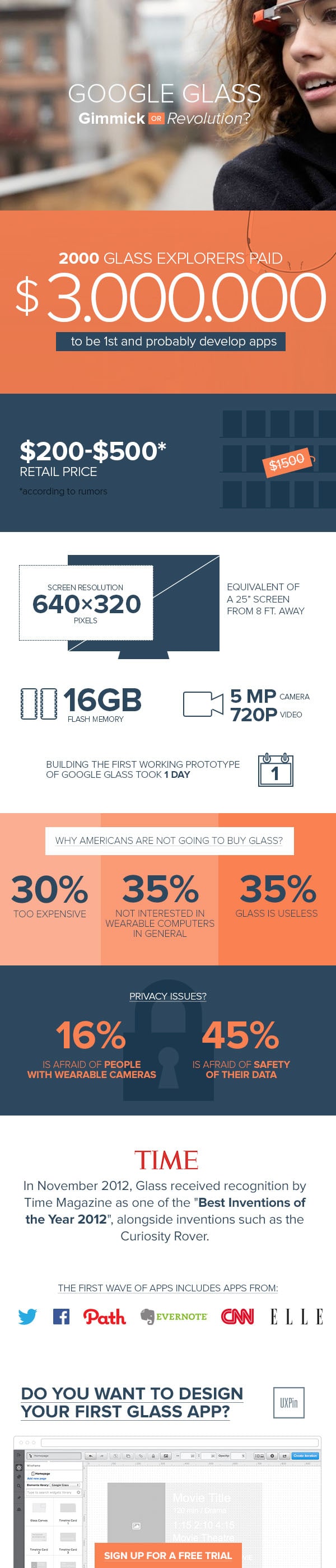
And while Glass received recognition by Time Magazine as one of the “Best Inventions of the Year 2012”, customers in the US remained unimpressed. Surveys show that 35% of consumers aren’t interested in wearable computers at all and another 35% think that Glass is a useless device. Sad numbers.
Right, so we have a device that was a great hope, but the reaction after using it is at best lukewarm. Why should we care? Why should we design apps for a platform that doesn’t exist yet?
There are two reasons:
- Glass will get better soon. Android smartphones right at the beginning were absolutely terrible. The system looked outdated the day it was launched, was extremely buggy and simply ugly. Right now Android is dominating the market and who knows whether it can be stopped. I’m quite confident that the next versions of Glass will be much better and eventually it will be either a revolutionary device or a significant part of the wearable device revolution run by Apple.
- Wearable computers sooner or later will be a revolution. This is your chance to shine on a completely new type of device. Get used to twisted devices on which users will be in need of your app. This is the age of multichannel design. Glass is the first of its kind which eventually will be an important part of the market. Practice now and rule the world later.
The current version of Glass might not win the market, but the future belongs to such devices and we’ll all find ourselves needing to design for them.
That’s exactly why at UXPin we’ve decided to introduce Google Glass components in our User Experience Design Application. Some might think it’s too early, but for us it was an obvious choice. We know that you – our users, will need it.
Let’s now consider how to design, first for wearable computers in general, then for Google Glass in detail and finally we’ll go through several examples of early Glass design.
With Startup App and Slides App you can build unlimited websites using the online website editor which includes ready-made designed and coded elements, templates and themes.
Try Startup App Try Slides AppOther Products2. Designing for wearable computers
The idea of wearable computers on a basic level has one simple rule: digital devices will be as close to you as possible. Because of this physical proximity the design of all such devices will be enormously context-dependent.
Imagine the interface of the, much rumored, iWatch – the new kind of smart watch that Apple are supposed to launch sometime in the future. Designers of the iWatch should take into account a couple of context-based facts that should affect the final design:
- Hands tend to shake affecting the ability to operate the controls of a User Interface on a small screen,
- The watch cannot be too big in order not to limit hand movements,
- The watch will certainly be exposed to severe environmental conditions (not to mention constant light reflections on the screen).
This means that the context of use must highly influence the design of both the hardware and software of the device. This is the reality of designing for wearable computers. Context rules the design. In Google Glass this rule of thumb is moved to the extreme. A device that, even slightly, interferes with our sight should be treated with extra care.
We’re not only talking about annoying design, but something that could possibly be dangerous. Let’s consider a couple of rules that you need to hold to while designing for Glass.
3. Designing for Google Glass – the rules
Google proposed four canonical rules for Glass designers:
Design for Glass
“Glass is fundamentally different from existing mobile platforms in both design and use. Build your Glassware with this in mind, and design it specifically for Glass…”
As for every really specific platform the design should be dedicated for Glass. You absolutely have to deeply consider both the context of use and the Glass Interface Guidelines.
Don’t get in the way
“Glass users expect the technology to be there when they want it and be out of the way when they don’t. Your Glassware should never take precedence over users’ lives.”
- Do not annoy users with notifications that are too frequent or unexpected.
- Provide appropriate controls for your users, so they can interact with your Glassware when desired and ignore it when they don’t. If a user misses a timeline item from your service, it should not degrade their experience.”
When it comes to getting in the way of users – it was never easier than on Glass. The temptation to show notifications on Glass that are meant to improve the engagement in a specific app is huge. They can just pop out in the right corner of your vision. A really tough thing to ignore.
All designers should be aware, though, that tormenting users with unwanted notifications is a sign of a terrible user experience, which in the case of Glass might be even dangerous.
Distraction when the user is crossing a street and your app may cause serious injury. Wearable computers are way less forgiving than any other device in the world. A great User Experience is a must!
Keep it timely
“Glass is a platform that is most effective when in-the-moment and up-to-date. Always deliver fresh and relevant content to users. You also have access to a real-time notification system that can inform your Glassware about certain events, such as when users delete or reply to timeline cards. If your Glassware responds to these notifications, do so in a timely and expected manner.”
This rule is meant to limit the irritation of users while wearing Glass. Uncertainty and doubt about the current status of the application, or simply unexplainable slowness may be very painful for the overall experience when the unfortunate application hangs out right in front of your eyes.
Glass doesn’t forgive such mistakes.
Avoid the unexpected
“Surprising the user with unexpected functionality is bad on any platform, but especially on Glass, because it is so close to a user’s daily experience. Always be honest about the intention of your Glassware and get explicit permission before you do anything on the user’s behalf.”
A surprise in front of your eyes might not always be the best thing. Glass is designed to accompany you in your daily activity and you probably wouldn’t like it to interrupt you without a reason, right? Again – it’s hard to ignore Glass.
All the above rules seem to make sense. I found among them a missing point though. Something that is fundamental and already visible in most well designed Glass apps: absolute simplicity.
The nature of Google Glass forces us to create limited, task-focused, applications, with clear interfaces based hugely on typography. Try to do something cluttered full of unnecessary features and you’ll be doomed to failure. Ugliness won’t be welcome either. Would you like to have something ugly all the time in your vision. I thought not.
Keep Google Glass apps simple and sweet.
4. Google Glass App Examples & Best Practices
So we’ve learnt that Google Glass apps should be predictable, context aware, unobtrusive and simple.
A great example of such an app is KitchMe – an application that helps you prepare meals by guiding you through the recipes. KitchMe mastered the task oriented interface that mainly uses typography to reach the desired level of clarity. Designers of this app knew exactly what would and wouldn’t work on Glass. Just take a look at the super simple list of ingredients for a certain meal. This is really what you’d like to have in front of your eyes while working in a kitchen.
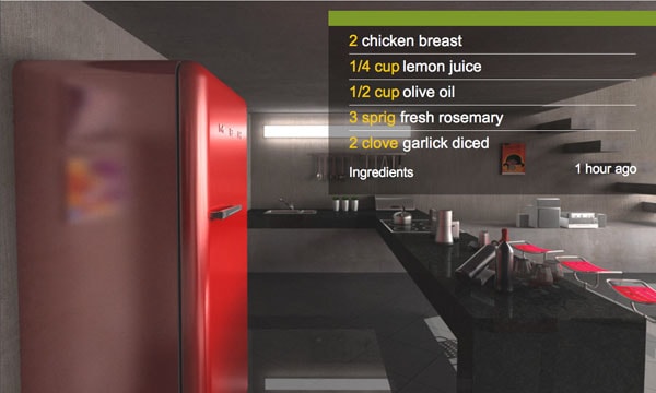
The KitchMe interface recreated as a prototype in UXPin the UX Design App.
The interface could hardly be any simpler and accurate at the same time. There’s nothing that is not needed on the screen.
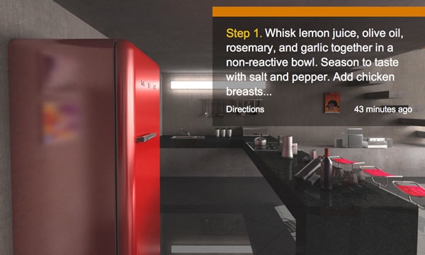
The KitchMe interface recreated as a prototype in UXPin the UX Design App.
The whole application complies with the rules established by Google and definitely is exemplary. Take a look at the full prototype here.
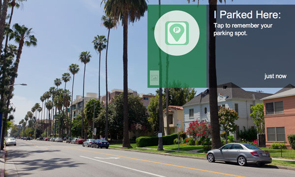
A more advanced app. but one that still complies with all the rules is Genie – the so-called Swissknife of Glassware (Google Glass applications are officially called that). Genie is a platform that aims at helping Glass users with their everyday lives. Genie will remind you where you parked your car, help you do the shopping, count calories and take some notes while jogging.
Genie’s interface is almost entirely text based. Designers were aware that to create a proper Glass experience, they had to be careful with anything that may harm the simplicity of the interface.
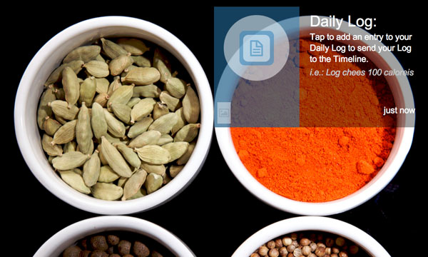
The Genie interface recreated as a prototype in UXPin the UX Design App.
Both KitchenMe and Genie use the main paradigm of Glassware – the card-based interface. There’s no obvious navigation and each card represents a state of the application.
The Genie interface recreated as a prototype in UXPin the UX Design App.
Cards use easy-to-read typography accompanied by hardly anything graphic. That’s an interface incomparable to anything that we know from the web and mobile – and that’s great. Glass, as a device, is incomparable to a smartphone, tablet or notebook.
Take a look at the full prototype of Genie’s interface here.
Finally something really special. Tesla’s application. Glassware is able to tell you whether your car is locked, how long it will take to charge, how to reach a certain destination and let you e.g. turn on your auto climate.
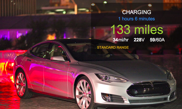
The Tesla App interface recreated as a prototype in UXPin the UX Design App.
The interface of Tesla App is slightly richer than the two previously discussed. We get a little bit of iconography and more color, but all in all this is still a well designed Glass App. All the rules that we previously discussed are respected by this interface.
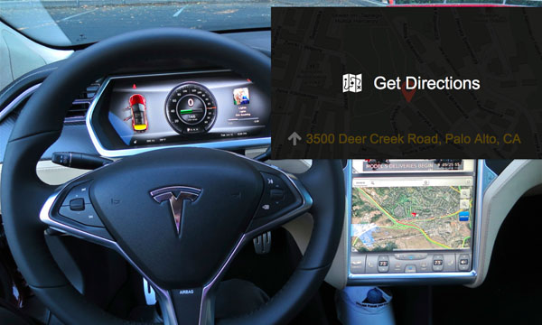
The Tesla App interface recreated as a prototype in UXPin the UX Design App.
I can see this kind of app as a standard in the near future. It’s so useful and convenient that it simply cannot be ignored. Take a look at the full prototype here.
Glassware prototyping
Now you can understand what should guide you when you’re designing a Google Glass App and you’ve seen some good examples of Glassware interfaces. Let’s quickly consider how to prototype for Glass.
Is it any different than prototyping for web and mobile? Yes and no.
No, because you’re still forming a representation of the final design and you’re working within the standards of the platform. Yes, because unlike prototyping for web and mobile, you need to present a context of use as well.
Sum up
The wearable computers revolution is just around the corner – we need to get ready for this with our design skills. Let’s start with Glass.
It might not be “the next big thing” today, but who knows what Google will make out of it tomorrow.
And a final present – enjoy this Glass infographic: