The Ultimate UX Design of: Responsive Web Design Navigation
Three years have passed since Ethan Marcotte coined the term “Responsive Web Design”. Once a revolutionary fresh idea, has in the year 2013 been transformed into a commodity. Responsive Web Design (RWD) is not a trend anymore, it’s the reality of design expression.
I’d even go so far as to say that responsive web design will soon be as obvious as the separation of css and html for semantic reasons. It’s not a question of whether to use it or not. It’s a question of whether you can implement it properly.
We live in the post pc era. Mobile devices (and soon wearable computers) are growing in importance and today we have no other choice than to accept the fact that our websites need to provide an exceptional experience for different screen resolutions. In 2013 25% of the Internet traffic will come from Smartphones and Tablets. More than 25% of TVs sold in 2012 were Smart TVs with Internet connectivity. Only responsive web design will let you easily serve all these devices and their owners.
Designers need to prototype responsive websites and coders have to code them. That’s the new reality. Welcome to the age of responsive design.
Wait a sec…What’s Responsive Web Design?
Responsive Web Design is certainly not a self-explanatory term (although it’s close to that), so I guess we need to define it. Responsive Web Design is a design approach that lets a website respond to the screen resolution of certain devices. It means that thanks to Responsive Web Design designers are able to control the look&feel of a website when it’s opened on a mobile phone, tablet, huge screen, etc.
Can’t wait to see it in action? Open UXPin in a new browser window (by the way, while you’re there you can sign up for a free trial of UXPin Design Application that lets you prototype Responsive Web Design Prototypes) and slowly make the browser thinner and wider (resize the window). You should see the layout magically adjust itself to the size of the window. It’s a simulation of opening the website on devices with different screen resolutions. If you resize the window to 320px, you’ll see how the website looks on an iPhone, etc.
With Postcards Email Builder you can create and edit email templates online without any coding skills! Includes more than 100 components to help you create custom emails templates faster than ever before.
Free Email BuilderFree Email TemplatesHere are some screenshots that will help you better understand Responsive Web Design:
You can also test the responsiveness of the Designmodo website. Resize the window and watch how cleverly it shapes the experience for different screen resolutions.
Responsive Web Design is more of a design philosophy than a single, well-defined, method. RWD is a design mindset that forces designers to consider the experience on different devices.
The Challenges of Responsive Web Design
Now that you understand what Responsive Web Design is, let’s discuss its challenges.
RWD requires designers and coders to have a multichannel design thinking process. You absolutely have to consider the experience created by your website on many different devices. It usually means that you need to completely remodel the interface for it to remain pleasurable to use. Each of the major resolutions has to be a breakpoint which reshapes the interface.
One thing that you need to remember is that Responsive Web Design is NOT about shrinking everything to fit into the screen of an iPhone. Designing an RWD website is all about providing a great, continuous, cross-channel, experience. That’s your goal and the highest concern.
With Startup App and Slides App you can build unlimited websites using the online website editor which includes ready-made designed and coded elements, templates and themes.
Try Startup App Try Slides AppOther ProductsSounds like a lot? It is! That’s the tough life we’re living.
Think about the navigation – one of the most important components of every website might get totally messed up on mobile devices if it isn’t carefully adjusted to smaller screen resolutions. The result will be fatal. Your website, without the properly designed navigation, will become an unusable experience and a source of misery.
And though most responsive websites that I know have adaptable navigation components, they are usually poorly designed. Touch screen devices have different requirements and conventions when it comes to navigation; large screens give more space to achieve clarity, etc. That’s something that you should always bear in mind when designing responsive websites. To design a continuous, cross-channel, experience, means to carefully consider whether each channel/device has been served with the same precision.
Troublesome responsive navigation is something that I want to discuss in detail. To help you understand design patterns each navigation component has been recreated as a prototype. That should let you focus on the structure and meaning of the responsive solution.
Below each example you’ll also find links that will let you reuse the patterns in your designs.
And now – let’s deal with popular navigation patterns used on responsive websites.
Shrink & Hide
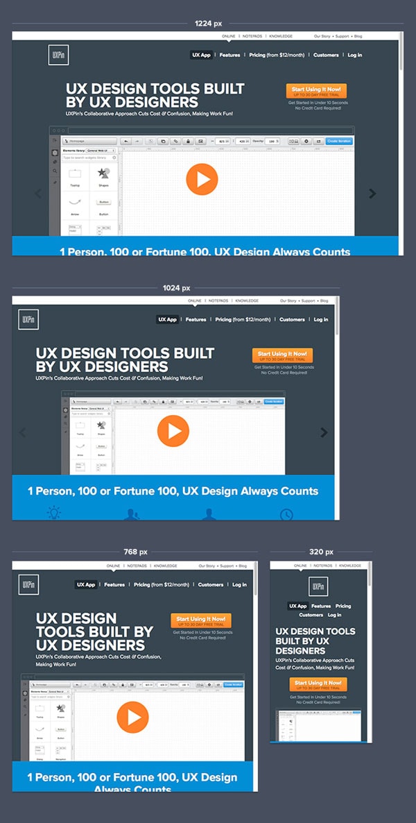
One of my favorite examples of greatly designed responsive navigation is Done Done. For a standard 1224px screen width Done Done has a simple list of links in the top menu with two clever exceptions: a button for “Plans & Pricing” and a separate “sign in” link. In both cases designers of Done Done provided visual distinction for navigational items that they considered crucial. It might not be astonishing, but it’s certainly a proper design job. Well done.
Magic happens for smaller resolutions. When you start to resize the window, you’ll notice that firstly they make the navigation links smaller (but still easily readable e.g. on an iPad Mini) and then at 720px they hide the navigation links. Designers working on the Done Done website understood that they cannot continue shrinking the font size in the navigation indefinitely so they took advantage of popular mobile app navigation patterns. Navigation links, hidden in a convenient menu, have a fixed position at the top of the screen. This means that while scrolling down the website, you have constant access to the navigation. Love it.
UXPin Responsive Prototype (open in a new window and resize it to see changes). Reuse responsive navigation patterns from Done Done in UXPin – The UX Design Application:
- 1224px
- 1024px
- 768px
- 320px
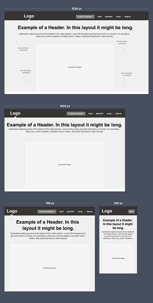
Another example of this strategy is the website of Responsive Process (surprise, right?). For smaller screen resolutions they shrink and move navigation links to provide a continuous experience of navigational ease. If you open the page on your smartphone, you’ll notice that they “fixed” the position of the navigation, just as Done Done did. Lovely. However, the new version of the website has got a tiny issue. The “Discover” link goes under the logo of the website on an iPhone. Could that be better done? Sure. They could, for example, hide links in a “Done Done” style menu.
UXPin Responsive Prototype (open in a new window and resize it to see changes). Reuse responsive navigation patterns from Responsive Process in UXPin – The UX Design Application:
- 1224px
- 1024px
- 768px
- 320px
Finally, my favorite example – Skinny Ties. This beautifully crafted website handles different devices very well. First off, their top navigation size is adjusted to the screen size (it also slightly changes position to create a consistent layout). For smaller screens designers decided to hide… the cart, search and sign in/sign up links. An excellent choice as it leaves the dropdowns fully functional (note that the content of dropdowns is also adjusted to the size of the screen), while precious space has been saved. Skinny Ties’ responsive website is a kingdom of clarity. Absolutely love it.
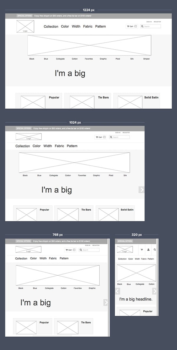
UXPin Responsive Prototype (open in a new window and resize it to see changes). Reuse responsive navigation patterns from Skinny Ties in UXPin – The UX Design Application:
- 1224px
- 1024px
- 768px
- 320px
Move & Hide
Not every navigation is suitable for shrinking and hiding links. If the navigation has many layers, complex information architecture, many links, or perhaps just typography that doesn’t really allow you to use small fonts – you must consider a different option. A popular choice is to reorder navigational links for medium size screens and hide them in a menu for smaller screens (smartphones).
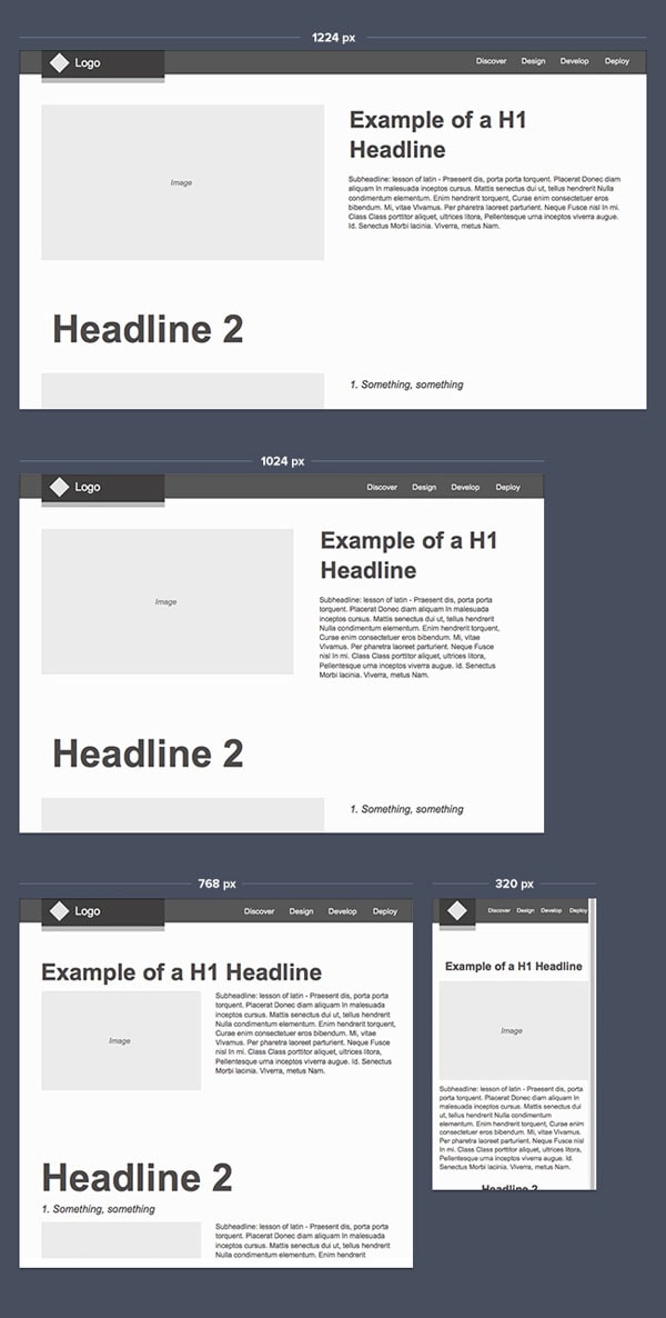
The Next Web have mastered the art of moving & hiding navigational links. Their responsive website on a wide screen presents a complex navigation pattern. Two dropdowns, iconography, five links, hidden search – that’s a group that might cause some problems. The Next Web designers had a great idea though. If you resize the window to 800px, you’ll notice that they reorganized the whole top of the website. The logo has been shrunk to fit into the top menu. The whole “all channels” column has been hidden in a menu on the left side of the screen. The iconography has been limited since they eliminated the social “follow us” links. The result is great. A clear and navigable website that properly uses popular RWD patterns (although the “all channels” in a menu is somehow strange).
A strange thing happens if you resize the window to 768px and below, or just open it up on an iPad/iPhone. Five navigation links simply disappear from the screen. It certainly adds clarity to the overall form, but if the links weren’t that important at all, why were they present on a wider screen in the first place? Perhaps I don’t understand certain business objectives, but it seems like an unnecessary complexity in the whole navigation that’s just squeezed onto the site, because it fits the wide screen.
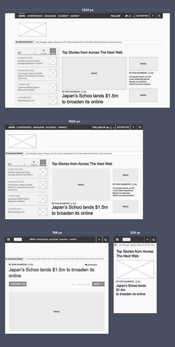
UXPin Responsive Prototype (open in a new window and resize it to see changes). Reuse responsive navigation patterns from UX London in UXPin – The UX Design Application:
- 1224px
- 1024px
- 768px
- 320px
The failure of forcing additional information into the wider screen has been avoided on Smashing Magazine’s website – another example of highly complex navigation. Smashing Magazine has three levels of navigation altogether:
- Main Categories: Books, Library, Events, Job Board
- Topic Categories: Coding, Design, Mobile, Graphics, UX Design, WordPress
- Sub Categories specific for each Topic Category
These three layers of navigation forced Smashing Magazine’s designers to create a complex responsive website. For the widest screens Smashing Magazine use two navigation columns on the left side of the screen. Screens with a size of 1224px and smaller have Main Categories at the top of the site and one column with Topic Categories and Subcategories. That’s a reasonable choice of the reorganization of the menu structure.
However, the most interesting things happen for smaller screens.
If you open Smashing Magazine on your iPad in a landscape view (1024px), you’ll notice that subcategories disappear, while Topic Categories have been squeezed below the Main Categories.
Finally, for 728px and smaller sizes of screen – all navigation links are hidden in a beautifully designed menu. The only thing that somehow might be a problem in Smashing’s pattern is the lack of a fixed position of the menu on mobile devices. That could be justified though with the notion that most users visit the website to explore the latest articles, rather than browse through categories.
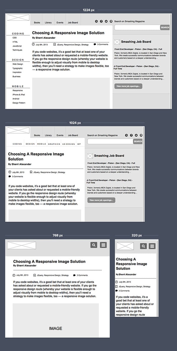
UXPin Responsive Prototype (open in a new window and resize it to see changes). Reuse responsive navigation patterns from Smashing Magazine in UXPin – The UX Design Application:
- 1224px
- 1024px
- 768px
- 320px
Sony also created an elegant pattern for their website. While almost nothing changes with the navigation between 1224px and 400px, they beautifully hide their five navigation links in a menu on the right side of the screen for 320px. This pattern keeps the website usable on an iPhone. Nicely done.
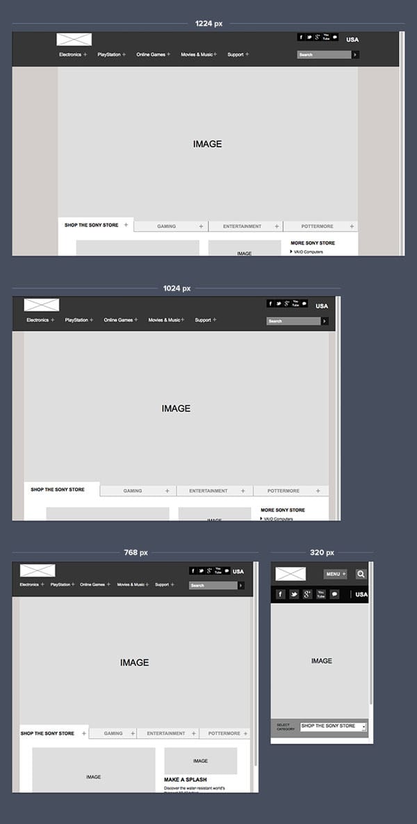
UXPin Responsive Prototype (open in a new window and resize it to see changes). Reuse responsive navigation patterns from Sony in UXPin – The UX Design Application:
- 1224px
- 1024px
- 768px
- 320px
Microsoft uses a similar pattern to the navigation on Sony.com. Microsoft designers decided to hide navigation links for smartphones in a neat menu on the right side of the screen. Unfortunately, it doesn’t have a fixed position and it’s too complex overall with dropdowns for each category (try to use it on an iPhone – a nightmare of endless scrolling). In their defense – they did repeat the navigation link in a footer, which helps users who scrolled to the bottom of the page and didn’t find what they were looking for. This kind of repeated navigation link is an excellent pattern.
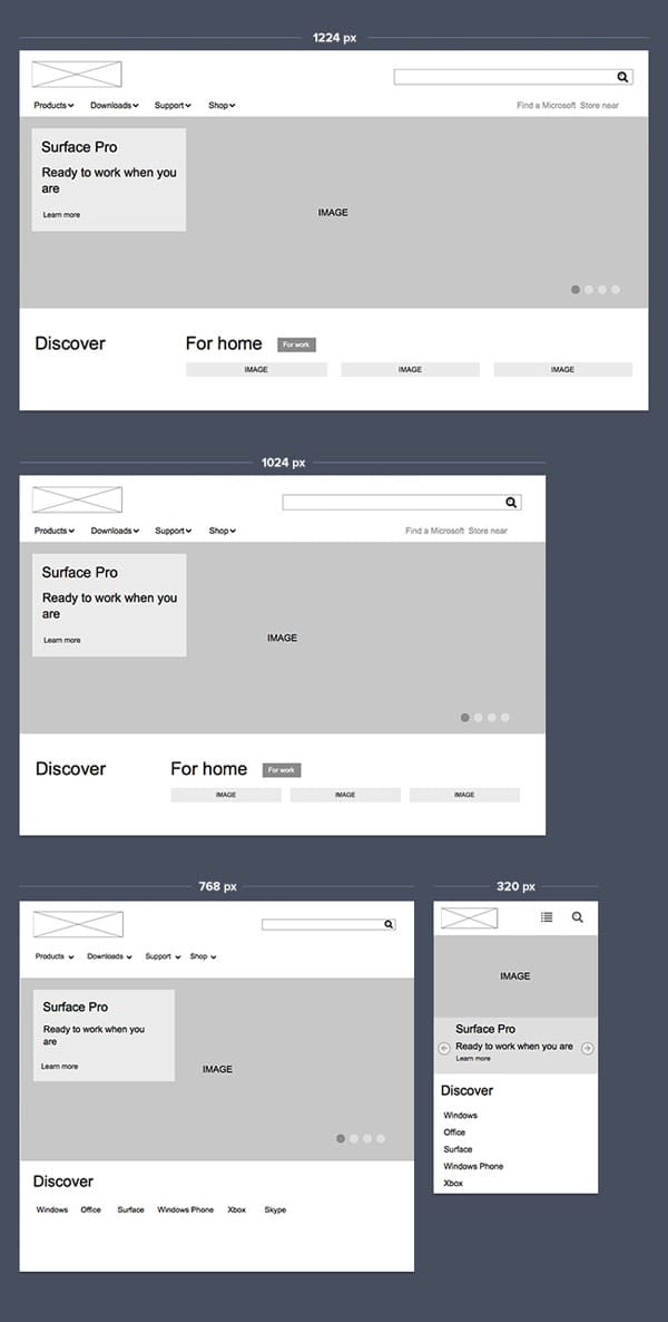
UXPin Responsive Prototype (open in a new window and resize it to see changes). Reuse responsive navigation patterns from Microsoft in UXPin – The UX Design Application:
- 1224px
- 1024px
- 768px
- 320px
Total reorganization
The last popular solution for navigation on a responsive website is total reorganization. The rule is simple: if it doesn’t fit – find a completely new order. Very pragmatic.
UX London used a simple and elegant solution. For wide-screen devices the navigation links are placed horizontally, for smaller devices – they reorganize the links in a vertical plan. The navigation remains usable, although it uses quite a lot of vertical space which forces users to do some solid scrolling in order to reach the content.
UXPin Responsive Prototype (open in a new window and resize it to see changes). Reuse responsive navigation patterns from UX London in UXPin – The UX Design Application:
- 1224px
- 1024px
- 768px
- 320px
Another example of total reorganization is the website of Food Sense. On the wide screen, the navigation is organized vertically and all the links are accompanied by iconography. For a 768px screen the navigation will be changed into a vertical order. Finally, for 320px smartphones the navigation goes to the top without the iconography (a good choice that brings more clarity to the small screen).
UXPin Responsive Prototype (open in a new window and resize it to see changes). Reuse responsive navigation patterns from UX London in UXPin – The UX Design Application:
- 1224px
- 1024px
- 768px
- 320px
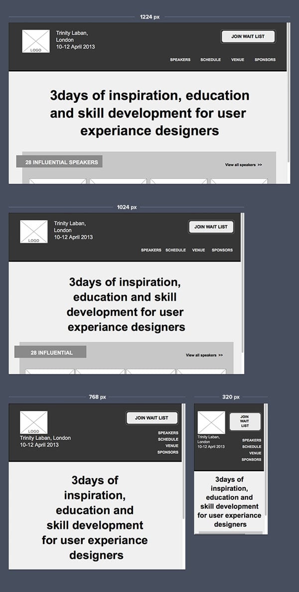
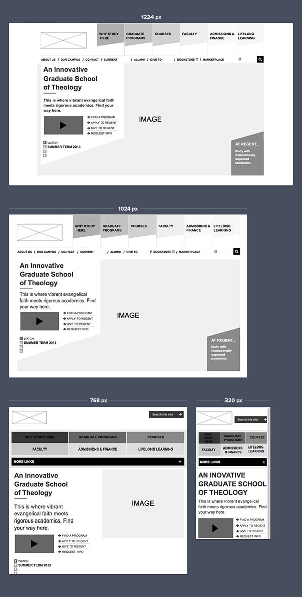
Regent Collage’s website has a similar navigation pattern. For a wide screen the navigation is neatly placed at the top of the website. Below the main category, there’s a couple of additional links. For smaller devices the main categories are regrouped in a kind of two row grid, while the additional links are hidden under the obscure “more links” button (which isn’t a pattern that you should copy…).
UXPin Responsive Prototype (open in a new window and resize it to see changes). Reuse responsive navigation patterns from Regent Collage in UXPin – The UX Design Application:
- 1224px
- 1024px
- 768px
- 320px
As you can see, all the approaches have their flaws and advantages. All in all, it’s not about kosher methods but about constant thinking about our specific use case, on a specific device/type of device. Responsive Design is entirely devoted to multichannel thinking. The matrix of devices and use cases should guide you through the meanders of the design. It usually means that you’ll be mixing, shrinking, moving, reorganizing and hiding design elements to create a perfect structure.
And that’s the right way to do it. Users before methods – that should be your design motto.
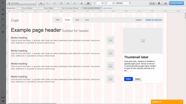
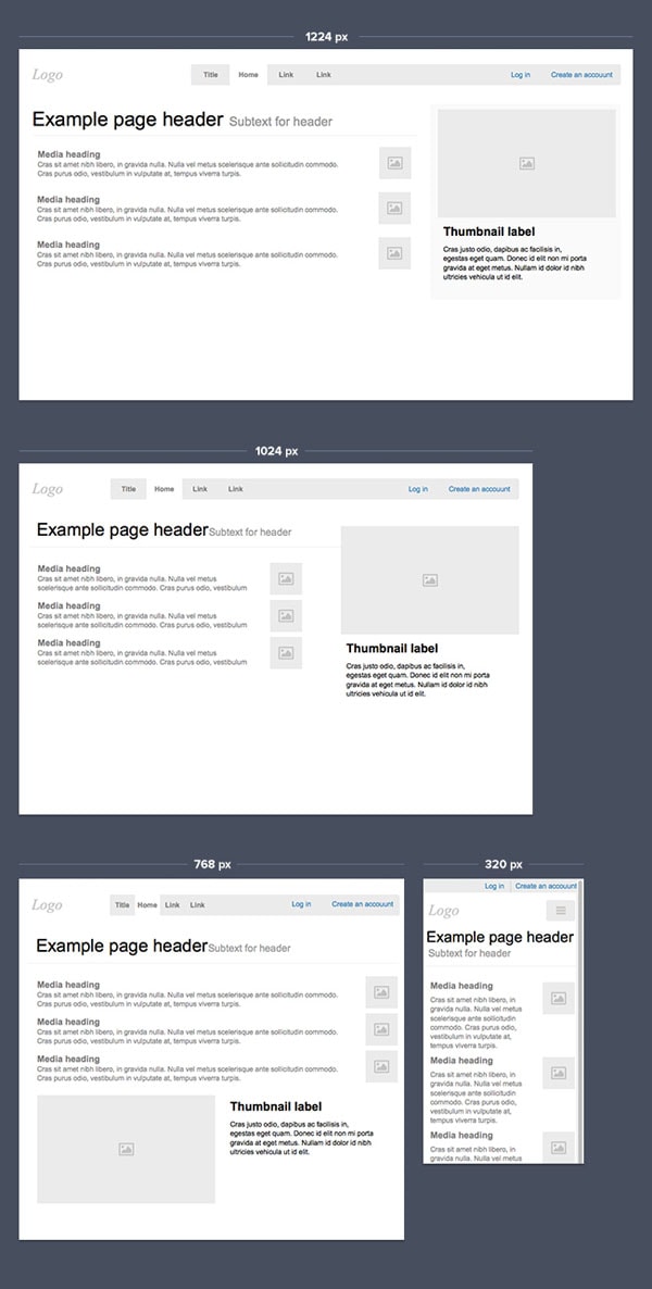
Let’s focus for a couple of minutes on a simple navigation pattern. Top, horizontal menu, 4 links, plus a sign in/register link. A pretty standard option for e.g. a SaaS landing page. I’ve started to design it from the largest screen size (1224px in my case). The other approach would be “mobile first” but I always find it more productive for simple services to design from the largest size to the smallest.
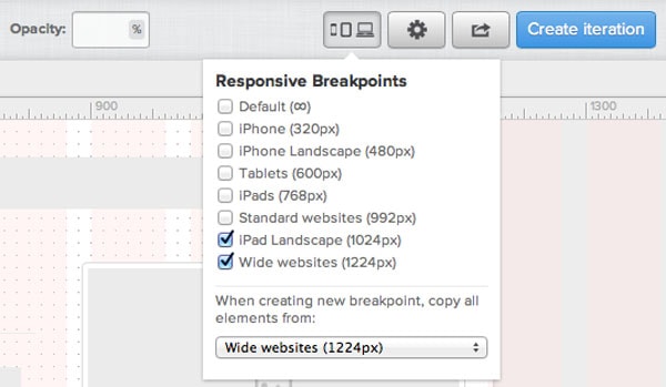
My next step is to add a responsive breakpoint for 1024px and specify what the design should look like on a slightly narrower screen. In UXPin I’m adding a responsive breakpoint from the top menu specifying that I want my design to be copied from the 1224px version.
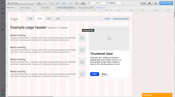
Thanks to this simple option I just need to adjust my design to a smaller screen size with a couple of movements. I also decided to shrink the content to fit the new version of my project nicely.
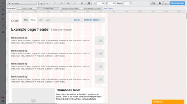
When the version for 1024px is ready I’ll add a breakpoint for 768px (since that’s an iPad screensize – it’s an important breakpoint). Usually that’s the moment when we start to play a little bit more with the navigation. In my case, however, it’s not needed. Hiding any links or changing the model of navigation would provide unnecessary complexity. Could be fancy, but we should rather look for simplicity and clarity than fanciness.
Having said that, I just moved & shrunk the navigation a little bit, while I also eliminated the whole right column and I placed the content of it below the main content. That’s an approach that I would encourage you to do. Don’t look for fireworks if they’re not necessary. Amaze your users rather than your design friends. And believe me, users will be amazed by the ease of use of the simple solution.
Finally, the most tricky breakpoint – 320px. A smartphone. It would be hard and risky to try to make the navigation links smaller. The overall result could be an untappable nightmare for a mobile user. So I decided to go radical. I’ve moved the navigation to a classic mobile menu on the right side and I placed the “log in” and “Create an account” links at the top of the site – for easy access (especially important for regular users).
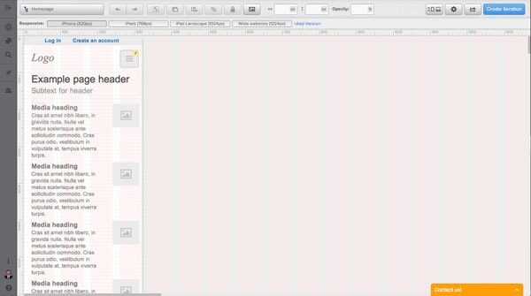
Thanks to that little trick the site is fully navigable on a small screen, but has lost nothing on the clarity of the design.
Please note though that for a 320px screen this kind of pattern was a necessity. Unfortunately, I often see it on my iPad in cases where it wasn’t necessary to hide the navigation at all.
Take a look at the video below to see all the specific steps in the process of designing the perfect responsive design navigation:
Responsive Web Design is here to stay. I have no doubt about it. That’s definitely one of the main paradigms of modern design. I sincerely hope this article will help you design amazing, fully navigable websites for any screen size.
Till the next time!


 siter.io
 pulsetic.com
 static.app
 mailpost.io