It’s Not UX vs. UI, It’s UX & UI
How differentiating the two will improve them both
Chris Bank of UXPin — the wireframing & prototyping app — compares and contrasts web UI and UX, explains why we sometimes default to building a UI, and how UI shapes UX. For analysis of examples from over 33 companies, feel free to check out Web UI Best Practices.
The web user experience (UX) is the abstract feeling people get from using a website. The user interface (UI) is what people interact with as part of that experience.
When designing a website, you want your UX to be as positive as possible — you want your users to enjoy being on your website, that’s kind of the whole point. But you can’t just say “let’s improve our site’s UX” any more than a business can say “let’s make more money.” It’s the strategies you use to create your UX, namely the UI, that can enhance (or weaken) it.
Source: UX is not UI
Typically for websites, a company’s design team works on the UI in order to heighten the UX. Menu options, buttons, text, graphics, videos — and where each are placed on the page — make up the interface, and should all be meticulously planned. These are the components of the UX, and how they’re used directly affect how the user feels.
With Postcards Email Builder you can create and edit email templates online without any coding skills! Includes more than 100 components to help you create custom emails templates faster than ever before.
Free Email BuilderFree Email TemplatesWe’ll start by giving an overview of UI with some examples, explain strategies to help you understand why a good UX depends on a good UI, and dive into why it’s easier (but necessarily correct) to create a UI instead of UX.
What Web UI Is… And Isn’t
In the context of the web, let’s say the designer chooses to include the option of dragging files around as a means of organizing content. That’s UI. Now let’s say a user prefers that site over its competitors because they like how simple it is to enjoy music for hours. That’s UX.
As discussed in Web UI Best Practices 2014, web UI is the design, presentation, and execution of the elements that make up a web page. Naturally, these are varied, since they encompass everything a designer can put in a site, but luckily, Usability.gov, a leading UX resource for recommended practices and guidelines, categorized them in a helpful and convenient way:
- Input — text field forms, date field forms, dropdown lists, checkboxes, list boxes, clickable buttons, toggles
- Navigation — sliders, search field forms, pagination, sidebars, tags, icons
- Sharing — friend lists, follow buttons, like/promote, share buttons, invite friends
- Information — text content, tooltips, message boxes, notifications, icons, progress bar, modal windows
For example, the OS X Yosemite strives for exceptional UI. While Yosemite is an operating system (rather than website), the principles behind the UI are still applicable to a web environment. The visual achievements for their clickable buttons (input) make using the system more enjoyable, its vibrant sidebars (navigation) let users see content behind the window, and its crisp notification center (information) provides need-to-know information without cluttering the desktop.
Most importantly, as Apple states in their UI guidelines, these elements help paint the bigger picture of “custom functionality and a unique user experience.” The end goal of the Yosemite UI is to allow users to enjoy a system that is sophisticated enough to be empowering without being overwhelming.
Seeing UI in Action
UI & UX are different concepts, yet undeniably connected.
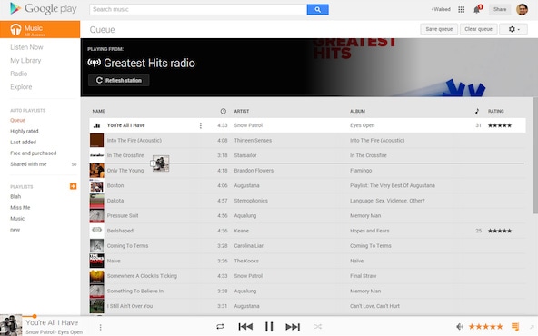
As shown in Web UI Design Patterns 2014, Google Play masters the drag-and-drop UI technique (called a “pattern”). On their site, users can drag-and-drop their songs into a playlist, then drag-and-drop them in the order they want to listen to them. As a result, the UX is improved since all the user needs to do is tell the app what songs they like and relax as the music flows. In this way, a UI choice (drag-and-drop) improves the UX through convenience and personalization.
With Startup App and Slides App you can build unlimited websites using the online website editor which includes ready-made designed and coded elements, templates and themes.
Try Startup App Try Slides AppOther ProductsSource: Web UI Design Patterns 2014
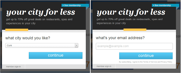
Now let’s talk about a less direct example. Let’s say a lot of your users leave your site prematurely because they don’t want to sign up to use some of the features. It’s clearly a UX problem since the experience is encouraging abandonment, but you may be able to find the root of the issue in the UI. Perhaps your current login requires too many form fields. In that case, the immediate immersion (“lazy signup”) UI pattern might be the solution. This gives the user access to most of the site without signing up. After browsing freely for a period of time, they’ll likely decide to create an account, especially if there are gated features accessible only to members.
AirBnB takes the same tactic to attracting new customers. Users without a membership are free to browse all the posts on the site as if they were members, letting them see if AirBnB has something of interest. However, once they find a room they want to reserve, they need to start an account to book it.
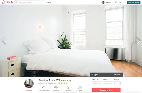
Source: Web UI Design Patterns 2014
If the UX is created in part through the UI, then the UI is created through design processes like sketching, wireframing and creating mockups. Wireframes and mockups are like the outlines or blueprints designers use before they create the actual site. These can be anything from hand-drawn sketches on napkins to digital wireframes built in a tool like UXPin or Balsamiq. This is arguably the most important phase, where designers must think theoretically about what kind of UI will create the desired UX. Just like with building house, you wouldn’t get started on construction unless the blueprint was thoroughly detailed.
For a more detailed explanation of wireframing for UIs, check out the Guide to Wireframing.
Why We Build UI Instead of UX
Shawn Borsky, UI/UX Lead Designer at Rivet Games, reminds us that the UX is more than just the result of UI. According to him, the UX is the “nucleus of a brand,” with the brand itself being “the sum of the experiences that a person has with a company or organization.” That puts a positive UX as not just the goal of UI, but the goal of all interaction with an organization.
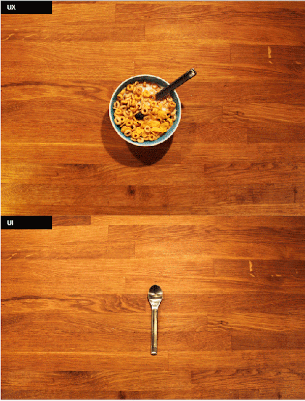
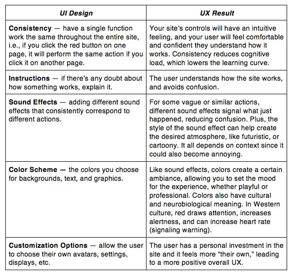
Every detail a website puts forward contributes to its users’ experiences and to the memories and impressions they form when using the site — but the site designers can’t control that experience directly. As you can see in the below illustration, it’s easy to get tunnel vision and focus just on the UI because it’s tangible (like a spoon) versus crafting the whole experience (like the enjoyment of breakfast).
Source: UX vs. UI
Likewise, if you’re cooking an important dinner, you want to put a lot of thought into it, right? You hand-pick all the best ingredients, choose the best recipes and follow them carefully, and you may even put out a nice centerpiece to create the right atmosphere. Well, a website is no different. You want to plan everything perfectly so that your visitors have a good time. While you can spend hours — even days — planning and preparing the meal itself, it’s only part of the ultimate goal of a fantastic dinner experience. That’s why it’s only worthwhile to focus on the details of UI if you keep the UX in mind.
If a UI is built with thought, attention, and care, then it will show in the UX. If the UI is built haphazardly and with little effort, or if there is a large oversight, then the UX will likely suffer. A good example of this kind of UI oversight is the iPhone’s Shift key (while we’re discussing specifically websites, mobile devices are not immune to faulty UI ruining their UX):
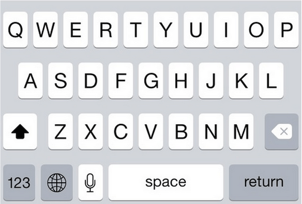
Source: Quora
Which picture has the Shift key activated and which one doesn’t? Some of the background keys are always gray and some are always white, but the Shift key has both, depending on whether or not it’s activated. This is a poor UI design, even though everything is functional and the user can still access the Shift function. The result? Users (like us at UXPin) often must delete and retype our texts, which gets frustrating, leading to a poor UX.
(Seriously, which pictures has it on?! At UXPin, we’ve had iPhones for six years, and we still get confused.)
As shown as a cautionary example in Web UI Best Practices, one of the most notorious poor UI designs is also fairly common, even for popular sites like LivingSocial.
Source: Bad UI/UX Design
This is the window that appears when you first enter the site. The problem is, there’s no way to exit it. That means casual or curious browsers unwilling to give up their email with leave the site as soon as they enter. Perhaps this is an intentional UI flaw designed to pressure users into giving up their emails but do you really want your site’s UX to be the same as a bully’s?
Now, it’s important to note that the UI here is completely functional and adequate — the colors are nice, the buttons are crisp — but the UX suffers. This is a good example of how you can have a bad UX despite a good UI. Marcin Treder, CEO of UXPin, believes that a bad UX is only sparingly acceptable if the goals are valid. “Sometimes you will see long and complicated web forms in which labels are left aligned, which creates a worse reading experience,” Treder says. “On the other hand, it can achieve the goal of better data quality by preventing people from mechanically fast form completion.”
We’re picking on bad UI designs simply because they’re easier to notice (and more fun) than well-planned UI designs. That’s because the better a UI is, the less you notice it. Just like a good film makes you forget you’re in a theater, a solid UI will immerse the user in the experience and not draw attention to itself. Not even noticing the UI produces the best UX.
How UI Shapes UX
Enough of theory — let’s see how UI choices directly affect the UX.
These examples are just a broad overview of the ways UI choices affect UX. For a problem/solution explanation of 63 such techniques, check out Web UI Design Patterns 2014.
Even though the UI shapes the UX, the first thing you want to do is decide what kind of UX you want, and then find the UI that will help bring it to life. Similarly, if there’s a problem with your UX, it’s best to identify and detail the problem before diving into which UI will fix it.
The UX of Learning UX
Understanding the difference between UX and UI is only the beginning — the key to building a good website lies in becoming familiar with how the two concepts relate to each other. While a lot of web design is compartmentalized and independent, UX and UI are almost always inherently linked.
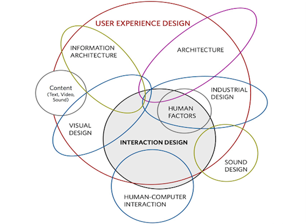
As you can see above, crafting an effective user experience requires much more than pretty visuals. Visual and sound design are only a few UI elements which feed into the UX. While you can’t necessarily control your website’s UX, you can control the UI — so make sure you have a general UX goal and design your UI accordingly.
For practical advice on building web interfaces based on examples from top companies like AirBnB, Wufoo, Linkedin, and more, check out Web UI Best Practices.