Sanctum Sanctorum: Website Designs Featuring Workspaces
Showcasing a workflow in website design has begun with creative agencies that tried to make their online portfolios look ingenious and unique through supplying them with extra process sections that break the monotony of regular text-style pages with its fantastic and creative solutions. This trend has smoothly flowed into the other one – incorporating an image or video background, which depicts workspace or distinct stages of working process into a website.
Usually they are worked into front pages in order to immediately give a glimpse of what is going on inside a company. This is a quite clever idea, especially for those who prefer to work and interact with clients via internet. Such a viable solution adds openness and transparency to the collaboration that is truly crucial for simple customers that got used to various frauds in the web. It can be also used as a peculiar decorative element that moreover is an original solution that is a claim for building a better, more serious and formal relationships with online clients.
Today we present website designs seriousness of purpose in the work of which is bolstered by images and videos that display workspaces and workflows.
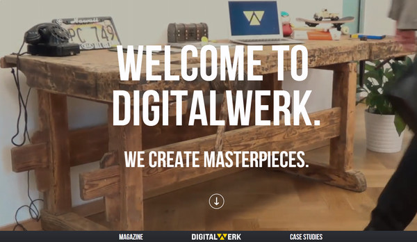
Digital Werk leverages a video background that features a peculiar workspace filled with engaging mundane things. The half-tone effect that is applied to a backdrop along with a massive, sharp type helps the greeting message to look prominent.
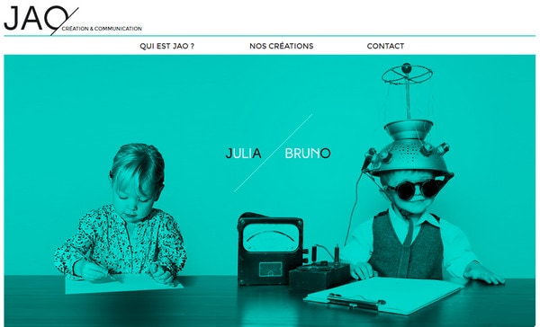
JAO Creation has an amusing welcome section that radiates children’s creativity and ease. This appealing human touch gives the website its own oomph and note of originality.
With Postcards Email Builder you can create and edit email templates online without any coding skills! Includes more than 100 components to help you create custom emails templates faster than ever before.
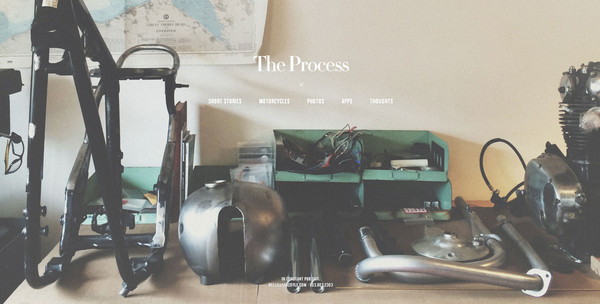
Free Email BuilderFree Email TemplatesIan Coyle presents an instrument-oriented hero area that sheds a light upon tightly-packed together motorcycle tools. As a result, the landing page looks brutal with a strong masculine appeal.
Pixel Wrapped – Unlike the previous examples, the team has adopted an approach of using funny illustration in order to demonstrate its workspace, and at the same time, to draw users’ attention to creativity and artistic skills inherent to its members.
![]()
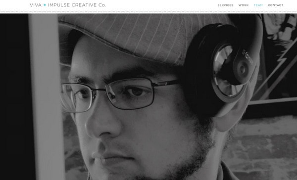
Viva + Impulse Creative – The creative agency has decided to familiarize regular visitors with not only a workspace, where the whole magic is happening, but also with stages of process and collaboration between the staff with a help of a discolored video that serves as a background for the welcome section.
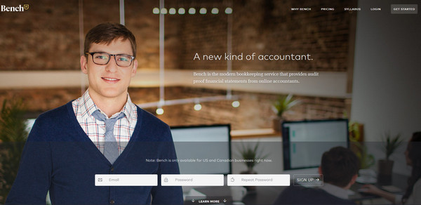
Bench – The agency has populated its website with several images dedicated to workspace and working process. Thus, the home page features an open image background with one of the team member that is supposed to engender confidence into company.
With Startup App and Slides App you can build unlimited websites using the online website editor which includes ready-made designed and coded elements, templates and themes.
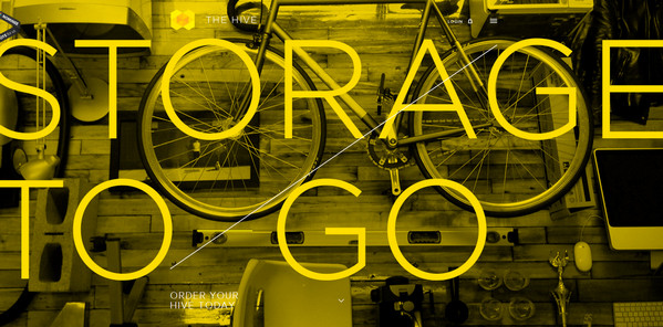
Try Startup App Try Slides AppOther ProductsHive Storage – The website design relies on a positive color scheme that employs yellow and white as two primary colors. The landing page exhibits a well-organized set of instruments and tools that can be placed in storage without hustle and bustle.
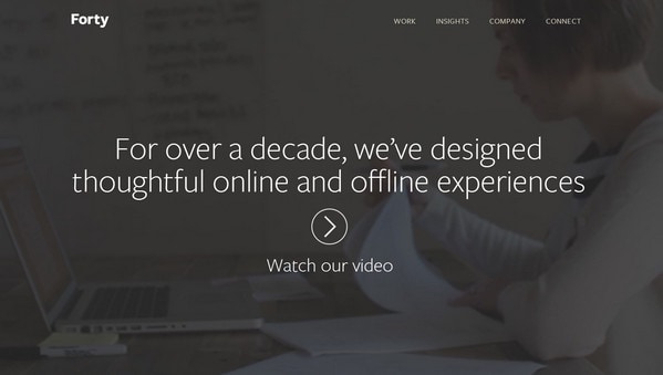
Forty – The home page has 2 things that immediately grab users’ attention: the video background that is deliberately blacked out, and the welcome message that stands in a startling contrast to it. The first one displays a small video with a working process and serves as an intro to main video.
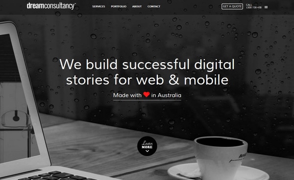
Dream Consultancy – The website looks trendy and elegant due to vibrant flat style graphics, clean solid color background and nice smooth animations. The image of a neatly-organized workspace on the front page perfectly fits into refined environment.
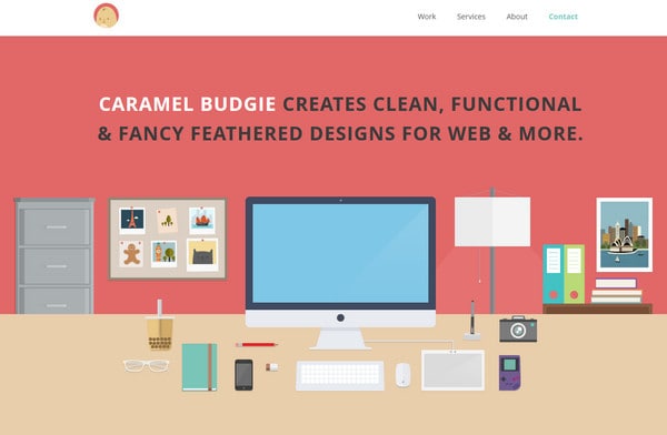
Caramel Budgie – This is another eye-catching website design in our list that is personified by classy illustration. The latter is aimed to draw attention to accuracy and professionalism of the team as well as support the tagline.
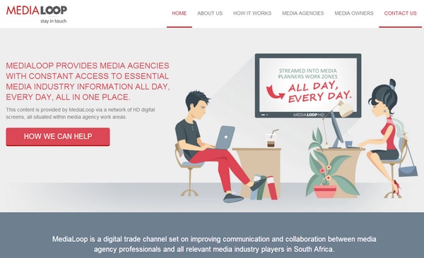
MediaLoop also showcases its workflow via a well-crafted drawing. The design adheres to the same thematic line throughout the whole website design, utilizing only illustrations and various vivid graphical components.
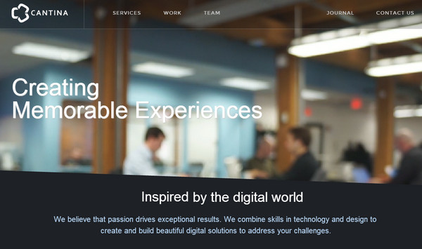
Cantina leverages a slightly blurred video that is placed in a header of the page. It helps to establish a note of busyness and organization and at the same time, allows not distracting visitors from the content.
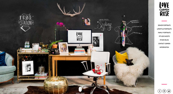
Love Carmen Rose – The website is owned by a professional photographer that as we can see, keeps her things well organized. The picture of a workspace featured on a welcome section exudes an image of creativity and love of beauty. Moreover it also plays a role of navigation, quite ingenious solution.
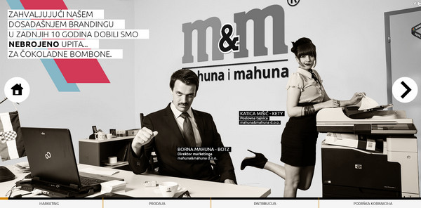
Mahuna Neuralab – The team adds a note of humor to its website by providing the home page with a set of amusing office pictures. They serve as a guide to working process and with that try to familiarize online audience with the team members.
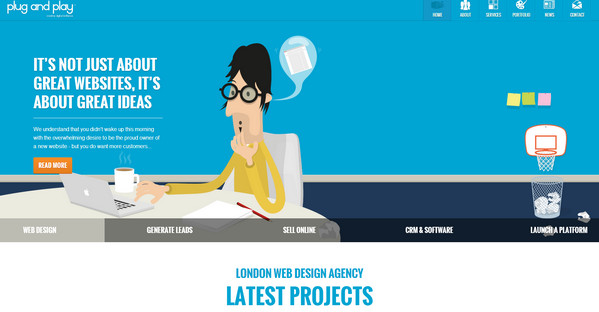
Plug and Play – The website design effectively combines both illustration and real shots of workspace. However, it is more based on a drawing-style approach that is capable of bringing a note of creativity and adding an extra flair to the whole design.
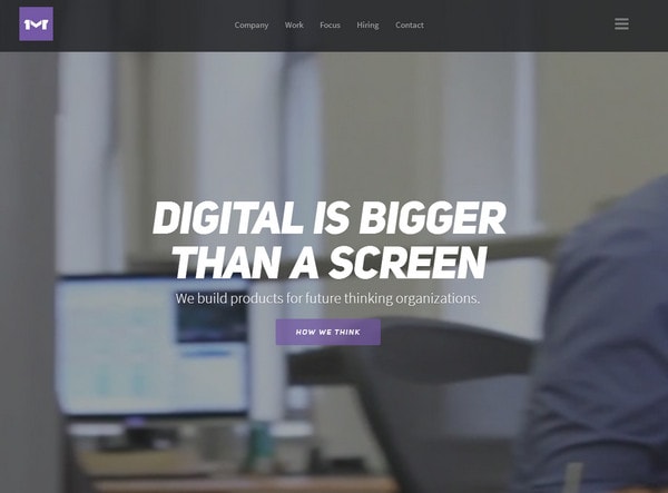
One Mighty Roar – The team skillfully employs a video background that depicts a workflow in order to deepen you into their small world. It also helps to support the presented tagline “Digital is bigger than a screen”.
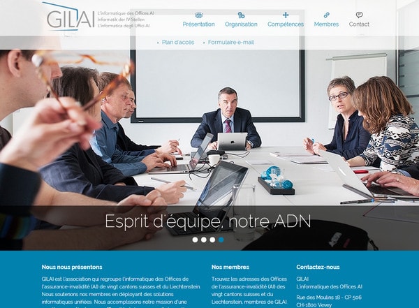
Gilai makes use of a set of images. The confidence and professionalism of the company here is presented via set of images that depict a basic workflow. This set also effectively bolsters the atmosphere of the website and recreates a nice businesslike feeling.
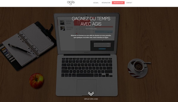
Agis – The website begins its acquaintance with the agency with a vivid image of a workspace that features standard tools: a laptop, notebook and cup of coffee – 3 main attributes of every web designer or developer.
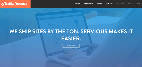
Mostly Serious – The team utilizes various images as a backdrop for landing page. Thus, it features not only workflow but also leisure time activities in order to highlight the harmony of the whole working day.
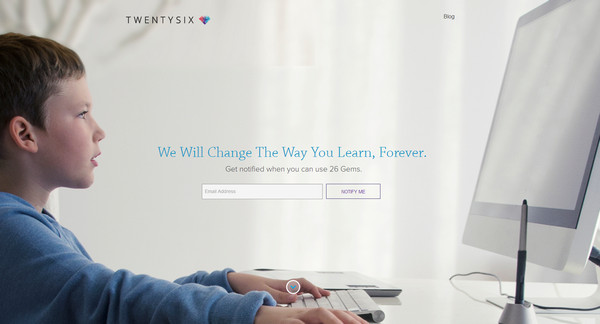
26 gems – The agency wants to reinforce its main slogan by utilizing a clean and pleasant image in the welcome section that shows how a modern child learns.
Conclusion
Demonstrating workflow and workspace became quite popular last year. Such approach helps not only familiarize regular visitors with the agency but also establish a businesslike atmosphere that should substantially boost confidence in it.
Is it a productive way of developing trusting and friendly relationships between the agency and your potential customers? Why or why not?
