How to Wireframe a Well-Converting Landing Page
We’re getting near to the end of our course (the last part will be published next week). Thanks a lot for supporting us with tweets, likes, +1 and comments. All of us here hope that you’re learning useful techniques to help you design amazing things.
Today’s part is really down-to-earth. We’re about to tackle some of the misconceptions about the work of a UX designer. Misconceptions which are based on magic. As you will see, there’s no magic in the optimisation of a Landing Page – just hard, continuous work.
The Reality of Conversion Optimisation
Clients, stakeholders and neophyte UX designers tend to be strong believers. Believers in the miracles of conversion going through the roof after the use of one, final, magic trick from the latest online tutorial. Change the copy, change the button and watch the growth go crazy – popular articles and books shout out such optimistic slogans to believers. The results are hardly as exciting though. If believers get lucky, some of the tutorials may influence important metrics. Usually though, nothing interesting happens.
The reality of rapid optimisation is not as simple as the dream, but it certainly works better for all interested parties: clients, designers, users… Optimising conversion is an ongoing endeavour which hangs on gathering knowledge about your users’ behaviour, interpreting it by the creation of different versions of a design and finally testing a couple of versions of a design simultaneously on an equal number of users from one segment (the methodology of discreet charm).
Therefore, this article is not just another ”how to boost conversion in 2 days” tutorial. If you expected anything like that – I’m afraid you’ll be disappointed. Instead of deluding you with magic tricks I have a vicious plan to:
- show you the reality of conversion optimisation
- teach you methods of documenting design that will help you methodically change your design into a well-converting machine.
Sounds like fun? Only for UX Design geeks I suppose. No worries, we’ll be pragmatic and I’ll try to be at least moderately funny. We’ll stay focused on concrete examples by discussing and practising wireframing a landing page.
With Postcards Email Builder you can create and edit email templates online without any coding skills! Includes more than 100 components to help you create custom emails templates faster than ever before.
Free Email BuilderFree Email TemplatesA landing page is a page that follows a marketing campaign and lets a user finalise their interest in a product/service by becoming a client.
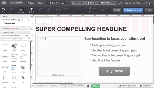
A landing page is a type of page which most of us, UX designers, are forced to create at least every couple of months. It’s the fruit of our tough relationship with marketing departments.
The special thing about designing a landing page is that it’s always a kind of reality check for a designer’s knowledge and skills. Technically simple, a landing page is able to quickly show whether we’ve created something great, average or just plainly malfunctioning. The important thing to remember though is that the first design hardly ever wins. The optimisation of conversion cannot, as believers firmly claim, be done overnight.
Dozens of tests checking the influence of every tiny fragment of the design – this is the road you should take if you want to sky-rocket your conversion rate.
I’m afraid there are no shortcuts. I spent more than three years constantly fighting for the conversion rate of one web service. Can you believe that? For three years I was analysing one service trying to spot places worth optimisation. Boring? Not at all! It was fun. I was literally forced to get to know the tiniest emanations of our users’ behaviour. Hundreds of tests, all the psychological tricks I could think of and a couple of sudden double digit growths in the conversion rate.
It all taught me that conversion optimisation is not a weekend-long job – it’s a way of developing your service.
That’s the tiresome reality. Have fun!
With Startup App and Slides App you can build unlimited websites using the online website editor which includes ready-made designed and coded elements, templates and themes.
Try Startup App Try Slides AppOther ProductsTo clear things up: Some of you may wonder what a conversion is and what a conversion rate is. Though these terms have made an extraordinary career in recent years, I noticed that it’s really easy to mess up their meanings. Nothing to be ashamed of.
Conversion – is an act in which users change a casual visit to a website/mobile app, etc. into the achievement of a desired action (business goal).
Filling in a form might be considered a conversion, so could buying a product, sharing a message with friends, etc. It depends on our business goals.
Conversion Rate – is the ratio of users who change their casual visit into a desired action (business goal).
Therefore, optimising conversion means taking certain actions with a plan to increase the conversion rate. Users are part of the conversion rate equation so you really need to get to know them. How can you do that? Test, test, test, test – by testing your designs you’re gathering knowledge which will help you make the right design decisions.
Befriend testing
So in my salvational monologue, I’ve tried to express that you need to test, test, test and… test. Most probably it’s in your power to double your current conversion rate, but, as Spiderman once said, with great power comes great responsibility. Your responsibility is to test your design conceptions and choose the best one.
If I was forced to sum up my whole experience in optimising conversion in one mere point, I’d say: optimising conversion is always surprising.
I’ll give you an example:
You’ve probably read somewhere that red and orange buttons convert the best. The argument sounds reasonable – red and orange tend to focus our attention and increase our blood pressure preparing us to take an action. Unfortunately, design is tricky and most things that we design form complex environments in which predicting results is really hard.

In a study that was conducted in my previous company, a blue button bettered red and orange. Why? The website colour was primarily red and blue buttons created a contrast that successfully conquered the user’s attention.
We wouldn’t know that if not for testing. Of course we had some hypotheses that the contrast might matter in such a case, but how could we be sure?
The testing method that we used is called – Multivariate Testing (called also: Multi-Variable Testing). Just as the term says – it’s a method of testing multiple variables. Not so clear, right? Well it’s a method of simultaneously testing many different versions of a design.
Users visiting your websites are randomly assigned to one of a number of test groups (of course one of the groups has no changes – it’s called a control group). The conversion rate of each group can show you which design performs in the best way.
Simple? Be careful. Since I strongly encourage you to test even the smallest details, you may fall into a trap. Sometimes only a bunch of small details working together can increase your conversion, while none of them on its own can make a difference. That’s really tricky.
Before we get to the core of our problem, which is: how to wireframe a well-converting landing page, let’s find the answer to two basic questions:
What to test?
- copy
- pictures
- placement of pictures/copy
- variation of design patterns
- colours
- links
- ….
Which tools can help me?
- Optimizely
- Visual Website Optimizer
How to wireframe a landing page?
If you read the couple of paragraphs above, you’re well aware that to optimise conversion you need to prepare a couple of versions of your design (using your best knowledge and experience) and test them with real users.
What’s most important though is: how to wireframe a landing page so your team will actually understand the importance of testing.
Let me guide you through the process step by step. Log in to UXPin and follow my lead.
1. Wireframe a first version of your landing page
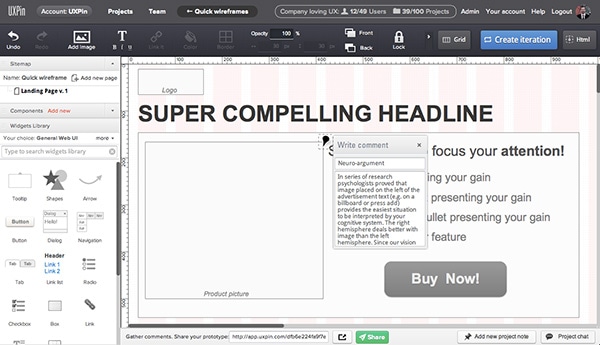
You’ll see a lot of landing pages using a classic layout with a picture on the left side and a call to action on the right. The reason for that layout comes from the knowledge gathered by psychologists working in the field of advertising.
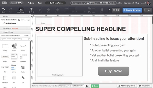
In a series of research, psychologists proved that an image placed on the left of the advertisement text (e.g. on a billboard or press ad) provides the easiest situation for your cognitive system to interpret. The right hemisphere deals better with images than the left hemisphere. Since our vision neurones are crossed – an image processed by the left eye goes directly to the right hemisphere.
Does this mean that the layout above will always better the one with an image on the right, or at the top? No. Though the neuro-argument is quite strong, it doesn’t mean that the conversion rate will definitely be higher. It just suggests that the image and text will be quicker processed, therefore there’s a chance that with a great, meaningful image and copy, your landing page will perform better. You should still test this in the specific environment that is formed by your design and your users.
2. Provide your team with arguments
It’s great that you decided to test various versions of your design. However, it gives your teammates a lot of new work to do. They will hate your guts and criticise everything that you do.
Unless… you actually provide them with reasonable arguments. Always explain your proposition and decisions. On the picture below you can see how I provide my teammates with some explanation of the page layout.
They will actually see my thought processes about the design and where I see chances for optimisation. In my experience people readily welcome such information. They kind of feel that they are a part of this optimisation process (which is true!) and are just better motivated.
3. Clearly mark the versions of your design
I usually use a site map to store the versions of my design that are about to be tested simultaneously, marking them with the appropriate version number (v1, v2) and a title (to let my teammates recognise them easier). A mere v.14 – is no good for your team – v.14: Blue Button – will work better.
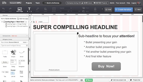
I usually copy the main version page (v1) and start by providing reasonable changes. Thanks to this I don’t start over every single time, but rather I work on the design. That’s the quickest technique for creating different versions of a design.
Since you can literally generate hundreds of versions, it’s really important that you always design based on your knowledge, not just the mathematical possibility of multiplying the design.
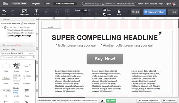
On the wireframe below I decided to eliminate the image and base the whole layout on text. It provides less visual mess and gives more space around the call-to-action button. Therefore, the effect of a contrast might be more significant. What’s more, the whole layout will be weighted towards the headline and two bullets, which are very compelling.
In some cases, this might be a very persuasive layout for a landing page.
If a certain version of a design gives me some idea of a hypothesis which is small but worth testing, I’m creating a dependable version. In the example below you can see that the only thing that I’ve changed is the button colour. I purposefully reduced the contrast between the content and call-to-action button, to check if users, forced to focus less on a button and more on a headline copy, would convert better. I called this version “v. 4.1 No image; pale button”, so the visual designer would easily understand what I’ve been trying to accomplish.
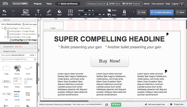
If I want a new version to replace a previous one, I create a new iteration in UXPin (by hitting the big blue button), which lets me always come back to the old version if needed. It’s a kind of version control system.
That’s the golden rule – always share and discuss the result of an optimisation test of your landing page with the whole team. Let them see what works and what doesn’t for your users and teach them how small things can affect business. It’ll pay off with great motivation, and understanding of the users and the design.
To learn more about collaboration in the UX design process have a look at the previous part of the course: Collaboration in the User Experience Design Process.
Sum Up
Hope you’ve learnt that there are no miracles in the art of optimising a landing page – just room for hard design work and a lot of testing. It actually gives you super-hero power. No tutorial will outsmart you and replace your experience.
The Conversion Rate is up to you dear friend.
Feel free to use the wireframing techniques that I’ve presented in your next project. Let me know the results!
PS. If you haven’t signed up to UXPin yet – it’s time to practise some design skills.
