2 Ways to Add Interactive Hotspots to Postcards Email Templates
Adding an interactive hotspot to your email’s image is a wonderful idea. It can significantly improve clickthrough conversions if your subscribers can click on the items you’re referring to in your copy. Additionally, these interactive hotspots can be an innovative and fun way to step up your email marketing in a creative way.
Let’s go over two different way to add interactive hotspots using Postcards.
How complicated are interactive hotspots to make?
I wanted to address this concern head-on. There are a variety of ways to go about creating interactive hotspots. One is through HTML and the other through CSS. We’ll go over both of them in this tutorial. Both of them are easy to recreate and reuse within your Postcards emails.
The design of the email
Before we get started with the coding, I wanted to address the design of the overall email. In order to make things less about the design and more about the tutorial, I’m only going to be editing the Header 5 section. In Postcards, you can add custom code to the text areas, so this header will do just fine for us.
Creating interactive hotspots through HTML
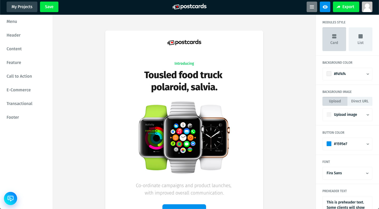
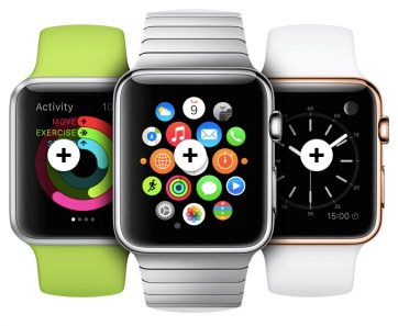
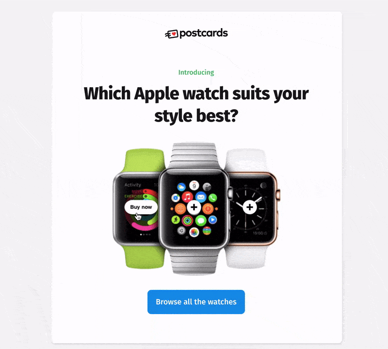
First, we need an image. I’m just repurposing the one used by default in the Postcards template to make things simpler.
In HTML I’ve generated the following code for it:
With Postcards Email Builder you can create and edit email templates online without any coding skills! Includes more than 100 components to help you create custom emails templates faster than ever before.
Free Email BuilderFree Email Templates<img src="applewatches.jpg" width="346" height="277" alt=“Three Apple Watches" usemap="#watches">
Using the <img> tag, we’ll, of course, define the source. You can upload the image directly to your provider such as MailChimp and enter its URL from there or self-host it and copy that URL as your source. Next, don’t forget to add an alt description for usability purposes. Defining the width and height is optional.
Now the fun part. We need to add the usemap attribute to the image. This is important for the <map> tag we’ll be using later. I’ve named mine ‘watches’ to go along with this example, and yes, you need to include the # before it in order to make it work with the <map> tag. That’s because the image will link to the <map> tag named ‘watches’.
Using the <map> tag
Below the <img> tag, lets start the <map> tag.
<map name="watches">
    …
</map>
Within the <map> tag we’ll be adding area coordinates that will add an interactive link. Don’t forget, the name of the <map> tag needs to be the same as the usemap attribute we’ve added to the image.
We can now start defining the areas within this map. The <area> tag takes a verity of attributes:
<area shape="" coords="" alt="" title="" href="" target="">
Let’s break them down.
The shape attribute defines whether the area is a rectangle or circular while the cords identities the size of the area. The title and alt attributes are going to be important here for users using a site reader who will need to know what the interactive hotspot links to. The remains two attributes, href and target are the standard link attributes which address where and how the link should open in the browser.
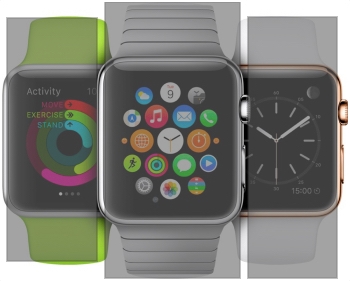
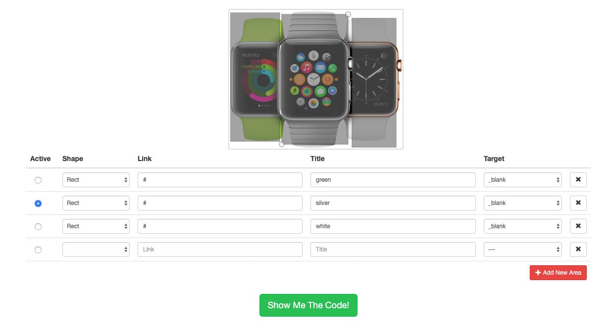
First, let’s add the area for the green Apple Watch to the left, the silver one in the center and the white one to the right. I’ve defined all of the attributes for it below:
With Startup App and Slides App you can build unlimited websites using the online website editor which includes ready-made designed and coded elements, templates and themes.
Try Startup App Try Slides AppOther Products<map name="watches"> <area shape="rect" coords="100,264,0,4" alt="A green Apple Watch" title="A green Apple Watch" href="green-watch-page.html" target="_blank"> <area shape="rect" coords="238,0,103,276" alt="A silver Apple Watch" title="A silver Apple Watch" href="silver-watch-page.html" target="_blank"> <area shape="rect" coords="246,276,335,15" alt="A white Apple Watch" title="A white Apple Watch" href="white-watch-page.html" target="_blank"> </map>
Below I’m going to give you a visual representation of the areas and their hotspots.
How do I get the coordinates?
For rectangular areas, the coordinates are the pixel position in relation to the top left of the image. It’s any opposite corners of a rectangle – the top left and bottom right or top right and bottom left corners.
If you don’t want to waste your time counting the pixels manually. You can use a handy free site like Image Map Generator which lets you mark unlimited areas right on the image and then generates the code for you.
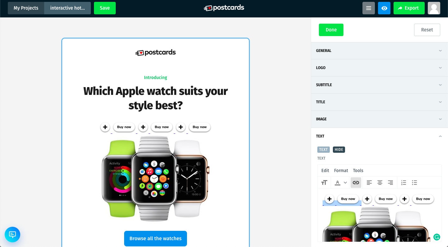
Adding the code to Postcards
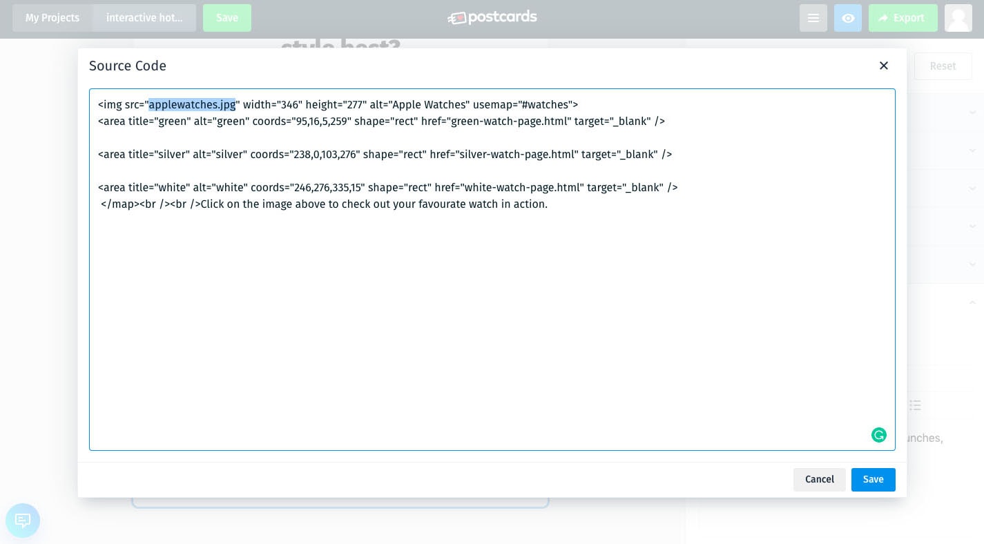
As I’ve already mentioned, you’ll need to add the whole code including the image and the map areas into the Postcards source code.
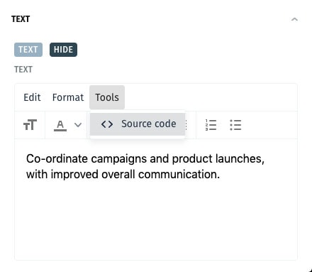
Above the text area, select Tools then Source Code. A window will pop up where you can enter your code into. It will look like the below screenshot.
Don’t forget to update the source of the image from the local file to a proper URL. Save your edits, and you’re good to go!
Adding interactive hotspots with CSS
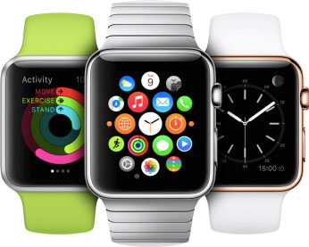
In order to use CSS, which does have a lot more creative capabilities, we’ll need to start with a new <div>. In it, we’ll include 3 link areas with a hover effect over the initial images we used already of the three Apple watches.
<div>
  <a id="green-watch" class="area" href="#">
  </a>
  <a id="silver-watch" class="area" href="#">
  </a>
  <a id="white-watch" class="area" href="#">
  </a>

  <img src="applewatches.jpg" width="346" height="277"/>
</div>
In CSS, let’s add some styles to the links. The idea here is to map out the links over the image in the position where you’d want the link to be. I’m going to divide the image up into three, equal width columns.
#watches{
position: relative;
}
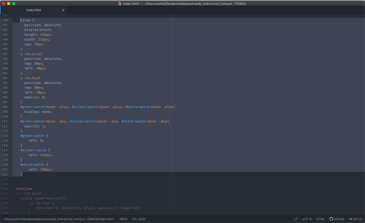
.area {
position: absolute;
display:block;
height: 145px;
width: 115px;
top: 75px;
}
#green-watch {
left: 0;
}
#silver-watch {
left: 115px;
}
#white-watch {
left: 230px;
}
Adding interactive elements
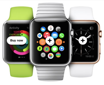
Next, we’ll need to add a default and a hover image that we will be turning on and off via CSS on hover.

Within each link, I’ve added two images, a plus, and a buy now button.
<a id="green-watch" class="area" href="#">
    <img src="plus.png" width="36" height="36" class="plus"/>
    <img src="buy.png" width="76" height="36" class="buy"/>
  </a>
<a id="silver-watch" class="area" href="#">
    <img src="plus.png" width="36" height="36" class="plus"/>
    <img src="buy.png" width="76" height="36" class="buy"/>
  </a>
  <a id="white-watch" class="area" href="#">
    <img src="plus.png" width="36" height="36" class="plus"/>
    <img src="buy.png" width="76" height="36" class="buy"/>
  </a>
Now we have to give the appropriate CSS styling to the above images.
a img.plus{
        position: absolute;
        top: 50px;
        left: 40px;
      }
      a img.buy{
        position: absolute;
        top: 50px;
        left: 20px;
        opacity: 0;
      }
I’ve positioned my two images in relation to the link areas appropriately. I’ve also made sure that the buy now button is by default not visible.
The very last thing we need to do is to style these two images on hover. Meaning, the plus sign needs to disappear while the buy now button needs to get back to full opacity.
#green-watch:hover .plus, #silver-watch:hover .plus, #white-watch:hover .plus{
        display: none;
      }
      #green-watch:hover .buy, #silver-watch:hover .buy, #white-watch:hover .buy{
        opacity: 1;
      }
Go nuts with creativity
Such a CSS trick isn’t a lot, but it does open up for many creative possibilities. You can manipulate the images in all sorts of ways. It’s your time to get creative!
Adding the code to Postcards
Before we wrap up, we need to add the code to Postcards. First things first, we need to take the HTML and enter it into the source code of our text are. It will look a little messy for now but bear with me.
After you’ve all done editing your Postcards email template go ahead and export it.
You’ll get a zip file with all of the code for your email. Open the HTML code in your editor of choice. Now, within the <head> tag of the file, scroll all the way down to the end of the included CSS and paste the CSS we’ve created together.
Next, please open the email in a browser to test it. Specifically, double check the left positioning of your links just in case and adjust them accordingly. And, you’re done.
Conclusion
Creating amazing, interactive and fun emails with the help of your own custom HTML is quite easy in Postcards. After all, Postcards is an amazing and inexpensive tool that’ll help you create fantastic emails.
However, don’t forget that it’s also a versatile tool that will work with you if you want to spice up your emails with your own creativity and ingenuity.


 siter.io
 pulsetic.com
 static.app
 mailpost.io