Background Images in Email Templates, How to Use
Use of multimedia in an email newsletter is not something new. Almost every other message in our inbox is packed with images, icons, and even gifs and videos. Rich multimedia is an integral part of the web sphere and designers and developers of email newsletters are not willing to make exceptions. Even though there are lots of limitations, yet still, we, regular subscribers, are enjoying HTML newsletters that look much like any standard web page. They have the same structure and even use the same decorative tricks. We can see beautiful call-to-action buttons that beckon us, custom fonts that enrich the messages with emotions, trendy graphics that add diversity to the experience and of course gorgeous background images that make every section shine.
Note: Check out our new email template builder – Postcards. Try it for free!
Speaking of which, use of background images is a quite controversial topic. Many designers prefer to avoid them in email newsletters. There are a couple of reasons for that.
- It is still tricky to make the background image work as you wish since you need to balance between various screen sizes. Finding the sweet spot is always an issue whether you create a website or newsletter.
- Not all mail user agents support them, so you need to make sure your email letter still looks good even without them.
- It may take some time before you find the ideal background image.
How to Use Background Images in Email Templates
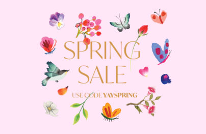
So it is much easier to avoid them at all and opt in favor of a simple, pure white canvas. However, let’s be honest without background images email newsletters lose. Just take a look at Happy fall greetings from ASU. It is the most primitive example of using background imagery; nevertheless, it saves the day here.
Not only does it enrich the design but it also strengthens the overall message, makes a strong impression and even ignites our interest, prompting us to read at least the first paragraph. You must agree: without this autumn-inspired pattern and beautiful yellow and orange coloring the newsletter would look banal, and boring, and would undoubtedly end up in the trash folder of your inbox in several seconds. But, with this backdrop, it’s a different story.
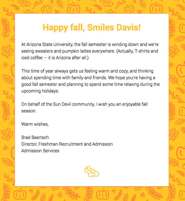
Happy fall greetings from ASU
With Postcards Email Builder you can create and edit email templates online without any coding skills! Includes more than 100 components to help you create custom emails templates faster than ever before.
Free Email BuilderFree Email TemplatesThere are some other fantastic newsletter designs in which the image backgrounds change the game. For example, From 12,481 ft. above to 800 ft. below.
The email from the Natural Retreats feels adventurous and highly alluring. It is a skilfully styled infographic that is based on various geographical facts. The illustrative approach runs the show here. Without a background image, it would certainly lose its charm and a powerful natural appeal.
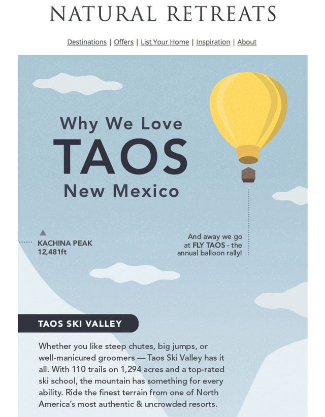
From 12,481 ft. above to 800 ft. below
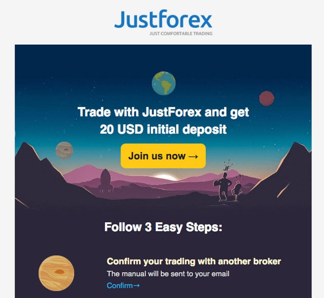
Do you think of widening new horizons?
Much like the previous example, the email newsletter from Justforex is also made with the illustrative approach in mind to produce the powerful first impression. The hero area is marked by a beautiful picture that goes perfectly well with all those fancy icons scattered throughout the design. Here, the image backdrop makes the design complete.
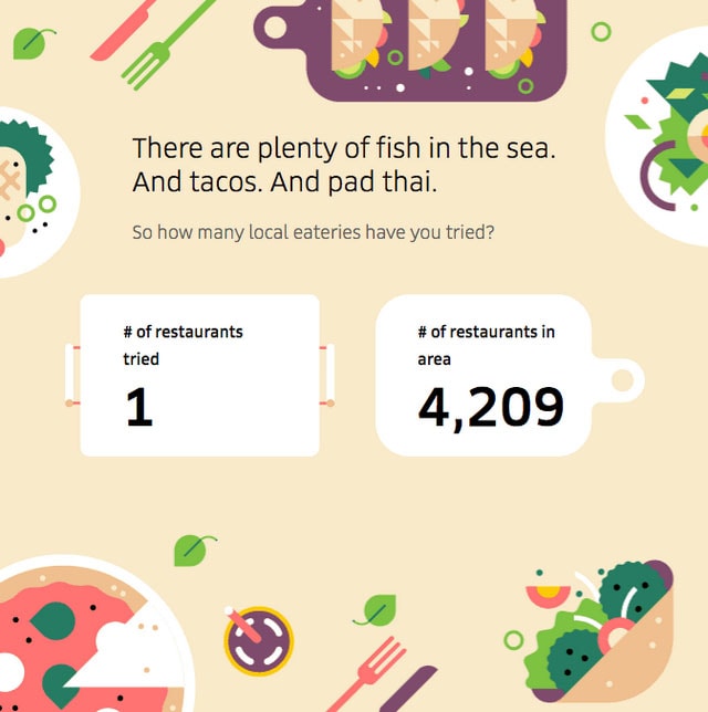
Discover what’s new to eat near you
Although the designers behind the email newsletter from Uber Eats mostly rely on images featuring delicious dishes; still the yummy illustration that is used as a background for one of the sections easily whets the appetite.
Another example from the team of Uber Eats. Here they show how to make the newsletter correspond with the current festive. Using an excellent illustration as a background they add to the letter a feeling of celebratory mood and at the same time give way to the message. Killing two birds with one stone, isn’t it?
With Startup App and Slides App you can build unlimited websites using the online website editor which includes ready-made designed and coded elements, templates and themes.
Try Startup App Try Slides AppOther Products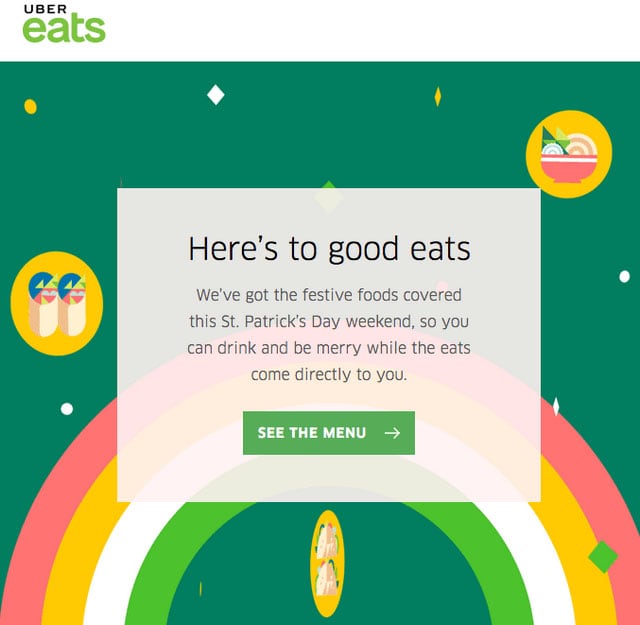
Celebrate St. Paddy’s Day with Uber Eats
Thanks to simple background images, the primitive thank you letter is transformed into a lovely artwork. It can easily make your day, not only with its generous offer but also with its adorable appearance.
Just a thank you note
From fancy illustrations to realistic images that make any email newsletter to look like a regular landing page. Consider Periodic from Studio Science that feels like a basic minimal one-page website with a one-column structure.
The newsletter has a neat appearance. It does not include many sections, so a compelling image background that makes the hero area an eye-catcher is a main visual driving force here. It favorably highlights the message and enhances the first impression.
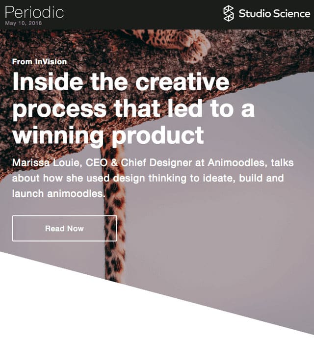
Periodic from Studio Science
The email newsletter by team Sattva resembles a standard promo page for mobile applications. We have seen a ton of them in the wild. Now it can be found in our inbox as well. The image backdrop that shows an app enclosed in white iPhone is a thing that sets the proper atmosphere here. With its vibrant appearance, it makes the design look positive and inviting as well as demonstrating the product in the best possible light.
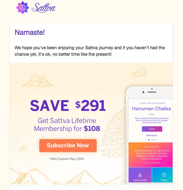
Get Sattva Lifetime Membership for $108
Speaking of happy mood, the email newsletter sent by the Starbucks team looks joyful and delightful. It is so alluring that you want to grab this cup of coffee right away. Its fancy background that was inspired by geometric trends, plays a vital role in all this. It stands behind the cheerful atmosphere as well as giving a lovely zest to the general aesthetics.
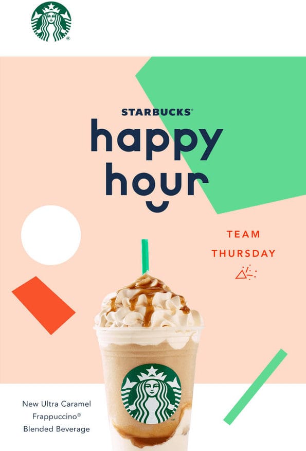
See you at Starbucks Happy Hour
Here the team uses background images everywhere. They can be seen in the header, footer, and just regular sections. They help to transform the email newsletter into a regular landing page. As a result, it looks stylish, sophisticated and up-to-date.
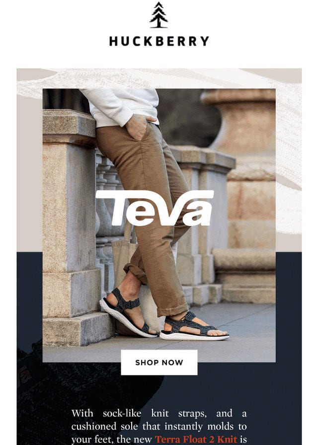
Tevas From The Future
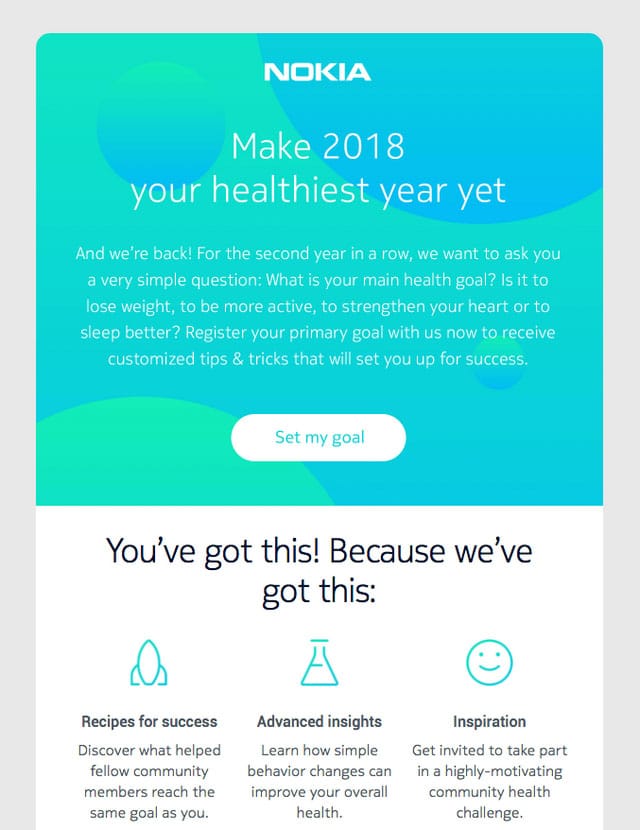
Make your goal a reality
The newsletter from Nokia team features an abstract background instead of a realistic photo. It unobtrusively directs the attention towards the message and at the same time enhances it with its artistic nature. It looks minimal, neat and clean.
The Tool of the Trade
Using background images can be challenging and tricky; nevertheless, anything is possible. If you have the right instruments at your disposal, it is not just easy but also enjoyable. One such tool is Postcards. Being a popular online HTML email newsletter builder with an intuitive drag-and-drop interface, it efficiently handles numerous issues, letting you create a newsletter of your dreams without much hassle.
You can add background images wherever you want. And it won’t require extra time, special skills or even writing code. What’s more, it has a bundle of pre-made blocks, custom fonts, pixel-perfect graphics, gorgeous color schemes and a neat modular layout that works great everywhere. Whether you are a tech-savvy person or not, you have an opportunity to please your subscribers with a true masterpiece.
With Postcards, you will be able to use background images wherever you need. For example, you can use it to make:
- the header to set the tone for the email newsletter from the first seconds like in case of Mother’s Day offer. From the get-go, it becomes obvious what event is honored here.
- the hero area to become a real eye-catcher like in case of PremiumBeat Email Updates. Here the welcome section does not differ from those alike that are used on regular websites. It is just impressive.
- the footer to look like a perfect finishing touch that will add to general aesthetics much like any other detail of the design. Welcome To Trade Coffee is a perfect example of that. Here the footer plays not only informative but also a decorative role.
- the regular section to stand out from the content flow like in case of Let’s do this. It is here where an area with search input gets an extra visual weight thanks to the proper background image.
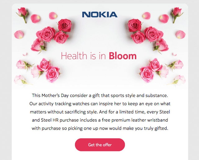
Mother’s Day offer

PremiumBeat Email Updates
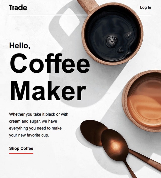
Welcome To Trade Coffee
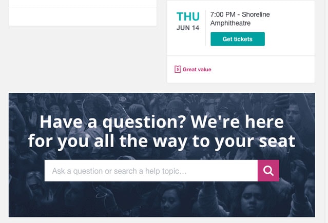
Let’s do this
Conclusion
We tend to compare email newsletters and regular web pages all the time. Sometimes they look so alike that it seems there is no difference between them. However, that’s not exactly true. If you take email marketing seriously, then you are probably aware of all the stumbling blocks that wait for you in your path of creating the ideal email newsletter. And even though HTML and CSS stand behind every email newsletter, except for the plain text versions of course, still due to various limitations, you can’t enjoy all the perks that are provided by these two popular technologies.
Remember: Try free email template builder – Postcards!
It is here where you need to balance between the graphical and textual part in order not to ruin everything. It is here where you need to take care of literally dozens of tiny things starting with a careful choice of custom fonts and ending with an adaptation of the layout for all the popular screen sizes. And it is here where you need to strike the harmony with all the favorite email clients. In one word create a perfect email newsletter where background images play an integral role in the design much like in websites can be a challenging task. However, with the right instruments like Postcards, this task turns into a child’s game where the only concern is what content to choose.