Bootstrap Grid System Guide: Examples, Tutorials, and Tricks
Bootstrap grid is at the core of the framework. The grid system underlies everything. As the Bootstrap grid is the heart and soul of the boilerplate, we choose it in the first place. In one word, it is where everything begins. If you want to embrace the power of the Bootstrap, you need to know it inside and out.
Read about Bootstrap columns, Bootstrap navbar and Bootstrap modal.
When it comes to the Bootstrap grid, there is nothing complicated whatsoever. Like anything else, it obeys general rules and is built according to principles that stay consistent. Of course, you already know that it has 12 columns, unlimited rows, and requires a .container class to build a baseline layout.
Looking for a Bootstrap online builder?
- 👉 Try our Bootstrap Builder and create unlimited projects for unlimited clients.
- 👉 Start to build a website using our Bootstrap Templates.
However, there are still some things that you may find confusing. To eliminate these uncertainties, let’s clear things up a bit.

Meaning of Numbers in Bootstrap Grid Main Classes
While the principles of the Bootstrap grid are evident, it can be a little confusing to get the grasp of the meaning behind the numbers. Let’s break the code behind .col-sm-3.
With Postcards Email Builder you can create and edit email templates online without any coding skills! Includes more than 100 components to help you create custom emails templates faster than ever before.
Free Email BuilderFree Email Templates.col-sm-3
- col – means a column
- sm – means a type of screen size; there are four different types
- sm – small screens: Majority of mid-sized cell phones with monitor size lies between 576px and 767px
- md – medium screens: Desktops with monitor size between 768px and 991px
- lg – large screens: Standard monitors with a size between 992px and 1199px.
- xl – extra large: Screens that are greater than 1200px
- 3 – means the number of Bootstrap grid columns to merge and form one area; you can put any number from 1 to 12
Note in Bootstrap 4, “xs,” the breakpoint that covers mobile phones whose monitors are less than 768px, was dropped. Instead, you should use .col-. It is applicable for layouts with less than 576px wide.
While a number at the end of a class is self-explanatory, the “sm” abbreviation may confuse some. So why do you need it? This classification of monitors, or to put it in other words range of breakpoints, allows developers to control the layout and change its behavior in order to make the website look just the way they want. This mechanism stays behind the flexibility of the Bootstrap responsiveness. For instance:
<div class="col-6 col-sm-4">Column 1</div>
This code means that Column 1 will take 1/2 width on cell-phones but 1/3 width on tablets, large desktop monitors, and even cell phones with monitors greater than 576px.
Also, it is vital to note that you are not obliged to list all the grid classes since the classes that define the behavior on the smaller screens set the behavior on larger screens until they are overridden. In our particular case, you do not need to specify .col-md-4, .col-lg-4 and col-xl-4 since col-sm-4 did it.
Vertical Alignment in Bootstrap Grid v3 and v4
If you are struggling with Bootstrap 3, vertical alignment still can be a nightmare. If you need to center a column, there are two methods.
First, you can benefit from the offset classes. The markup may look like this
<div class="row">
    <div class="col-md-2 col-md-offset-5"></div>
</div>
The second method implies the utilization of time-proven margin: auto technique. The markup is this
With Startup App and Slides App you can build unlimited websites using the online website editor which includes ready-made designed and coded elements, templates and themes.
Try Startup App Try Slides AppOther Products
.col-centered{
    float: none;
    margin: 0 auto;
}
As for other lucky guys who prefer the fresher, more updated and advanced version of the boilerplate (aka the 4th one) everything is done with just several lines of code thanks to Flexbox.
Use align-self-center like this
<div class="row">
           <div class="col-8 align-self-center">
                <div>
                    Center
                </div>
           </div>
           <div class="col-4 align-self-center">
                <div>
                    Center
                </div>
           </div>
</div>
You can also employ in-built display utils such as display:table, display:table-cell, display:inline to center things. The markup may look like this
<div class="row">
    <div class="col-sm-12 d-table">
        <div class="card card-block d-table-cell align-middle">
            I am centered vertically
        </div>
    </div>
</div>
How to Create 5 Equal Columns in the Bootstrap Grid
This one is tricky yet very exciting. Even though the Bootstrap grid is based on 12 columns, it is still possible to create a structure that uses an odd number of columns. If you are using the latest version of the boilerplate, everything is easy peasy. Thanks to Flexbox, you define five columns, and they divide the area into equal portions. The code snippet looks like this
<div class="row">
   <div class="col">
      1 of 5
   </div>
   <div class="col">
      2 of 5
   </div>
   <div class="col">
      3 of 5
   </div>
   <div class="col">
      4 of 5
   </div>
   <div class="col">
      5 of 5
   </div>
</div>
However, if you are still working with the third version, you need to create a special class where you set the specific width to each column and add it to your general stylesheet. The class should look like this
.col-xs-5ths,
.col-sm-5ths,
.col-md-5ths,
.col-lg-5ths {
    position: relative;
    min-height: 1px;
    padding-right: 15px;
    padding-left: 15px;
}

.col-xs-5ths {
    width: 20%;
    float: left;
}

@media (min-width: 768px) {
    .col-sm-5ths {
        width: 20%;
        float: left;
    }
}

@media (min-width: 992px) {
    .col-md-5ths {
        width: 20%;
        float: left;
    }
}

@media (min-width: 1200px) {
    .col-lg-5ths {
        width: 20%;
        float: left;
    }
}
After that, you can freely use it in the document like this
<div class="row">
    <div class="col-md-5ths">
       ...
    </div>
</div>
Helpful Resources for Bootstrap grid
Although Bootstrap grid is not responsible for the decorative part of the website since its job lies in silent support of the entire interface, nevertheless, there are still some valuable tools that help to handle it efficiently.
Bootstrap Grid Generators
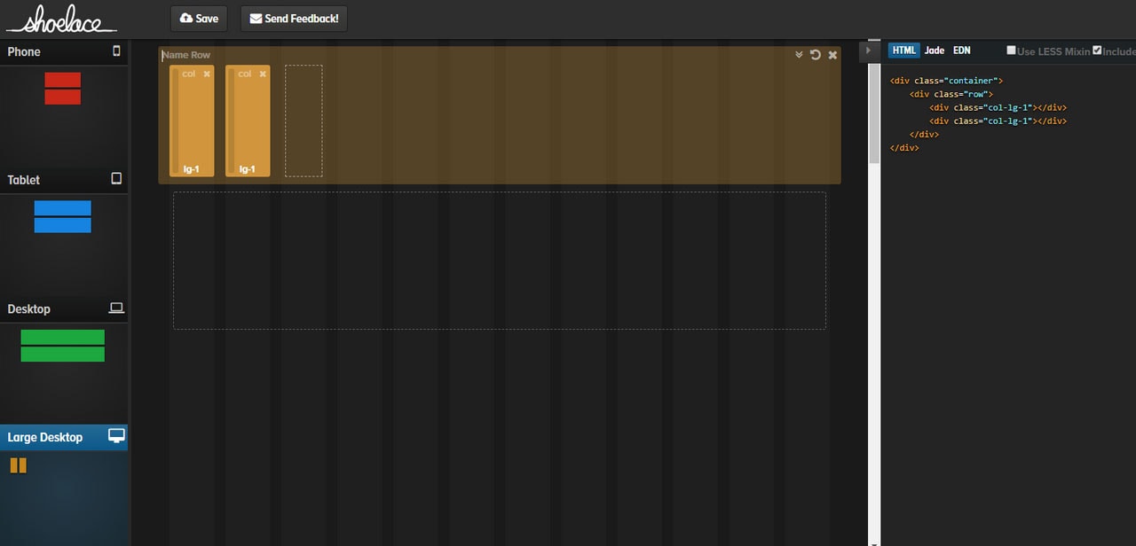
Shoelace is a popular tool to build Bootstrap grids. Manipulate rows and columns as well as switch between phone, tablet, desktop, and large desktop previews to edit each of these layout versions.
Layoutit
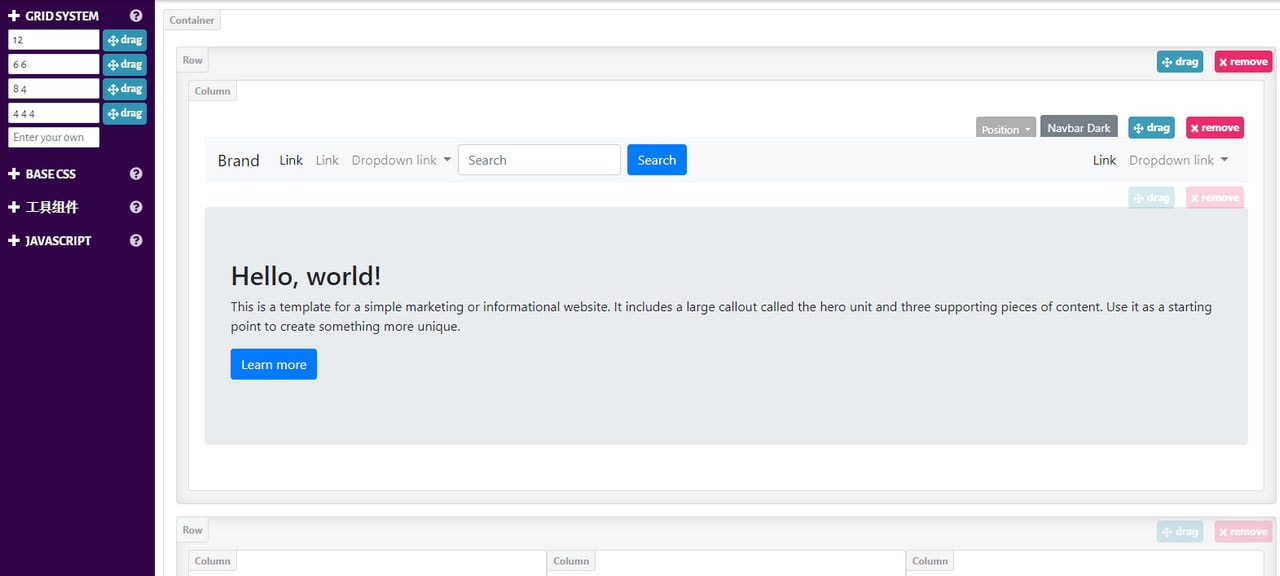
Unlike the previous example that specializes in the third version of the boilerplate, the team behind Layoutit follows updates. Therefore, their visual Bootstrap grid builder is centered around the fourth version. Here you can build the foundation as well as populate it with baseline components, both static and dynamic bringing about a wireframe of the future website.
Speaking of which, if the Bootstrap grid generators are not enough then we recommend taking a look at Bootstrap builders. Not only do they help to create a solid foundation for the future website but also design the entire interface from scratch using beautiful hand-crafted components.
Bootstrap Builders
Startup
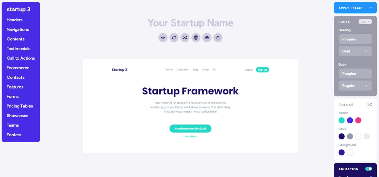
Startup is a popular free Bootstrap builder for themes. It covers a large number of components that stand out with a modern design, businesslike nature, and pleasant user experience. Along with using predefined elements, developers are welcome to customize every inch of the interface; therefore, building fully-working templates that meet their expectations without much trouble.
Mobirise
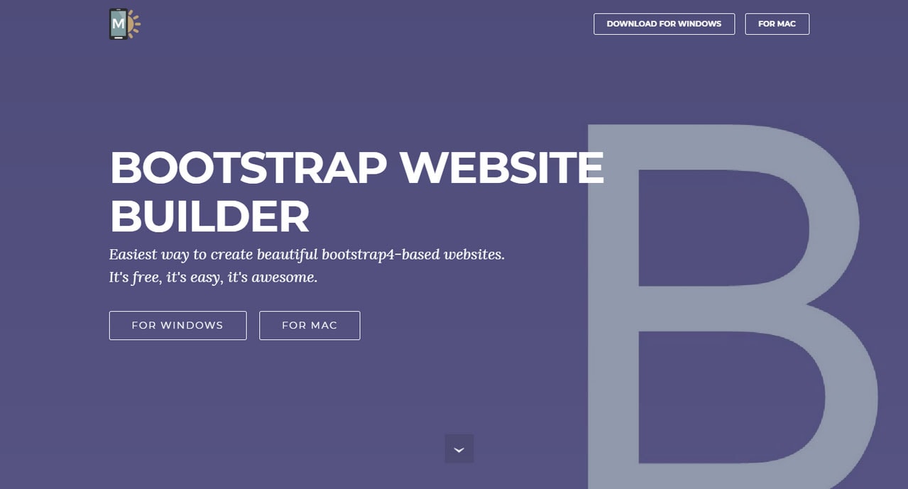
Mobirise is another Bootstrap builder that runs on your local PC. It is available for Windows and Mac users. Much like Startup, it also does not require any coding skills. There is a handy interface where everything can be created by dragging and dropping.
Bootstrap Studio
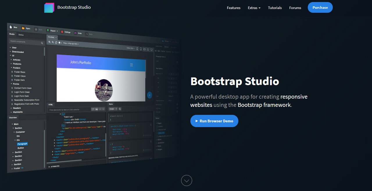
Bootstrap Studio is a desktop application that focuses on building websites using Bootstrap grid. Much like the Startup, the visual editor is continuously updated so that you can benefit from the latest enhancements in the framework. It comes with numerous components that will please you with its custom design.
Bootstrap Grid Templates for Designers
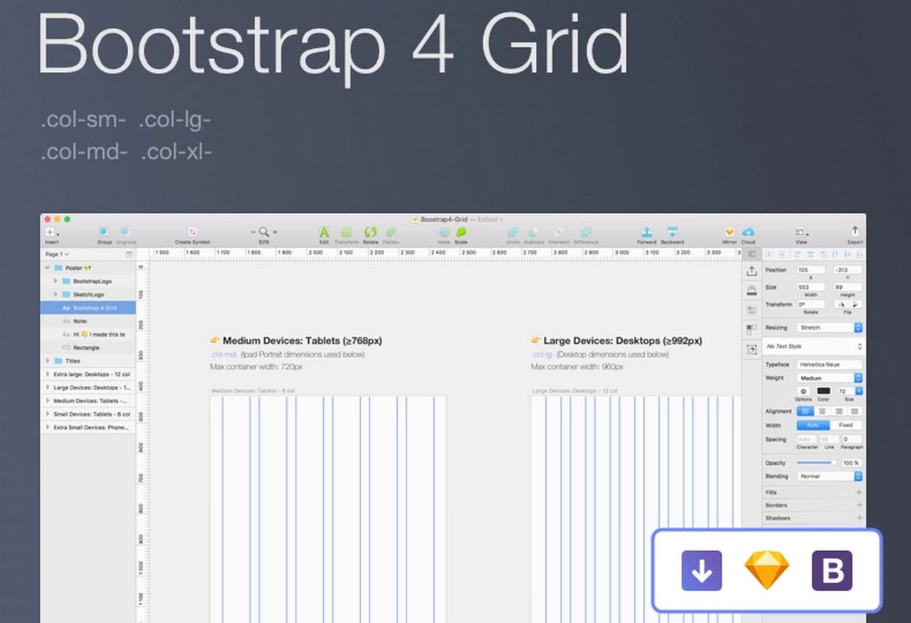
Where for developers everything begins with mixing and matching classes and utilities, for designers everything starts with a clean canvas in one of the popular graphic design programs. And, if you want to create a compatible Bootstrap template, you need a properly-aligned mockup that includes all the tiny details like gutters, viewport sizes, etc. Here is a small list of freebies to address this issue.
- For those who prefer Photoshop, Alexander Rechsteiner has created a Bootstrap 4 Grid PSD template with various helpful features inside.
- For Sketch fans, Thomas Pageot has an exclusive mockup.
- If you are using Figma, try a freebie created by Alex Martinov. It includes files for versions three and four.
What’s more, we have a small collection of Free Bootstrap Grid PSDs for Crafting Excellent Website Designs in our magazine as well.
Conclusion
Knowing Bootstrap grid well is a crucial skill. It is a foundation that might not be visible with the unaided eye, yet it is here, and it supports everything. If it goes wrong, it will take lots of time, effort, and money to fix the problem. Who wants that? Before jumping into the whole designing and decorating thing, you need to nail Bootstrap grid first.
Make sure a layout works on all screen sizes, and the structure complies with requirements. And, if you still feel insecure about handling the grid, you can always seek aid from visual builders like Startup that will solve problems quickly and efficiently.


 siter.io
 pulsetic.com
 static.app
 mailpost.io