How to Create Off-Canvas Sliding Navigation Menu
Off-Canvas Navigation has been on the web for quite some time and is widely used on different types of websites to provide better user experience primarily for mobile device users.
It’s a trendy sidebar design that is attractive to website visitors, giving users easy access to the menus of a website.
Off-canvas navigation is used mostly on mobile and touch devices. It has a UI component which is an effective way of presenting menus on small screens and can be easily implemented using some simple JavaScript and CSS.
According to Jason Weaver, off-canvas navigation was inspired by the observations of Luke Wroblewski, a product director at Google and an internationally recognized digital product leader who has designed and built various software used by more than 1 billion people. He called it “Multi-Device Layout Patterns” which describes innovation through fluid grids and media query adjustments, responsive design enables web page layouts to adapt to a variety of screen sizes.
While there are plenty of jQuery plugins that create a similar effect, it’s actually easy to implement.
With Postcards Email Builder you can create and edit email templates online without any coding skills! Includes more than 100 components to help you create custom emails templates faster than ever before.
Free Email BuilderFree Email TemplatesThis article will show you how to make cool sliding navigation with an off-page canvas effect. We will use CSS transition and animation as well as jQuery for adding/removing classes to trigger the animations.
Here’s a demo and download link showing the end result:
Resources use in this tutorial
- Font-Awesome
- css
- jQuery Library
- Google Fonts (Raleway and Lato)
Getting Started
Before we start we will add necessary links in our header section. These contain links of fonts, jQuery libraries as well internal and external CSS.
<!-- Styles -->
    <link href="css/reset.css" rel="stylesheet">
    <link href="css/style.css" rel="stylesheet">

<!-- Fonts -->
    <link href=
    'https://fonts.googleapis.com/css?family=Raleway:400,600,500,700,800' rel=
 'stylesheet' type='text/css'>
    <link href=
    'https://fonts.googleapis.com/css?family=Lato:400,700,900,300italic,400italic'
    rel='stylesheet' type='text/css'>
    <link href=
    "https://netdna.bootstrapcdn.com/font-awesome/4.0.3/css/font-awesome.css"
    rel="stylesheet">

<!-- Scripts -->
    <script src="js/jquery.min.js"></script>
    <script src="js/custom.js"></script>
The HTML
The markup for our off-canvas sliding navigation is a bit different than the ordinary site navigation. To show you how this works we’re going to focus on the three elements:
- Container – the div which will wrap everything on the body tag and display or hide the elements on the screen
- Canvas – the div that will enable the sliding off-page effect of the navigation and the content page side by side
- Navigation – the div which will hold our sliding menu/navigation
This is the basic structure:
<div id="container">
        <div id="canvas">
            <div id="nav">
            //Sliding Navigation Content Here
</div>
</div>
</div>
Now let’s add the main content for each element:
<div id="container">
<div id="canvas">
<div id="nav">
<h2 id="title"><i class="fa fa-sitemap"></i> MENU</h2>
<ul id="toggle">
<li>
<div class="active border">
<span class="menu-icons fa fa-home"></span> <a href="#">HOME</a>
</div>
</li>
<li>
<div>
<span class="menu-icons fa fa-user"></span> <a href="#">ABOUT US</a>
<span class="the-btn fa fa-plus"></span>
</div>
<ul>
<li>
<a href="#">OUR TEAM</a>
</li>
<li>
<a href="#">OUR SERVICES</a>
</li>
</ul>
</li>
<li>
<div>
<span class="menu-icons fa fa-briefcase"></span>
<a href="#">PORTFOLIO</a><span class="the-btn fa fa-plus"></span>
</div>
<ul>
<li>
<a href="#">WEB DESIGN</a>
</li>
<li>
<a href="#">GRAPHIC DESIGN</a>
</li>
</ul>
</li>
<li>
<div>
<span class="menu-icons fa fa-envelope"></span>
<a href="#">CONTACT</a>
</div>
</li>
</ul>
</div>
<a href="#" class="toggle-nav" id="bars"><i class="fa fa-bars"></i></a>
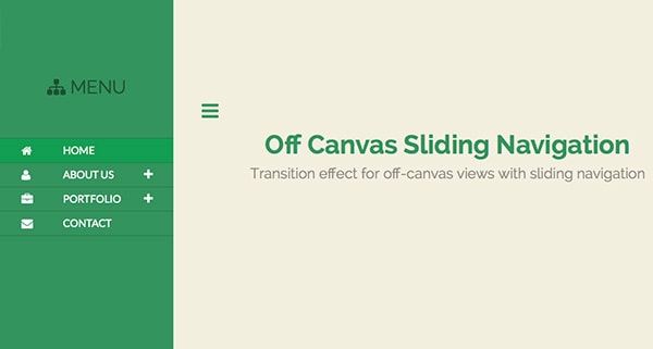
<h1>Off Canvas Sliding Navigation</h1>
<h3>Transition effect for off-canvas views with sliding navigation </h3>
<p> <a href="#" class="back">← Back to the Article</a></p>
</div>
</div>
A few things to note:
- The div that has an id of nav contains an unordered list with an id toggle. Use this id later to select and enable our sliding navigation effect.
- Inside the unordered list there is a div that holds the font-awesome icons and the link itself to each individual menu.
- If the list contains a child unordered list, add a (+) plus sign span icon button from font-awesome. Toggle this button with a (-) minus sign span icon button later on our jQuery.
- The anchor tag that contains the class toggle-nav and has the three-bar icon with the id bars will be used later on by jQuery codes to toggle the canvas and navigation side by side.
Now that we’ve got our complete HTML structure, we can start making it look awesome!
With Startup App and Slides App you can build unlimited websites using the online website editor which includes ready-made designed and coded elements, templates and themes.
Try Startup App Try Slides AppOther ProductsThe CSS
Start by adding the basic styles. This includes html and body tags, as well as h1, h2, h3 tags.
html,
body{
background: #f3efe0;
}

h1, h2, h3{
	text-align: center;
}

h1{
	font-family: 'Raleway', Arial, sans-serif;
	font-weight: 700;
	font-size: 45px;
	margin-top: 15px;
	color: #38935f;
}

h3{
	font-family: 'Raleway', Arial, sans-serif;
	font-weight: 400;
	font-size: 25px;
	margin-top: 15px;
	color: #918e84;
}
Next, let’s add styles on our main elements. The container id will hide our canvas and navigation that overflow outside this div.
#container {
    width: 100%;
    height: 100vh;
    position: relative;
    overflow: hidden;
}
Note: I used the sizing unit vh (viewport’s height) for the height attribute which is 100/100 of the viewport’s current height or 100% of the height. This means that the size of the element will be relative to the size of the viewport.
Now let’s style the canvas. Give it a width and a height of 100% and position of relative. Add some transition and transform properties to achieve the off-canvas effect using jQuery (later on).
#canvas {
    width: 100%;
    height: 100%;
    padding: 5.5% 0;
    position: relative;

    -webkit-transform:translateX(0);
    -moz-transform:translateX(0);
    -ms-transform:translateX(0);
     -o-transform:translateX(0);
        transform:translateX(0);

    -webkit-transition:.5s ease all;
    -moz-transition:.5s ease all;
     -o-transition:.5s ease all;
        transition:.5s ease all;
}
Now for the nav id, which will have an absolute position with a left value of -300px. We also added some transition and a transform of rotate (-90deg) value to rotate the menu 90 degrees inward creating a smooth and simple 3D effect.
#nav {
    width: 300px;
    height: 100%;
    background: #38935f;
    position: absolute;
    left: -300px;
    top: 0;

    -webkit-transition:.5s ease all;
    -moz-transition:.5s ease all;
     -o-transition:.5s ease all;
        transition:.5s ease all;

/* By default, rotate the menu 90deg inwards */
    -webkit-transform:rotateY(-90deg);
    -moz-transform:rotateY(-90deg);
    -ms-transform:rotateY(-90deg);
     -o-transform:rotateY(-90deg);
        transform:rotateY(-90deg);
}
Next, let’s add supplemental classes to our design. Nothing special here just a basic CSS for bars and titles.
#bars{
    font-size: 34px;
    margin-left: 49px;
    color: #38935f;
}
#bars:hover{
    color: #48b978
}
#title{
    margin: 0;
    padding: 1em;
    color: rgba(0,0,0,0.4);
    text-shadow: 0 0 1px rgba(0,0,0,0.1);
    font-weight: 300;
    font-size: 2em;
    font-family: 'Raleway', Arial;
}
.border{
    border-top: 1px solid rgba(0,0,0,0.2);
}
a.back {
    color: #38935f;
    width: 200px;
    text-decoration: none;
    text-align: center;
    font-family: 'Raleway';
    font-size: 20px;
    font-weight: 600;
    display: block;
    margin: 50px auto 0 auto;
    border: 2px solid #38935f;
    padding: 10px;
}
a.back:hover{
    color: #48b978;
    border: 2px solid #48b978;
}

.clear {
    clear: both;
    display: block;
    overflow: hidden;
    visibility: hidden;
}
We also need to put some styles on the sliding navigation. The following styles consist of displaying the parent element list, and hiding the sub-menus of the parent menus, the background color, menu icons and the plus and minus sign icons using font-awesome.
These elements will be manipulated later on our jQuery section where in we will manage to create an awesome sliding effect.
#toggle {
    list-style: none;
    margin-top: 40px;
}
#toggle div:hover {
    background: rgba(0,0,0,0.2);
    -webkit-box-shadow:inset 0 -1px rgba(0,0,0,0);
    -moz-box-shadow:inset 0 -1px rgba(0,0,0,0);
    box-shadow:inset 0 -1px rgba(0,0,0,0);
    color: #fff;
}
#toggle div.active {
    background: #1f9d55;
}
#toggle div {
    cursor: pointer;
    display: block;
    border-bottom: 1px solid rgba(0,0,0,0.2);
}
 span.menu-icons {
    font-size: 20px;
    height: 20px;
    width: 22px;
    float: left;
    margin: 11px 0px 10px 37px;
    color: #fff;
}
span.the-btn {
    float: right;
    font-size: 20px;
    height: 30px;
    width: 43px;
    margin-top: 10px;
    margin-right: 8px;
    padding:0;
    color: #fff;
}
#toggle ul {
    list-style: disc;
    display: none;
    color: #fff;
    background: rgba(0,0,0,0.2);
    -webkit-box-shadow:inset 0 -1px rgba(0,0,0,0);
    -moz-box-shadow:inset 0 -1px rgba(0,0,0,0);
    box-shadow:inset 0 -1px rgba(0,0,0,0);
}
#toggle li a {
    line-height: 41px;
    color: #fff;
    list-style: circle;
    width: 240px;
    padding: 0;
    margin: 0 0 0 50px;
}
#toggle a {
    margin: 0 0 0 47px;
    padding: 0;
    font-family: 'Lato';
    color: #fff;
    line-height: 41px;
    font-weight: normal;
    font-size: 18px;
    text-decoration: none;
}
#toggle ul li {
    margin-left: 109px;
}
#toggle ul li a:hover{
    background: #1f9d55;
}
#toggle ul li a {
     margin-left: 0;
}
Finally, let’s work on the animation. Using the transform property, transition the menu with perspective on show-nav class. This will enable a 3D flipping effect on our navigation and to slide the canvas from left to right.
#nav {
width: 300px;
height: 100%;
background: #38935f;
position: absolute;
left: -300px;
top: 0;
-webkit-transition:.5s ease all;
-moz-transition:.5s ease all;
-o-transition:.5s ease all;
transition:.5s ease all;
/* By default, rotate the menu 90deg inwards */
-webkit-transform:rotateY(-90deg);
-moz-transform:rotateY(-90deg);
-ms-transform:rotateY(-90deg);
-o-transform:rotateY(-90deg);
transform:rotateY(-90deg);
}
#container.display-nav #canvas {
-webkit-transform:translateX(300px);
-moz-transform:translateX(300px);
-ms-transform:translateX(300px);
-o-transform:translateX(300px);
transform:translateX(300px);
}
/* transition the menu with perspective on &quot;show-nav&quot; */
#container.display-nav #nav {
-webkit-transform-origin:100% 50%;
-moz-transform-origin:100% 50%;
-ms-transform-origin:100% 50%;
-o-transform-origin:100% 50%;
transform-origin:100% 50%;
-webkit-transform:perspective(600px) rotateY(0deg);
-moz-transform:perspective(600px) rotateY(0deg);
-ms-transform:perspective(600px) rotateY(0deg);
-o-transform:perspective(600px) rotateY(0deg);
transform:perspective(600px) rotateY(0deg);
}
The jQuery
Add magic to the styles and markup. First, enable the toggle effect using toggle-nav class through the display-nav class to hide or display the navigation. Create an anonymous function and then call our toggleNavigation function.
// Calling the function
$(function() {
    $('.toggle-nav').click(function() {
        toggleNavigation();
    });
});

// The toggleNav function itself
function toggleNavigation() {
    if ($('#container').hasClass('display-nav')) {
        // Close Nav
        $('#container').removeClass('display-nav');
    } else {
        // Open Nav
        $('#container').addClass('display-nav');
    }
}
Now that the entire block element is displaying properly and we already have the off-page canvas, create the jQuery sliding effect. In my jQuery code below, I created a variable to take a reference of the current menu icon by using the code: $currIcon=$(this).find(“span.the-btn”)
Then, I change all the icons back in the compressed state (the plus icon). Next, using toggle Class, switch plus/minus icons on the previously stored element $currIcon.
// SLiding codes
$(&quot;#toggle &gt; li &gt; div&quot;).click(function () {
if (false == $(this).next().is(':visible')) {
$('#toggle ul').slideUp();
}
var $currIcon=$(this).find(&quot;span.the-btn&quot;);
$(&quot;span.the-btn&quot;).not($currIcon).addClass('fa-plus').removeClass('fa-minus');
$currIcon.toggleClass('fa-minus fa-plus');
$(this).next().slideToggle();
$(&quot;#toggle &gt; li &gt; div&quot;).removeClass(&quot;active&quot;);
$(this).addClass('active');
});
Conclusion
Congratulations! We’ve successfully built an awesome off-canvas sliding navigation menu.
Though there are a lot of cool effects that you can add on this off-canvas sliding navigation, this is a good start. Hope you learned and were inspired with this article. Please feel free to experiment with this tutorial and let me know if you come up with another cool effect in the comments.


 siter.io
 pulsetic.com
 static.app
 mailpost.io