How To Apply Consistency in Web Design
There’s tremendous value in consistency of digital interfaces. People browsing the web encounter dozens of websites that all have different styles, yet most feature very similar page elements.
Most designers don’t even think about these features. Page headers, navigation menus, body copy, CTA buttons, the list seems endless.
By designing with consistency you’ll learn how to create interfaces that encourage typical user behaviors. Your layouts will build trust and teach users repeatable patterns that help them work through your site much quicker.
Design For User Expectations
Most users expect websites to work a certain way. It should scroll vertically, links should be clickable, and the navigation should be visible right from the first page load.
How you design these expectations is completely up to you. But when you’re designing for consistency you want to keep a clear uniform design across the entire layout.
For visual consistency on the web I think BodyBuilding.com is a pristine example.
With Postcards Email Builder you can create and edit email templates online without any coding skills! Includes more than 100 components to help you create custom emails templates faster than ever before.
Free Email BuilderFree Email Templates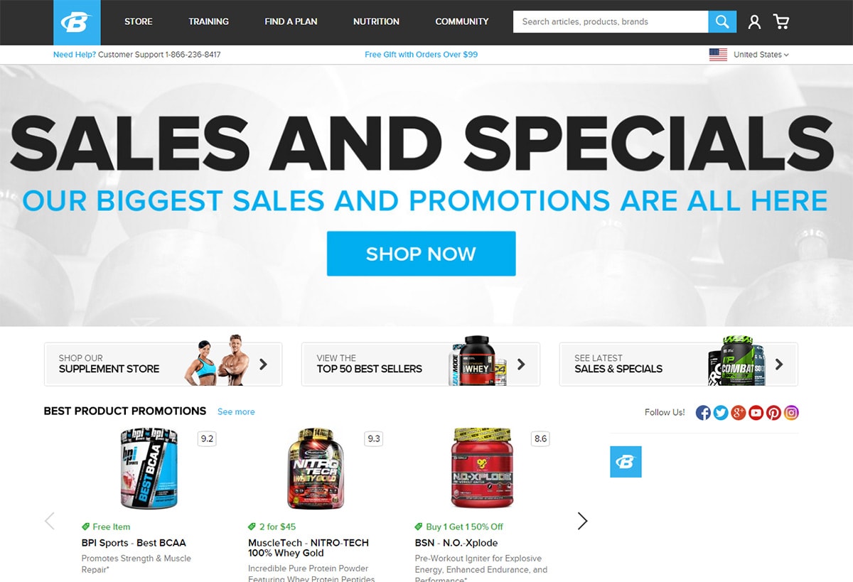
This site has many portals linking to their forums, their eCommerce shop, and their online help guides. All of these pages have the same design and the same navigation to keep them consistent with the entire site.
Users don’t want to think. They just want to act and get results. Consistent design helps this happen.
Do the thinking for your user to understand what they need. How would you design a blog page to encourage reading? What about an ecommerce shop to encourage checkouts?
Think about these questions yourself and apply them to your web projects. Which elements should be consistent on every page? This line of thinking always leads to solutions.
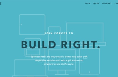
The homepage of Sketch is very consistent with certain user behaviors and expectations. The page has two CTAs: one for downloading a demo and one for buying the program.
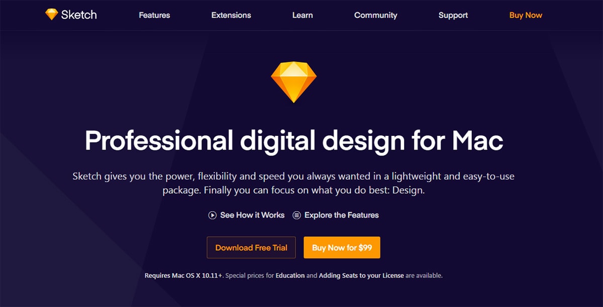
But not everyone who visits the site wants either of those options. The top nav becomes the obvious next step.
With Startup App and Slides App you can build unlimited websites using the online website editor which includes ready-made designed and coded elements, templates and themes.
Try Startup App Try Slides AppOther ProductsSomeone new to the site might care about features or how Sketch works. But an existing user might want to look into extensions or get support.
Add consistent elements with clear in goals. If you know what users expect to do on your site then you can design for those expectations.
One more point to consider is with redesigning a layout. The popular social news site Reddit has been online for well over 10 years. Over that time they have made a few changes, but generally the site looks very similar today as it did back in 2005.
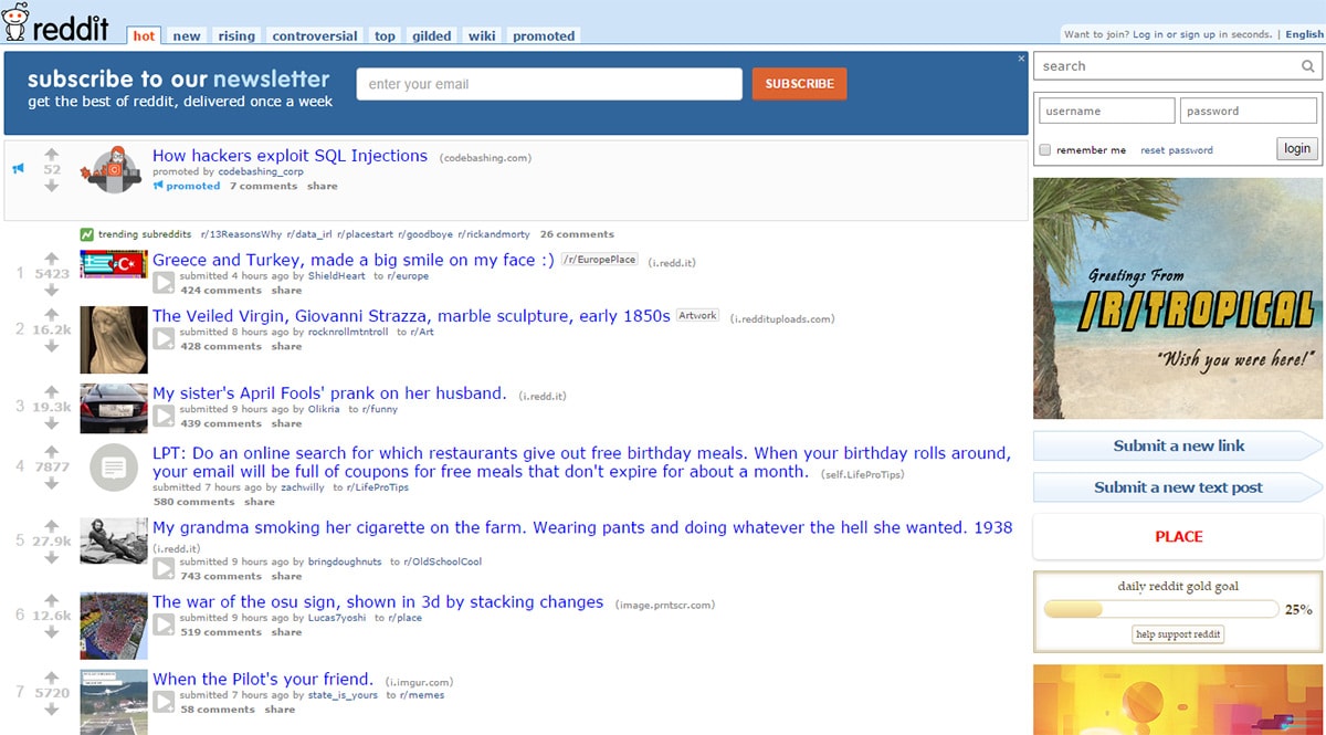
If you’re making minor changes to improve performance and optimize the user experience that’s always welcome. But drastic abrupt changes to a design usually throw people off.
Consistency goes beyond keeping pages similar and usable. It can also mean staying consistent with redesigns if your site already works well.
Users should understand a lot about your site just from the header. This area should explain what the site does and what it’s about, not to mention the top navigation links.
A well-designed navigation isn’t enough. You’ll also want great copy to sell the pages and let visitors know exactly what’s on your site.
Nav text can be restyled in my ways including font size, writing style, and interface elements like hamburger menus for responsive navigations. The key is to stay consistent and keep these links easy to use.
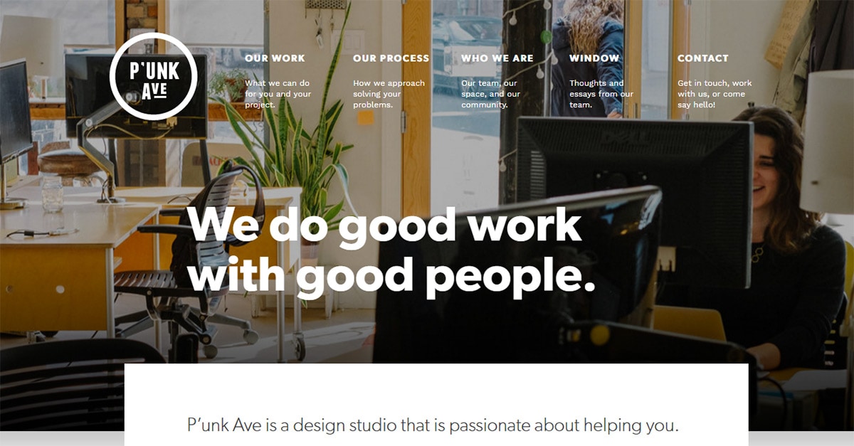
The nav links on P’unk Avenue are quite unique and rather detailed. But they work well for this site because they help explain what’s on each page.
Their nav links feature descriptions on larger screens, but rely on the hamburger sliding menu with simple links for smaller screens. An excellent design style for anyone creating custom layouts with detailed aesthetics.
For larger nav menus you might have to add sub-menus or links in a larger list. The Guardian has a fine example of this on their website.
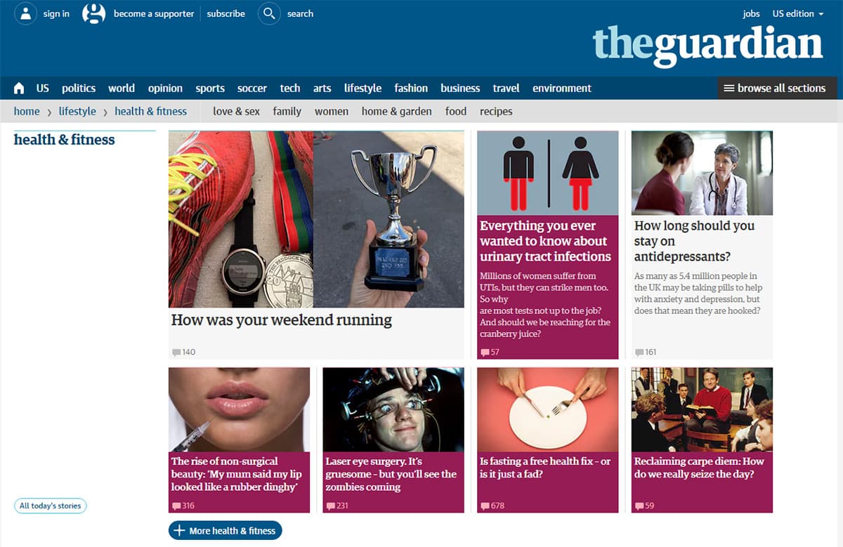
When you browse through any of the top categories you’ll get a sub-menu directly underneath. This can work like a breadcrumbs bar or sub-categories based on the primary link.
The consistent style and multi-link menus are great for big sites and blogs. As users get familiar with those links they’ll have an easier time browsing through content.
Repeat Layout Styles
This technique breeds consistency and it can work on multi-page sites or singular landing pages.
The goal is to re-use similar elements all throughout the page, but with different content & graphics.
By repeating certain styles you’re creating a theme on the site and building comfort with users. Consistency breeds familiarity and this is what you should be going for.
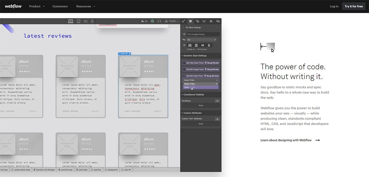
Notice the repeated patterns on the Webflow homepage that alternate between colors and different design styles.
Each section features a screenshot of the app listed alongside main site content. This style is beautiful and it’s one of the cleaner ways to craft a consistent design.
Note this style is predominantly found on the Webflow homepage but it could be repeated elsewhere. That’s why consistent elements are easier to use across the whole site.
But aside from page elements you can also repeat styles in your design. Take a look at Algolia for one example.
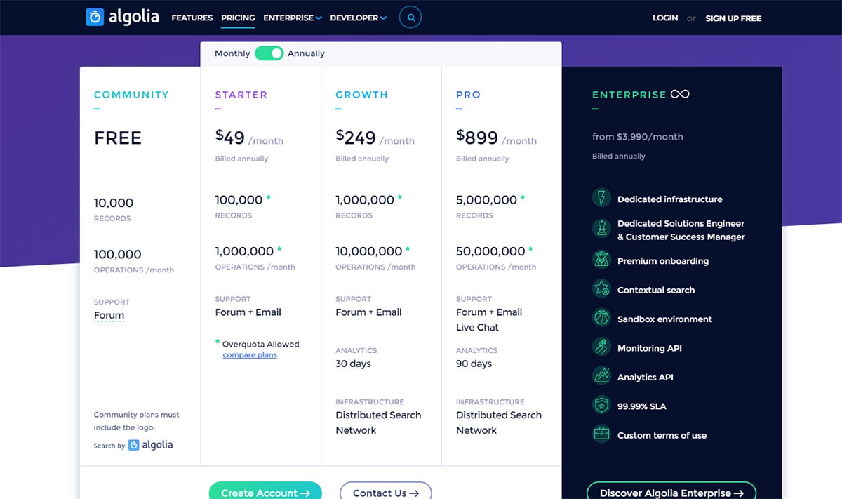
This site uses heavy diagonal lines between page sections along with darker background colors. Headers all have a small underline and the text all follows a similar size & thickness.
If you dig deeper into the site you’ll notice the box shadow effect is replicated throughout. This is a small touch but it’s one of the easiest ways to build visual consistency.
Try not to get too lost in repetitive page elements.
Instead think about how you can make the interface easier to use and what that might entail. Most of the time you clone what you’ve already done and keep using those patterns.
Keep Branding Consistent
Web branding is a deep topic and it’s more than a simple identity.
You also need to consider page colors, textures, typefaces, padding, and icons/elements related to the brand. There are no right or wrong ways to brand, just some ways that work better for some websites.
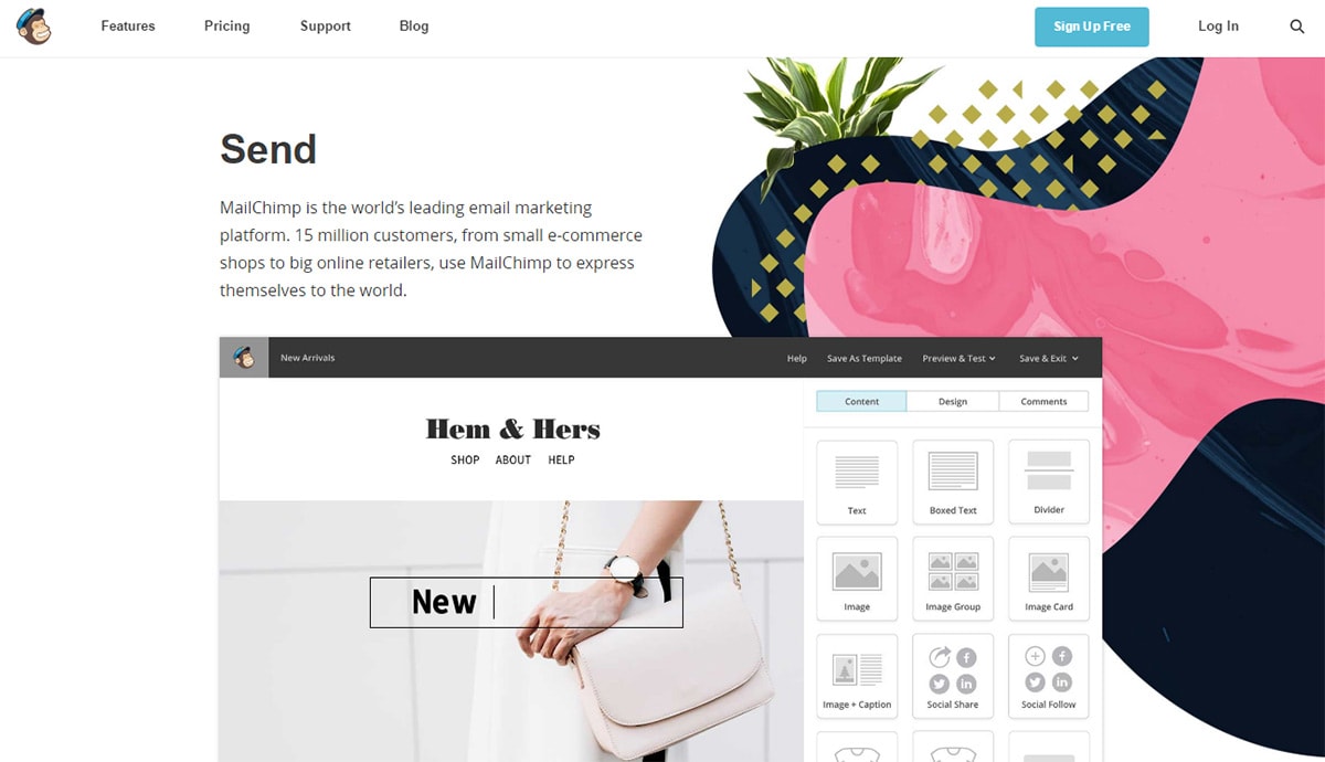
MailChimp does this by repeating their branded monkey friend everywhere. The site has a fixed top navigation which includes this logo on every page.
But you’ll also notice similar typeface designs and colors with similar text styles. This may seem like an obvious thing to do, but some designers underestimate how much this can impact branding.
An even better example is the Docker homepage with their cargo whale logo.
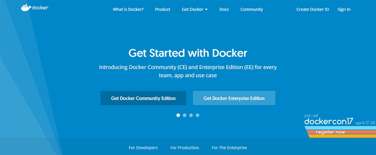
This creature finds its way into almost every part of the site. The header, the footer, and most content pages also feature illustrations of our Docker ocean friend.
You don’t need to create a mascot just to build consistency. It’s merely one more tool you have in your arsenal for digital branding.
If you study some of your favorite sites you may recognize subtleties you never noticed before. This is the best way to get ideas for creating consistent branding in your own projects.
Wrapping Up
As you browse the web you’ll notice consistency across nearly every site. But since each project is different you need to think about the user’s needs before designing anything.
The one thing you can guarantee is that every single user wants a consistent experience. And I hope these tips can get you thinking more about consistency in your everyday web design work.