What is a Design System, Why It is Important and What to Include
What is a design system, why is it important and what do you include in one?
Over the last few years, design systems have become a popular, hot topic among designers. If you’re just joining this awesome bandwagon, welcome! Many businesses and companies are investing more in design. Having a design system in place can be hugely beneficial to companies and teams that are growing and need to keep track of everything. After all, good customer experience is vital. A design system can also help with reducing design debt, speed up the design process, and build awareness and brand accountability across various teams.
In today’s post, I’m going to talk about the different must include elements within a design system. Of course, there will be fantastic examples of publicly available design systems from many popular brands!
Grids
Grids are essential components for understanding and unifying page layouts. Take a look at how MailChimp addresses grids. It’s the first item under their design system’s pattern section. It covers different topics such as grid sizes, gutters and how to mix them.
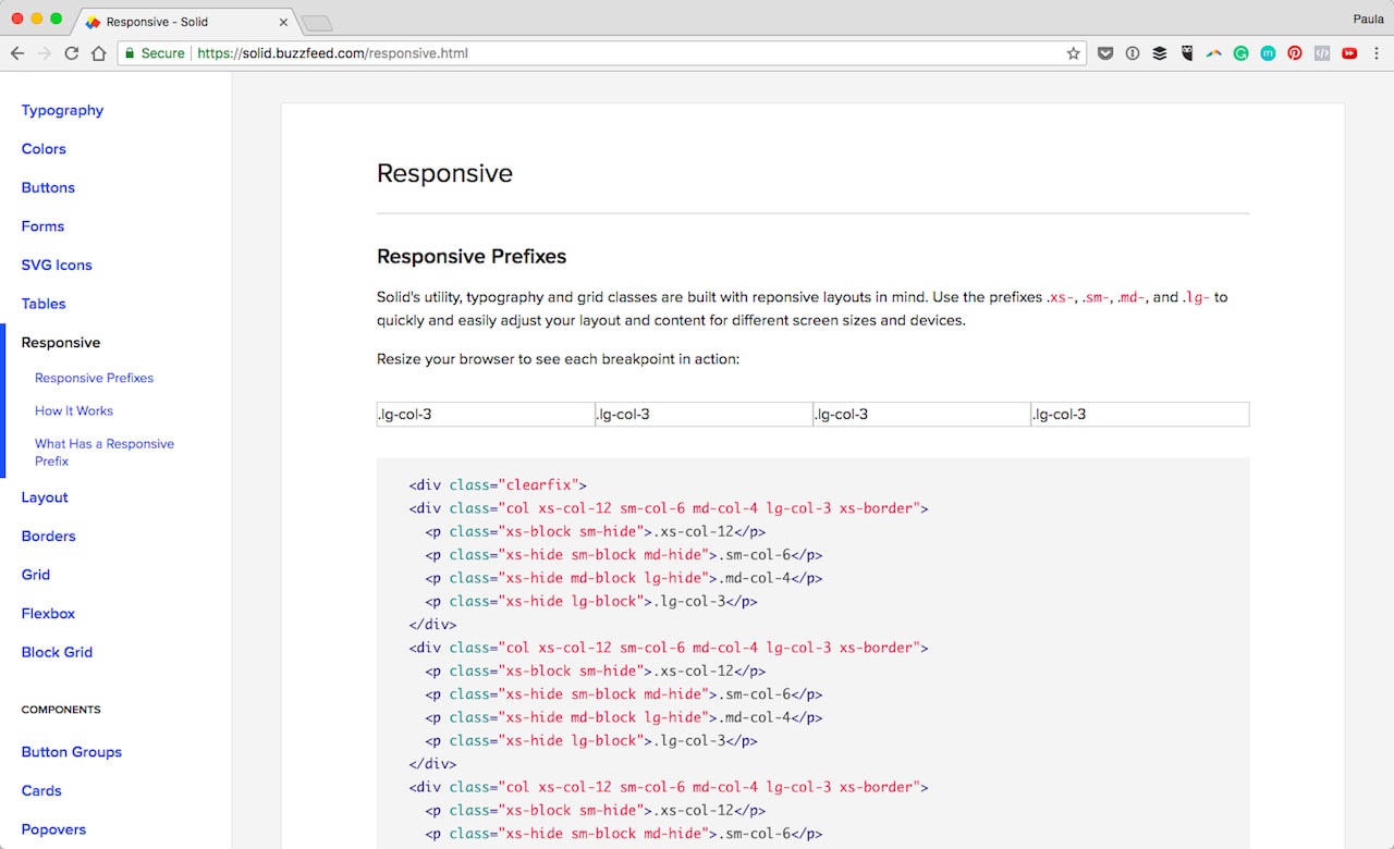
BuzzFeed’s design system is a little different. They have two different sections, one called Grid one called Responsive. They both refer to the same thing, how the grid system works. The responsive section is just an extension.
Spacing
Similar to grids, spacing is another useful section. In Shopify’s design system (called Polaris), they go into extensive detail about different padding and spacing between elements such as cards. They talk about line-height as spacing, too.
With Postcards Email Builder you can create and edit email templates online without any coding skills! Includes more than 100 components to help you create custom emails templates faster than ever before.
Free Email BuilderFree Email Templates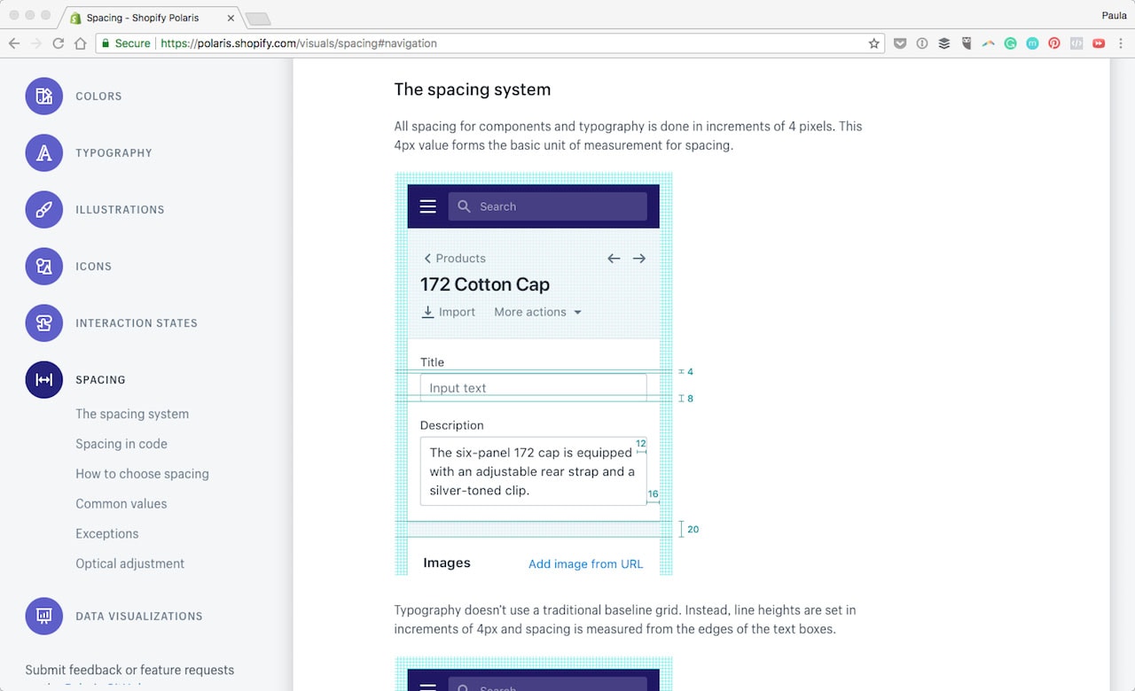
Errors and Validations
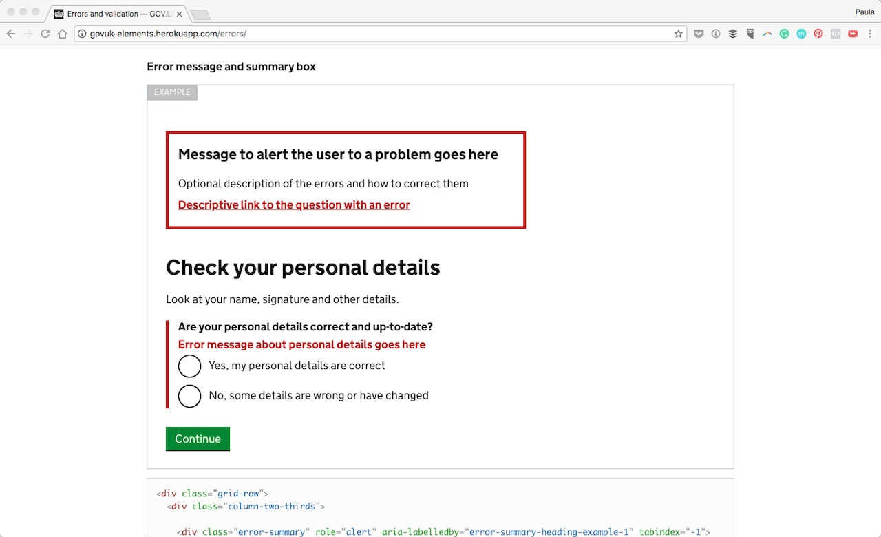
That’s the exact name of one of the design sections from GOV.UK. They talk about how to best how to handle them properly when they occur. They even include code snippets for the design patterns in use for these circumstances.
Coded Components
The one thing I love about Zendesk’s system is their incorporation of both CSS and React components. There are so many of them. Under React is Avatars, Tags, and Tabs. Each has installation instruction and usage example. This makes using them consistently clear and easy.
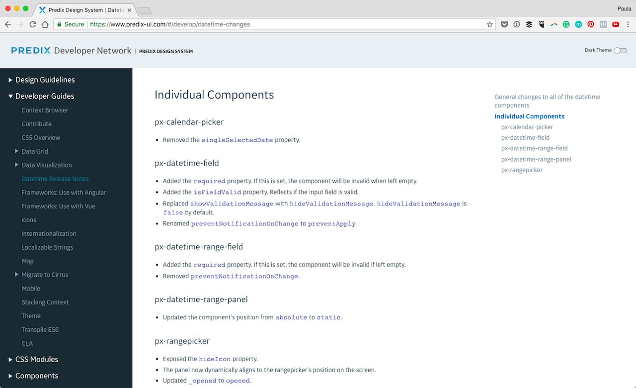
Predix has a large library of guides specifically for developers as well as CSS modules and UI components with code right next to them. The Developer Guide takes about many elements from using Angular and Cue to Maps.
Naming Conventions
WeWork’s system takes a deep dive into naming and syntax. It’s a great idea to keep consistency across teams, files and even programs.
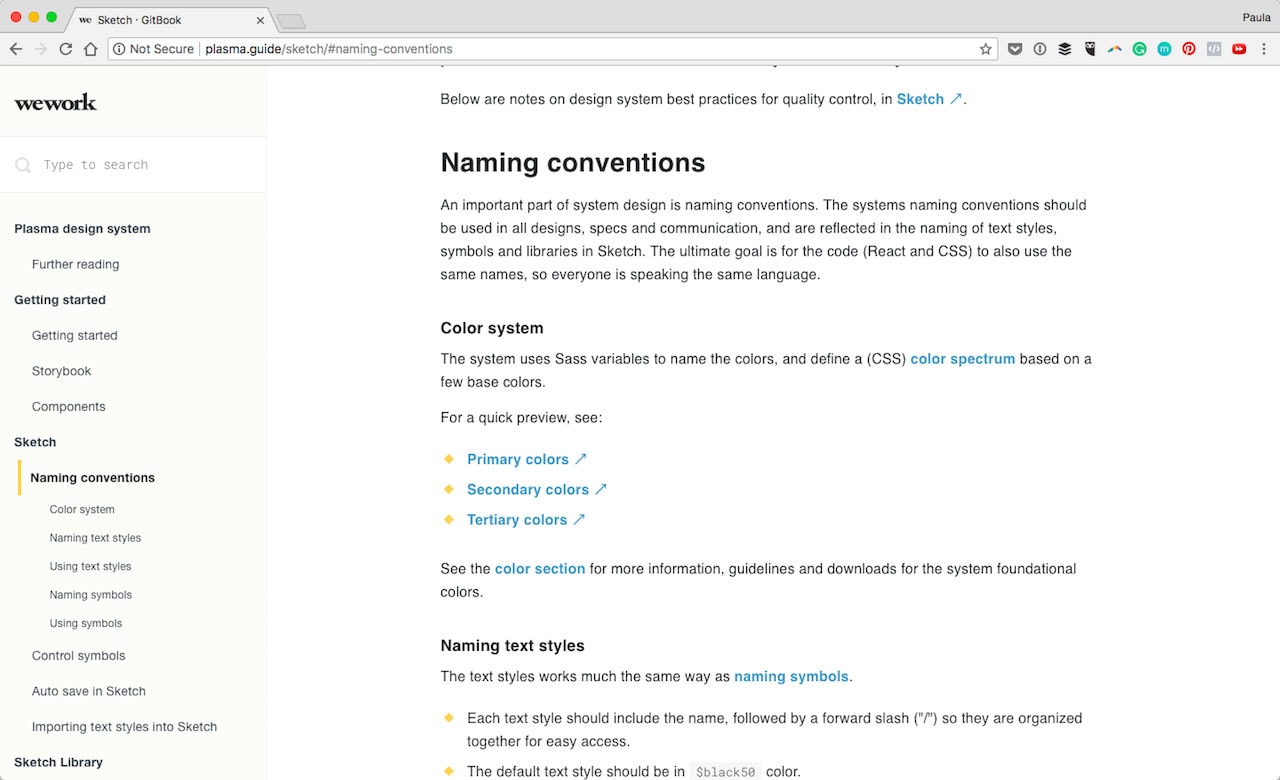
With larger teams, it can be complicated to keep consistent and clear naming. However, with predefined conventions, it makes things a lot easier.
Iconography
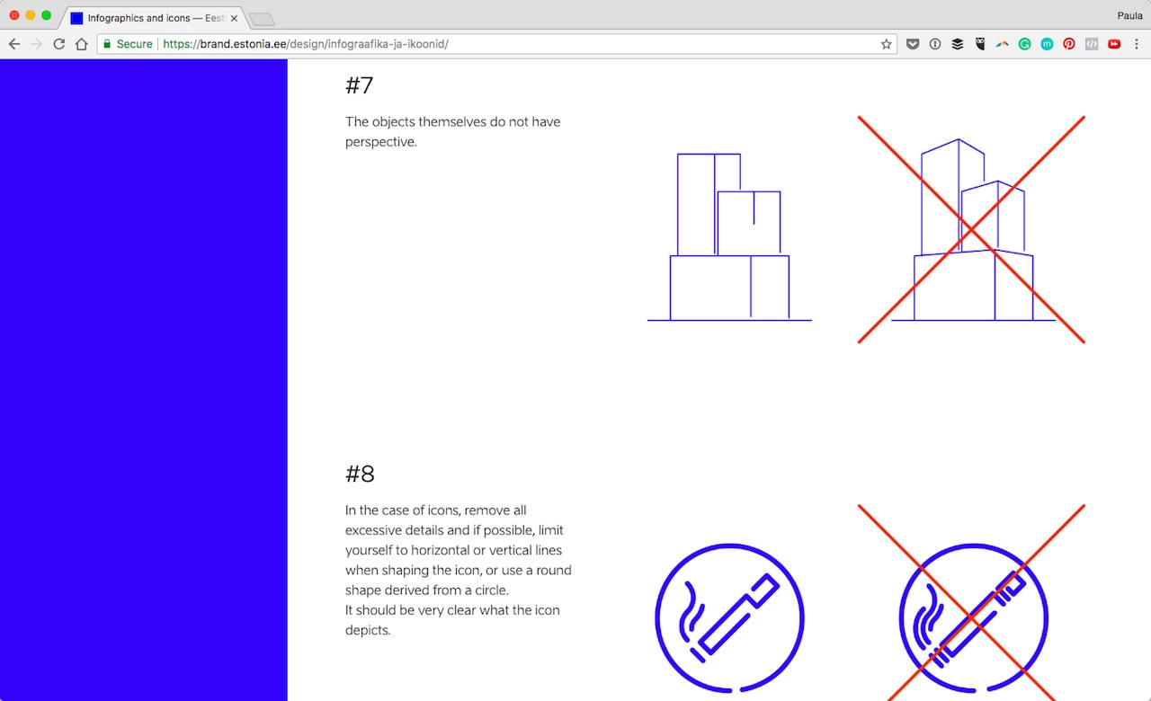
I like the way Estonia tackles icons and graphics in their design system. They have a quick explanation to set expectations and then show ready-made and appropriate examples. Additionally, they go on to show 11 rules as well as their dos and don’ts.
On the other hand, is Priceline with a more traditional approach to iconography. They have an extensive list of all the icons used in their branding. Each icon is individually displayed with its name.
Typography
No design system would be complete without defining the text. I absolutely love Nordnet’s approach. At the end of their typography section, there are clearly defined typography don’ts such as don’t right align. It’s so good in preventing weird one-off instances and inconsistencies.
With Startup App and Slides App you can build unlimited websites using the online website editor which includes ready-made designed and coded elements, templates and themes.
Try Startup App Try Slides AppOther Products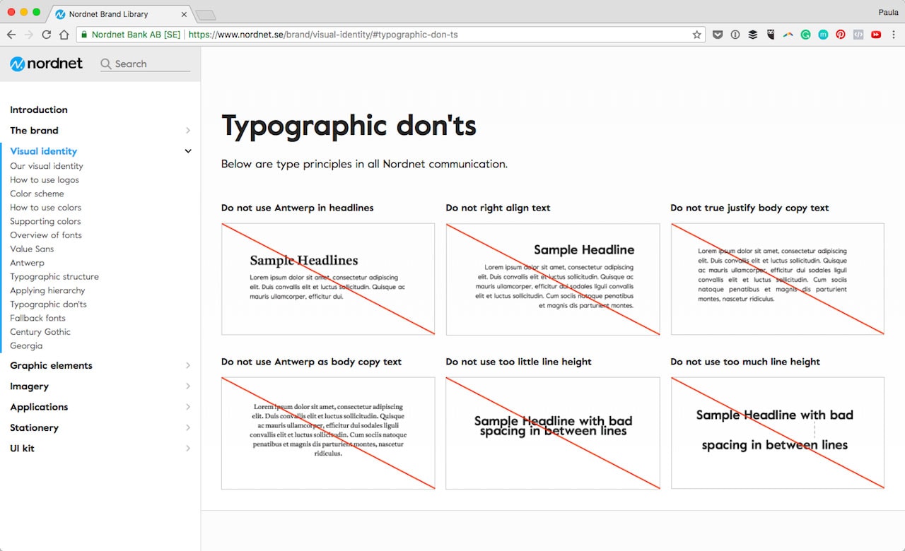
Accessibility
Both Microsoft and Quickbooks include whole sections on accessibility. Microsoft especially gets exceptionally detailed in explaining different instances and necessities of appropriate accessibility for their products to be easily usable by anyone. They mention things like contrast, keyboard functionality, spacing, navigation clarity and so on.
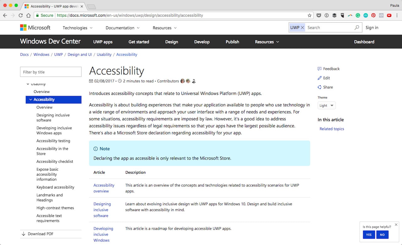
The goal of accessibility is to make sure the UX is consistent and seamless. Quickbooks includes a section on accessibility on mobile too. While Microsoft includes accessibility practices to avoid which is super useful also.
Tone and Voice
Believe it or not, visual components are not the only important things to include in a design system. Tone and voice are important too as they help define the quality and consistency in communication. It could be something simple like using sentence case across all branded materials. Though it often goes more in-depth on how to communicate best, write or speak in the appropriate messaging style.
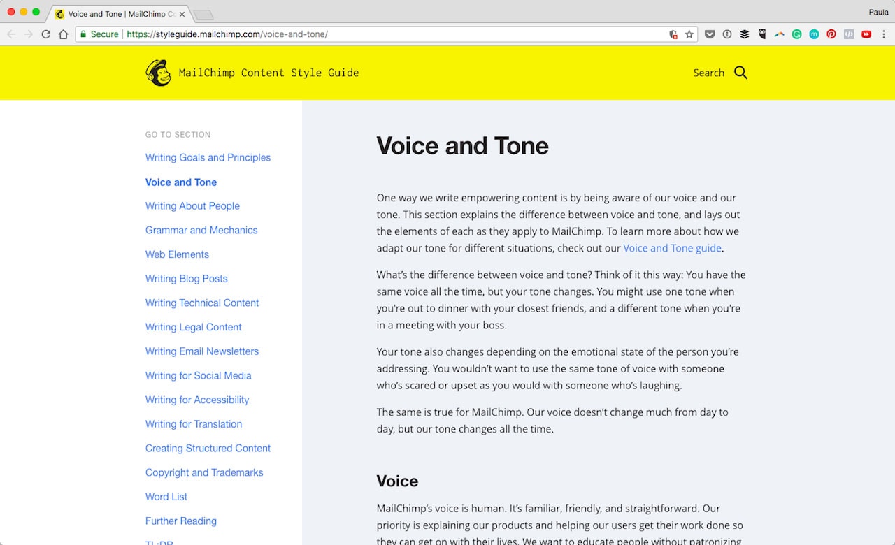
Monzo has a comprehensive tone of voice guide which even includes overall principles. Then there is MailChimp again. They cover items such as writing blog posts and translations to simple UI copy.
Logos and Color
Two of the most fundamental design aspects of every design system are the logo and color choices. Have a look at how Atlassian wants its teams to use the logo. Or head over to Lonely Planet’s system to have a look how they want colors to be handled as well.
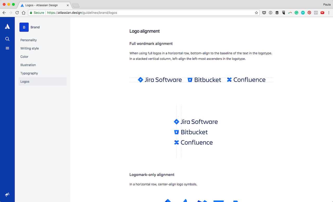
Both great examples! After all, when most people think style guide or branding the first thing that comes to mind seems to be logo and color. And by no means should they be excluded from a design system either. They are in fact critical in keeping consistency across different channels.
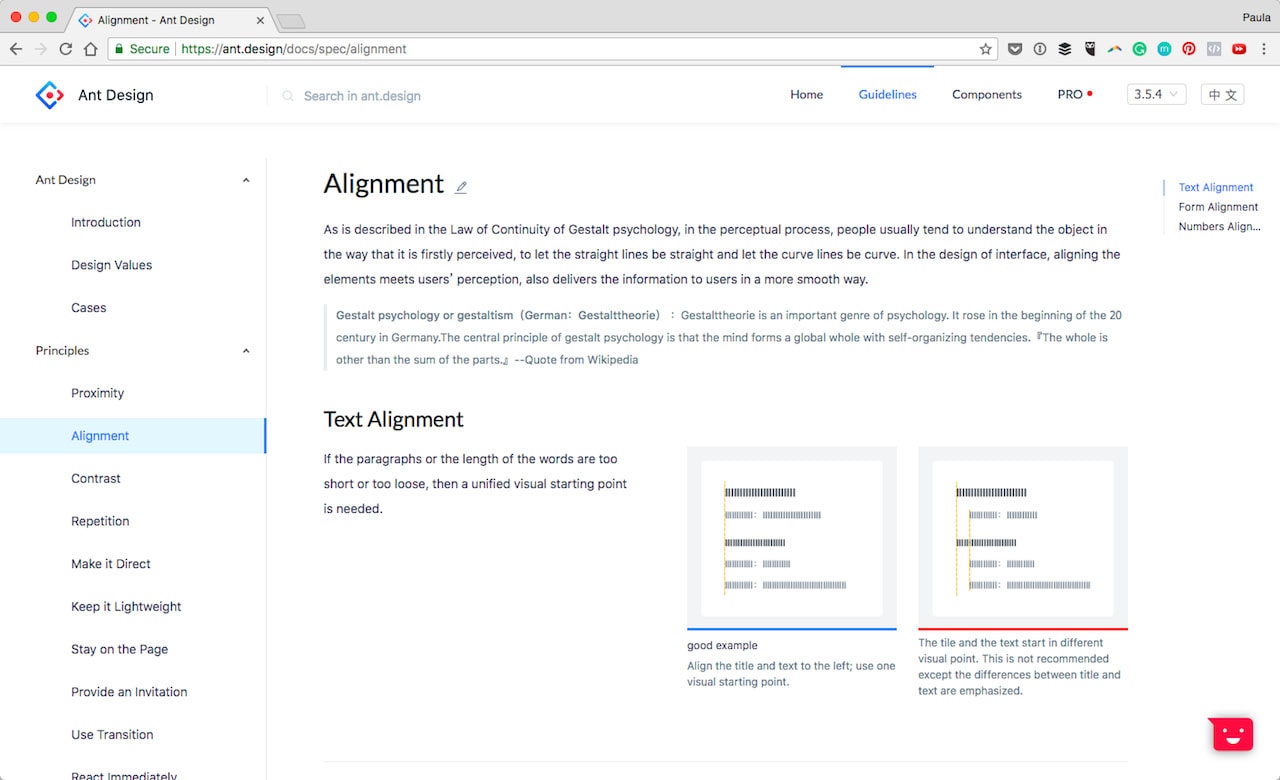
Alignment
I am in love with Ant’s system. They have a full section designated to alignment! It’s such a seemingly irrelevant detail. It is important to keep consistent. Why else include text, form and number alignment? Because it matters!
Common UI Elements
Additionally, no design system would be complete without the most common UI elements being included. I’m talking buttons, forms, checkboxes and the like.
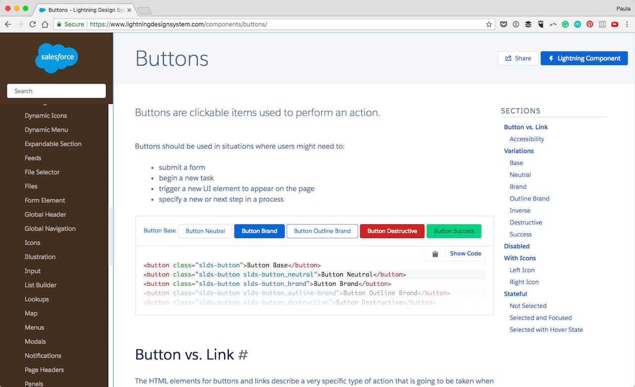
Salesforce has a boatload of individual elements from buttons to cards, from data tables to menus and progress bars. It’s all there, detailed as to how to use it and with code snippets right there by their side. Mapbox has the same thing going on for forms, text blocks and tables.
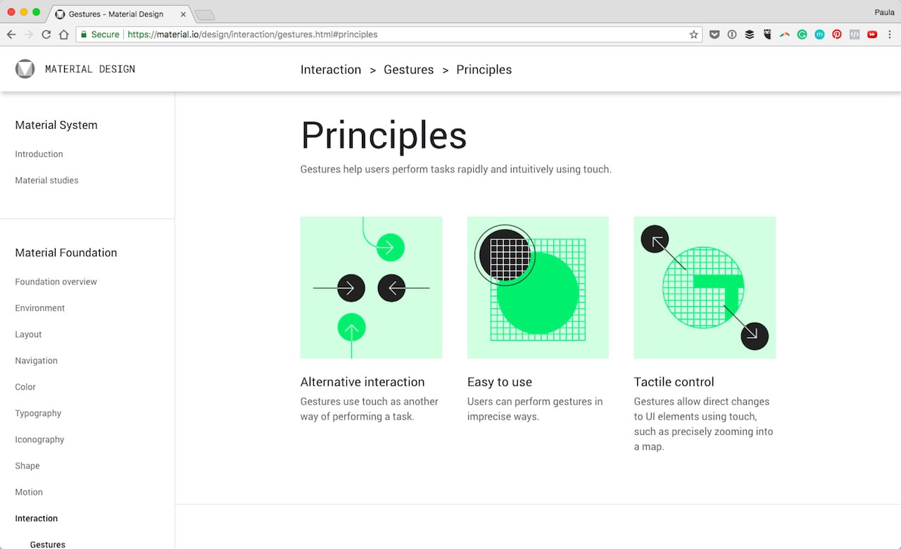
Gestures
I think we can all agree that Google’s Material Design Guides were the first of its kind, documenting what a proper design system should be. They include so much useful information it’s ridiculous. But then again, they are Google. One section to consider including from Google is gestures. This is especially important for companies who have many mobile users!
Motion
Motion and animation are often forgotten design elements. They can positively influence the user experience, don’t you think? IBM’s Carbon Design System did include a motion-specific section. Have a look if you’re using animations and transitions in your designs.
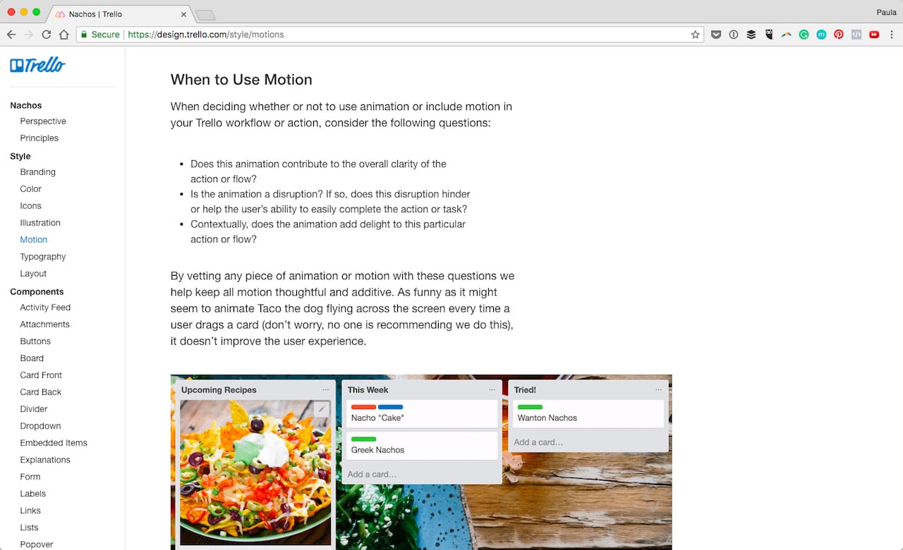
Trello also included motion in their design system. They include guidance on when to use a motion for the best possible results as well as how to use it. They have detailed criteria on how motion needs to be executed.
Conclusion
How about you? What do you think of design systems? What do you think should be included to maintain consistency across teams and platforms?


 siter.io
 pulsetic.com
 static.app
 mailpost.io