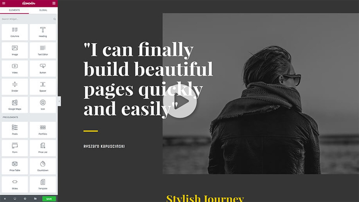
10 Design Trends That Can Easily be Built with Elementor
Some web design trends come and go very quickly, others tend to hang around until they’re considered part of the “core”. This year’s predictions have shed light on several trends that have already shifted the design landscape and will continue to shape the web. Are you keeping up?
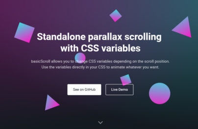
Gradient effect
Last year, when two leading brands – Spotify and Instagram – came out with a new gradient-enhanced look, the effect was officially considered back in fashion. This old-made-new trend has been embraced across the design landscape ever since, swiftly meshing with other website trends, such as flat, material and minimalistic design. The beauty of gradient effect is that there are no distinctive rules for how to use it.
It can include more than two colours, radiate from the side or the center of the page, or fall horizontally. Designers have been applying the trend in different creative ways – experimenting with two-tone gradients, using backgrounds with depth to add a level of reality to the design, exploring images with gradient overlays and even adding them back into user interface elements. It’s safe to say that the gradient has become one of the coolest and sought-after trends that can be used to refresh a tired-looking website or build a crisp, modern-looking one.
Encouraged by the growing popularity of this trend, Elementor have recently rolled out a new background gradient effect feature, which makes adding background gradients to WordPress pages a breeze. Because it is done visually, designers don’t need to do any CSS coding. It is now easier than ever to spruce up images and videos, add a little finesse to certain sections or columns and play around with the background design, easily controlling the location, angle and colours of the gradient effect.
With Postcards Email Builder you can create and edit email templates online without any coding skills! Includes more than 100 components to help you create custom emails templates faster than ever before.
Free Email BuilderFree Email TemplatesCard and grid UIs
Made famous by Pinterest and later hyped up by Google’s Material Design, the card and grid web trend has taken over the internet and doesn’t seem to be slowing down. The incredibly neat and convenient way of organizing and displaying information on the page is feeding into the internet’s need to consume as much content as possible. Cards work well on tablet and mobile screen, fitting nicely with the responsive design requirements. As brands continue to strive for providing smooth and enjoyable user experience, the card-based UI is likely to stay high on the hottest trends list, giving brands a chance to organize the constantly increasing amounts of content.
Shapes divider
As mobile browsing is overtaking desktop browsing, designers were forced to rethink the “above the fold” mentality. This explains the adoption of the long scrolling web design trend. Long scrolling introduces many great opportunities for designers to elevate the user experience through storytelling, creative visuals, navigation, and a more immersive overall experience. However, the infinite scroll can also get boring quite quickly if it’s not supported by additional elements and creatives.
One way to neatly organize information on a single page while keeping the site’s story exciting but coherent is by using creative page dividers. Separators not only considerably broaden the range of design possibilities, but can also transform any page into a sleek, professional-looking design.
Elementor’s Shapes divider feature allows designers to refresh their pages with cool separator effects by customizing one of the 18 starter shapes. The feature gives designers a total control over the various settings that help customize every shape, including its background, size, location, and so on.
Typography
With Startup App and Slides App you can build unlimited websites using the online website editor which includes ready-made designed and coded elements, templates and themes.
Try Startup App Try Slides AppOther ProductsThe strong emphasis on typography took hold right after the introduction of CSS3 and Google Fonts, as designers were given the freedom to use any font they liked for their designs. In 2017, typography will continue to plant its roots as one of the top priorities for web designers. As the resolution on our devices increases, so will the desire of brands and designers to push typography to its limits in order to appeal to their users. Typography is a powerful and visual medium, which is why we can expect for type to gradually take centre stage and become the main visual piece of content instead of image or video.
Box Shadow
3D shapes and objects have long been forgotten in web design, mainly because the technology was not advanced enough to do the designs justice. However, the new and improved native support for 3D rendering in browsers means that 3D shapes and interactive design is now practical and making a comeback to web design. We’ve already seen in 2016 the introduction of infographics in web design, and this trend will continue to grow in 2017. This is all thanks to the advancement of WebGL technology which allows your web browser to draw power from your computer’s graphic card to render smooth and beautiful 3D designs on your website.
Excited by this growing trend, Elementor just introduced a new Box Shading feature, which you can add to columns, elements, buttons and sections. The shading effect gives a unique and modern 3D effect to your designs. Elementor is the only page builder to offer Box Shading and to give complete control by allowing you to adjust the color, softness, blur and direction (both horizontally and vertically) of the shadow effect. The feature can take your design from 0 to high-tech in minutes.
Minimalist design
Less is always more and web design is no different. Minimalist designs are not only beautiful and sophisticated, they are also more trustworthy and have reduced loading times. Content is king, so stripping away all the distractions will keep the focus on your content. Also, the sleek and sophisticated feel of a minimalist design increases legibility.
Entrance and hover animations
Hover animations is one of the up and coming design trends of 2017. Sharp and delightful animations can have a huge impact on the user experience and help users better understand the design. A simple directional cue or navigation element can enhance the flow, guide the user through the page and add a pinch of charm to the design. No wonder designers are all over this trend.
Adding entrance and hover animations to images, buttons and icons with Elementor’s feature is a stress-free experience, as absolutely no coding or CSS is required. With the wide range of different animations available, including pop, shrink, grow, buzz, bob, skew, rotate and hang, designers can easily liven up and energize their designs.
Authentic, natural-looking photography
When it comes to web design, few things can beat compelling visuals. And this year, one trend that we’re really bidding farewell to is cheesy stock photography. A new wave of beautiful, original stock photography has washed over the internet over the past few years, bringing new life and energy to business and personal websites. Free stock image libraries like Unsplash or Pexels are changing the game by providing designers with heaps of high-quality, authentic visual material to work with. Pairing natural-looking photography with strong interactive design is the new formula for a modern-looking website.
Flip box
Animation and animated effects are one of the most popular concepts of interactive design. Not only do they add visual appeal, but they also transition users between states of content by providing context of how to interact with the design. The five primary functions of animation include animated notifications, revealing information, highlighting content, collapsing forms and menus, and scrolling (especially for one-page websites).
A simple but awfully effective way to add another level of interactivity to a site is by taking advantage of flip boxes. Flip boxes are, as the name implies, boxes that flip over when you hover over them. They can help you draw attention to the most important bits of information on the site, highlight your best products, features or services, make the content more interesting and elevate the user experience.
With Elementor’s Flip box feature, designers can enjoy a full set of flip effects, including flip, push, slide, face, zoom in and zoom out as well as add captivating 3D effects to make the boxes more prominent. To make the flip box richer and even more unique, designers can also add images or icons inside the boxes as well as change background color and border style.
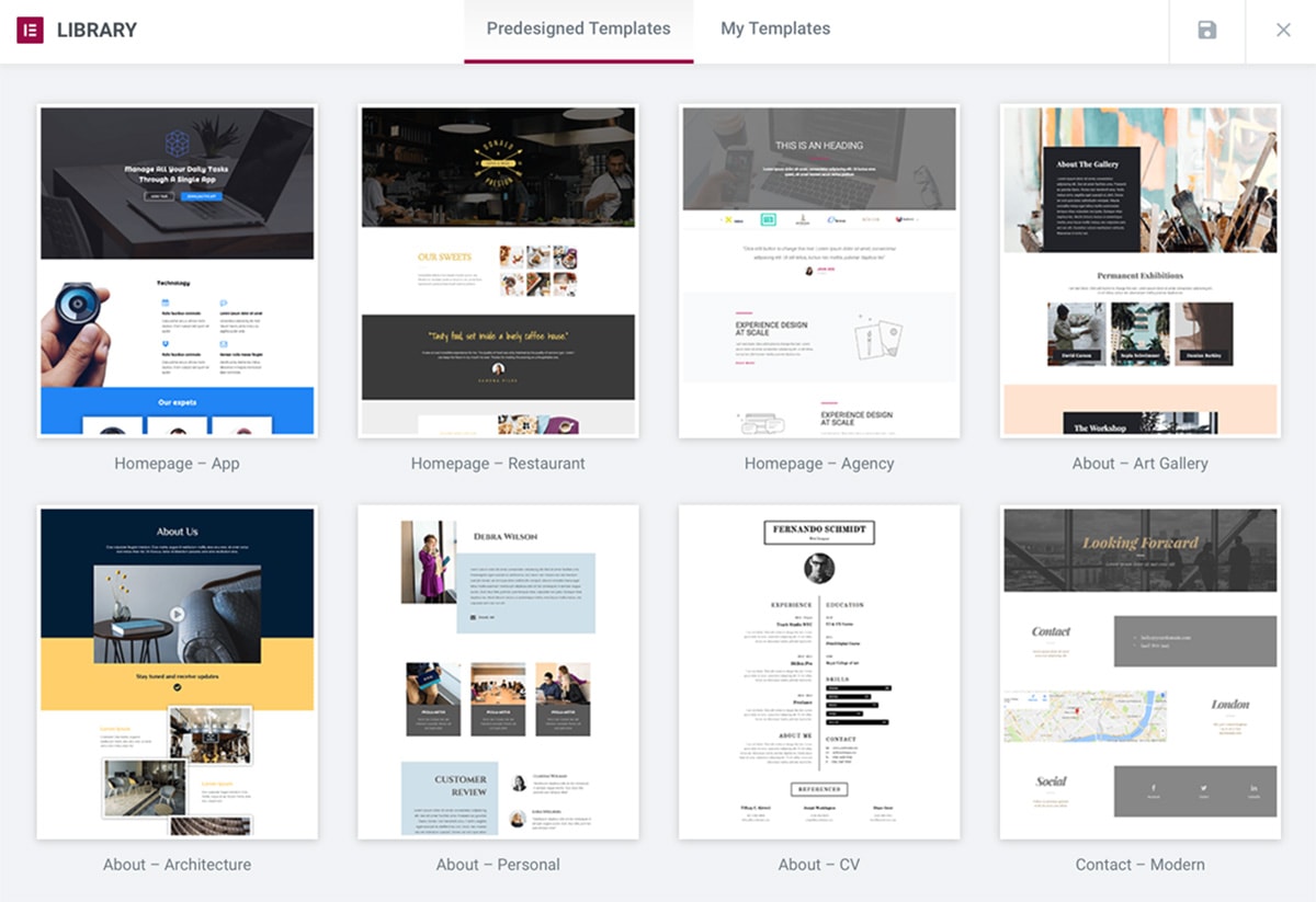
Pre-made templates
In a fast-moving and ever-changing design world, pre-made templates are really taking off in 2017. Pre-designed templates pack a bunch of benefits, but most importantly it’s a much faster way to design. Pre-made templates eliminate the terrifying prospect of having to code and is becoming a great building design tool for anyone to use. Most of the templates are free and customizable, which allows designers to use the template as a stepping stone to creating their own designs.
Conclusion
As consumers grow accustomed to certain trends and learn how to interact with different designs and elements, designers need to meet a whole list of user expectations to keep them on the page. Whether we like it or not, our work is greatly influenced by the winds of change in the web design scene and staying up-to-date with the newest and coolest solutions has a direct impact on our success. But staying abreast with the industry’s news can be as simple as moving a toggle if you turn to products like Elementor that allow you to streamline your processes and work smart. Make the best of the trends without any of the stress of coding from scratch!
 siter.io
 pulsetic.com
 static.app
 mailpost.io