Ghost Buttons and Hollow Objects – Line Art is Thriving
They are less powerful in terms of driving conversion, they are less attractive in comparison to its solid shapes, their effectiveness primarily depends on contrast and surroundings – there are so many cons that it seems that ghost buttons should have vanished a long time ago but they are very much alive.
One of the main reasons that the trend exists, and even flourishes, is that we got more used to them. When ghost buttons made their first steps in interfaces, the trend received a mixed and almost chilly reception, these days it evokes less confusion and misunderstanding.
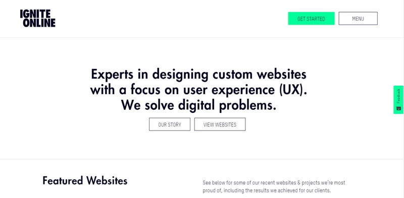
We know that it is a button. Consider Ignite Online. Not only does the ghostly interpretation perfectly fit into the clean and businesslike design of the website but it also draws the attention to the calls to action and naturally places a “get started” button in focus without looking overwhelming.
Ignite Online
This was a way of using ghost buttons in the interfaces in the past. Now, the solution is applied with some improvements. Take a look at Climazone by Adidas.
Climazone by Adidas
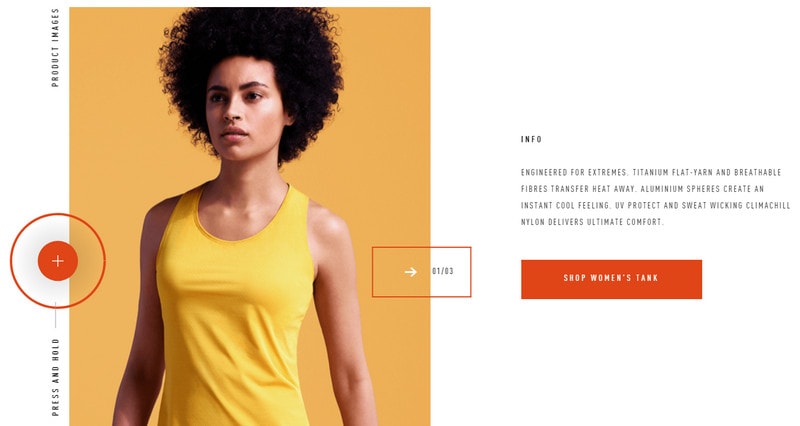
Here, the ghost button has more air inside as well as the nice hover effect that adds solidness to the component. The circular element on the left contributes to its consistency.
Given the previous example, there are some tiny points to take into account to benefit from the trend:
With Postcards Email Builder you can create and edit email templates online without any coding skills! Includes more than 100 components to help you create custom emails templates faster than ever before.
Free Email BuilderFree Email Templates- Make the button bigger by expanding padding
- Make sure there is plenty of of white space around it
- Make lettering inside the component contrast with the background
- Complement it with appropriate graphics
- Apply a hover effect – the simple block reveal effect will do the trick
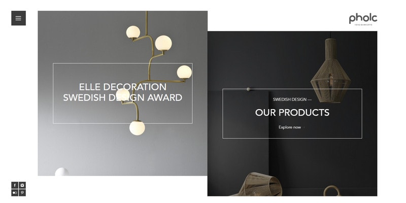
It may sound surprising, but the outline style is able to enhance user experience. Take a look at Pholc. Here, the solution forms a splendid tandem with split screen design that has a boxy vibe resulting in a fantastic outcome. Two non-evident buttons are presented as messages that are framed onto thin white borders. You have two options – two ways to explore the website – and they are perfectly clear for the audience.
Pholc
An Echo of Line Art
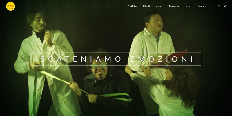
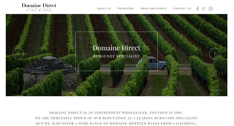
Buttons are not the only elements where delicate line art underlies the foundation of the design. There is an obvious tendency of using hollow objects throughout the design, and it is miscellaneous and diversified. For example, headings enclosed in thin borders with a contrasting shade can receive not only an extra subtlety but also extra focus, like in case of Drawlight and Domaine Direct. Both websites apply the technique to the content placed in slides to separate messages from vivid backgrounds.
Drawlight
Domaine Direct
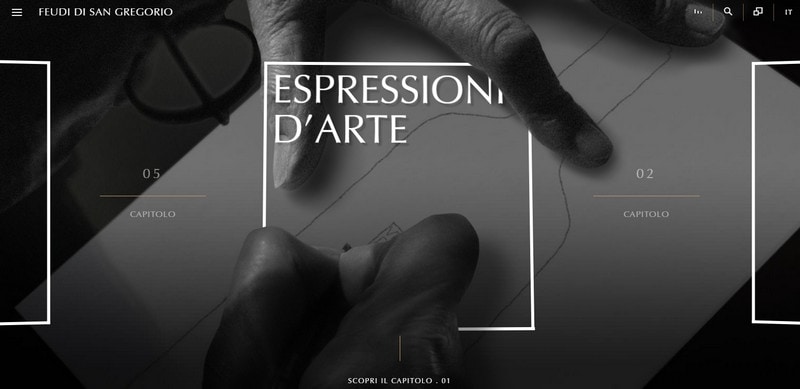
Feudi di San Gregorio deserves close attention. While previous examples concentrate only on the headings, the design team behind this website maximizes visual impact enclosing the whole message in the outlined box, thereby achieving a vivid focal point.
Feudi di San Gregorio
This trick can be beneficial for static welcome screens just with one small change in the size. Shift your attention to ContraryCon.
ContraryCon
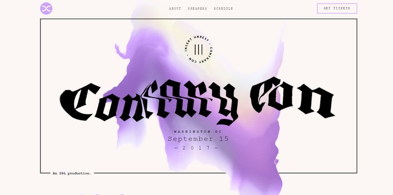
The website begins its conversation with the online audience with an animation that imitates a glitch effect. While the effect can be a little intimidating and overwhelm some people, it grabs overall attention right away thanks to a smart trick with the thin border around the centerpiece that as if restrains the ardor of animation inside. Users get an opportunity to create order out of chaos and distinguish key points such as the menu, CTA and logo.
Hollow Objects as Decor
When it comes to decoration purposes, hollow objects are hard to beat in the era of obsession with geometric-inspired visuals. It can be applied to various aspects of the design. The examples below prove that it can be used to:
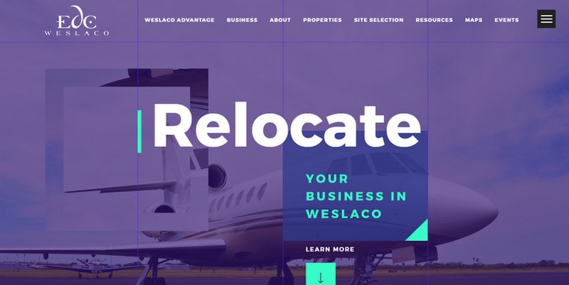
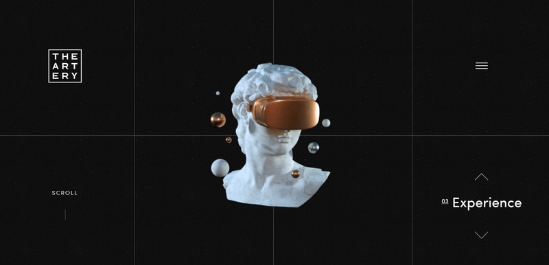
- Enrich the background, making it less homogeneous and dull but more intriguing like in case of Weslaco Economic Development Corp and The Artery. Both websites feature grid-inspired backdrops that look fantastic. While the first example uses the solution in tandem with the image resulting in a backdrop with a twist, the latter applies it to the clean monotone canvas ending up with a nice touch.
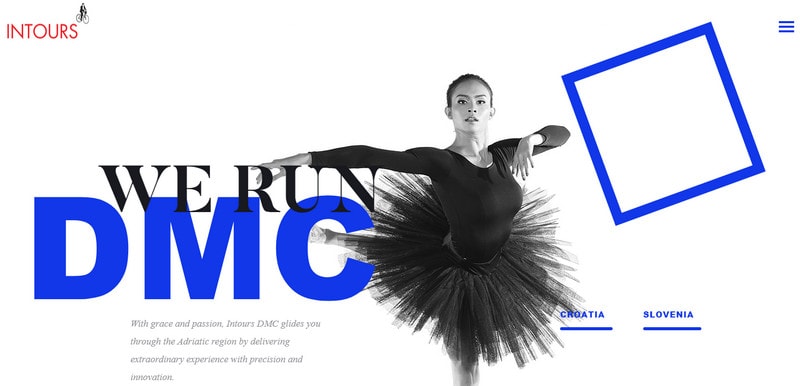
- Add spice to the scene, serving as a standalone detail like in case of Intours DMC. A blue outlined square mirrors the bold heading on the left, placing the picture of ballerina in the spotlight.
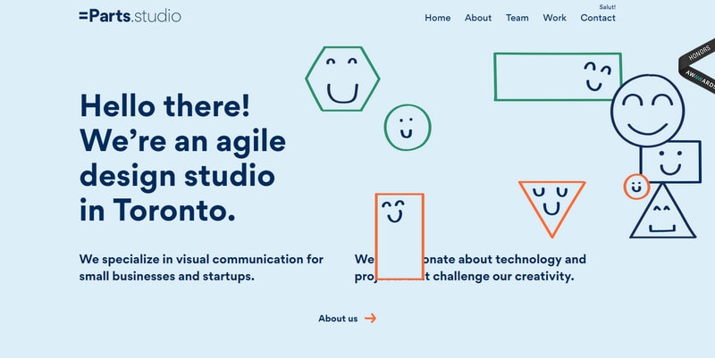
- Entertain like in case of Equal Parts. The welcome section is populated with smiley faces enclosed in hollow squares, rectangles, triangles, and circles. Using drag and drop, you can move them across the screen, toying around.
Weslaco Economic Development Corp
The Artery
Intours DMC
Equal Parts
Line Art
Hollow objects eventually drive us to the line art that stands behind these subtle and delicate stylistic choices. Let’s consider two outstanding examples: Viennese Modernism and Vos Besoins by the Buyer. They provide direction with a nice and unexpected twist in some way.
Viennese Modernism
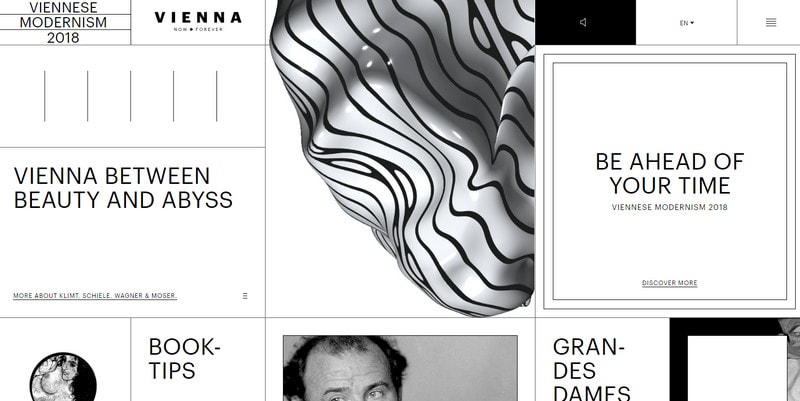
Viennese Modernism has an extraordinary landing page that fully complies with the spirit of the project. The grid-like structure is heavily enriched with the decorative lines, thin borders and geometric shapes. The design looks modern, artistic and crafty.
With Startup App and Slides App you can build unlimited websites using the online website editor which includes ready-made designed and coded elements, templates and themes.
Try Startup App Try Slides AppOther ProductsVos Besoins by the Buyer
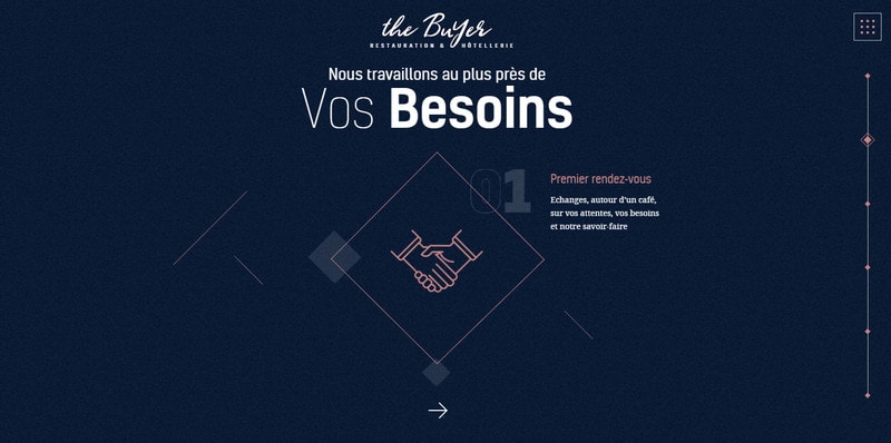
Although Vos Besoins is built around the peculiar implementation of line styled elements, much like in the previous example, yet it feels less artistic but more techy. The overall effect is a result of a combination of hollow objects, ghost buttons and complementary thin lines shrouded in a generous amount of space.
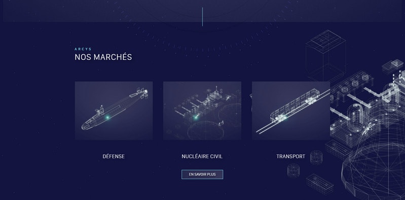
If these modern incarnations in the face of ghost buttons and hollow objects seem a bit odd to you, there are still designs that stick to the traditional path such as Arcys and Festive Folks. They demonstrate the beauty of line art.
Arcys
Festive Folks
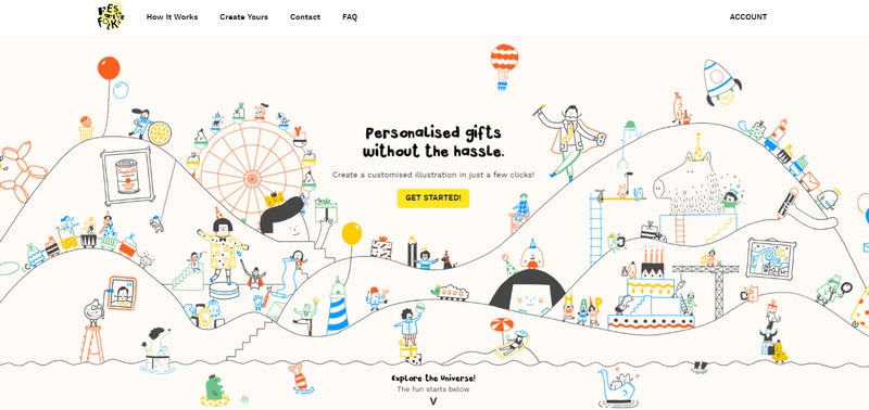
The Arcys leverages sketch-like drawings radiating the high-tech vibe; whereas Festive Folks embraces the artistic approach in full measure exhibiting an outstanding colorful mood of a hand-drawn painting.
Conclusion
Hollow objects, and in particular ghost buttons, like any element with a fragile nature should be used with caution, especially if you care about the UX. There are several things to do in order to derive benefits this trend:
- Determine the goal of the component: If it is a button it should serve as a call to action; if it is pure decoration, then it should either blend into the scene or serve as a focal point
- Pay attention to surroundings, since line-styled elements can easily get lost in a dense environment; the simplest alternative is to add space inside and outside the element
- Remember contrast: When done right, even the barely perceptible details can become a focal point; give the outlined element extra focus by making sure that everything else is of a lighter weight


