Designing for iOS 7: Guide to Getting Started
Now that we are a couple of weeks into the new Apple iOS, are you ready to design for it?
And if you already have an app running on the platform, chances are that you designed with the new iOS in mind but are thinking about going back and making a few necessary tweaks.
Either way, you want to design for the new interface so that your app matches the experience users are getting on their Apple devices.
So how do you do it?
Think Flatter
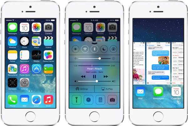
Apple’s iOS 7 is designed with flat in mind, although it is not completely flat.
With Postcards Email Builder you can create and edit email templates online without any coding skills! Includes more than 100 components to help you create custom emails templates faster than ever before.
Free Email BuilderFree Email TemplatesSo think “flatter” when planning the design for your app or mobile site.
Gone are all of the once-trademark skeuomorphic style icons and effects. In are single-color boxes, lots of colored type and lots of space.
The design guidelines from Apple for iOS 7 encourage simplicity in design and usability. But the design guidelines do not focus on specifications that we have come to know as flat design. Some of the things we are seeing in these newly designed apps (and in Apple’s own styling) is counter to some of the characteristics of flat design.
Color, for example, in iOS7 includes quite a few muted tones and transparent effects. Flat design often uses bright, highly-saturated color.
The keys and buttons that you do see are not designed as flat either. Take the keyboard; every letter is contained within a button that has a drop shadow on it. These subtle effects are quite characteristic of the new look.
Focus on Type
Type is the key to the iOS 7 design.
Rather than buttons, actions are directed by tapping on words. (Or in some instances, icons.)
With Startup App and Slides App you can build unlimited websites using the online website editor which includes ready-made designed and coded elements, templates and themes.
Try Startup App Try Slides AppOther ProductsApple’s default typeface is Helvetica Neue, a thin and simple set of letters. But that is not your only option.
Lettering is a little larger in iOS 7, primarily because of its use. And hierarchy in text is vital. Take advantage of color and different weights to make the flow of type and user interface elements clear and easy to follow.
But where do you start?
After you select and obtain the license for a typeface, begin with Apple’s guidelines for default type specifications.
- Navigation bar title: Medium, 34 pixels
- Buttons and table headers: Light, 34 pixels
- Table labels: Regular, 28 pixels
- Tab bar icon labels: Regular, 20 pixels
Go Borderless
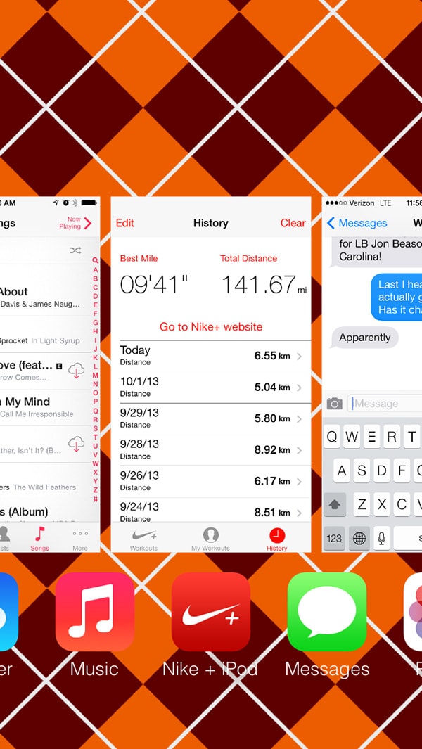
We’ve talked a lot so far about text serving as a button in iOS 7. It goes even further than that. Much of the design interface is borderless.
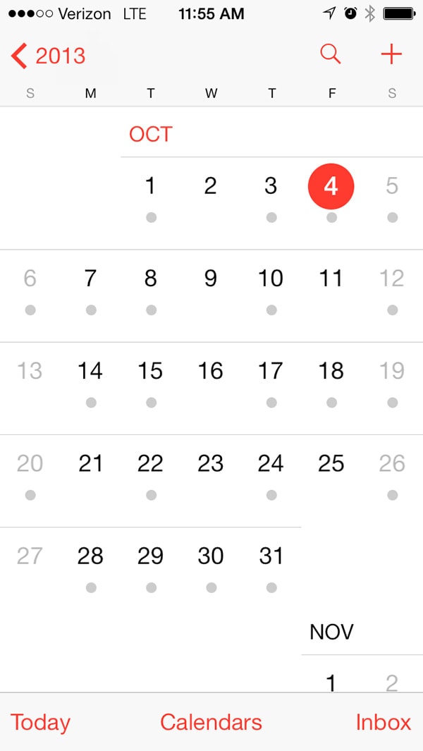
Look at the calendar – no gridlines in the dates. Look at clickable places in Safari – no defined buttons. Look at the clock or built-in weather app – gridlines are also gone.
What has replaced those gridlines is space. And don’t be confused. The grid is still there as well (and it is very defined), the lines separating “blocks” on the grid have just been eliminated.
This lack of lines creates a more open space. The minimalistic style and additional “white” space allows users to see and feel where buttons and gridlines exist without actually drawing them into the design.
So when it comes to boxes, buttons and borders and deciding when to use them – when in doubt, leave them out.
Consider Parallax
One of the major new features in the iOS 7 design is animation. The effects included in the operating system are far more complex than in previous Apple releases.
Take advantage of it.
Consider new and different ways to make objects within your app move and interact with one another. Consider parallax scrolling (up and down or even left to right) as an option that you did not have in the past.
Keep in mind that a lot of what Apple is touting in this release is user experience. Keep that in mind throughout the design process.
Build Depth Using Layers
One of the final tools that Apple has given designers is a new way to create and use depth in iOS 7. In previous releases, depth was created with skeuomorphic effects. In iOS 7, depth is a product of layering.
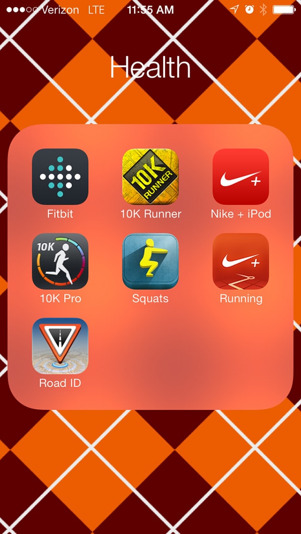
Take the home screen for example. Open a folder. It rests in the middle of the screen and does not occupy all of the space.
This layering also includes transparency effects. Open the menu from the bottom of your device. You can see through it. The colors and general idea of your screen are there, but with a transparent blur added (unless you have enabled the “Increase Contrast” option in the settings). Same goes for notifications, Siri and even buttons on the home screen that allow you to take a call.
Consider how to incorporate these effects into you app design. Is it with the hues you select for a color palette? Does it come into play when developing buttons, icons and calls-to-action?
How to you create an appropriate blur? In Adobe Photoshop, a 10 pixel Gaussian blur seems to do the trick.
Take Care with Your Icon
Designing your app icon can be almost as important as the app itself. It, too, must fall in line with Apple’s iOS 7 guidelines.
While the shape is quite similar it has a few new features, including a specific grid system for the design of the icon itself.
Michael Flarup of Pixelresort created a great template for creating this icon, making it a breeze to create an Apple-approved icon in no time.
Don’t Forget
Apple also has a three-item list to keep in mind when designing for iOS 7 (new or redesigns).
New apps need to follow these rules for inclusion in the Apple Store.
- Remember to update the app icon for existing apps to match the new style. The specs are 120 by 120 pixels for phones and 152 pixels square for iPads.
- Include the status bar area in the launch image.
- All designs should support Retina display and iPhone 5.
Conclusion
Now that we’ve looked at things you need to do to prepare your design for iOS 7, you are ready to get started.
If you are looking for further clarification or guidelines, Apple has a transition guide for designers and developers and documentation explaining the design concept as it was imagined by their team.

 siter.io
 pulsetic.com
 static.app
 mailpost.io