How to Migrate from Bootstrap Version 4 to 5
Bootstrap is more relevant than ever with updates that are easy to learn and use. With the release of Bootstrap 5, there are a number of key updates to the framework. While the whole framework did not go through a complete rewrite, code quality was improved. New custom properties were added, form controls we’re redesigned, the color palette was expanded, and an assurance of CSS variables and faster JavaScript integration with minimal dependencies and better API is clearly anticipated.
Slides: HTML Static Website Builder
Looking for a Bootstrap Online Builder?
- 👉 Try our Bootstrap Builder and create unlimited projects for unlimited clients.
- 👉 Start to build a website using our Bootstrap Templates.
A key update includes Bootstrap no longer depends on jQuery but will rely on vanilla JavaScript moving forward, with dropped support for Internet Explorer 10 and 11. Bootstrap is also sporting a brand new logo to give the old B in a rounded square a small upgrade.
Read about Bootstrap columns, Bootstrap navbar, Bootstrap buttons, Modal Guide, and Bootstrap grid.
Here, we’ll walk through the changes and new features of version 5 by showing some specific class and behavioral changes that will be beneficial when migrating from version 4 to version 5.
With Postcards Email Builder you can create and edit email templates online without any coding skills! Includes more than 100 components to help you create custom emails templates faster than ever before.
Free Email BuilderFree Email TemplatesNote: Before you take a step and migrate from Bootstrap 4 to Bootstrap 5, please remember that Bootstrap 5 is in alpha version at the time of this writing so some changes from the code and updates are anticipated until the release of the first beta version. It’s recommended to always check the open issues and pull requests on their official GitHub repository for open questions and feedback.
Browser Support
Before we dig in with key changes of the new Bootstrap framework, let’s first look at the browser support for Bootstrap 5. If you are using Bootstrap 4 or older version of Bootstrap framework, you may need to customize your support level when migrating to Bootstrap 5. Internet Explorer 10 and 11 has been officially dropped on the new version. The new minimum browser is the Microsoft Edge Browser along with the other major browsers such as Google Chrome and Firefox including the latest Extended Support Release (ESR) version of Firefox. Please note that proxy browsers (such as Opera Mini, Opera Mobile’s Turbo mode, Amazon Silk, UC Browser Mini) are not supported. Bootstrap 5 might also function well in Chromium and Chrome for Linux, and Firefox for Linux, but not officially supported.
In addition, alternative browsers that use the latest version of WebKit, Blink, or Gecko, whether directly or via the platform’s web view API, are not officially supported.
When it comes to mobile support, the minimum iOs supported version is version 7 and above. For Android, it is version 6 and above on browser and WebView. The rest of the older Android and iOs versions are not officially supported. Some CSS properties such as hidden; on the <body> element are quite limited in iOS and Android.
If you want some workaround on bugs on old and buggy browsers, Bootstrap uses CSS browser hacks called validators to target special CSS to certain browser versions in order to work around bugs for progressive enhancement. You can visit this page to learn more.
Global Changes
As technology evolves, newer ways are used to create clean, speedy websites much simpler including the dropping of support to obsolete methods and tools.
Let’s summarize key changes:
- Enhanced grid system
- Redesigned form controls
- Included a handful of components and layout options
- Expanded color palette
- JavaScript support
- New static site generator
- Added SVG icon library
- Coming Soon: RTL, off-canvas and more
Bootstrap 5 Source Code
Before we go deeper into this version, let’s take a look at Bootstrap 5 source code. If you download the source code here, and unzip the file, you’ll find lots of files but we are only concerned with the dist folder inside where the core CSS and JS files live.
With Startup App and Slides App you can build unlimited websites using the online website editor which includes ready-made designed and coded elements, templates and themes.
Try Startup App Try Slides AppOther Products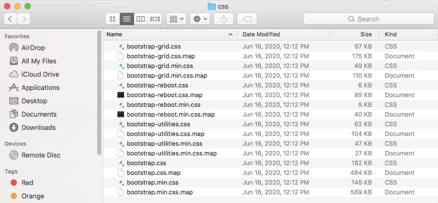
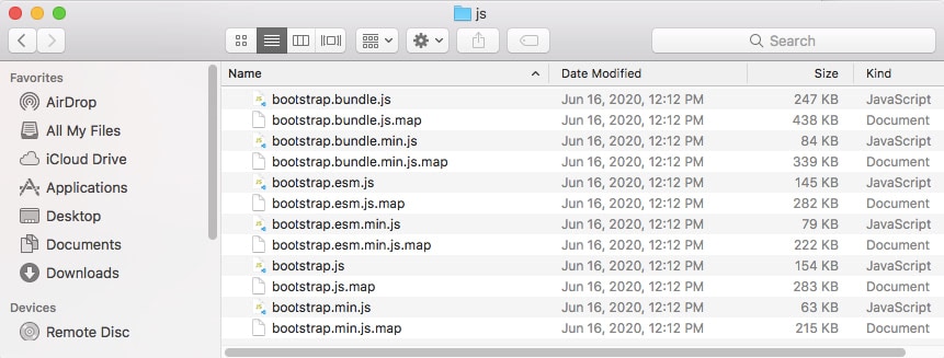
As you can see in the images above, you have lots of CSS and JavaScript files inside. However, you will only need two files here in order to manually take advantage of Bootstrap 5 features in the minified version: bootstrap.min.css and bootstrap.min.js. If you are interested in using the unminified version then you need the bootstrap.css and bootstrap.js file.
Bootstrap 5 Installation
Bootstrap 5 can be installed using various options. You can download and install it to get it compiled with CSS and JavaScript, via source code or simply include it with the modern development tools such as package manager like npm, RubyGems, and more.
You can choose any option you want according to your preference and development environment:
- Compiled CSS and JS. Ready-to-use compiled code for Bootstrap v5.0.0-alpha1 to easily incorporate with your project. It includes compiled and minified CSS bundles and compiled minified JavaScrip tplugins.
- Source Files. You can use this to compile Bootstrap using your own asset pipeline via Sass and JavaScript. It includes Sass compiler (Libsass or Ruby Sass is supported) and Autoprefixer for CSS vendor prefixing.
- Bootstrap CDN. If you don’t want to download either the compiled CSS and JavaScript code and source codes, you can skip the download process and simply attach the Bootstrap Content Delivery Network link into your HTML file to use Bootstrap 5.
- Package managers. Using programming tools to create project environments and easily import external dependencies such as bootstrap, you don’t have to reinvent the wheel since bootstrap offers you a handful list of package managers to use bootstrap. Bootstrap can be installed via npm, yarn, RubyGems, cComposer, and NuGet.
Enhanced Grid System
Technically speaking, Bootstrap 5 isn’t a complete rewrite of Bootstrap 4. The Bootstrap development team has decided to build a new version of the framework without the use of jQuery and all other factors while keeping in mind the migration process of the users which was noticeably difficult during version 3 to version 4. Instead of replacing a bunch of classes, the Bootstrap development team decided to improve it.
Say Hello to .xxl Class
Bootstrap’s grid system can now adapt across all six default breakpoints. The six default grid class are as follow:
- Extra small (xs)
- Small (sm)
- Medium (md)
- Large (lg)
- Extra large (xl)
- Extra extra large (xxl)
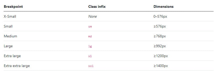
Bootstrap 5 introduced a new utility class that applies to ultrawide screens. The class .xxl will handle breakpoints that are beyond the regular bootstrap media query breakpoint which has a minimum dimension of 1400px grid breakpoint in a 12 column layout.
As an example, if you want to target a screen beyond 1400px wide screen you can use:
<div class="container">
	<div class="row">
		<div class="col-xxl>
			<p>Your content here</p>
		</div>
	</div>
</div>
Gutter Classes
Gutters are the padding between your columns. This was made to responsively space and align content in the Bootstrap grid system.
In Bootstrap 4, gutters can be responsively customized by breakpoint-specific padding and negative margin utility classes. But in Bootstrap 5, the gutter classes have been replaced with .g* utilities which are like margin/padding utilities.
Gutters are the space between column content, created by horizontal padding. In order to set this, you need to set the padding-right and padding-left on each column and use a negative margin to offset that at the start and end of each row to align content.
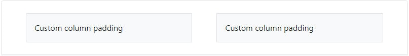
For instance, if you are planning on controlling the horizontal gutter widths, you need to use the .gx-* class.
<div class="container px-4">
	<div class="row gx-5">
		<div class="col">
			<div class="p-3 border bg-light">Custom column padding</div>
		</div>
		<div class="col">
			<div class="p-3 border bg-light">Custom column padding</div>
		</div>
	</div>
</div>
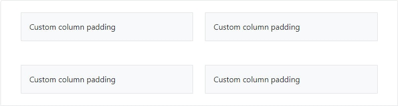
Alternatively, you can use the .gy-* class to control the vertical gutter widths:
<div class="container overflow-hidden">
	<div class="row gy-5">
		<div class="col-6">
			<div class="p-3 border bg-light">Custom column padding</div>
		</div>
		<div class="col-6">
			<div class="p-3 border bg-light">Custom column padding</div>
		</div>
		<div class="col-6">
			<div class="p-3 border bg-light">Custom column padding</div>
		</div>
		<div class="col-6">
			<div class="p-3 border bg-light">Custom column padding</div>
		</div>
	</div>
</div>
Redesigned Form Controls
In Bootstrap 4, form controls receive the global styling of Bootstrap theming. Form elements such as <input>, <textarea>, and <select> elements with class .form-control have a width of 100%. In order to properly deliver consistent margins on the form you need to add a wrapper element .form-group class for each subset of elements:
<form>
	<div class="form-group">
		<label for="exampleInputEmail1">Email address</label>
		<input type="email" class="form-control" id="exampleInputEmail1" aria-describedby="emailHelp"> <small id="emailHelp" class="form-text text-muted">We'll never share your email with anyone else.</small> </div>
	<div class="form-group">
		<label for="exampleInputPassword1">Password</label>
		<input type="password" class="form-control" id="exampleInputPassword1"> </div>
	<div class="form-group form-check">
		<input type="checkbox" class="form-check-input" id="exampleCheck1">
		<label class="form-check-label" for="exampleCheck1">Check me out</label>
	</div>
	<button type="submit" class="btn btn-primary">Submit</button>
</form>
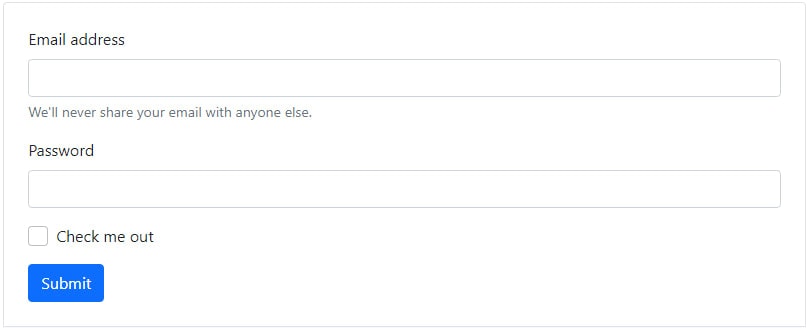
But in Bootstrap 5, .form-group class was removed and replaced by the grid system. This will provide customized displays for a more consistent rendering across browsers and devices in a simpler way.
<form>
<form>
	<div class="mb-3">
		<label for="exampleInputEmail1" class="form-label">Email address</label>
		<input type="email" class="form-control" id="exampleInputEmail1" aria-describedby="emailHelp">
		<div id="emailHelp" class="form-text">We'll never share your email with anyone else.</div>
	</div>
	<div class="mb-3">
		<label for="exampleInputPassword1" class="form-label">Password</label>
		<input type="password" class="form-control" id="exampleInputPassword1"> </div>
	<div class="mb-3 form-check">
		<input type="checkbox" class="form-check-input" id="exampleCheck1">
		<label class="form-check-label" for="exampleCheck1">Check me out</label>
	</div>
	<button type="submit" class="btn btn-primary">Submit</button>
</form>
Components and Layout Options
By dropping Internet Explorer 10 and 11 support, the Bootstrap development team was able to easily include a handful of components and layout options.
Take for instance the .table class. If you are using Sass, you can take advantage with the new local variables to make striped, hoverable, and active table styles easier.
@mixin table-variant($state, $background) {
  .table-#{$state} {
    $color: color-contrast(opaque($body-bg, $background));
    $hover-bg: mix($color, $background, percentage($table-hover-bg-factor));
    $striped-bg: mix($color, $background, percentage($table-striped-bg-factor));
    $active-bg: mix($color, $background, percentage($table-active-bg-factor));

    --bs-table-bg: #{$background};
    --bs-table-striped-bg: #{$striped-bg};
    --bs-table-striped-color: #{color-contrast($striped-bg)};
    --bs-table-active-bg: #{$active-bg};
    --bs-table-active-color: #{color-contrast($active-bg)};
    --bs-table-hover-bg: #{$hover-bg};
    --bs-table-hover-color: #{color-contrast($hover-bg)};

    color: $color;
    border-color: mix($color, $background, percentage($table-border-factor));
  }
}
You can check this page to learn more about various options for bootstrap tables.
Expanded Color Palette
In Bootstrap 4, theming is possible through Sass variables, Sass maps, and custom CSS which provides a basic set of color palettes that you can use, enabling your project to add gradients, shadows, and more.
In Bootstrap 5, the bootstrap development theme expanded the color palette with an extensive color system built-in. You can now easily customize the look and feel of your app without ever leaving the codebase.
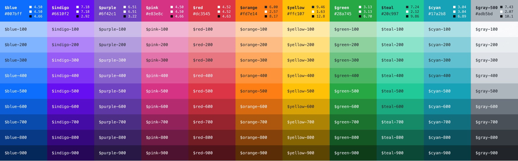
You can set your color of choice which is available as Sass variables and a Sass map in Bootstrap’s scss/_variables.scss file.
All these colors are available as a Sass map, $theme-colors.
$theme-colors: (
"primary": $primary,
"secondary": $secondary,
"success": $success,
"info": $info,
"warning": $warning,
"danger": $danger,
"light": $light,
"dark": $dark );
You can check this page to learn more about the new Bootstrap 5 color palette.
JavaScript Support
The new version of Bootstrap no longer has jQuery as a dependency and was replaced with vanilla JavaScript. It was in 2017 when the Bootstrap development team opened a pull request that speaks about the plan of removing jQuery as a dependency.
In addition to dropping jQuery, the Bootstrap development team created a handful of other improvements to the JavaScript code in version 5 that focus on code quality and bridging the gap between version 4 and version 5.
One of the noticeable updates is dropping bulk button plugin toggle states. Toggle buttons are powered by checkboxes and radio buttons. The Button plugin is removed in favor of a CSS only solution, a checkbox/radio with a .btn-toggle class. This solution works with as well normal as outlined buttons. With this you don’t need the $().button(‘toggle’) jQuery snippet anymore.
To give you a taste of these JavaScript updates, let’s try to add a modal using Bootstrap 4 and then compare it with Bootstrap 5.
To do this in Bootstrap 4, you need to add the following dependencies first on your html tag which includes the jQuery library:
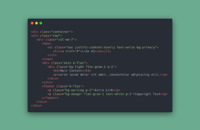
<!-- Button trigger modal --> <button type="button" class="btn btn-primary" data-toggle="modal" data-target="#exampleModal"> Launch demo modal </button> <!-- Modal --> <div class="modal fade" id="exampleModal" tabindex="-1" role="dialog" aria-labelledby="exampleModalLabel" aria-hidden="true"> <div class="modal-dialog" role="document"> <div class="modal-content"> <div class="modal-header"> <h5 class="modal-title" id="exampleModalLabel">Modal title</h5> <button type="button" class="close" data-dismiss="modal" aria-label="Close"> <span aria-hidden="true">×</span> </button> </div> <div class="modal-body"> ... </div> <div class="modal-footer"> <button type="button" class="btn btn-secondary" data-dismiss="modal">Close</button> <button type="button" class="btn btn-primary">Save changes</button> </div> </div> </div> </div>
Finally, to make the modal show on the screen at the click of the button, you need to add the following jQuery codes to trigger the event:
$('#myModal').on('shown.bs.modal', function () {
  $('#myInput').trigger('focus')
})
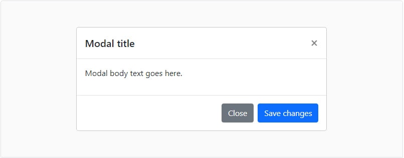
Now let’s try to create a similar effect in Bootstrap 5. First, we need to add the following dependencies on our HTML but this time there is no jQuery library involved.
<script src="https://cdn.jsdelivr.net/npm/popper.js@1.16.0/dist/umd/popper.min.js" "></script> <script src="https://stackpath.bootstrapcdn.com/bootstrap/5.0.0-alpha1/js/bootstrap.min.js "></script>
And then, we add the button and modal markup:
<div class="modal" tabindex="-1"> <div class="modal-dialog"> <div class="modal-content"> <div class="modal-header"> <h5 class="modal-title">Modal title</h5> <button type="button" class="close" data-dismiss="modal" aria-label="Close"> <span aria-hidden="true">×</span> </button> </div> <div class="modal-body"> <p>Modal body text goes here.</p> </div> <div class="modal-footer"> <button type="button" class="btn btn-secondary" data-dismiss="modal">Close</button> <button type="button" class="btn btn-primary">Save changes</button> </div> </div> </div> </div>
Finally, we need to add the following JavaScript code in order to display the modal on the screen at the click of the button:
var myModal = document.getElementById('myModal')
var myInput = document.getElementById('myInput')

myModal.addEventListener('shown.bs.modal', function () {
  myInput.focus()
})
You will see that both of them work but this time in version 5 you don’t need jQuery dependency.
New Static Site Generator
Building a static website is one of the fastest and efficient options to deploy a website nowadays which comes with many advantages like easy to use development tools, blazingly fast performance and deployment. There are two leading solutions for this: Jekyll and Hugo.
Bootstrap 4 has been a great tool to integrate with Jekyll through Sass (Syntactically Awesome Style Sheets) and was known for its simplicity with deploying to Github Pages. However, in Bootstrap 5, the Bootstrap development team decided to go with Hugo. One of the major reasons for the switch is that Jekyll requires Ruby to be installed and it was very slow. Hugo on the hand is written in Go and has no external runtime dependencies which provide a lightning-fast and quite extensible static site generator that has the basic tools: Markdown-based files, templates, and more.
If you want to integrate Hugo on your Bootstrap project, Here’s how to get it started:
- Run through the tooling setup above to install all dependencies.
- From the root /bootstrap directory, run npm run docs-serve in the command line.
- Open https://localhost:9001/ in your browser.
To learn more about how to use Hugo, check their documentation page.
SVG Icon Library
Back in version 3, Bootstrap offered 250 reusable icon components called “Glyphicons” which was licensed under GLYPHICONS.com. Eventually, these icons were removed in Bootstrap 4.
For the first time ever, Bootstrap has its own icon library in version 5 which is custom designed and built for components used from form controls to navigation. The best thing about these icons is that they are in SVG format. This means that they scale well on different viewports without affecting the quality and can be styled with CSS. While they’re built for Bootstrap, they’ll work in any project. Bootstrap 5 icons are open-sourced (MIT), so you’re free to download, use, and extend.
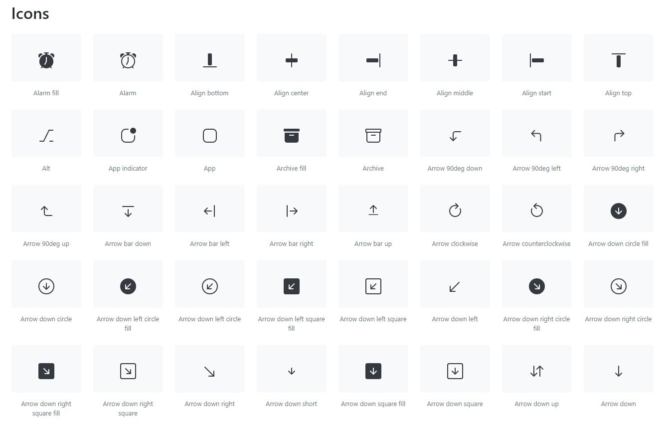
Bootstrap 5 Icons are published to node package manager (npm), but they can also be manually downloaded if needed.
You can install the Bootstrap icons via npm through:
npm install bootstrap-icons
Then you can use the svg tag to embed the icon of your choice:
<svg class="bi bi-chevron-right" width="32" height="32" viewBox="0 0 20 20" fill="currentColor" xmlns="https://www.w3.org/2000/svg">
	<path fill-rule="evenodd" d="M6.646 3.646a.5.5 0 01.708 0l6 6a.5.5 0 010 .708l-6 6a.5.5 0 01-.708-.708L12.293 10 6.646 4.354a.5.5 0 010-.708z" />
</svg>
If you plan on using them manually, you can download the latest package zip on this page and include them via image tag.
For instance:
Coming Soon
With the release of Bootstrap 5, a few things have been dropped and a couple of new ones have been added. One of the expected features to expect in the future release is the integration of RTLCSS which is a way of transforming Cascading Style Sheets (CSS) from Left-To-Right (LTR) to Right-To-Left (RTL). This provides a powerful set of Directives to manage the conversion process right from within your CSS.
Another expected future feature is the implementation of an offcanvas menu which slides when a user clicks an icon or performs some sort of action (e.g. click on a menu) that results in a vertical navigation menu sliding into the screen from off canvas. This is still in the process of development.
Finally, we can expect more changes from the source codes, RFS (Responsive font size) implementation, Sass module system, and increase of CSS custom properties.
Final Words
Bootstrap 5 has many more changes and improvements to come in the future including the refining of some source codes and more JavaScript plugin integration. According to the Bootstrap development team, we can expect another alpha release within 3-4 weeks and likely a couple more after that.
To understand all the updates made so far, try to go through the documentation on the official Bootstrap 5 website and experience them hands-on.
Migrating from Bootstrap version 4 to 5 can be relatively painless if you follow the steps outlined in this guide. Be sure to review the official documentation for more in-depth information on the changes introduced in Bootstrap 5. By updating your projects to the latest version, you’ll benefit from improved performance, enhanced features, and better compatibility with modern browsers.


 siter.io
 pulsetic.com
 static.app
 mailpost.io