How to Design Mobile Product Pages for Greater Sales
Mobile e-commerce has experienced a meteoric rise these last few years. And according to recent data, experts predict that the vast majority of online sales will be made through smartphones by 2021.
Specifically, it’s believed that 72.9% of e-commerce revenue will come from mobile consumers.
Considering what we know about the rise in mobile search engine traffic and how Google has changed the way it indexes the web because of it, mobile ecommerce design is more important than ever.
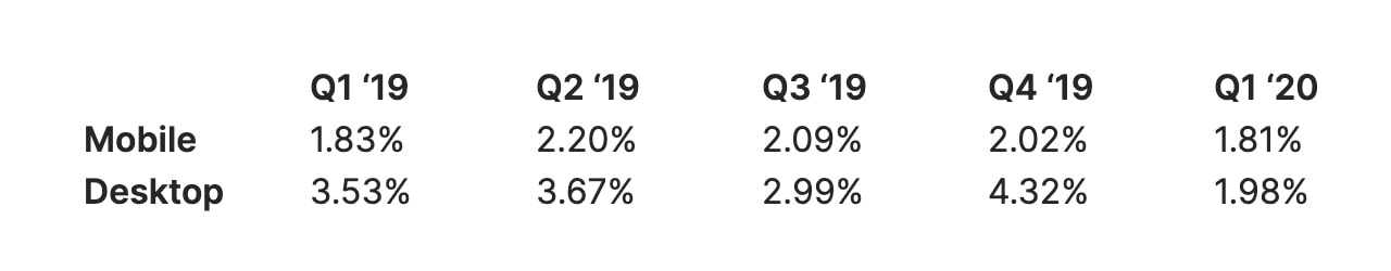
Sadly, the trend until recently has been for m-commerce sites to convert at a much lower rate than their desktop counterparts (despite having more visitors). Recent data from Monetate breaks down the mobile vs. desktop conversion rates from around the globe:
So, today, we’re going to zero in on mobile product page design. If we can remove the friction, anxiety, and fears that often plague mobile shoppers, we can design ecommerce sites that are prepared to capture more of that revenue coming in from smartphones.
Designing Mobile Product Pages for Greater Sales
Mobile product pages play a pivotal role in convincing shoppers to place items in their carts. When designed right, they can also lay the groundwork for a more trustworthy checkout process, which will help increase your website’s conversion rates.
With Postcards Email Builder you can create and edit email templates online without any coding skills! Includes more than 100 components to help you create custom emails templates faster than ever before.
Free Email BuilderFree Email TemplatesHere are 10 things you can do:
1. Hide the Header… But Not Entirely
It doesn’t always feel like you have enough room to work with on smartphones, especially on ecommerce sites where the navigation plays an important role in moving shoppers to different departments and products. So, we need to find a middle ground.
One thing you can do is shrink the header when shoppers are on product pages. That way, they’ll always have the shopping cart in view, but the full bar won’t take up as much space.
A better solution, however, is to hide the header altogether when visitors scroll down the page. This way, you don’t have to compromise on how large your product photos are or how much information you place within each section.
A good example of this is Uncommon Goods. This is what shoppers see when they first enter a product page:
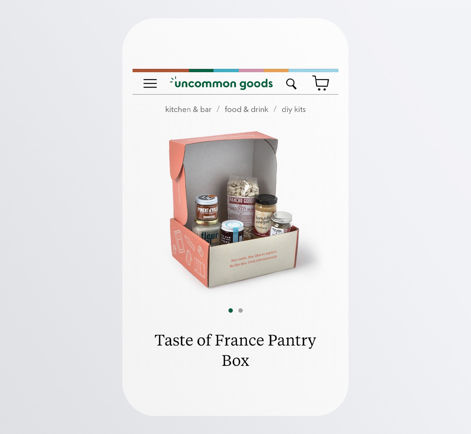
It’s a great-looking snapshot at the product, even with the header bar and navigation on full display.
The breadcrumbs navigation above the product photo is another great touch. This way, if a shopper quickly decides “This isn’t for me”, they can easily backtrack through the related categories and try to find a better-fit item than starting all over.
Once the shopper starts scrolling down the page on the Uncommon Goods site, the top bar disappears and this is what they’re left with:
With Startup App and Slides App you can build unlimited websites using the online website editor which includes ready-made designed and coded elements, templates and themes.
Try Startup App Try Slides AppOther Products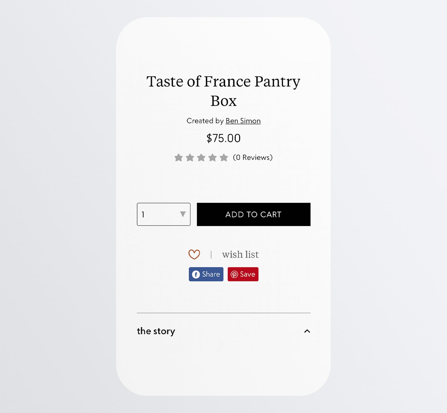
Not only does this create more room, but it also provides a distraction-free scrolling experience. This can be a huge relief for shoppers who have grown way too accustomed to being lured away from what they’re looking at by an overabundance of options and FOMO.
Providing a header-free product perusing experience will increase their attention so they can more confidently click that “Add to Cart” button and buy what they’re looking at.
2. Include Essential Details Above-the-fold
Again, this idea of trying not to overwhelm shoppers when they look at product pages is huge. So, it’s really important to include only the most essential of details above-the-fold and then leave the rest of the page to expand on the rest.
How you decide what to put at the top of your mobile product pages depends on what’s most important to your shoppers.
For example, H&M provides these basic details:
- Breadcrumbs navigation
- Main product image (with a heart icon for one-click saving to Favorites)
- The name of the product
- The price (and member price)
- Size selector
- “Add” button
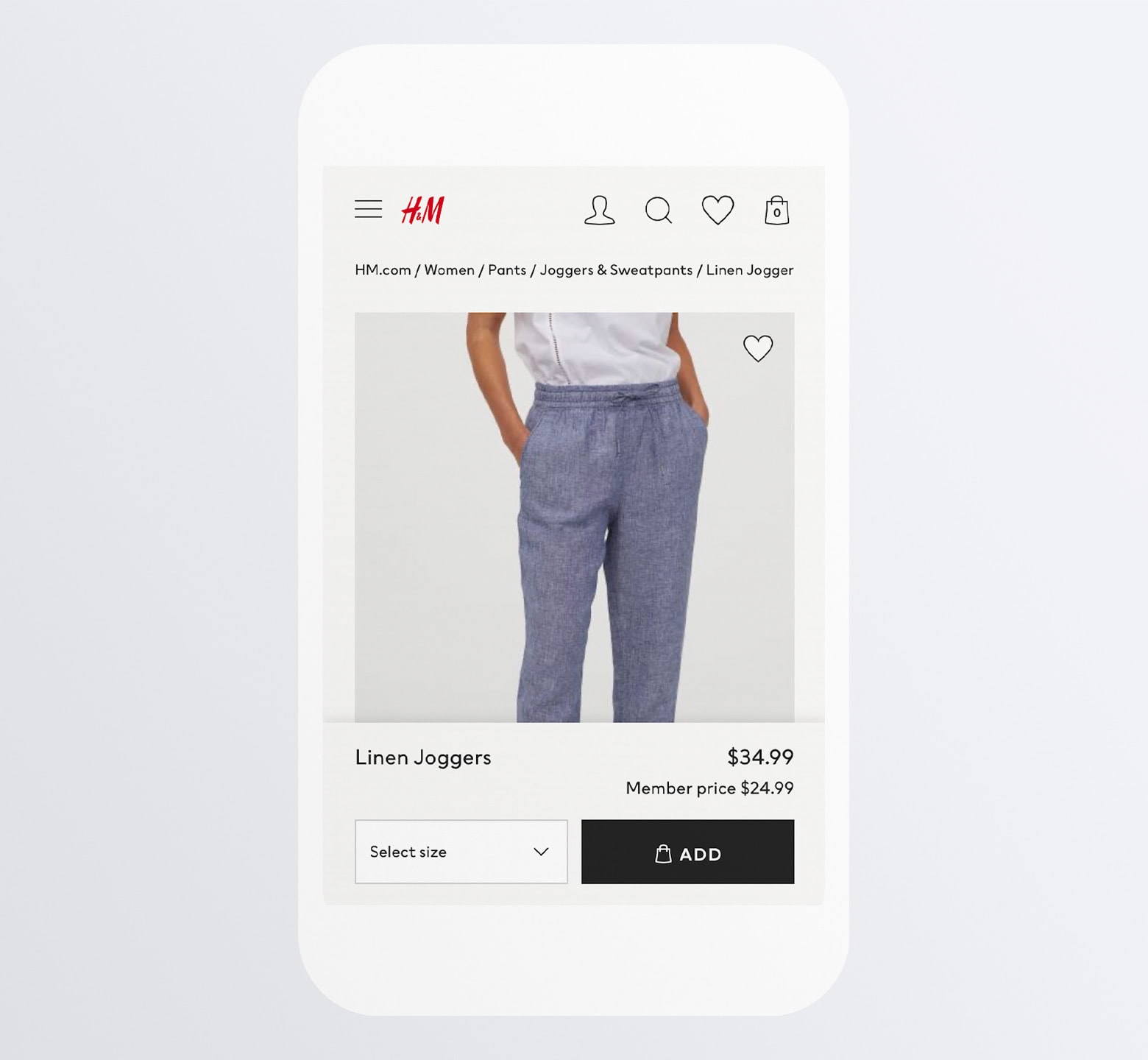
That alone gives shoppers a great overview of the product. It might not be enough to sell them on buying the pair of pants, but this well-organized product introduction and summary sets a really strong first impression.
Macy’s, on the other hand, dedicates the top-half to details like:
- Breadcrumb navigation
- Product name
- Product description
- Average star rating and number of reviews
- Free shipping offer
- Product image
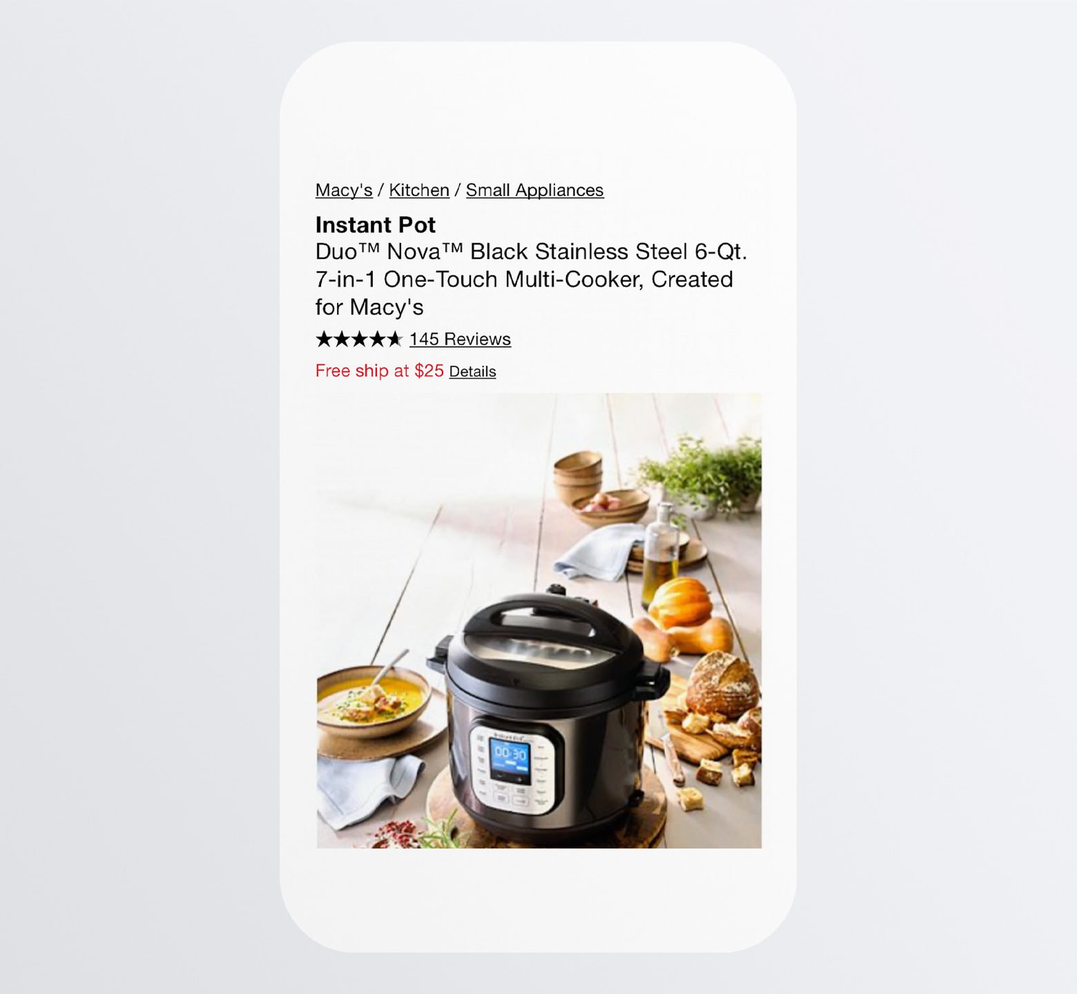
Although it’s not as neat and concise as H&M’s product page, it does a nice job including key decision-making details — the product rating as well as the free shipping offer.
By getting to know your target audience better, you’ll know which details are most important for shoppers to see at a glance (e.g. in-store availability, free shipping thresholds, sale price, etc.).
3. Provide Clear and Relevant Images of the Products
Most websites aren’t equipped with a virtual reality fitting room or an augmented reality try-on. This makes product images a really important part of the sales process in ecommerce, which means designers have to be careful with how they present them.
Here are some things to keep in mind:
Images should be no larger than the smallest smartphone screen. Forcing mobile users to scroll will no doubt lead to frustration.
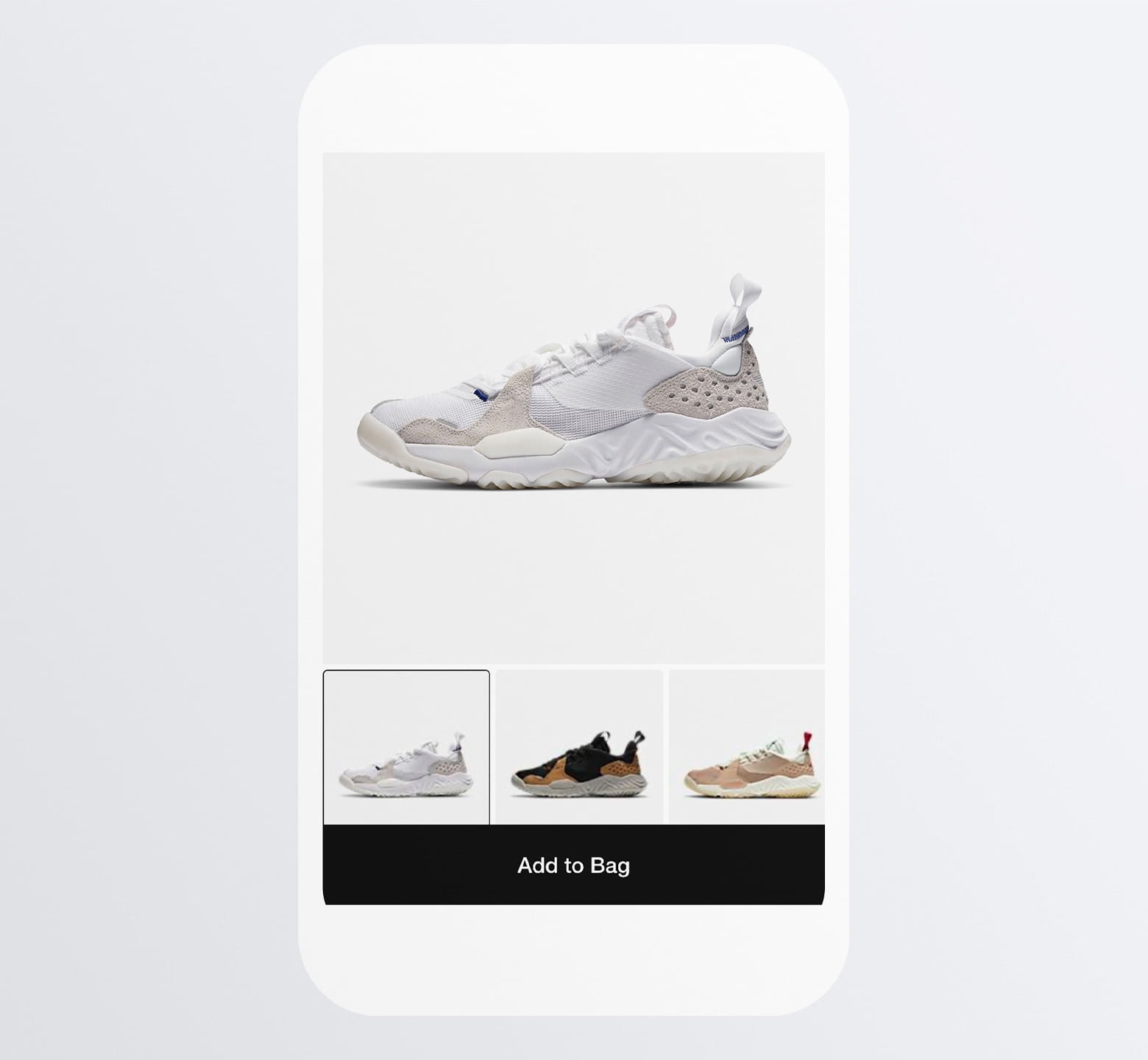
Take a page from Nike’s book and make them even smaller than the boundaries of the screen:
Then, use a lightbox that enables shoppers to zoom in on the product’s high-resolution details:
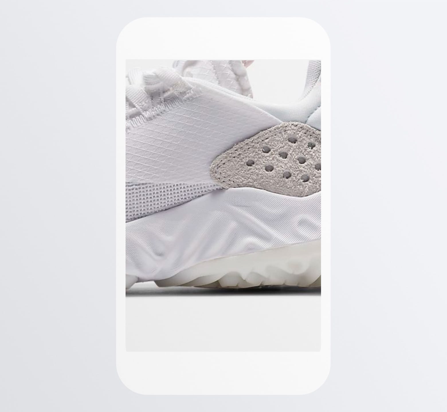
Just make sure you use images worth zooming in on. Since online shoppers can’t actually try any of these products on, they’re going to need to see those fine details in order to make a confident buying decision.
Here’s another thing to think about:
Include more than one image so shoppers can see the product from different angles, in available variations, or being used in different ways.
Dollar Shave Club, for example, doesn’t just show fancy bottles of its body products:
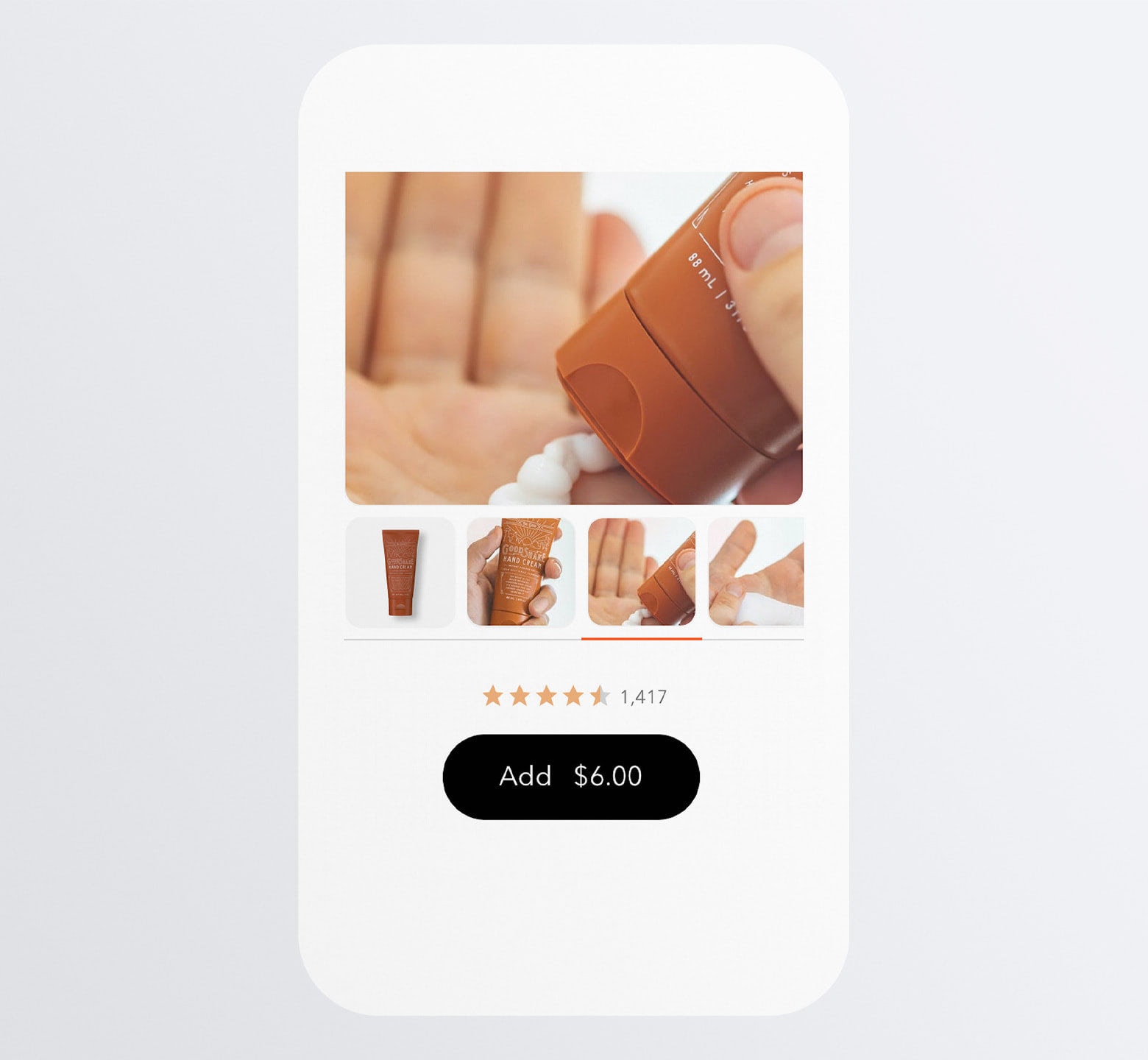
In this particular example, shoppers see the product bottle, get a sense for how big it is when framed against someone’s hand, as well as see what the actual cream looks like.
It would also be beneficial to include a short video or interactive 360-degree view (when relevant) in your image gallery.
Basically, include whatever you need to include in order to keep the shopper from feeling like they need to go in store to try the product on/out.
And, of course, make sure all images on your website are optimized for speed. Mobile websites are notoriously slower than desktop, so if you want to encourage shoppers to buy from their smartphones, your product pages should load in under three seconds.
4. Prevent Shoppers from Choosing Out-of-stock Variations
There are tons of ways to frustrate shoppers on a mobile website. Like when you wait until they’ve selected a product or variation to tell them “Sorry, that one’s not available”.
Treat your mobile product pages like your mobile contact forms. You wouldn’t allow someone to fill out a form incorrectly and only notify them of the issue until after they hit “Submit”, right?
When it comes to mobile product pages, choose a style for available variations and another for unavailable ones.
The most common way to handle this is with greyed-out boxes or text, like Nike does:
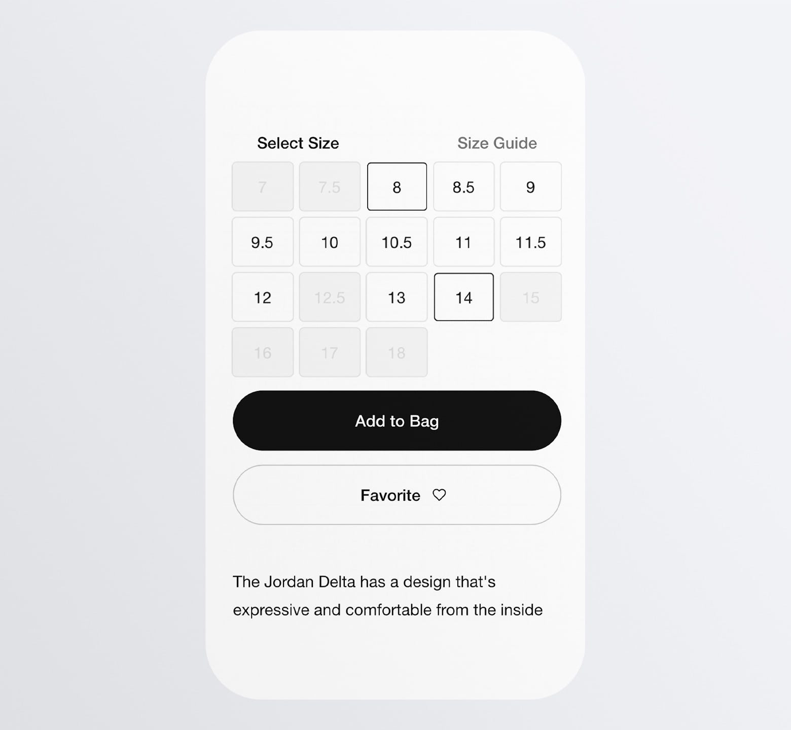
This way, shoppers will immediately and clearly see what their options are.
Now, if you’re designing an ecommerce site for a company that can replenish its stock more quickly and predictably, you might not want to use greyed-out selectors.
Take Amazon, for instance:
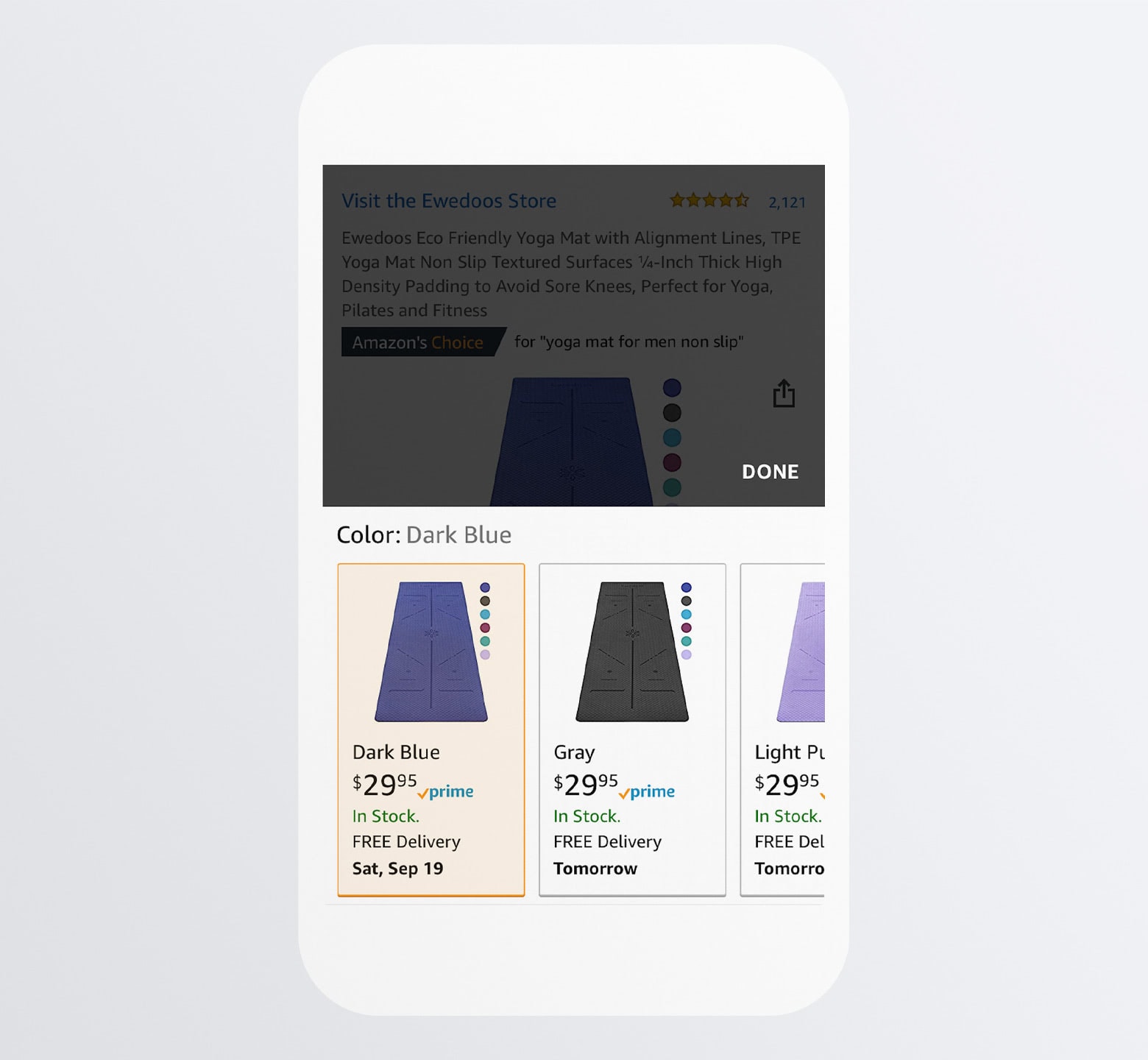
While there are some cases where Amazon sellers just can’t stock their items within a reasonable timeframe and have to mark the variation as “unavailable”, this one doesn’t have that problem.
A shopper who has their mind set on a dark blue yoga mat doesn’t need to settle for a color they don’t want or walk away from the purchase altogether.
By keeping these variations free of the dreaded “Unavailable” and providing a concrete date of availability (even if it’s later than expected), your site can increase shopper satisfaction as well as its sales.
5. Be Efficient in How You Display Product Information
Let’s be honest: The above-the-fold details aren’t going to be enough to convert most shoppers. So, the rest of the page needs to lay out supplemental information that’ll help them come to that decision.
Depending on the kinds of products you sell, this will require a lot of space on a mobile website. And that means lots of scrolling for your visitors.
Shrinking the size of the text is not an option as you don’t want to compromise legibility or readability. Instead, you can use one of two kinds of space savers.
You’ll find a good example of the first on the Walgreens website:
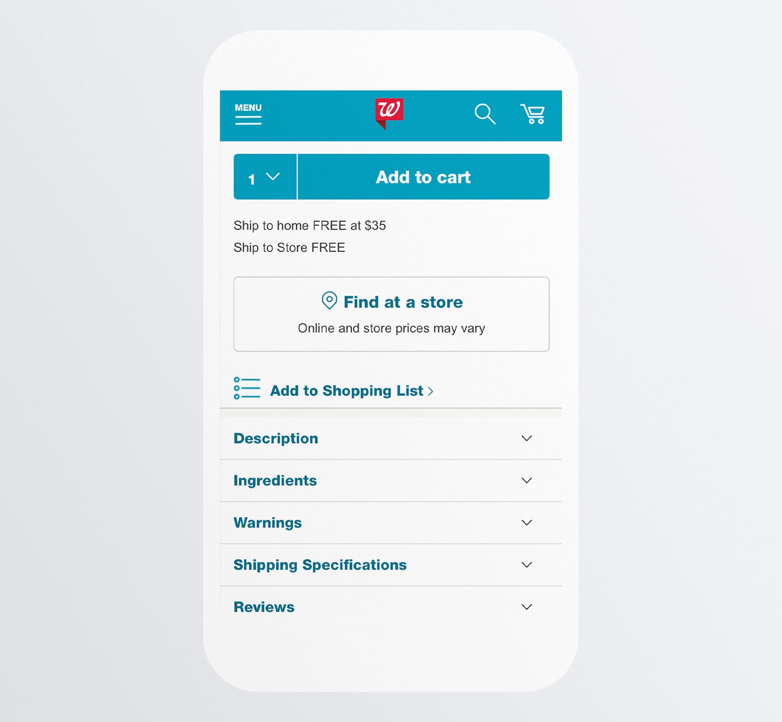
Each informational section is neatly tucked away under an accordion. That way, visitors can easily pick-and-choose which bits of information they need in order to make up their minds.
H&M takes another approach to this. Here is how it lays out its informational sections:
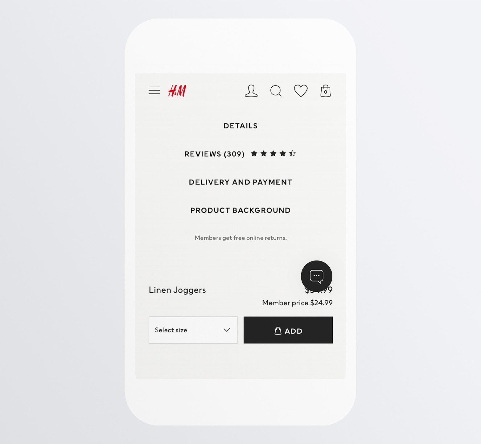
It somewhat resembles the accordion layout of the Walgreens site. However, the lack of arrowheads tells us that’s not how this page is not going to operate.
Instead, here’s what happens:
H&M moves its lengthy informational sections off of the page entirely. Each of them exist within their own scrollable and dismissible modal.
One of the problems with weather mobile design, in general, is that pages can get really long (or at least seem that way to the people perusing them). This is definitely one of those design tricks that’ll help you keep your pages to a more reasonable length.
Even if you’ve condensed as much information into accordions or modals as possible, mobile pages can still take awhile to scroll through. So, when a shopper has read through what they need to read through, why make them scroll and scroll until they find the add-to-cart button again?
Answer: You don’t have to.
Here’s how Walmart handles it:
The second someone lands on a product page, they see this sticky add-to-cart bar alongside the product price. As they scroll down, the bar stays in place.
This makes a lot of sense when you think about the way people shop online. The chances of them converting above-the-fold without reading any product details or reviews is pretty low (though it doesn’t hurt to make a good impression there).
By having the “Add to cart” present no matter where they scroll, they can take action the second they’re convinced it’s the right move.
Another website that does this is IKEA:
IKEA’s add-to-cart bar includes more details than Walmart’s. Shoppers see the:
- Image
- Name
- Price
- Blue add-to-cart button
Despite all the information there, IKEA’s simple design and layout choices keep this preview bar from becoming an eyesore.
What’s interesting about this sticky bar, in particular, is the “View details” link under the product’s name. When clicked, this link instantly takes the shopper back to the relevant product details section.
Not only does this sticky bar make adding to cart a much more convenient act, but it also provides a shortcut to the most important details about the product.
7. Include Alternate CTAs, But Design Them Differently
While we know that there are more and more consumers shopping with their smartphones, we also know that some are still more comfortable converting on desktop. We also know that the smartphone is a valuable resource for in-store shopping as well, enabling people to compare prices, clip coupons, check stock availability, and so on.
So, alternate CTA buttons will give your shoppers the ability to use their smartphones however they please. And, in return, your m-commerce site can capture (or assist in capturing) more sales.
Just be careful with how you present your other CTAs. You don’t want them to distract from the primary “Add to Cart” option.
Macy’s does a nice job of this:
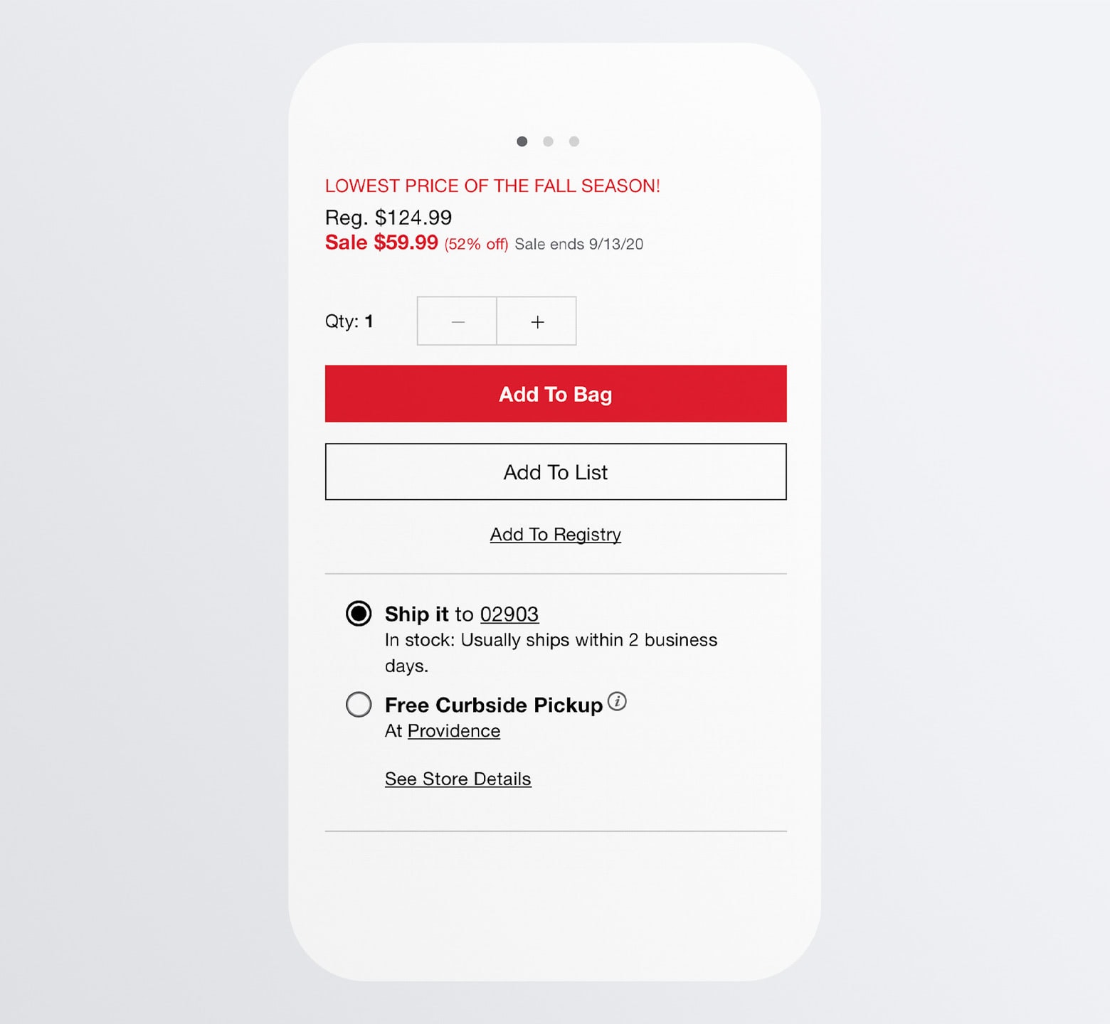
The primary CTA is “Add To Bag”. It’s a full-width red button that screams “Click me!”
But let’s say someone isn’t yet convinced they’re ready to buy.
Just below it is the “Add To List” button. By designing this as a transparent ghost button, it’s not likely to grab as much attention, but won’t completely fade into the background.
“Add To Registry” is the third CTA option and it makes sense why it’s designed without a button shape. While Macy’s is likely a popular source for building wedding or baby shower registries, it’s not a common action that visitors take so there’s no need to give it so much prominence within the design.
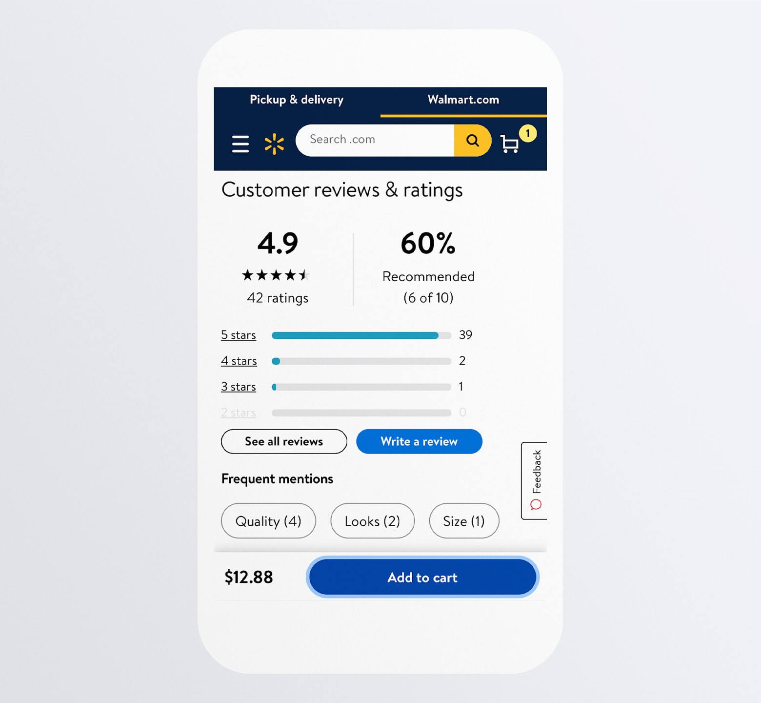
8. Place Trust Builders Around the CTA
There are many things about a brand, a website, or even a product that can break the trust of a new customer. And, sometimes, it’s not anything you’ve done that’s caused customers to worry and want to back out before it’s too late. Sometimes it’s because of something you haven’t done.
This is why trustmarks need to be present on your mobile product pages and, specifically, around the CTA buttons. If your website has done everything else to convince them to buy, this is your last chance to reinforce the trust you’ve acquired up to that point.
Trustmarks come in many different forms.
Home Depot, for example, includes two trustmarks around the “Add to Cart” button:
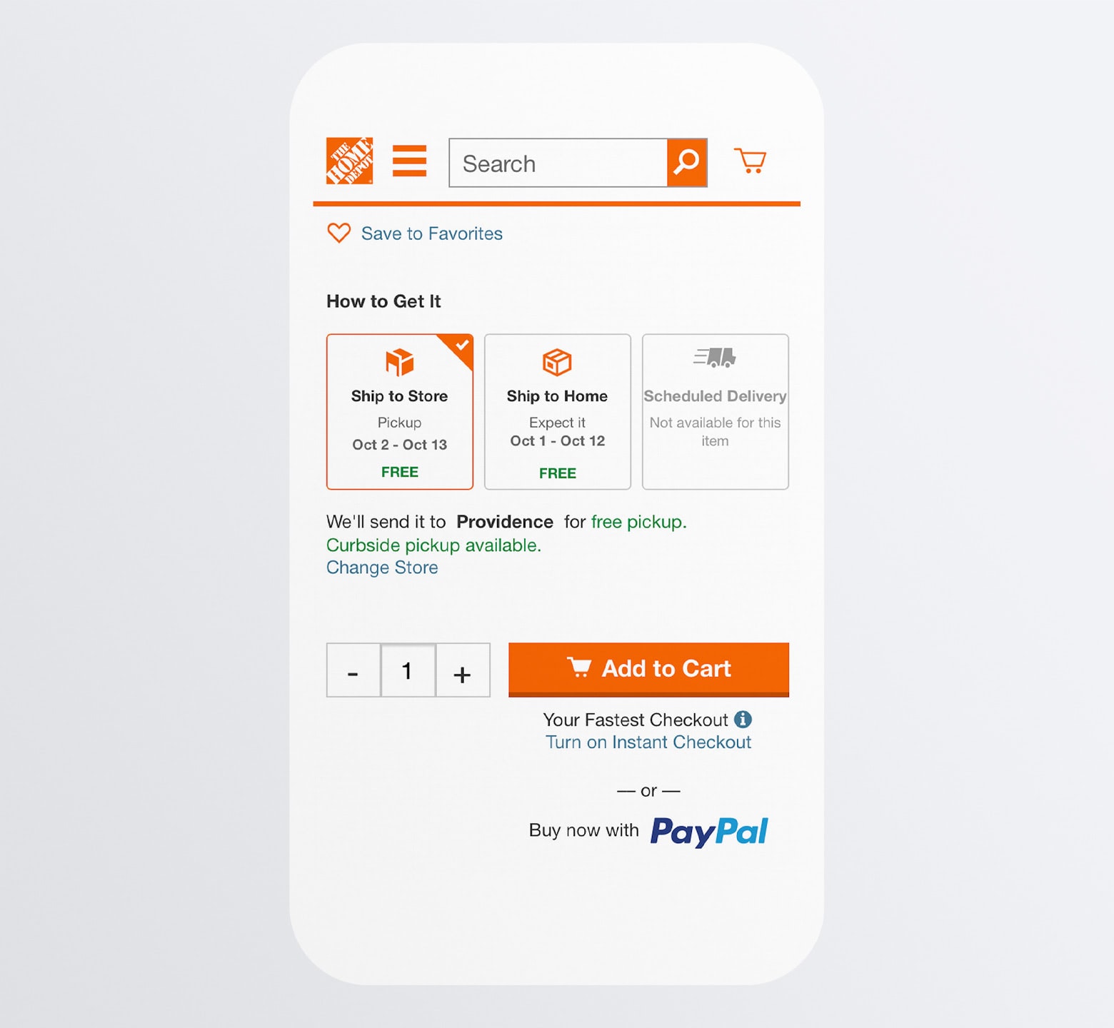
The first is just above the button: How to Get It.
This option isn’t always available from online stores. And, when it is, it doesn’t show up until the shopper is halfway through the checkout process. For customers that want flexible shipping and pickup options, this trustmark needs to be available on the product page.
The other trustmark here is below the button: The Instant Checkout and PayPal Checkout options.
One of these provides shoppers with a pain-free way of getting through mobile checkout. The other provides them with a highly trusted payment processor to check out with. Either way, the goal is to let shoppers know that their comfort is priority number one.
Walmart is another one that includes shipping and pickup information before checkout:
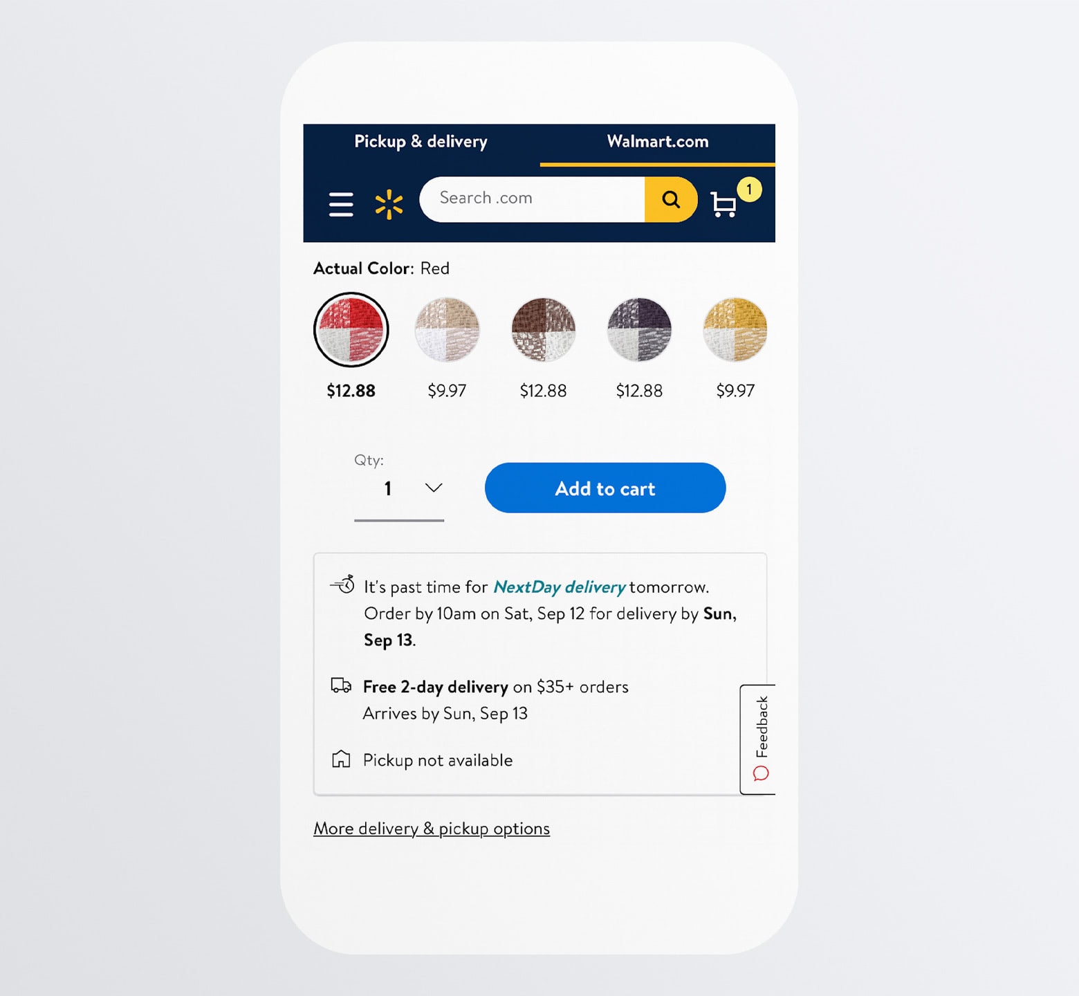
Next-day and two-day delivery offer ecommerce sites a major competitive edge (as does in-store pickup), so highlighting these options and spelling out when exactly the deliveries will arrive is a smart move.
Also, notice the “Sold & shipped by Walmart”, which lets shoppers know they won’t have to worry about a third-party mishandling their delivery. There’s also the “Return policy” link. It’s always a good idea to have this around the CTA since many shoppers won’t think to look those details up until it’s actually time to return something. Which may be too late.
9. Include Non-intrusive Chat Widget
Just because people have chosen to shop online instead of in store, that doesn’t mean they don’t still want help from a store associate when they have questions.
With a chatbot or live chat widget installed on the site, you can automate a lot of these interactions while freeing up the support team to deal with questions and issues that require custom responses.
But be careful.
A chat widget on a desktop ecommerce site might not be a big deal since it sits on top of white space in the corner of the site. On mobile, though, it’s bound to cover up important product details.
Rather than use the typical chat widget button in the right corner, create one similar to Apple’s:
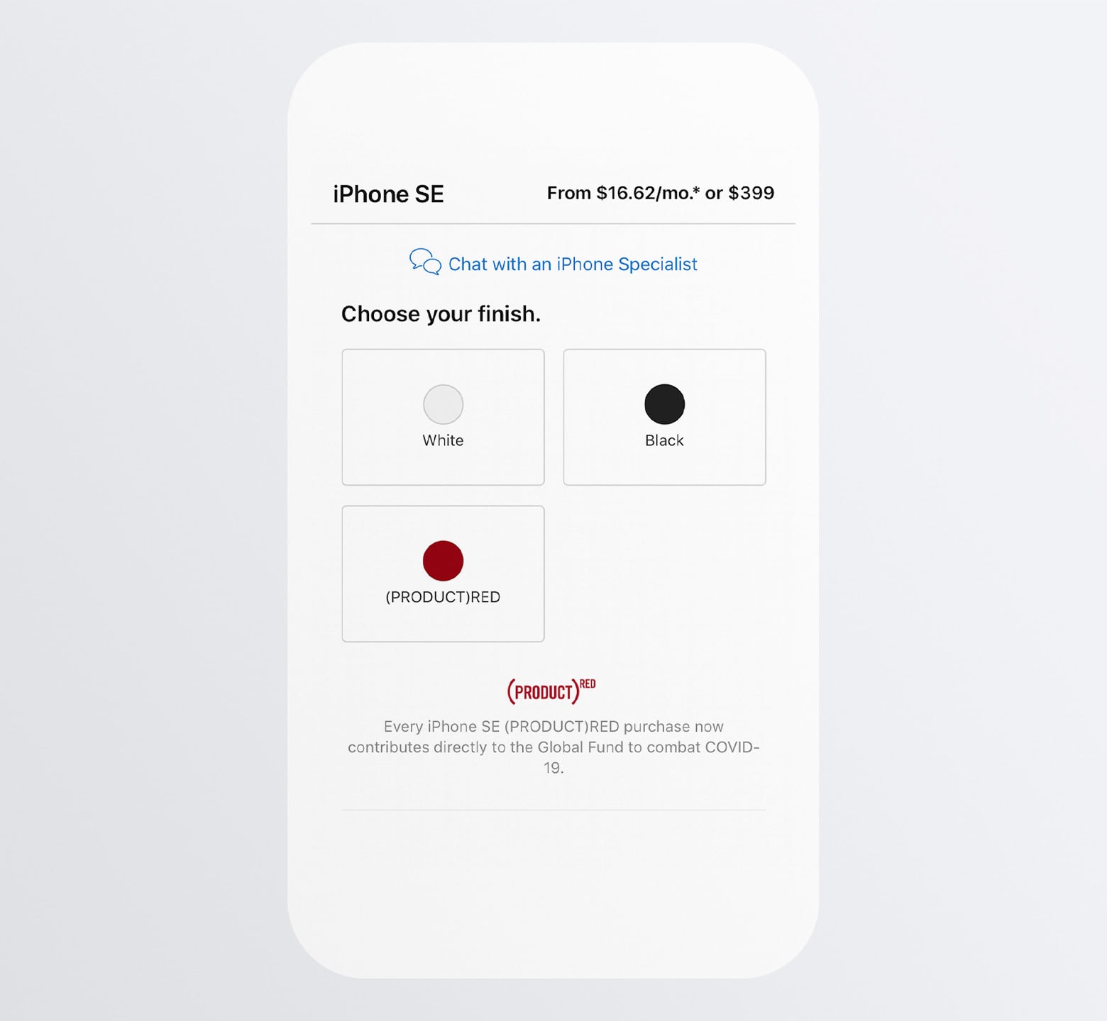
The blue “Chat with an iPhone Specialist” initially appears as a hyperlink beneath the main product image. However, once the visitor scrolls past the image, the chat link becomes affixed to the top of the page.
You don’t have to use this design exactly, but the concept of sticking a chat bar to the top or bottom of your mobile product pages is a good one as it keeps this helpful, though not-always-needed conversational element out of the way.
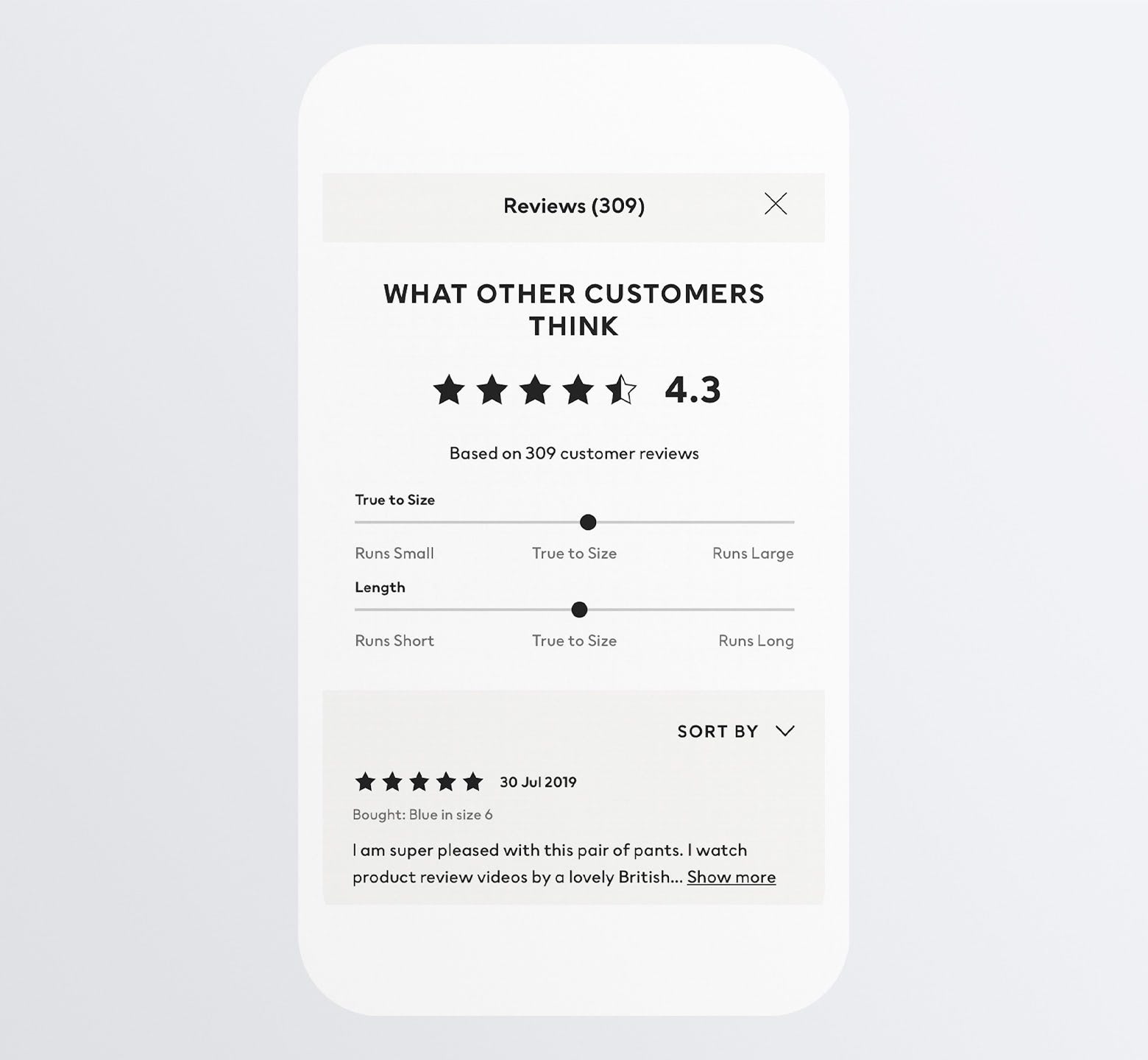
10. Make Product Reviews Searchable/Sortable
Including a reviews and ratings section on your product pages is a must. That said, we still need to be cognizant of content length.
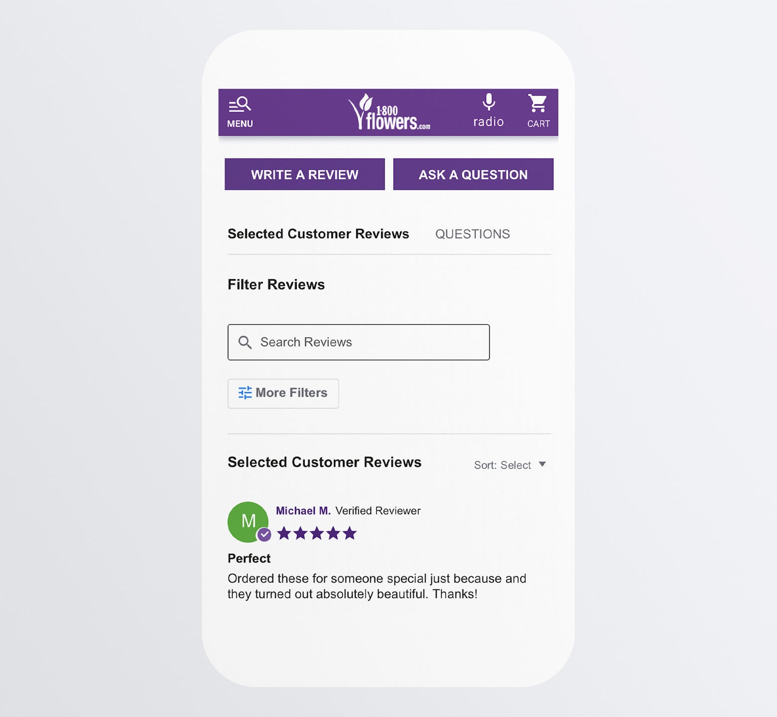
One thing you can do when designing your reviews section is to include a search bar.
This will provide your smartphone users with a shortcut to the most relevant details, like 1-800-Flowers does:
Another thing you can and should do is to allow for sorting by:
- Newest
- Oldest
- Highest customer rating
- Lowest customer rating
- Most helpful
This way, visitors can narrow down how many reviews they see and spend their time reading the ones that’ll have the greatest impact on their buying decision.
Wrapping Up
Sure, mobile shopping is on the up and up. But is the act of shopping on a smartphone the only metric we should be looking at?
If we want to capture as many sales as possible, then we need to be focused on how many mobile visits actually turn into mobile sales. And, if not, what’s holding them back from doing so?
By implementing the 10 strategies above into your mobile product page design, you can:
- Make a strong first impression.
- Remove common m-commerce distractions and obstacles.
- Cut down on the time shoppers spend scrolling.
- Instill greater trust in your shoppers.
And, of course, make more sales at the end of the day.


 siter.io
 pulsetic.com
 static.app
 mailpost.io