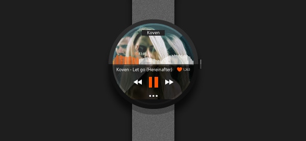
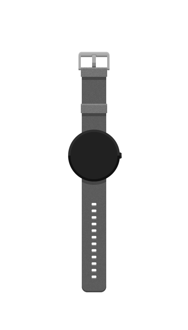
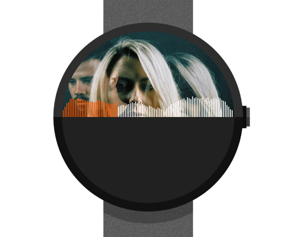
How to Create a Moto 360 Smart Watch in Adobe Illustrator
If you’re into smartwatches, now this is the tutorial for you. With the use of some basic shapes and some tricks here and there I will guide you step by step so that in the end you will have created a stunning moto360 smartch with a little added Soundcloud flavor to make it whole.
So let’s get starting!
Step 1: setting up our document
As always, the first thing we need to do is make sure our document is set up right. So, assuming you’re already running Illustrator, create a new document (ctrl + N or File>New…) with the following settings.
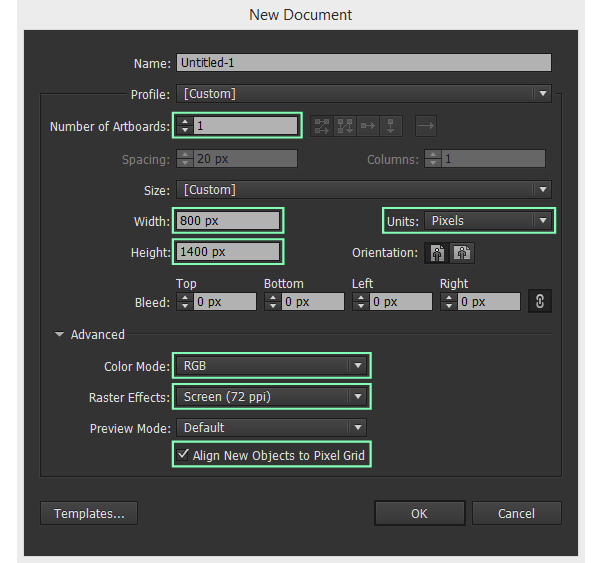
- number of artboards: 1;
- width: 800px;
- height: 1400px;
- units: pixels (as the illustration will be mainly used on digital devices);
And from the Advanced tab
With Postcards Email Builder you can create and edit email templates online without any coding skills! Includes more than 100 components to help you create custom emails templates faster than ever before.
Free Email BuilderFree Email Templates- color mode: RGB (color mode for screen use);
- raster effects: Screen (72 ppi);
- align new objects to pixel grid: checked (as we want everything to be pixel sharp).
Step 2: the layering process
Once we’ve created our new document, the first thing we need to do is create a number of individual layers so that we can work on different parts of the illustration without having to worry about affecting others nearby.
From the Layers Panel, create 7 layers and name them as follows.
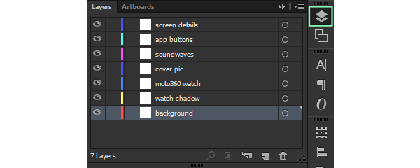
- background;
- watch shadow;
- moto360 watch;
- cover pic;
- soundwaves;
- app buttons;
- screen details.
Quick tip: I suggest locking all the layers except the one you are currently working on so that you won’t accidentally end up with some pieces of the artwork on another layer and find out about them later when you want to edit them.
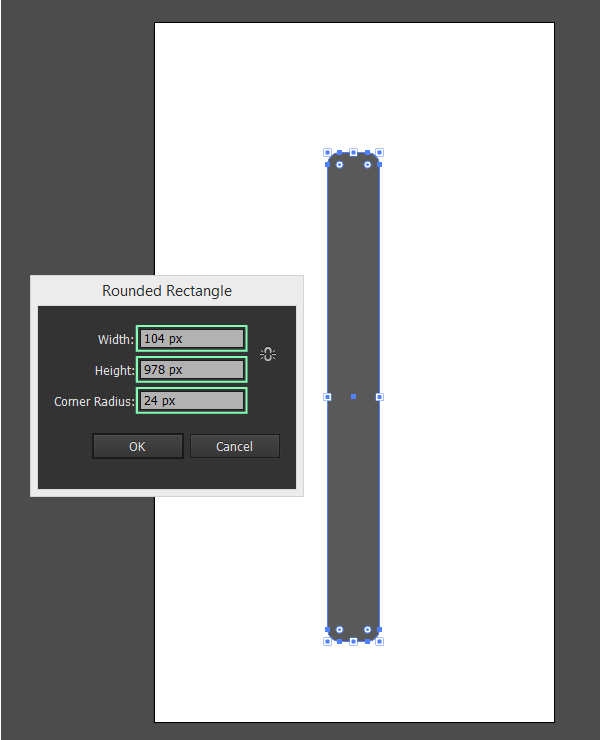
Step 3: building the smartch
Assuming you’re done setting up the basics of our document, it’s time to actually start building stuff, and populate our cozy Artboard.
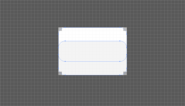
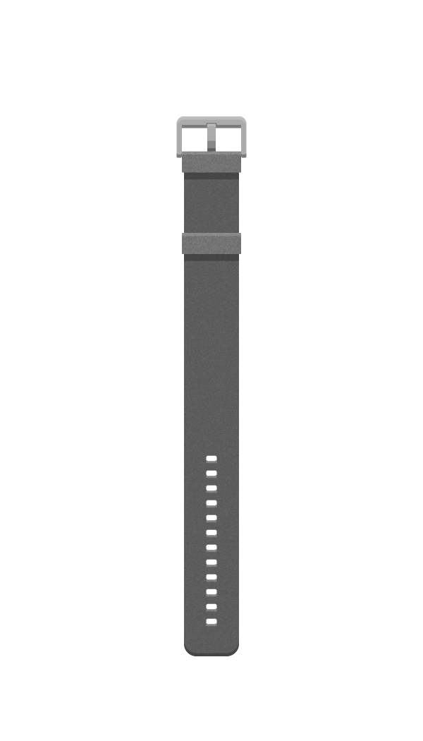
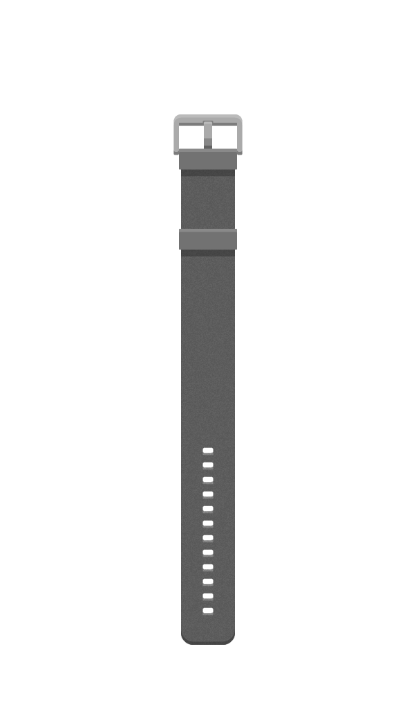
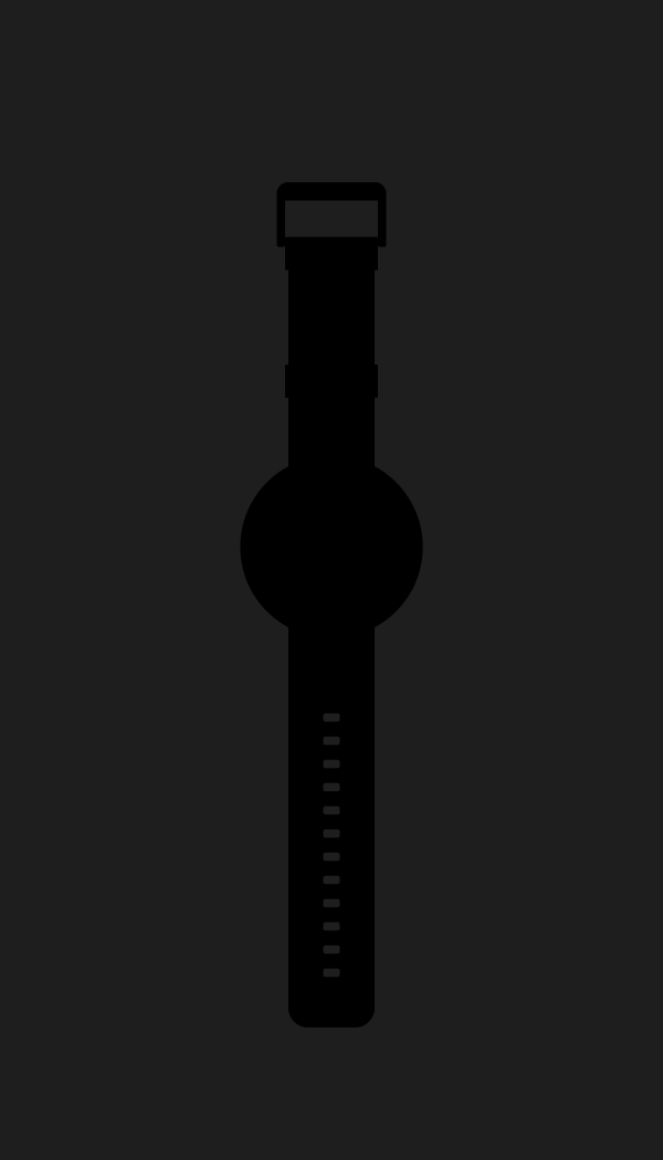
The watch band
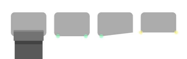
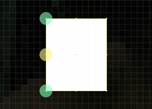
The first thing that we’re going to create is the leather band. Make sure you’re on the moto360 watch layer and using the Rounded Rectangle Tool create a 104 x 978px object with a 24px corner radius. Use #595959 to change its color to a darker grey, so that it will start showing a leather like finish.
As we need to the top section to be completely flat (without any rounded corners) we will grab the Direct Selection Tool (A) drag and select the top center anchor points (highlighted with green) and then hit Del to erase them. As soon as you’ve deleted them, make sure you close the shape by uniting the remaining anchors using the Join function (ctrl + J).
With Startup App and Slides App you can build unlimited websites using the online website editor which includes ready-made designed and coded elements, templates and themes.
Try Startup App Try Slides AppOther Products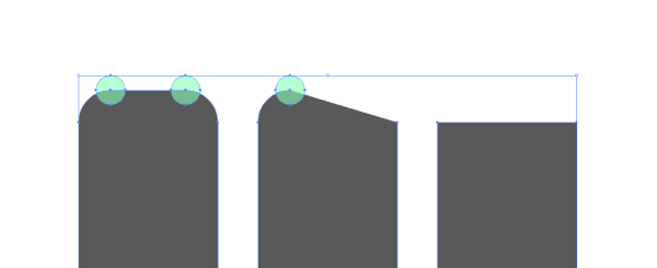
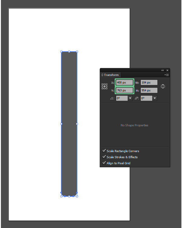
Next let’s position the object. Using the Transform Panel, select the object and input the following coordinates:
- x: 400px;
- y: 763 px
Using the same trick with the Transform Panel, position the object on top of the wrist band using these coordinates:
- x: 400px;
y: 866px.
Change its color to a lighter gray (#727272) and position it using the following values.
- x: 400px;
- y: 460px.
Once you’ve positioned the band, it’s time to start adding some details. As the default bands that ship with the moto360 have punctured holes, we need to make sure our design incorporates them too.
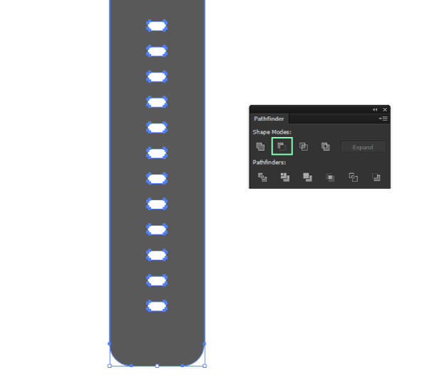
Grab the Rounded Rectangle Tool again, and draw a white 20 x 10px shape with a corner radius of 2px.

Using the same trick with the Transform Panel, position the object on top of the wrist band using these coordinates:
- x: 400px;
- y:
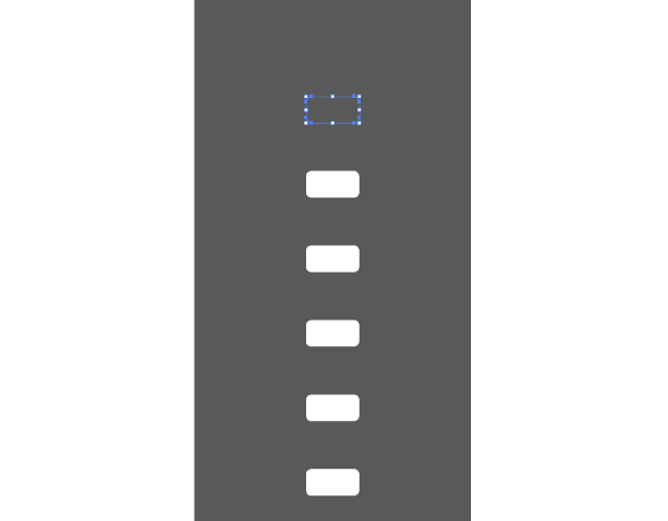
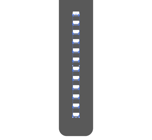
We now have our base hole, but we need about 12 of them. To do so, first enter Pixel Preview Mode (alt + ctrl + Y or View>Pixel Preview) so that you can easily begin the duplicating process. Select the created puncture shape and while holding down alt + shift, drag it about 10px towards the bottom of our Artboard. Repeat the process 10 times using ctrl + D (duplicate function). Now, select both the watch band and the holes (ctrl + A) and using the Pathfinder Minus Front function subtract the smaller objects from the bigger one.
We can now add some small highlights to the holes. Double click on the band object to enter Isolation Mode and select one of the puncture shapes by clicking on the outline of the shape (not the inside of it as it has none).
Now simply copy (ctrl + C), and paste the object on top of the band (ctrl + F) once you’ve made sure you’re out of Isolation Mode (esc key).
As you might have noticed, the pasted object is now colored the same as the one underneath. Change this by coloring it white, and then, after entering Pixel Preview Mode duplicate it (ctrl + C > ctrl + F) and move the top object (I’ve colored it slightly darker so you can understand) towards the bottom by 4px.
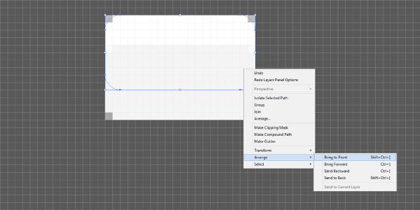
Select the object underneath the recently moved one, right click>Arrange>Bring to Front.
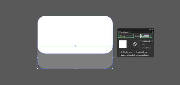
With both of them selected, use the Minus Front option in Pathfinder so that you end up exactly with the smaller highlight portion that we need.
Exit Pixel Preview Mode (alt + ctrl + Y) and then change the blending mode of the object to Overlay and make sure to lower its opacity to 40%.
Using the same little duplicate trick (ctrl + D) we used for the puncture holes, select the highlight and add 11 more to each puncture of the wrist band making sure to group them afterwards (ctrl + G).
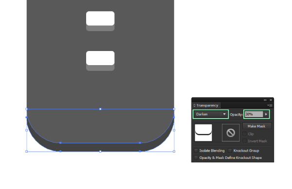
While we’re still at this stage of the illustration, we can add a small shadow to the bottom section of the band. Simply copy (ctrl + C) the band, paste it on top (ctrl + F), then move it about 6px downwards. Paste another instance of the object on top of the moved one, and using the Minus Front function delete the top section.
Change the new object’s color to black, and set its blending mode to Darken and its opacity to 30%.
The loop holder
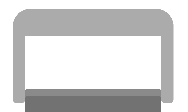
It’s now time to move towards the other end of the wrist band, and create the little loop holder section and then the buckle.
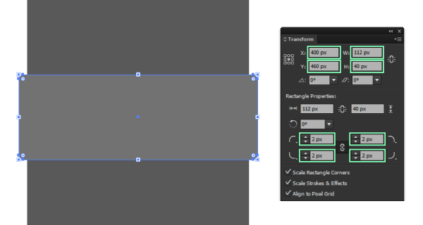
Using the Rounded Rectangle Tool create a 112 x 40px object with a 2px corner radius. Change its color to a lighter gray (#727272) and position it using the following values.
- x: 400px;
- y:
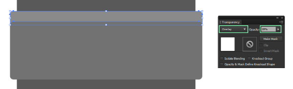
Add some details to the holder by creating a highlight section and a shadow.
For the highlight, simply duplicate the object, move it 6px down paste another instance on top and then use the Minus Front as we did before. Change the shape’s color to white, the blending mode to Overlay and lastly the Opacity to 20%.
For the shadow section, create a 104 x 13px rectangle and position it just under the loop holder. In order to quicken things up, use the Eyedropper Tool (I) to copy the blending mode and opacity straight from the bottom section of the wristband which we created a few moments ago.

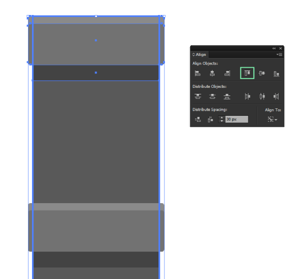
Make sure to select all the components of the loop holder and the group them by using ctrl + G.
Duplicate the group (ctrl + C > ctrl + F) and then with both it and the band selected, click on the band to make it the Key Object to which we will align to and use the Align Panel to position the group just at the top section of the band.
The buckle
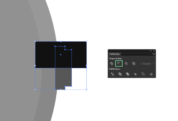
In order to create the buckle, we will use a couple of objects and modify them as we go. Using the now all familiar Rounded Rectangle Tool create a 132 x 89px shape with a 14px corner radius. Make sure to send it to the back using the right click>Arrange>Send to back function.
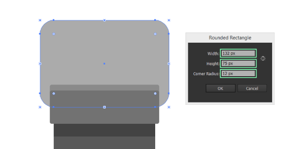
Color it using #AAAAAA and then using the Direct Selection Tool (A) select the center-bottom anchor points (highlighted with green) and delete them (Del). With the shape still selected, press ctrl + J to unite the remaining bottom anchor points (highlighted with yellow).
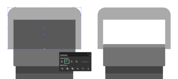
Next create a 112 x 53px rectangle, bottom-center align it and then cut it out using Minus Front so that you get the object on the right.
To create the rounded corner bottom sections of the buckle’s left and right walls, simply create a 10 x 12px rounded rectangle with a corner radius of 3px.
Then, using the Direct Selection Tool (A), delete the top 4 anchor points (highlighted with green), uniting (ctrl + J) the remaining bottom ones (highlighted with yellow).
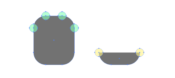
After that, align the modified shape to the bottom left side of the buckle, create a duplicate and align this one to the right side.

Make sure to change their color to #AAAAAA, and then with both them and the buckle selected use the Unite function in Pathfinder to create one single object.
We now need to add the tongue. To do so, create a 16 x 55px rounded rectangle with a corner radius of 3px. As we did before, repeat the process of deleting the bottom anchor points, uniting the remaining ones.
Because the color is identical to the one of the buckle, we need to add a top section under the tongue so that it will make it distinguishable.
Again, using the Rounded Rectangle Tool create a darker (#999999) 20 x 13px object that has a corner radius of 3px. Delete the bottom anchor points, unite the remaining ones, and then vertically align it to the buckle, positioning at the bottom of the top section. Make sure the tongue is on top of the darker section by bringing it to the front using the Arrange function.
To finish up the buckle, simply add some highlights and shadows as in the image bellow, using the same techniques used for the loop holder.
As you can see, our watch band is taking shape, but it doesn’t have that leather feeling were going for. So, to correct this, we will need to add some textures. First, select the base form of the band, copy and place it on top and then go to Effect>Texture>Grain.
Change the Intensity to 41, set the Contrast on 0 and make sure the Grain Type is Sprinkles.
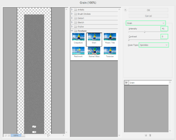
Next, make sure to change the Overlay mode to Hard Light and to lower the opacity to 70%.
Select both the grainy texture and the watch band and send them To the back using the Align function.
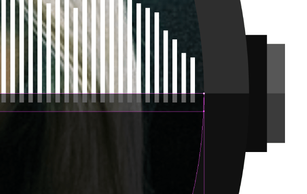
Now we have a little problem that might not be visible until we zoom in.
As you can see, the texture is actually going outside of the band’s surface, which is something we don’t want it to do. A simple solution to this (and any similar texture problems) is to copy the object underneath, paste it on top of the texture, and with both of them selected create a clipping mask (right click>Make clipping mask).
Apply similar textures to the loop holder, and top section of the wristband (following the exact same process) until you have something like this.
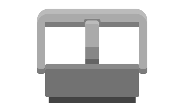
The watch
Up until now, we’ve dangled with all the composing elements of the wristband, but from now one, all our focus will be on the actual watch itself. We will remain on the same moto360 watch layer and build on top of the objects we have so far.
The first thing we need to create is a base form for our little gadget.
Using the Ellipse Tool (L) create a 220 x 220px circle and color it using #111111. Position the object using the bellow coordinates:
- x: 400px;
- y: 660px.
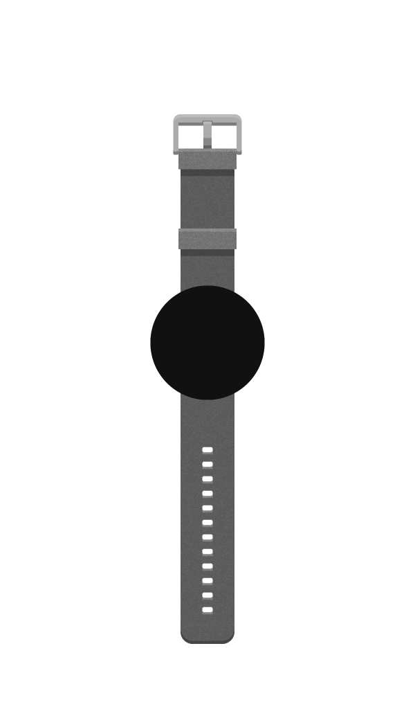
Next, create another 200 x 200px circle, which will act as a screen, color it using a slightly lighter grey (#212121) and then vertically and horizontally align it to the shape we created before it.
Add a warm highlight on top of the base large form by duplicating it, deleting the bottom anchor point and uniting the remaining ones. Change its color to #2E2E2E and make sure to position it underneath the screen.
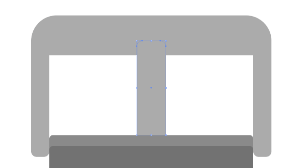
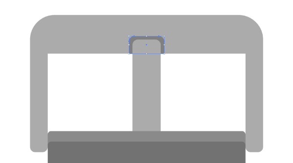
As the Moto360 is one of the smartwaches which actually have a physical button, we need to make sure that ours has one too.
Using the Rectangle Tool (M), create a 6 x 26px shape, color it using a darker shade (#0D0D0D) and then position it under the watch itself, using these coordinates to lock it in place:
- x: 511px;
- y: 660px.
Add another 4 x 22px rectangle, which will act as the pushing button, and color it using #575757. Horizontally align it with the previous object created, and make sure to position it on the right side.
Add a slight shadow, by duplicating both of the button parts, uniting them and then deleting half of the shape using a rectangle.
Change the resulting shape’s Blending Mode to Darken, lower its opacity to 40% and make sure to group it with the other 2 objects (select them>ctrl +G) and send them to the back of the watch (right click>Arrange>Send to Back).
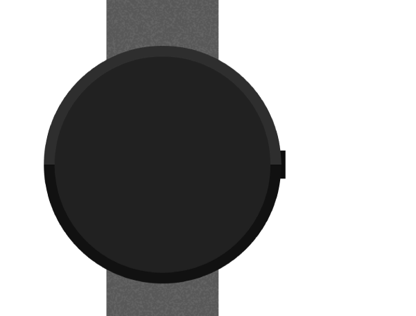
At this point, all we need to do is add a shadow underneath the bottom side of the watch to give it more dimensionality.
To do so, copy the base form of the watch (the largest circle), paste it in front of everything else, and then move it about 14px downwards. Change the blending mode to Darken and set the opacity to 30%, after which simply copy the shadow into the clipping mask created for the band’s texture.
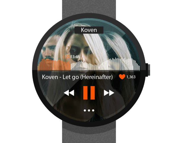
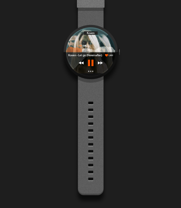
Step 4: building the UI interface
By now, you should have a good looking watch, which means it’s time to move onto the next layers and focus on creating the Soundcloud app interface. Before you lock the moto360 watch layer make sure to copy the screen circle as we will need it to create a clipping mask for the image that will act as a cover picture.
Once you’ve done this, unlock the cover pic layer and paste it there for the time being.
The cover pic
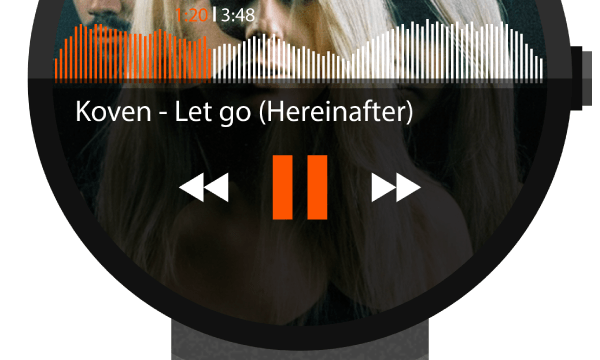
If you’re familiar with Soundcloud’s interface (and I bet you are) you know that every song played on a mobile device be it a tablet, or a smartphone has a cover image in the back, which is directly related to the artist.
Our little UI will abide to the same common sense, using a fullscreen background image. At this point, you can either use the same image as mine, or download another one of your choice.
Quick tip: If you go with the later, I have to let you know that some opacity settings might need adjusting to the different color tones your image might have.
I’ve went with using an image of Koven, a british band I really love. To obtain it I simply searched Google images where I found it in a couple of seconds.
Simply go to File>Place (shift + ctrl + P – if you’re using AI CC) and browse your computer to the folder where you saved your image.
To make sure it fits the actual watch frame, simply position the copied circle (the screen) on top of the image, and then lower its opacity so that you can position and adjust it accordingly.
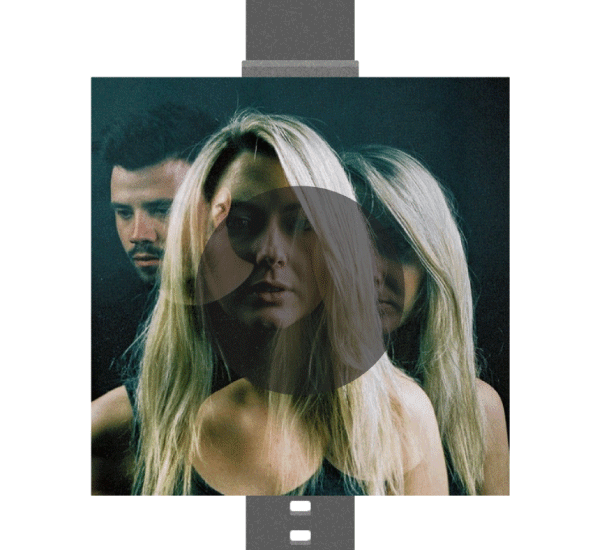
Once you’ve adjusted the image, simply select both it and the circle on top, and create a clipping mask (right click>Make Clipping Mask).
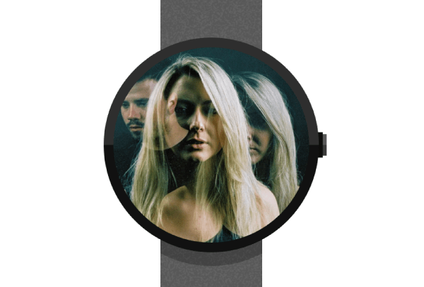
Great! Now let’s get UI-ing.
Adding some soundwaves
The first actual UI piece will be the soundwaves.
Assuming you moved on to the soundwaves layer, lock everything else, and using the rectangle tool create a white 1 x 24px shape, positioning it using these coordinates:
- x: 301px;
- y: 650px.
This might sound funny but next we need to duplicate it so that in the end we have 99 total sound bars, distanced at 1px from one another. To do so, first duplicate the already created sound bar, and position it at a distance of 195px from one another using the Align panel.
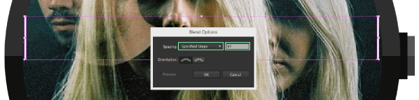
With both of the bars selected, we are going to create a blend. Go to Object>Blend>Blend Options and change the Spacing option to Specified Steps and enter 97 (99 that we need – 2 that we already have). Once done click on OK.
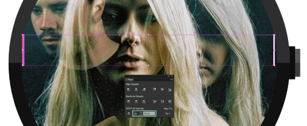
If you’re new to the Blend tool you should now that setting up the blend settings and hitting OK won’t actually create the blend. To do that, you need to go back to the Blend menu and click on Make (alt + ctrl + B).
You should now have 99 sound bars, which you need to Expand (Object>Expand) in order to be able to edit them individually, which unfortunately you will have to.
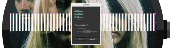
Now comes the hard part, modifying the heights of almost all the sound bar elements so that our soundwave takes shape. I recommend grouping all of them, and by entering Isolation Mode modify them using the Direct Selection Tool (A). It might take you a couple of minutes, but it’s worth it.
Also, make sure to color the front section using #FD5400 so that the song looks like as it’s being played. In my case, I have 32 bars colored orange and 67 white.
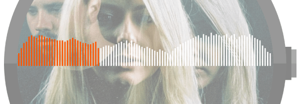
Once we’ve finished with the soundwave, we need to add another detail to this part of the illustration which will complement the rest of the artwork. That piece is the darker, semitransparent screen on which all the other buttons will thrive.
Quickly unlock the moto360 watch layer and copy the screen circle one more time. Paste it on the soundwaves layer on top of everything else. Using the Direct Selection Tool (A) get rid of the top anchor point, uniting the remaining ones (ctrl + J).
Change the object’s color to black (#000000), its blending mode to Darken and lastly lower its opacity to 80% making sure to position it on top of the sound bars.
Add a slight highlight by creating a white 200 x 4px rectangle, with an opacity of 90% and Overlay set as its blending mode. Vertically align the new object with the one created before, and then align it to its top.
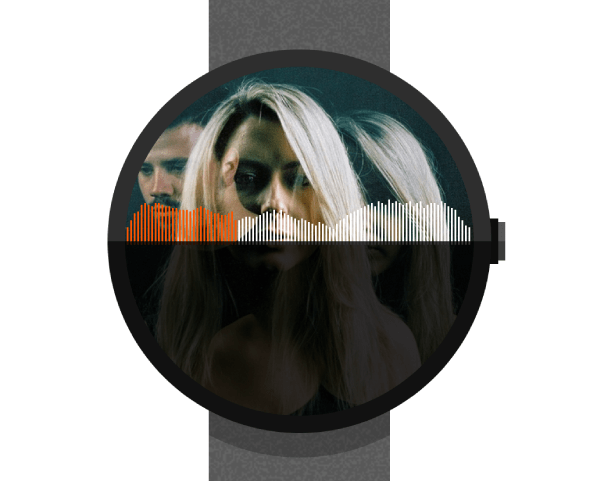
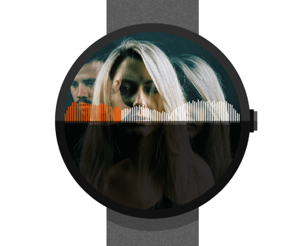
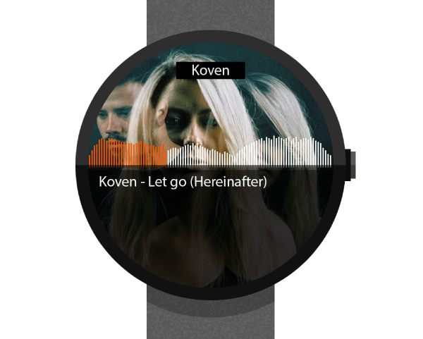
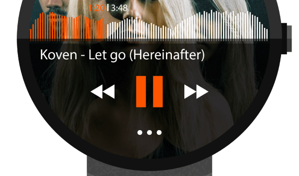
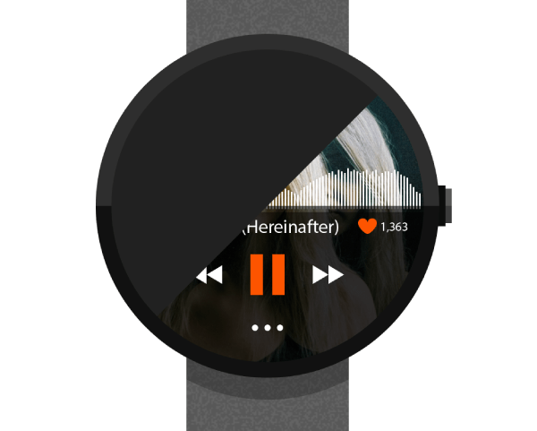
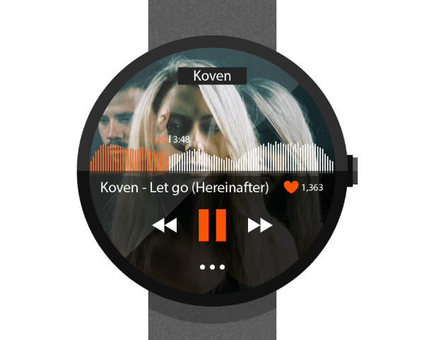
You should now have something looking like this.
Once we’ve finished laying our soundwave it’s time to move up to the app buttons layer and add some functionality to our little UI.
There are visual sections that we need to take in consideration:
- content/information display (the name of the artist and song, the time elapsed/time remaining);
- navigation buttons/instances (pause, previous, next and menu buttons);
- social (the heart shaped like button).
Content/information display
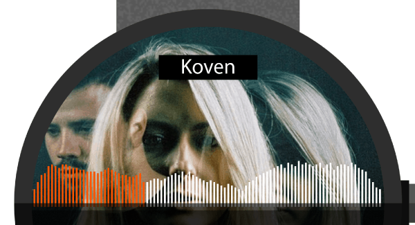
Using the Rectangle Tool (M) create a 56 x 14px object, which will hold the name of our artist. Color it black and then position it inputting these values in the Transform panel:
- x: 400px;
- y: 583px.
Using the Type Tool (T) write the name of your artist (in my case Koven) using Myriad Pro (as it’s a good font that will do the job) and 12pt for its sizing. With both the text and the rectangle selected (the latter being the Key Object) both vertically and horizontally align the two.
Next we need to add the name of the song along with the album and artist (yet again).
Again, using the Type Tool (T) write the specific information needed for this section, in my case it’s Koven – Let go (Hereinafter). Keep the font-size at 12pt and position the text just under the semi-transparent background towards the left.
Exact coordinates:
- x: 377px;
- y: 673px.
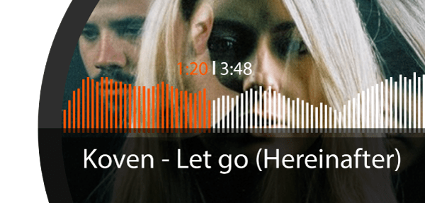
Now how about adding the time frame visual indicator. Set your font size to 8pt and create 2 text pieces one for the time elapsed (which we will color orange #FD5400) and the second one for the total length of the track.
I have mine set as 1:20 for the first and 3:48 for the other. Add a 1 x 6px object as a delimiter between the two and position it (depending on where your orange section of the track begins) just a few pixels above the beginning of the white section of the soundwave.
Once we’re done with displaying some basic information, we need to add some functionality by creating the buttons that will make things click.
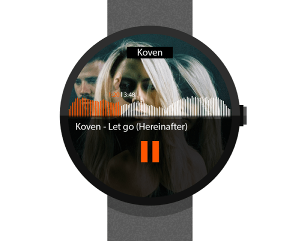
Using the Rectangle Tool (T) create a pair of 8 x 26px shapes and distance them from one another at about 6px using the Align panel.
Group (ctrl + G) and then position them using these coordinates:
- x: 400px;
- y: 704px.
These will act as our pause button so make sure to color them with the same orange color we used before (#FD5400).
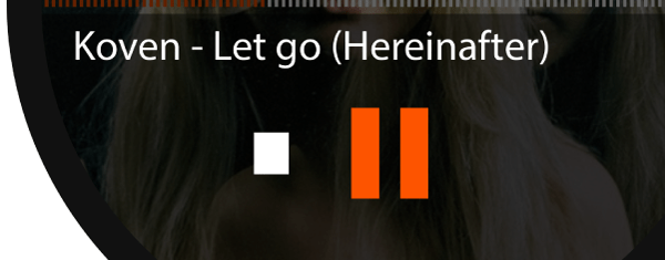
Next we need to add the previous and next buttons. They’re basically the same except that one is directionally opposed to the other.
First, create a 10 x 12px rectangle color it white, and position it at 18px from the pause button.
In order to shape the rectangle into an arrow, we will need to add an anchor point and get rid of the top and bottom left ones. Enter Pixel Preview Mode and using the Add Anchor Point Tool (click on the little arrow in the corner of the Pen Tool to select it) add a point exactly at the middle of the left side of the object (highlighted with yellow).
Then, switch to the Delete Anchor Point Tool and remove the anchors highlighted with green.
Exit Pixel Preview and you should have something similar to this.
To finish off the previous button, simply duplicate the arrow, and position it in front of the one we have right now, making sure to group the two (ctrl + G).
For the next button it’s simply a matter of copying, reflecting and positioning it on the other side of the pause button.
The last button that we need to take care of is the menu one. Using the Ellipse Tool (L) create a 4 x 4px shape which we will duplicate 2 times. With all 3 circles selected, group them (ctrl + G) and then position them under the pause button using the following coordinates:
- x: 400px;
- y: 738px.
As the quality of a song can be reflected by numbers of likes it has received over time, and Soundcloud makes no compromises in this direction, we shall add our own flavor to the app’s UI.
To create the little heart, first draw a 6 x 6px circle, duplicate it 3 times and position them as follows.
Next we need to adjust the position of the bottom circle’s top anchor point, by moving it just 1px upwards.
Once you’ve adjusted that anchor, simply unite the 3 circles using Pathfinder. You will end up with a Mickey Mouse like shape, which we need to further modify in order to get our heart defined. Using the Delete Anchor Point Tool get rid of the inner middle anchors (highlighted with green).
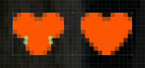
You should end up with an almost heart-like object, I say almost, because if we exit Pixel Preview Mode we can see that it still needs some tweaking.
Grab the Direct Selection Tool (A) and click on the heart’s bottom anchor point. You should now see a set of 2 handles with the help of which you can adjust the shape of the left and right side of the object. As we want everything symmetric, focus on adjusting just the left side as we will split the heart in two and then flip the correct side align it to the right and then unite them back to get our perfect heart.
Repeat the adjustment process this time on the left anchor point bottom handle.

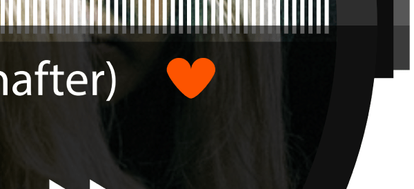
Position the resulting heart icon after these coordinates:
- x: 464px;
- y: 673px.
Don’t forget to add the number that indicates how many people like the song, this time using a smaller font size of just 8pt.
That’s it for the UI now it’s time to add some finishing touches.
Step 5: adding the final touches to the screen
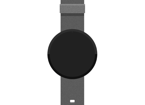
Adding some reflections
In order to make our screen look glass like, we need to add some little visual treatments that will give us that impression.
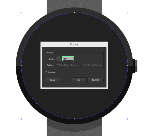
Unlock the moto360 watch one more time, and copy the screen circle.
Quick tip: at this point you might need to hide some of the layers to see exactly where the object is. Lucky for us we layered the entire artwork so that we can do exactly this.
Once you paste it on the screen details layer, make sure every other layer is locked, and then using Illustrator’s Rotate function select the circle, right click>Rotate> and enter 45 in the pop up box.
Quick tip: you can do the same thing by selecting the object, pressing R and while holding down shift rotate drag the object using the mouse.
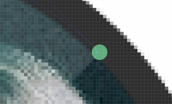
Once you have rotated the circle, we need to delete its right-bottom anchor point so that we end up with just half of the full shape.
If you zoom in, you might notice that the remaining bottom and right anchor points are no longer snapped to the pixel grid. This might not create any issues, but if you’re detailed obsessed, you might want to change that, by selecting and dragging them just a few pixels towards the outside using the Direct Selection Tool (A).
Hmm, you might wonder if we just distorted our shape. Have no fear, we will create a clipping mask by pasting the screen circle on top of our reflection which will make our reflection look perfect.
As our reflection needs to be transparent, select it using the Direct Selection Tool (A), change its color to white, and the set its Blending Mode to Hard Light lowering the opacity to about 14% depending on the image you used for the cover.
To give it an even more glass-like feel, copy and paste the screen circle on top of the reflection, set the color to white and then flip the fill with the stroke (shift + X). Change the strokes weight to 4px aligning it towards the inside from the Stroke panel.
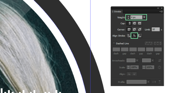
Finally, expand the shape and then change its Blending Mode to Overlay and lower its opacity to 40%.
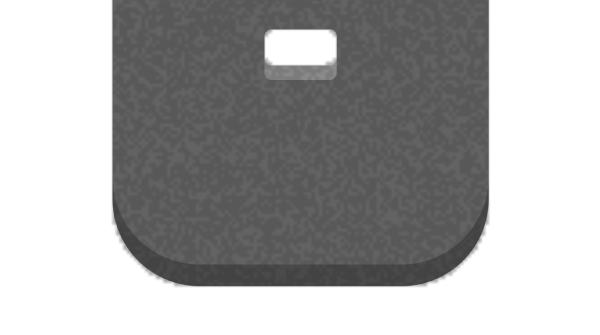
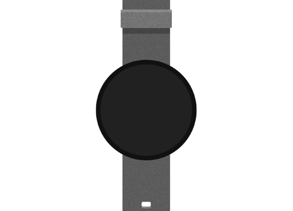
Adding the proximity sensor
The final piece for our screen detailing process will be the bottom proximity sensor.
To create it, simply draw a 136 x 24px rectangle, color it #111111 and position it using the values provided bellow:
- x: 400px;
- y: 758px.
Then, simply copy and paste it inside the main reflection’s clipping mask.
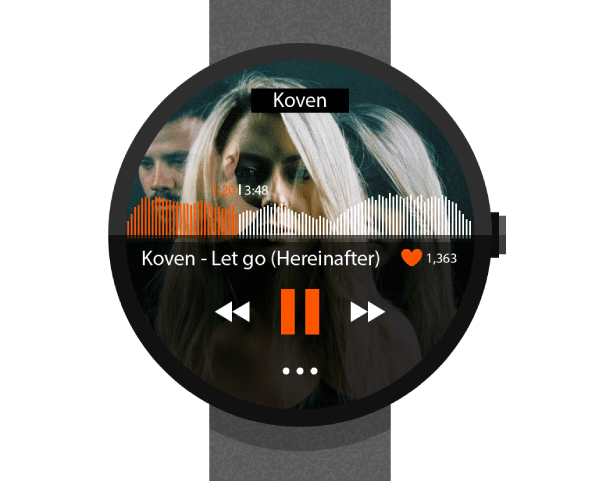
Step 6: finishing touches
Adding a background
To complete our illustration, we will first add a darker background. To do so, lock every layer except the background one, and create a rectangle that has the same width and height of our Artboard (800 x 1400px) coloring it using # 1E1E1E.
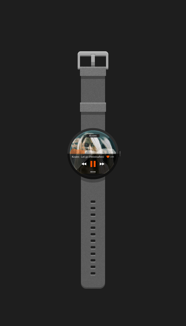
Adding a soft shadow
Move up to the watch shadow layer and by unlocking the moto360 watch layer copy the base forms that make up the watch, uniting them into one simple shape. It doesn’t matter what color the shape has, as it will be under the actual watch.
Next select the newly created object and go to Effect>Stylize>Drop Shadow and use the following settings:
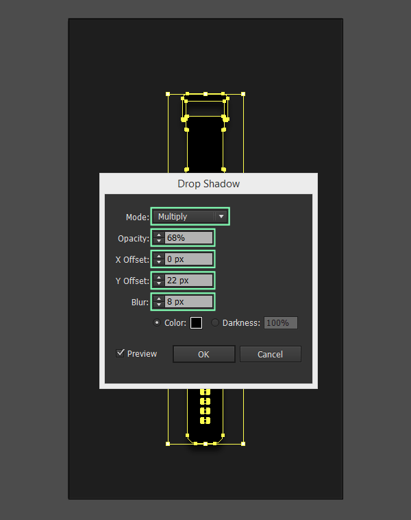
- mode: multiply;
- opacity: 68%;
- x offset: 0px;
- y offset: 22px;
- blur: 8px;
- color: black.
One last thing I wanted to point out before ending, is in regards to the use of a separate layer and object for the shadow. The reason, is fairly simple, I wanted to give you guys the possibility to show or hide the shadow as some of you might want something simpler.
The same goes for the use of the two circles making up the watch base form. I wanted to give you the possibility to show or hide the app’s UI, if you decided you just wanted to use the watch as if its screen was in standby.
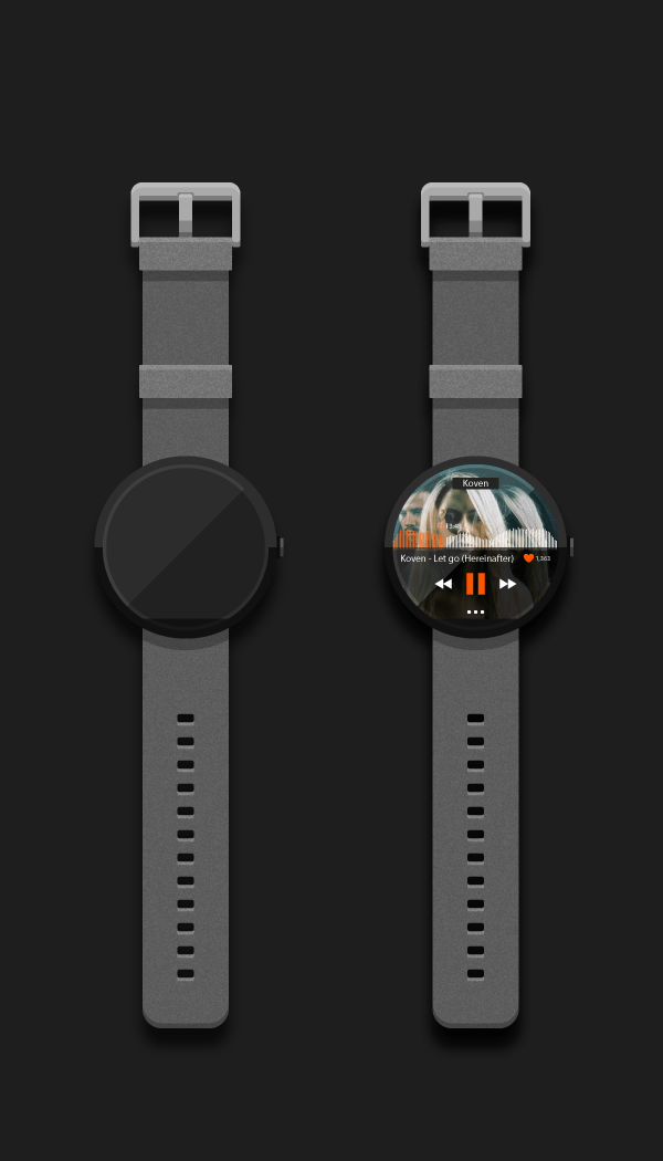
That’s it
We can finally say we did it. I hope you enjoyed the tutorial eventough it’s a little bit longer than what you might be used to, but I wanted to give you an indeep step by step look at the process for creating artwork like this.
Also, most of the techniques you’ve seen here, can be used on all other sort of projects, which in my book is a big plus.

 siter.io
 pulsetic.com
 static.app
 mailpost.io