How to Choose a Responsive Design Images Tool
Responsive web design is not a fancy concept anymore – it is a necessity. There is no doubt about the fact that mobiles and portable devices are taking over and most websites out there need a scaled-down web page to better fit those new devices.
I am sure you already you already know everything about this topic, but today we go a bit more into details and talk about one of the newest approaches, responsive images. Unfortunately not only the size of the websites is important, but also the size of the more interactive elements, such as images.
Why is image size important?
Especially since more and more people started using mobile devices, the size of the images became a huge problem. Remember that not everybody surfs the internet from a Wi-Fi, but many actually do it on their own 3G bandwidth, which normally is limited. And if the visitor wants to access your website from an area with a weak internet coverage, the Edge connection might not be fast enough to load the image in a decent time.
These people are more likely to abandon your website when seeing lots of images have to be loaded. They do not want your images to slow everything down and most definitely do not wish for you to consume their limited bandwidth for some, maybe, irrelevant images.
There are already some techniques out there that can be used to deal with this approach, such as Github’s HiSRC, Foresight.js and Picturefill, Adaptive Images and multiple others. There are many options out there although the idea of responsive images is quite new.
With Postcards Email Builder you can create and edit email templates online without any coding skills! Includes more than 100 components to help you create custom emails templates faster than ever before.
Free Email BuilderFree Email TemplatesMain discussion
It is also important to know why responsive images are one of the most difficult parts of the responsive design methodology. It is also important to remember that all these tools mentioned above are different ways of “hacking” the CSS and that none of them is perfect.
While it would be great to have this tool which adapts itself to the situation, we don’t have it right now – and who knows if we will ever put our hands on something like that.
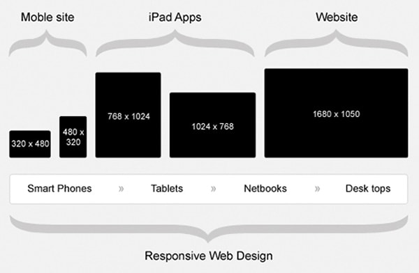
The main issue with scaling down images is that you can’t expect a photo that is intended for a 27 inch screen to look good on an iPhone. You simply can’t. A total new image will have to be uploaded for a smaller device. Responsive images are much more than pictures scaled down and there are more things to consider besides display or browser dimensions. Things such as display quality (pixel density, color capability), connectivity and input types also have to be taken into consideration.
Moreover, a lot of bandwidth will be wasted if a mobile device will have to download the same huge photo and then scale it down to fit the screen.
All the above-mentioned tools are limited, keep this in mind! Some of them will, though, work quite well for your projects. In order to find the one that suits you best, there might be some things to take into consideration. These will help you made the decision and, in the end, choose the matching solution for your project.
Do you want to validate?
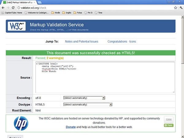
If you are a validation freak, then some techniques might work better for you than others. Tools such as Picturefill use different elements to be functional – these elements might become standard in the future, but for now those are technically invalid syntaxes, which means the HTML file will not validate.
If validation is important, I recommend you to take a look at Adaptive Images, HiSRC and Responsive Enhance, all of which use valid syntaxes and where validation should not be an issue.
With Startup App and Slides App you can build unlimited websites using the online website editor which includes ready-made designed and coded elements, templates and themes.
Try Startup App Try Slides AppOther ProductsDo you already have content?
It is important to think of how much content you already have posted on the blog where you want to use these tools. If you have a three-year old blog, there will surely be some images for you to modify. You might need to go through each post and each image tag and change everything by hand. It will take weeks.
Adaptive Images might be the best solution here, as it doesn’t work with markup changes. What Adaptive Images does is simple. It sends routing requests for images through a PHP file that delivers images in the appropriate size for the screen. If you, however, own a small project and can go back to update every image, I think you should do it.
What about special markup?
Another important thing to consider when you have a lot of content is if the tool you use requires you to add special attributes to each image element.
Some of the tools require the use of special HTML. While there is nothing wrong with these syntaxes from a semantic point of view, it might not be a very easy task to complete when you have 400 images already added on your website.
In case going back to edit each element is not an option for you, then Adaptive Images is the best bet. Now you can test your website using the Responsive Design Tool.
Do you want JavaScript/jQuery?
Some of the techniques mentioned above do not make use of JavaScript, while others do. It depends very much of your choice, but I would avoid choosing a technique that uses JavaScript myself. When you think of mobile platforms, JavaScript is not the best programming language to use.
Generally the tools using JavaScript will need a <noscript> element with an <img> attribute added, in case the user has JavaScript turned off. Sometimes this code hack will have to be added by you.
If you are totally against JavaScript usage, Sencha.IO might be the best choice. Instead of using cookies, this tool detects the device’s User Agent string and delivers an appropriate image size for it.
Remember that jQuery is also JavaScript, so tools which are dependent on this library, such as HiSRC and rwdImages, might also work a bit slower.
Cropping or resizing
You also need to ask yourself how you want the tools you use to work with those images; some of them might resize them, some others might crop them. While both have advantages, they also have disadvantages.
If you take a huge picture and resize it, the content might not be visible anymore at a scaled-down size. On the other side, cropping an image might be even more damaging, as cropped out content can turn a good picture into a bad one because of important details missing.
Picturefill might be the best option in this case, as it allows you to be specific about sources and different situations.
Do you use PHP or something else?
You might not care about this yourself, but the tools you use do. Some of them are not based on JavaScript, but still use .htaccess and PHP. This requires an Apache server. Remember that many sites run on Ruby or Python, not only on PHP. Responsive Images is one of the top tools using PHP.
Do you want bandwidth testing?
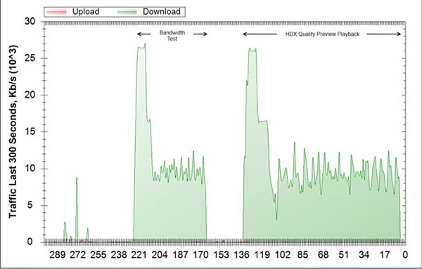
If testing the bandwidth of the user is something you want to use as part of the decision making, there are some tools that do it, such as Foresight.js and HiSRC.
Although it is not very difficult to download a test file and measure the download time, there are unfortunately no native bandwidth media queries.
The tools using this technique might be one or two seconds slower, but the benefit of getting delivered an imaged based on your current bandwidth is an asset.
What about disadvantages?
Most of these tools have a very good uptime, but you never know. Most of these tools are completely third-party and, if down, they won’t process the requests from your site and will not deliver images that fit the user’s screen size. With third-party apps you always run into the risk of downtime, so you also have to think of this downside of the problem.
If you do not want to give third-party apps access to your files, then try Server Side Responsive Image.
Do you actually need a tool?
If your website runs WordPress, you might not even need such a tool. The Image Uploader of WordPress has an option that scales down your image, so you can choose which one to use. And I am quite sure some other Content Management Systems have the same feature. In this case, using a third-party app might not even be necessary.
Further WordPress solutions
Many years ago Steve Jobs was caught saying “there’s an app for that” one time too many. If you would be WordPress’ Steve Jobs, you might want to say “there’s a plugin for that”, because there are literarily plugins for everything in WordPress. There is also a plugin called Mobble, which detects the size of the screen and accompanies CSS Media Queries.
Learn more
If responsive images techniques are something you are interested in, you should know there is already an official W3C community discussing and developing stuff for it. You can find the community here. You can learn a lot from there, get to know more people interested in the same topic and even come in contact with key people from the industry.
In case you want to know the story behind responsive images, you should read this story. You might not learn a lot from it, but it is a very good read if you are interested in the subject.
Bottom line
So you thought you knew everything about responsive web design. Well, it seems there is still something new that you didn’t know about – or at least wasn’t well aware of.
Responsive images are as important as any other element of the “responsive web design” concept. You should immediately go out there and research the multiple options and find the right one for you – in case you decide you need one. With so many available options out there, it would be a shame not to use one of them if you really feel the need to.
