-
Upload Static Pages with plugin for WordPress in minutes. Literally.
Finally! A simple solution to set a static web page with a custom URL in WordPress.
Learn More -


Snap! —
-

— sss...
-
Static... what?
Static sites are the most basic type of website and are the easiest to create. Unlike dynamic websites, they do not require any web programming* or database design.
A static site can be built by simply creating a few HTML pages and publishing them to a web server.
* HTML is a markup language; CSS is a style sheet language; and JavaScript is a scripting language.
-
The “Problem”
We know that people are struggling the task of creating static pages. We receive a lot of questions from users to help them install static pages on their current WordPress website. But there was no solution we could offer, except to hire a coder to make a “custom theme.”
-

00111010 01001111 —
-

— Served, sir!
-
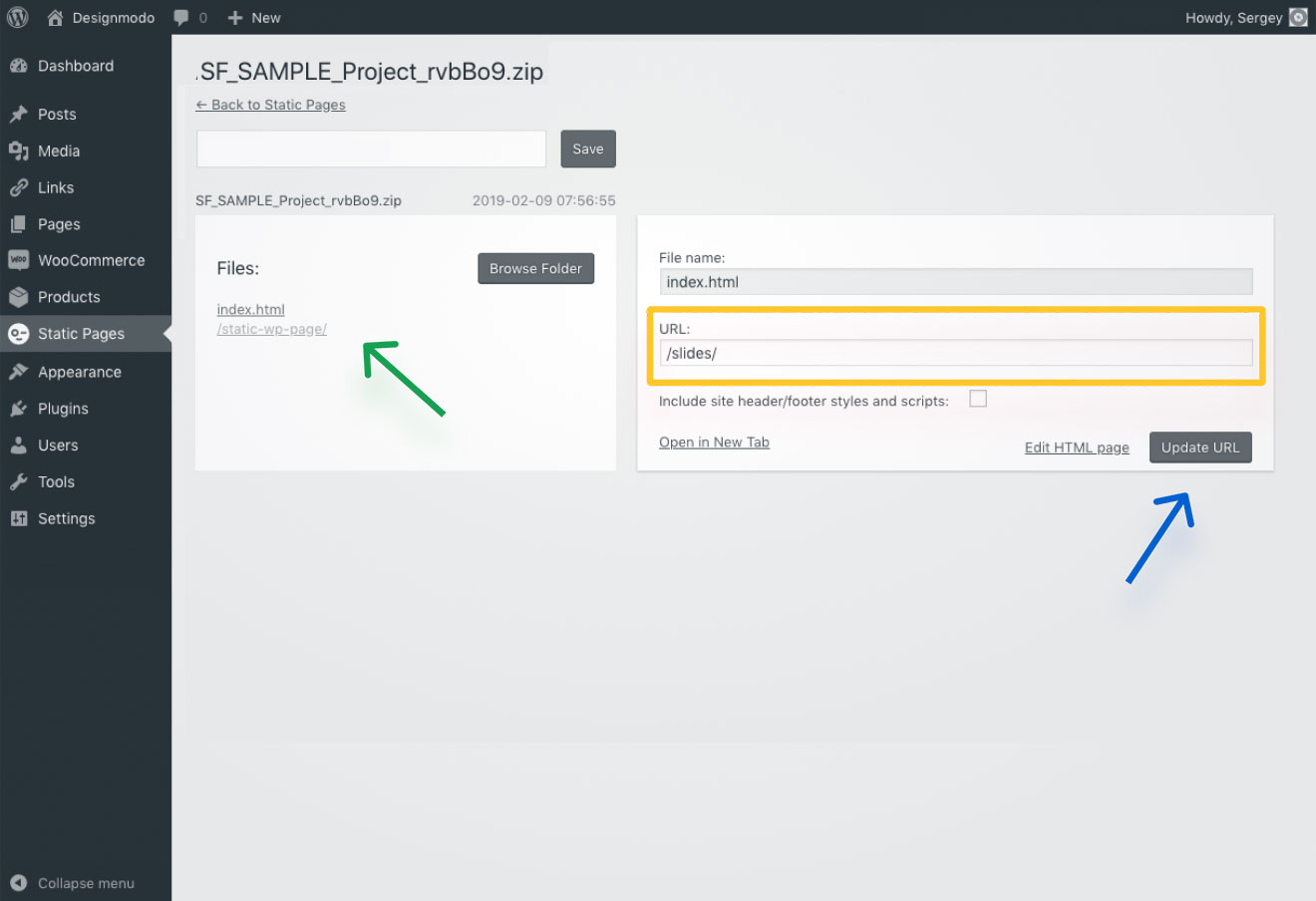
The Solution
Static Pages allows you to publish any static page on a WordPress website with any URL in a matter of seconds. And it is perfect for SEO.
Do you want to improve sales by adding a beautiful landing page for your existing shop or blog? Or add a page with a Mailchimp subscribe form? Or even test something quickly? Then Static Pages is for you.