Transactional Email Design: Examples and Best Practices
Transactional emails and promotional emails lay a sound foundation for every email marketing campaign. While the first one is responsible for luring people in, promoting products, and keeping the readers up-to-date, the second one is used for numerous notifications. Even though the latter has to deal with trivial tasks, it does not mean that it is stuck in banality. On the contrary, it is here where you have a high chance to get through to your readers and deliver your message since the transactional emails have the highest open rate among all the types of newsletters.
Note: Check out our new email template builder – Postcards. Try it for free!
There are many types of transactional emails. Starting from the simple reset password emails and ending with cunning re-engagement newsletters, each one has its purpose, and each one can be beneficial for your business. To show you the diversity of this direction, we have compiled a collection of fantastic examples of transactional emails.
Most transactional emails not only get opened by subscribers but are also thoroughly read from start to finish. Additionally, many of these emails are often saved, bookmarked, and revisited multiple times. Understanding the unique roles of transactional emails and dunning emails is crucial in business communication for engaging customers effectively.
Let’s examine them together to see how the famous companies turn them into their advantage.
Examples of Transactional Emails
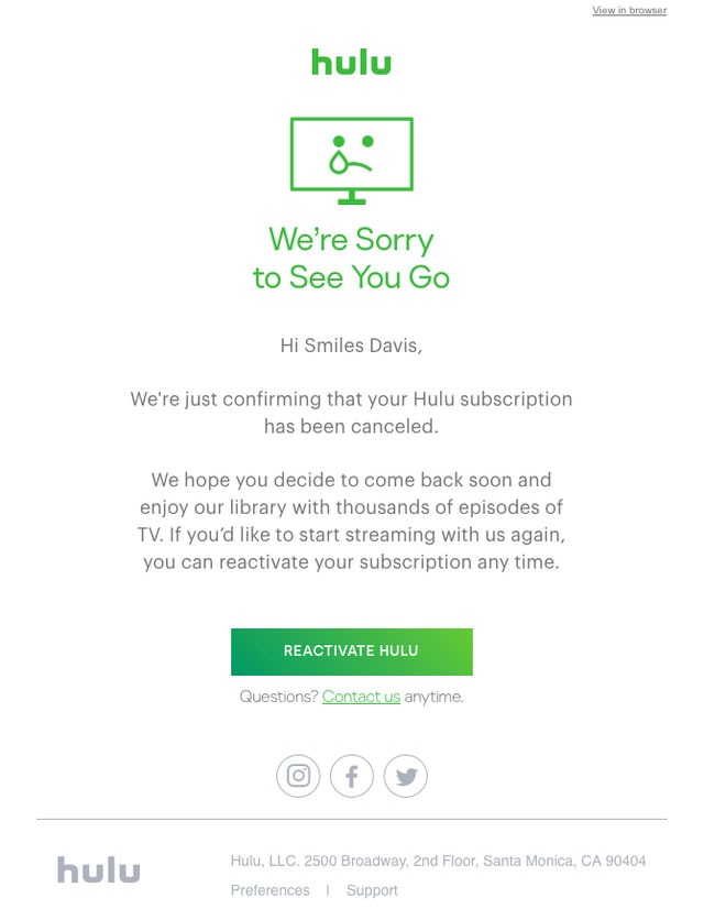
Your Hulu subscription has been canceled
With Postcards Email Builder you can create and edit email templates online without any coding skills! Includes more than 100 components to help you create custom emails templates faster than ever before.
Free Email BuilderFree Email TemplatesPeople cancel subscriptions all the time. Much like reset password emails, this kind of newsletter is quite popular, and every business owner deals with it regularly. Although it seems that there is nothing you can do about this, however, there is still hope, and your last email newsletter can save the day. So, make it positive and friendly, much like the team behind Hulu did. Their canceled subscription notification is minimal but truly eye-pleasing. Note several things.
- The first one is, of course, the funny mascot that is crying. Without a doubt, it evokes sympathy from the first seconds.
- The second one is a massive call to action that lures in with its bold appearance. It is placed at the bottom appearing right at the moment when former subscribers are ready to leave.
- And finally the coloring. Green color brings about positive mood.
Even though the email newsletter template includes just a goodbye message, still it draws attention and encourages people to think about their decision once again.
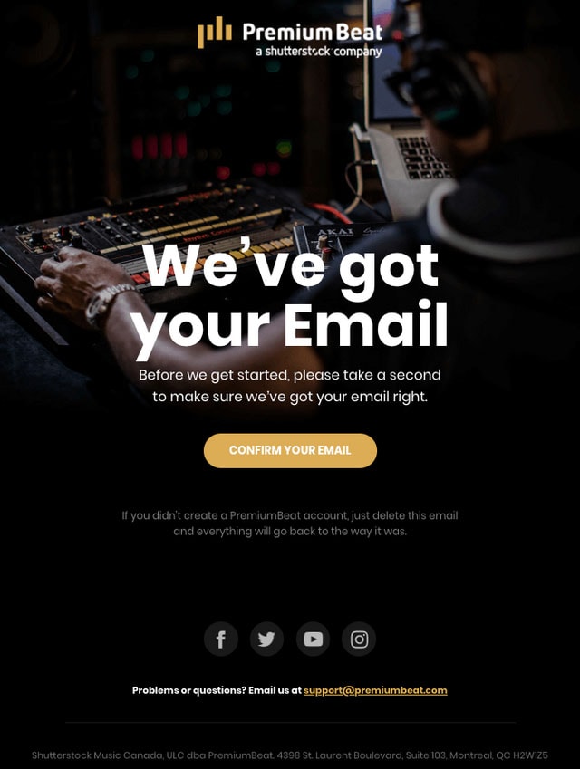
PremiumBeat Email
Unlike the previous example that is generated when people leave, this one appears in your inbox when you decide to become a member. This is another common and widely used type of transactional email newsletter.
The PremiumBeat team asks the user to confirm the email to ensure that nothing fishy is going on here. The email newsletter looks like a mini web page that is skillfully aligned with the brand identity of the company. There is a beautiful image background and text that stands in high contrast to the backdrop. The CTA button naturally catches your eye thanks to its relatively large size and prominence. Little information is provided, but the email newsletter does not look minimal thanks to its vibrant design. It feels like a digital promo flyer that skillfully engages people.
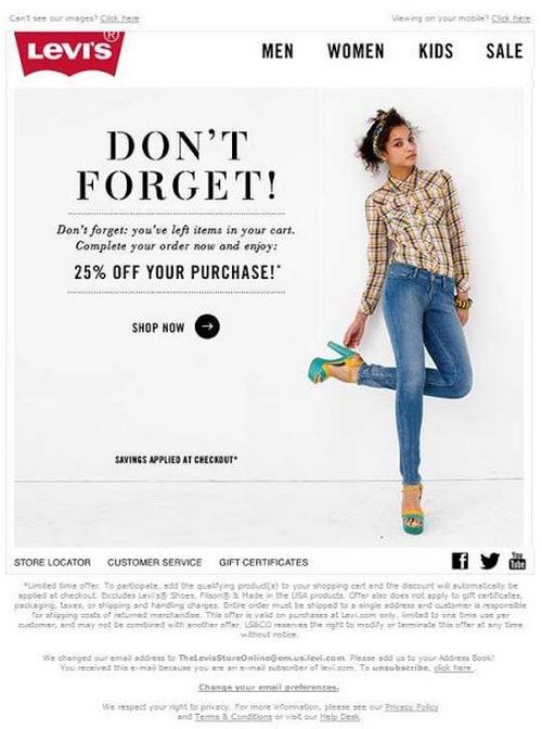
Levi’s email
An abandonment cart email notification is an integral element of marketing campaigns of every e-commerce website. Customers come and go and forget to finish their shopping. It’s not a big thing. Shop owners know perfectly well how to handle this situation. They send email notifications reminding people that they left goods in their shopping carts. And while some believe that this simple notification is enough to bring the customers around, others like the team behind Levi’s prefer to act cardinally.
Their abandoned cart email does not include any goods that we are accustomed to seeing in such types of newsletters; instead, the team gets straight to the business and offers the customer an extra 25% discount. If this does not work, nothing will help to win clients back. Smart decision, indeed.
With Startup App and Slides App you can build unlimited websites using the online website editor which includes ready-made designed and coded elements, templates and themes.
Try Startup App Try Slides AppOther Products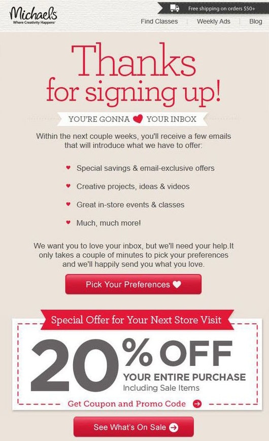
Mailbakery Newsletter
The signup email, much like a welcome email, is intended to bring new users up to speed with your offering. It should be informative but not overwhelming. It is here where you need to make a careful choice of what you are going to include inside. Set priorities and display only vital details. The team behind Mailbakery shows how to do this properly.
Their signup email newsletter has a classic structure and does not comprise much information. The copy is concise, yet it includes exactly what the newcomer will need. The content is well dished up: everything is correctly formatted, and the list is used to delineate some options. There are two call to action buttons that thanks to their relatively big size and bold red color, naturally lure the viewer in. With all those ribbons and patterned backgrounds, the design looks a bit sugary, but certainly artistic, and that makes it stand out from the crowd. And that’s not all: the star feature of this email is a promo block located right at the bottom of the newsletter. Here the team shares a 20% discount on the next shop visit. It is a perfect ending to the perfect transactional email newsletter.
Email newsletter with a request of updating privacy is not a frequent guest in our inbox, yet it happens once in a while. Though recently we have seen an upsurge of this type of emails. The reason was simple – GDPR has finally come into force. So everyone who was running email campaigns as well as having a list of subscribers was obliged to deal with this.
We have included two examples of transactional email newsletters that show how to overcome this challenge properly.
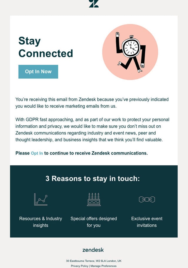
Zendesk newsletter
The first example is an email newsletter created by the Zendesk team. It looks like a mini version of the landing page that tries to sell the company to you. The content is divided into several paragraphs. At first, the team tells the goal of this email. After that, they provide reasons to stay.
The block «3 reasons to stay» is worthy of the attention. It is concise, includes only essential information and looks visually-appealing due to lovely icons.
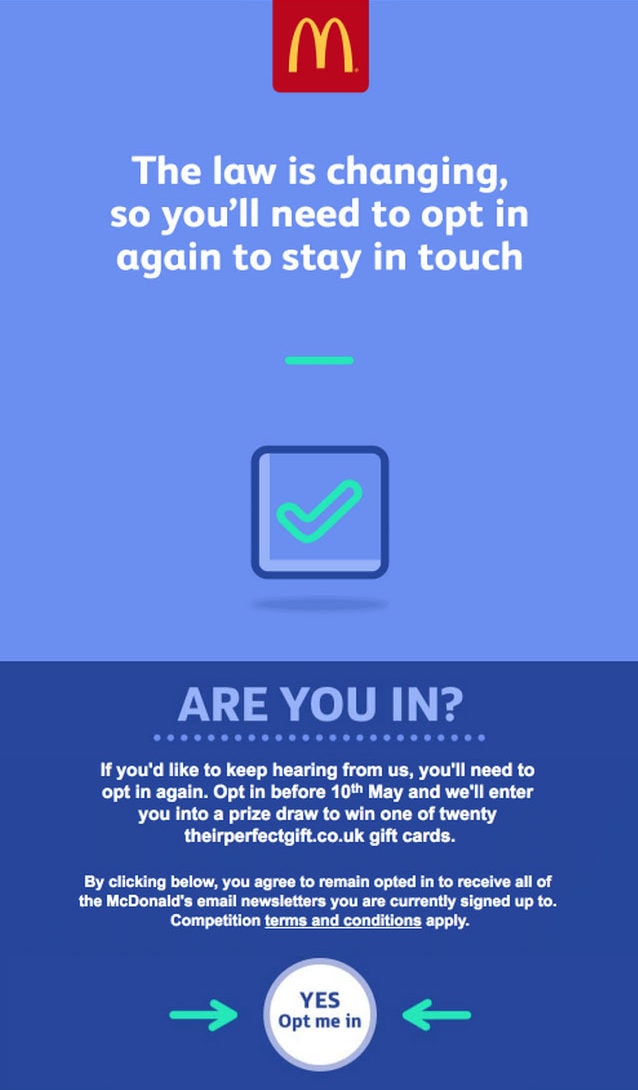
McDonald’s newsletter
The second example was provided by one of the Goliaths of the fast-food industry, McDonald’s. The marketing team has created a simple yet pleasing email newsletter that encourages subscribers to renew their subscription. Although there is nothing redundant in here – just several blocks with text and call to action – nevertheless thanks to a design that is overfilled with fresh air the newsletter makes an impact. There are two things to note.
First of all, the coloring. The blue tones exude businesslike charm on all fronts. Secondly, the layout is simple and functional, requiring little effort to explore. And finally, the CTA button. Not only does it have a quite unusual circle shape but there are also two arrows that point to it. Everything is well-thought-out.
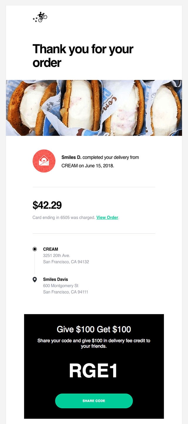
Cream newsletter
This is a classic «Thank you» email newsletter. All the owners of e-commerce websites take advantage of it. It is a rule of etiquette that you need to obey. Everyone expects it from you, so do not disappoint them.
This one looks clean. The team sticks to the conservative route, while still spicing things up a little. Not only does the newsletter include the order information, but it also has a special offer.
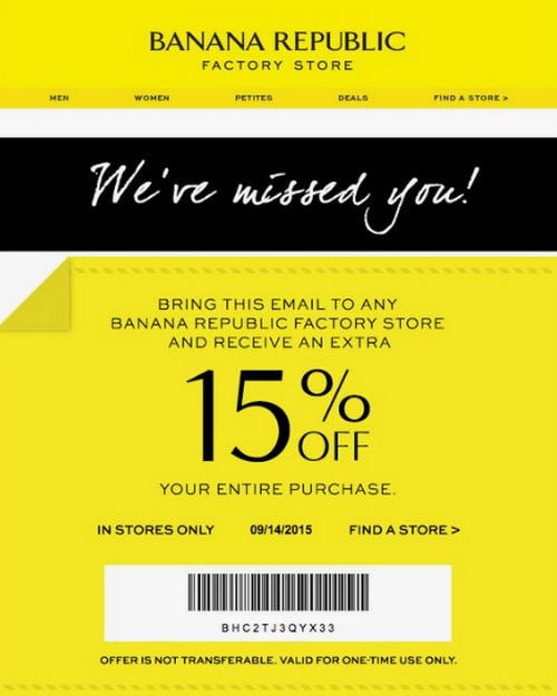
Banana republic email
Banana Republic’s email is a representative example of a common marketing ploy. The re-engagement emails that include nothing more than just a small body copy aim to bring customers back. Each such transactional newsletter has an offer. This one draws people in with a promo code with a 15% discount.
Thanks to smart design, the bonus instantly catches the eye, giving the readers food for thought.
Transactional Email by Postcard
The transactional email newsletters by Postcards easily differentiates itself from the competition with its beautiful typeface, gorgeous coloring, and outstanding minimal design. It gets down to business by offering the subscriber a discount coupon that takes up almost the entire space of the letter.
It does not overwhelm the audience; on the contrary, it looks neat and adorable. This is a fantastic example of using simplicity to win over a client. You do not need to reinvent the wheel to make an impact; a good combination of design and copy sprinkled with some offer easily does the trick.
Small tip: The Postcards’ solutions are very flexible and can be easily customized. So if you feel like you want to change every inch in here, you are certainly welcome to. Use the intuitive online builder to create a transactional email that best fits your goal.
Conclusion
Much like promotional email newsletters, transactional newsletters can look extremely alluring. Although their purpose of existence is merely technical, and they do not reach all your subscribers at once, nevertheless they provide you with an opportunity to be heard. And that is a thing that you can’t miss.
All the listed above examples show that when done right the transactional emails can easily benefit your marketing campaign by improving communication between you and your subscribers. Treat them like promotional newsletters, and you will certainly achieve success.