


Latest Articles
-
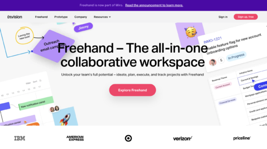
9 Best InVision Alternatives to Switch to in 2024
On 4 January 2024, InVision announced that its design collaboration services are shutting down. So, …
-
Top Web Design Trends 2024
With a huge emphasis on user behavior and engagement, the web design sphere constantly changes …
-
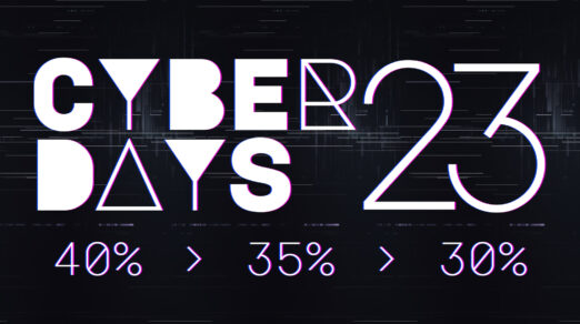
Cyber Monday 2023: Top Deals for Web Designers, Email Marketers, and Figma Designers
As Cyber Monday 2023 approaches, it’s an exciting time for web designers, web developers, email …
-
The Problem with Web Design Trends: Why Following Them Blindly Can Hurt Your Business
Web design trends come and go. Some trends stick around for a while, while others …
-

17 Tips for Designing with Type on a Photo
One of the best techniques to have in your toolkit is designing with type on …
-

Website Design: The Ultimate Guide with Examples
With modern technologies getting more powerful and widely supported by current browsers, the website has …
-

Font Psychology: Here’s Everything You Need to Know About Fonts
There are over half a million fonts in the world. While most of the web …
-
Responsive Web Design: 50 Examples and Best Practices
The number of handheld devices operating worldwide is growing exponentially. According to stats, more than …
-
Top Web Design Trends 2023
Some say trends in web design come and go: there is no point in following …
-

Seasonal Icons: Winter Inspiration and Free Packages
It is hard to argue that winter is a marvelous and magical season. Being a …
-
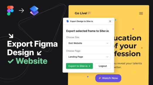
How to Export Designs from Figma to Siter.io
Siter.io is a design tool and website builder that lets you create and publish entire …
-
What is No-Code? The Best Tools to Get Started
Gone are the days when creating a digital product, like a website, newsletter, or application, …
-
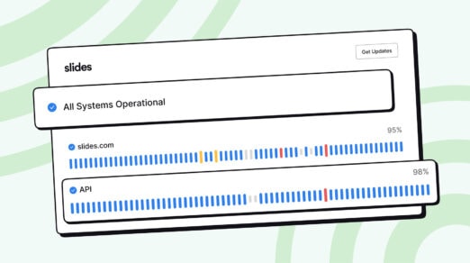
How to Build Public & Private Status Pages for Websites
Status pages are essential for many online businesses, applications, and platforms in today’s fast-moving technology. …
-
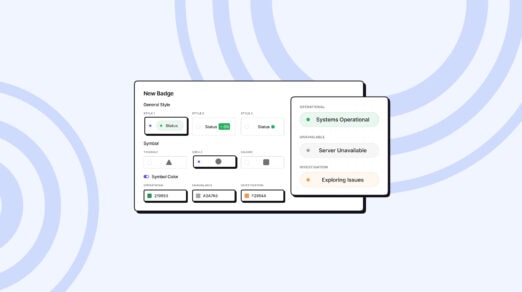
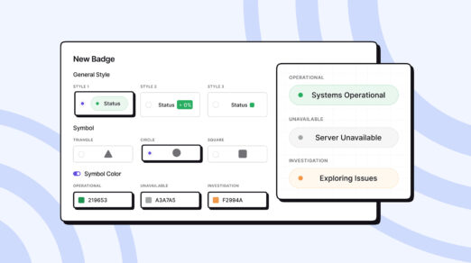
How to Create an Uptime Status Badge and Insert It into Your Website
A status badge is an essential add-on widget component of a website as it provides …
-
Best Status Website Badge Examples: How to Customize the Design
Do you know that visibility of system status is one of Jakob Nielsen’s 10 heuristics …
-
Best Status Page Examples: Advanced Customization, Design, and Incident Reports
Expect companies to embrace transparency in platforms to reinforce relationships with the digital crowd and …
-
Top Web Design and UI Trends for 2022
What web design trends will dominate 2022? What styles and techniques should you get familiar …
-
Are Website Pop-ups Still a Relevant Lead Generation Tool?
Did you know that the creator of the first website pop-up in 1997 — Ethan …
-

How to Use Social Media to Influence and Inspire Your Web Design Projects
In this day and age, many of us spend our lives swiping and scrolling through …
-

A Guide to Making Your Images and Videos Accessible
When you think of accessibility, do you envision things like ramps outside of restaurants or …
-
Everything You Need to Know About Dark Patterns
They are everywhere. Little tricks on webpages, in apps and with popups and forms that …
-
Top Web Design and UI Trends for 2021
Jumpstart new projects and website redesigns with a few of the hottest elements in design …
-
How to Create Featured Images That Draw More Readers to Your Blog
You’re familiar with how valuable images are on a website. They can: Break up otherwise …
-
When Should You Rethink Using Time-sensitive Images on Your Website?
There are two ways we can classify a website’s content in terms of time. Evergreen …
 siter.io
 pulsetic.com
 static.app
 mailpost.io