How to Create Perfect Color Combinations
One of the most challenging and tricky parts of the design process can be choosing a color palette that represents your brand or message, while creating an amazing base for the design.
Creating perfect color combinations is more than just picking two colors and running with it. There’s actually quite a bit of science and design color theory behind it. Today, we’ll look at nine ways to help you create a more perfect color palette. (And of course, the tips come with a showcase of websites featuring beautiful color combinations.)
Start with the Color Wheel
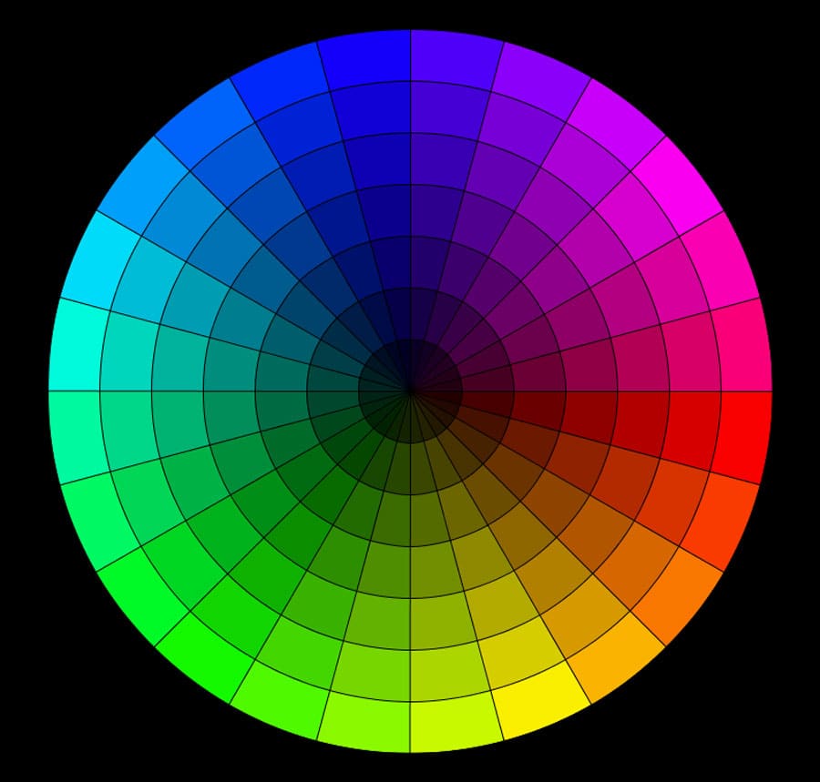
Do you remember the color wheel from school as a child? It’s still a practical tool as an adult.
The color wheel can help you think about color and how different hues relate to one another. It’s a practical way to determine whether a pair (or more) of colors will relate to one another in a harmonious way.
The wheel contains primary, secondary and tertiary colors and every combination therein.
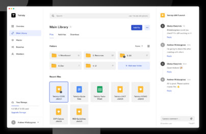
With Postcards Email Builder you can create and edit email templates online without any coding skills! Includes more than 100 components to help you create custom emails templates faster than ever before.
Free Email BuilderFree Email Templates- Primary colors: Red, Yellow, blue
- Secondary colors: Green, purple, orange (mix of two primary colors)
- Tertiary colors: Azure, violet, rose, red-orange, chartreuse, spring green (mix of a primary and secondary color)

How you mix colors on the wheel is important and contributes to how well the hues work together.
- Analogous: Pick three colors next to each other on the color wheel
- Complementary: Colors from opposite sides of the color wheel
- Split complementary: Pick a color and use the color on either side of the opposite color from the color wheel
- Double complementary: The hardest to create, this concept uses a primary color and complements from both side of the opposite color on the color wheel (works best with tints and tones)
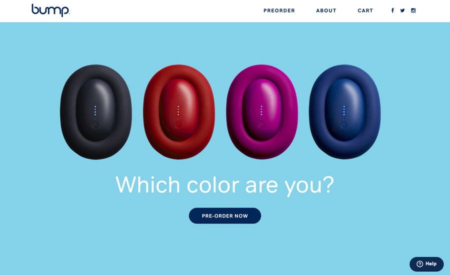
- Monochromatic: One color and variations of that color (such as Nifty, above)
- Triadic: Three colors equally spaced on the color wheel
Most color-picking tools use a simulation of a color wheel to help you make color choices. (So there’s really no way around this part of design theory.)
Black, White and Neutrals Matter

But a palette is more than just a bright color or two. Arguable, the most important colors in the palette might be the ones you don’t really see – black, white and neutrals.
These colors set the stage for how everything else works. They are often part of the background, provide a warm or cool feel for the project and contribute to overall navigation and usability though typography and other directional cues.
Toning and Tinting
Few designers are going to grab a few colors from the color wheel and just use them straight up. That’s where tints, tones and shades come in.
With Pulsetic you’ll be instantly notified the moment your website, API, or server becomes unavailable. Monitor uptime from multiple global locations and respond to incidents before your users are affected.
Create beautiful status pages in minutes to keep customers informed during outages and build trust with transparent communication.
Start Monitoring for Free- Tint: Color plus white
- Shade: Color plus black
- Tone: Color plus gray, or black and white
These variations change the saturation of color and give you variance within a palette. When it comes to creating color combinations tints, tones, and shades are often used to expand a palette beyond two or three colors, so that all the hues are in the same family (much in the same way you might use bold or italic with typography).
Use Trends with Caution
There are so many “trendy” colors out there. While they can be fun to use sparingly, these colors can be somewhat more difficult to use long-term. If you want to use a color trend, stick to one trendy option and work it in to your palette.
In general, you want to create a color palette that will withstand time and can be used over and over again. (Color is an important contributor to brand identity.) Work with a couple of colors that are “yours” and add a trendy option in as an accent for maximum impact. (That way, when the trend is over, you can return to another accent color.)
Avoid the Rainbow

Color is best when used with purpose and in moderation. You don’t need five, 10 or 15 colors in your palette. The best color combinations are often just groupings of two or three colors with a neutral background.
Why? This gives each color room to be seen and have a purpose. Color should do something in the design. Too many colors and the only purpose is color. The best designs and color combinations exist so that each color has a specific role and users can engage with color in a way that makes the website that much easier to use. (For example, most designers use the same color for every button in a website project.)
Include a Color for Text Elements

When you are building color combinations, it is important to think about text elements. Unless the text will be only black, white or gray, determine what color (or colors) will be used for text elements.
This can include anything from color for readability or usability to linking to menu items. The most important consideration when planning color choices for text is readability. Lettering needs to have plenty of contrast in relationship to the background so that it can be seen and read with ease.
The color used for text elements can be part of the overall color scheme or an accent color that is specific to lettering.
Consider Color as It Relates to Content
The best color combinations don’t only match hue to hue, but they also match color to content. Think about what’s actually on the website. Do the color choices blend well with that content?
Sometimes this is an obvious problem and solution. Websites that deal with nature or the environment might use greens or browns; banking websites are often blue because of that color’s association with trust.
Other times, it’s not that easy. When you are in doubt, look at the imagery in the site design. Pull swatches from it to help establish a baseline for the type of color that is most appropriate. Then build from there.
Stick to a Palette

Once you are on the way to creating a great color combination, establish a palette so that color use will remain consistent throughout a project. Establish a set of rules for how color should be used.
Answer these questions to get started:
- How many colors are you working with?
- Are there tints, tones and shades to use?
- Can text be colored?
- Is there a set hue for UI elements?
- Can accent colors outside the palette be added to the mix?
Conclusion
When it comes to color, a lot of what makes a great palette starts with you. Do the colors look and feel right? It might seem like a simple test, but it matters. If you are the least bit unsure, rethink your options or go back to the root of theory and make changes to one of the colors.
Remember to create contrast and variance within the palette. Establish a feel. And remember to match color to content for the best overall user experience.