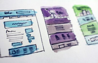
Primer on Web-Based Grid Systems
What’s in a grid? A grid-style framework is the backbone to almost any web design project, providing the structure for your site as well as a way to organize content, elements and images.
There are a variety of grid systems out there that you can buy or download free. You can also create your own if you are feeling ambitious. But one thing is for sure, you can probably benefit from using a grid system in your projects. (Every one of the website examples in this post did.)
What is a Grid?


A grid is a set of invisible lines – that run vertically and horizontally – that help you dictate where to place content. The structure is designed in columns and rows of equal spacing with a margin (or gutter) between each.
With Postcards Email Builder you can create and edit email templates online without any coding skills! Includes more than 100 components to help you create custom emails templates faster than ever before.
Free Email BuilderFree Email TemplatesGrid systems have been around for a very long time. Print designers use them and grids are making their way into more and more digital design projects. In web design, many of these grid systems come in the form of frameworks, which have become a standard format for creating websites.
The benefit of using a grid is that it helps organize content to create a consistent design. While users will never actually see your grid, designing on it will create a sense of flow and harmony, making your final product much easier on the user in terms of aesthetics and use.
Grid Pros and Cons


Grid systems can really help a designer of almost any experience level complete a project with ease and consistency. But some designers still aren’t complete fans of using this technique.
Pros
- Uniform design and consistency between pages
- Balance in design between elements and white space
- Prevent overcrowding of elements within the space
- Reduced coding since you are not starting on a framework from scratch
- Nesting allows subgrids within the framework
- Control over the design and structure
- Provides design stability
- Makes for ease of moving elements and placing them in different locations
Cons
With Pulsetic you’ll be instantly notified the moment your website, API, or server becomes unavailable. Monitor uptime from multiple global locations and respond to incidents before your users are affected.
Create beautiful status pages in minutes to keep customers informed during outages and build trust with transparent communication.
Start Monitoring for Free- Some say grids “stifle” the creative process
- Can be more difficult for sites with little content
- Some sites end up looking similar
- Grid systems can be tough for new users
Types of Grids

Historically, there are four basic types of grids – manuscript, column, modular and hierarchical. Add to that the most important type of grid system in today’s web design world – responsive.
Manuscript grids are developed in the form of blocks. These blocks determine the location of elements in the overall frame of the design. This grid style works for large blocks of text. Consider using it for the frame that will contain body text in a blog.
Column grids are exactly what you might expect – columns that run vertically across the page. Many grid systems contain some type of columnar format for organizing content. This is a common practice in web design.
Modular grids are an extension of column grids. They include both columns and rows to organize information. (Think about a table, for example.) A metro-styled website would be based on a modular grid.
Hierarchical grids are a more organic grid format and use a set of like objects to create vertical and horizontal space. In many cases, objects are placed on the canvas and then arranged in to some sort of order. Designers who create their own grids or base a system off a document grid are likely using this format.
Responsive grids are part of the hard coding of a website that give instruction for how the grid itself will shrink or expand based on device size. The responsive grid is based on percentages to determine size and placement rather than a hard canvas size. Most designers use a framework to create responsive grids to save time. There are a lot of responsive grid frameworks available for use, many of which are open-sourced and can be downloaded free.
Popular Grid Systems
When it comes to web design and grid systems the one thing you need to be mindful of is responsiveness. More than likely you will want a responsive framework for your project. Too many websites are viewed on too many device types to ignore responsive web design.
Here are 11 popular grid systems (and they’re all free):
Bootstrap
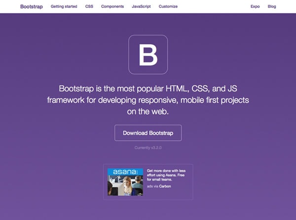
Currently, the most popular framework being used on the web.
Zurb Foundation
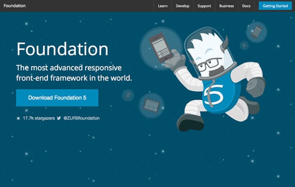
This framework touts speed and is fast for users, faster for designers and developers and easy to learn.
Skeleton
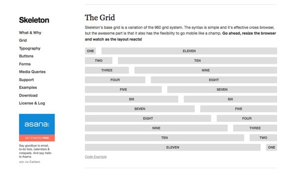
This framework is a collection of CSS files and includes a base 960 grid that scales for every device.
Responsive Grid System
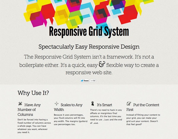
This grid system is just that and allows you to customize the number of columns and then plug it right into your design project.
CSSWizardry-Grids
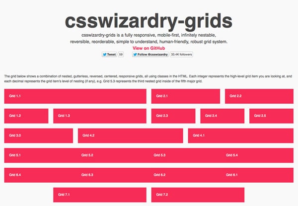
This grid system is nestable, reversible, easy to understand and robust.
CSS Smart Grid
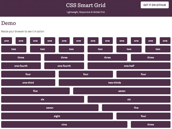
This grid builds on the popular 960 concept and scales for a variety of devices.
Gridlock
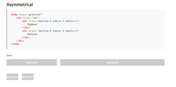
This grid works by nesting cells within rows and includes adaptive and fluid grid options.
Simple Grid
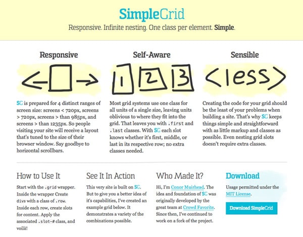
The grid system uses infinite nesting, one class per element and is simple to use.
Golden Grid System
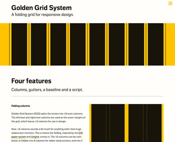
This system features “folding columns,” gutters, a baseline and script for a complete grid system vertically and horizontally.
Gumby
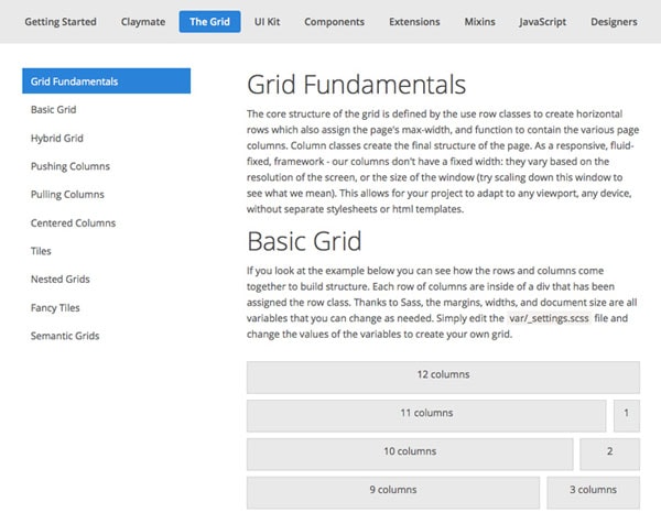
This framework uses a grid defined by row classes to create horizontal rows which also assign the page’s max-width, and function to contain the various page columns.
Unsemantic
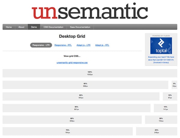
This is the responsive successor to the popular 960 Grid System. It works like 960 but uses percentages for the grid rather than static pixel sizes.
10 Tools to Create Your Own Grid
A framework or grid system may not be the best option for every designer or developer. But there are some tools out there to help you get started even if you want to design your own PSD grid.
- Photoshop grid from Elliot Jay Stocks
- 960 Grid Templates
- Frameless Grid
- Responsive Grid PSD from Joel Beukelman
- Bootstrap Responsive Grid PSD by Michael Henning
- Grid Calculator
- 4 Responsive Grid System PSD by Dyumin Vadim
- 12 Column Grid Template
- Proper Bootstrap Grid PSD by Simon Meisinger
Conclusion
Are you ready to design with grids yet? Now that you have the tools what are you waiting for?
What grid system is your go-to choice? Share it and your website using that grid system with us in the comments.