17 Tips for Designing with Type on a Photo
One of the best techniques to have in your toolkit is designing with type on and around images. But it can also be one of the toughest concepts to pull off successfully.
You have to have the right photo, a good eye for typography and know what you want to accomplish to make the most of adding type to an image. If you feel like you are ready to take on the challenge, here are a few tips for making it work.
Export Figma Designs to Live Website – No-Code
The use of text over an image is a common approach that may be used in a variety of graphic design applications. It includes superimposing text on top of an image in order to convey a message or provide context to a photograph. In this walkthrough, we will go over the steps necessary to put text over an image using Adobe Photoshop.
With Postcards Email Builder you can create and edit email templates online without any coding skills! Includes more than 100 components to help you create custom emails templates faster than ever before.
Free Email BuilderFree Email TemplatesNow, launch Photoshop and select the image to which you wish to add text.
- In the Layers panel, select the “New Layer” option to begin the process of creating a new layer.
- From the toolbar that is located on the left-hand side of the screen, select the “Type Tool.”
- From the toolbar that is located on the left side of the screen, select the “Type Tool.”
- Choose the portion of the image to which you would like to add text by clicking on it, and then start typing your content.
- Make the font, size, and color of the text, along with any other text attributes, seem exactly how you want them to by using the options available in the “Character” panel.
- Position the text above the image by using the “Move Tool” in Adobe Photoshop.
- In the Layers panel, alter the transparency of the text layer to your liking by dragging the “Opacity” slider left or right.
- The eighth step is to save the image using the specified file type.
It is essential to bear in mind the readability of the text at all times. Pick a color that has a strong contrast with the background of the picture so that it really jumps out. The text can also be made more legible by employing an effect known as a stroke or drop shadow.
How to Use a Text Over an Image
1. Add Contrast
Text has to be readable to be successful. Make sure that text varies in color enough to be seen in combination with the photo. If you have a photo with a dark background, opt for white (or light colored) text. If your photo has a light background, go with a dark-colored type treatment.
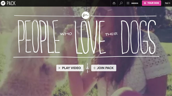
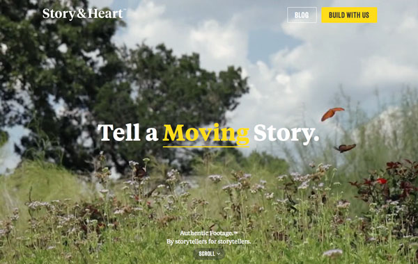
Contrast can also refer to the size of text in relationship to what is happening in the image. Lettering should work with (not against) the image. In the Pack website above, for example, the image is big and bold while the type is thin and light. The elements work together but they contain and element of contrast.
2. Make Text Part of the Image

With Pulsetic you’ll be instantly notified the moment your website, API, or server becomes unavailable. Monitor uptime from multiple global locations and respond to incidents before your users are affected.
Create beautiful status pages in minutes to keep customers informed during outages and build trust with transparent communication.
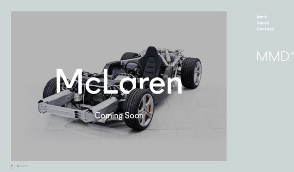
Start Monitoring for FreeSometimes it just works that text becomes – or is – part of the image you are working with. This can be tough to achieve and only works in limited cases. You either need a simple image and word to work with, such as the McLaren treatment above, or an image that is taken with text in it.
3. Follow the Visual Flow
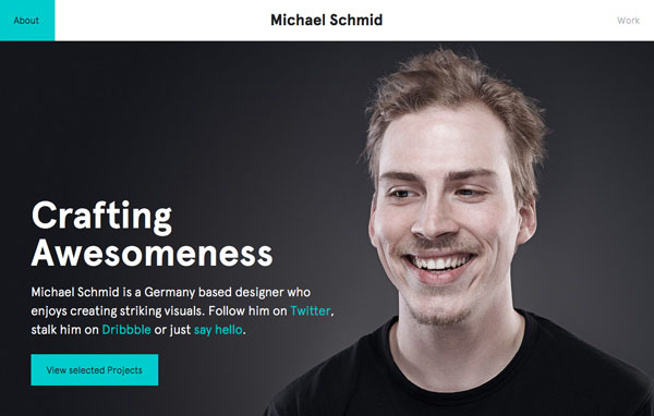
Working with the visual flow of an image is one of the most important tips when it comes to working with text and photos. You need words to fit into logical parts of an image. And please be careful not to put text over important parts of an image, such as the main action in a photo, faces or the product you are trying to showcase.
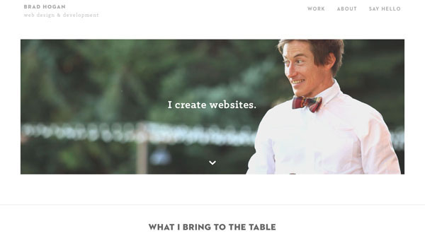
In terms of visual flow, look for spaces for text where the subjects of the image would look. Both examples about lead you from the body language or eyes of the person in the photo to the text. The flow of each is spot-on.
4. Blur the Image

One of the simplest tools you can have in your kit is the ability to blur part of an image. Adding a little blur to the background of an image with software such as Adobe Photoshop can help your text stand out. Blur can also add focus to your overall concept, such as the Wallmob website above. Blur brings the actual product and text into sharper focus for users of the site.
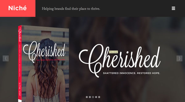
5. Put Text in a Box
When photos contain lots of color or differences between light and dark sections, putting text inside another frame can really make it stand out.
Choose a shape – you can see a rectangle and circle above – that works with your word choices and image. Then look for a color for the box that provides enough contrast for the lettering to show. Consider using a frame with some transparency for a softer feel that allows the image to show through.
6. Add Text to the Background

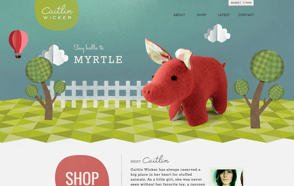
One of the best “tricks” out there is to put the text in the background part of the image rather than the foreground. Typically backgrounds are less busy and easier to work with when placing text. Backgrounds are often a single color as well, making it a location where text color is easy to figure out and even easier to read.
The end result is a natural-looking placement that does not require a lot of tricks or alterations to the main photo. Play with subtle shading effects, such as Caitlin Wicker’s site above, for text placement that also adds an element of depth to the image.
7. Go Big
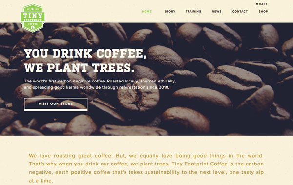
When you are not sure what works, consider going big. This applies to both the image – make it larger than life – or the type itself. The element of size will grab a user’s attention and with one element used large it can make it easier to create scale with the text and image.
Using big images, such as the coffee beans above, can help with shading and contrast differences. Using big text can add enough weight to lettering where it will appear readable against almost any image.
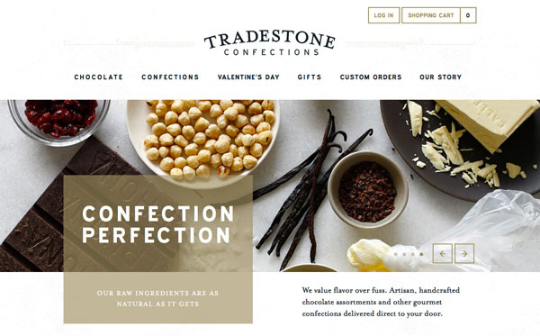
8. Add Color
Adding a hint of color can also add visual interest to an image. The sites above take two very different approaches – one uses a contrasting color not seen in the image to highlight certain words, while the other uses a tone that mirrors the image. Both techniques can be equally effective.
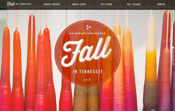
9. Use a Color Cast

An effect that is becoming more popular is the use of color casting over images to allow for text placement. While this can be a tricky effect to accomplish, it can also make for a stunning design.
Opt for a color that has high visual interest. The balance is in making the overlay color transparent enough for the image to show through, but not so transparent that the text is difficult to read. You may have to experiment with several color and photo options before mastering this trick. Not sure what color to use? Start with an overlay related to your brand colors.
10. Go Simple
The time-tested design advice “keep it simple” applies to text and images as well. You really want people to see both the photo and the words. Applying too many tricks can have the opposite effect.
11. Shift an Image to the Side
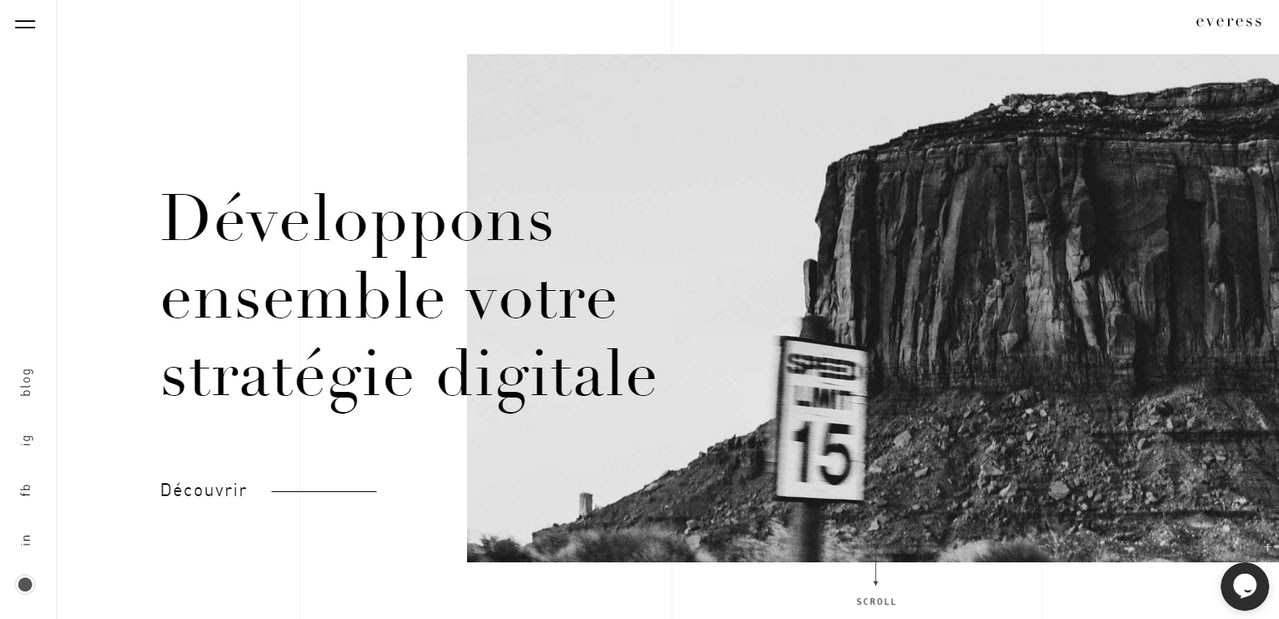
When you place typography on photo, it does not exactly mean that the photo should underlie content entirely. You are free to play with the background to establish a focal point on the content. For this, you can easily shift the image a little bit. You can move it either to the bottom or to the left or right side.
Things to pay attention to are contrast, size, and style of letterforms. The deal is, in this particular case, text over image will have some problems with readability since there is no uniformity in the backdrop.
Therefore, it is your task to eliminate all the possible issues and provide users with optimal contrast. It means that the size of the letters, as well as style, should create enough aesthetics to be perceptible effortlessly.
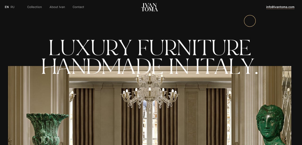
Consider Ivan Toma. On the website, you can see the text on image where the latter slightly shifted to the bottom. Thanks to such disposition, the top of the text has some solid monochrome backdrop. As a result, it simply shines.
However, there is a small flaw. Since the team has chosen elegant, subtle letterforms to meet the overall luxurious atmosphere of the interface, the second line of title blends into the image too much. It is one of those situations when you need to play with weight and style to achieve the proper contrast.
12. Think out of the Box
Shifting background images to the side is a modern trick and a huge trend for the web. However, you can adopt another solution when you put typography on photo to make the project look up-to-date, which is to think out of the box literally and figuratively.
The concept implies expanding visual borders and pushing the content beyond the backdrop. You need to do two basic things: first, stretch the title; second, narrow the image on the back, thereby creating huge gaps around the perimeter.
This way, the text on the image will feel much closer to you than other elements on the scene. Besides, the image will serve decorative purposes, whereas a header will serve informative purposes. This trick of bare layering also adds a subtle touch of depth.
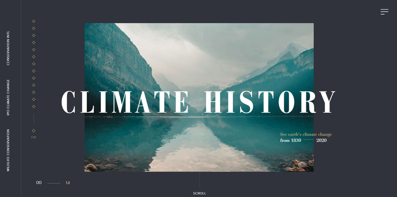
Consider Climate History as a case in point. Here you can see text over an image that is stretched beyond the backdrop. Even though there is no shadow, the caption naturally comes forward. The deal is the team has skillfully played with the font family that provides letterforms with a sharp and crisp appearance and font size that also helps the header to stand out from the background.
13. Vertical Rhythm
Sometimes all you can do to create a masterpiece by putting text on image is to ditch the traditional route and opt in favor of some fanciful tricks. There are many ways to go off the beaten track. However, one of the most underestimated but easy to bring to life is to use vertical rhythm.
The vertical rhythm was quite popular in the last few years. Although the mainstream has undoubtedly cooled off a little bit, yet it still is warmly welcome. It feels like the online audience is not ready to let it go. The solution gives us lots of room for creativity and certainly provides projects with a marvelous tint of mysterious Eastern Asian cultures.
When putting it into play, you can follow three main patterns. First, you can literally use vertical lettering to imitate aesthetics inspired by the traditional Japanese writing system. Just change the direction of reading flow, making it from top to bottom and then from left to right.
Second, you can twist an angle of the caption by rotating the typography on photo 90 degrees, like in the case of the 2020 Park Offer. Note the team behind the website has used vertical rhythm not only for the title but also for some functional elements that allowed them to bring true harmony into the design.
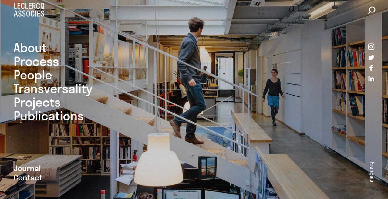
Finally, you can stick to the habitual horizontal reading flow with text over the image, however, divide it into words and arrange them into the column. This way, you will save users from unexpected twists while their reading, but still add a unique zest. Consider Le Clercq Associes to see how they have used typography on the photo. Thanks to column organization and vertical touch, the solution looks fantastic.
14. Dynamic Effects
We have featured a dozen good tips on how to designing with typography on the photo using some static approaches. However, what about pushing the boundaries a little bit further and getting the most out of the modern techniques.
If you need to place text on the image on your website, it is time to benefit from some inventive ideas. The more so, the web design sphere encourages you to do this by constantly implementing something extravagant in this area. Let us consider several incredible yet already time-tested ways to design with text over an image using dynamic solutions.
15. Spice Things up with Parallax Effect
Parallax effect is one of those techniques that, despite being with us for ages, still easily produce that desirable wow factor. It is relatively easy to bring to life; therefore, there were times when it was harshly overused. However, these times have passed, and nowadays parallax effect is one of the reliable assets in the developer’s toolset that may refresh any design.
The key feature of the parallax effect is that it gives a design a lovely sense of 3D-dimension by skillfully creating an illusion of depth.
In essence, the parallax effect is about making elements of the scene move at various speeds. As a rule, the background stands still or moves at the lowest speed, whereas elements on the foreground move faster, yet still, each one has a different speed. Thus, all the aspects of the scene receive its dose of the viewer’s attention.
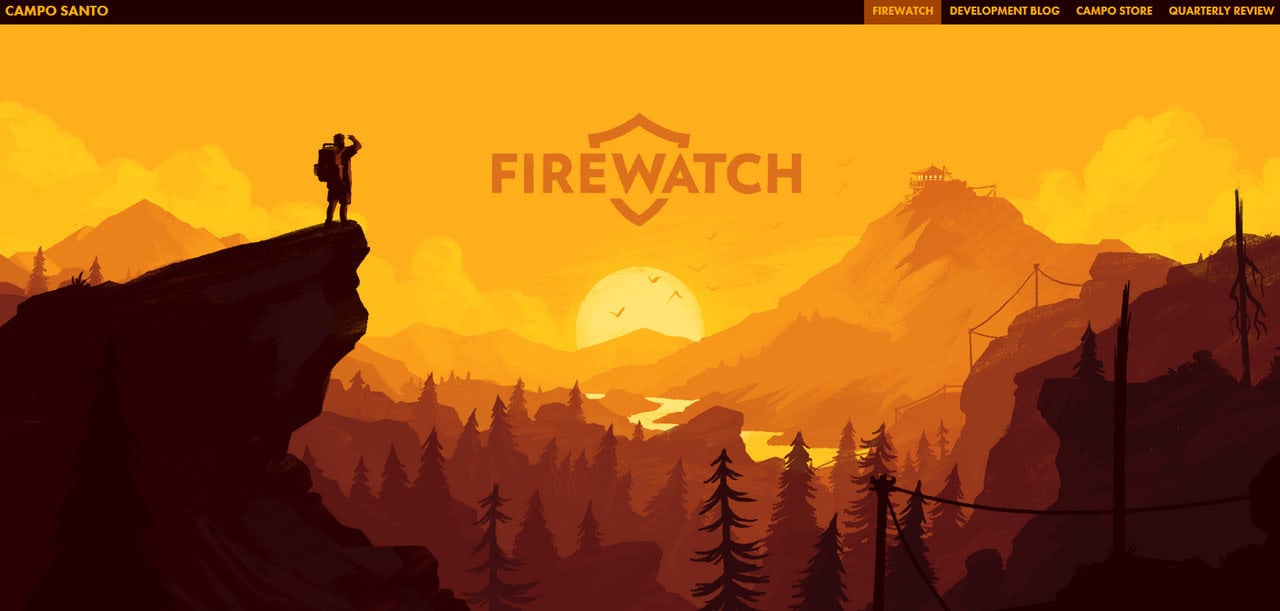
Consider Firewatch by Campo Santo. The team has pulled off quite a dramatic effect by using not one or two but six layers of images. As a result, you can enjoy the beautiful scenery with shifting layouts where text over image naturally occupies the central position.
16. Implement Rules of Perspective
Along with the parallax effect, there is another simple yet effective way to create an illusion of depth – that is, to use rules of perspective. While the previous trick requires scrolling to reveal its beauty, this one requires just regular movement from the mouse cursor. And these moves can take place anywhere on the screen.
Therefore, it is much more productive since users do not have to take any further actions to see the effect. The only thing that they need to do is just move the cursor along with the screen, and this happens all the time.
The technique makes the typography on photo to turn toward the position of the mouse cursor by skewing its edges and rotating its plane a little bit.
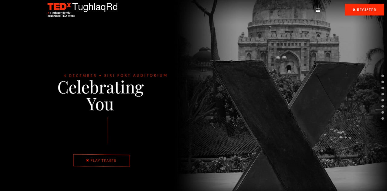
Consider TEDx ToughlaqRd as a representative example of the successfully adopted approach. Here the team has gone even further with the idea. The deal is they have broken the title into several layers to emphasize the central part unobtrusively. Note the movement of the entire content block: it is so smooth and flawless that it is a pure joy to play with it.
17. Add Hover Effect
Perhaps, adding a hover effect on the text on the image is one of the time-proven tricks in the toolset of dynamic solutions of these days.
This idea was with us for ages – we saw it all the time applied to the buttons or navigation links – however, only recently, it has become apparent that any detail of the scene may benefit from it. And typography on the photo is one of those situations where it can reveal its hidden potential the most.
The thing to remember when you follow this approach is that the effect will be evident only when the mouse cursor will hit the type. Therefore, you should not blindly rely on it. The text over the image should already be apparent. It can be big; it can be colorful. The hover effect should reinforce the default state. It may transform the typography on photo into a dramatic show; however, it still cannot do everything on its own.
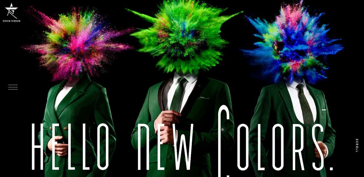
Consider Green Ribbon, where the team is perfectly aware of this. Although the image has some bright splashes of colors that try to make it all about themselves, however thanks to unusually elongated letterforms, colossal font size, and of course, hover effect that strengthens the appearance the text on the image has its place that is evident to everyone.
When working with images, use simple typography and a straightforward image for the best results. Remember to allow important parts of the image to show without obstruction and keep working n your design until the text is clearly readable.
In conclusion, placing text over a photo can be a straightforward yet effective approach to improve the appearance of your images and communicate the intended meaning. You can make attractive visuals that grab the attention of your audience if you have the necessary tools and know-how.


