Negative Space is an Important Design Tool: Here’s Why
Seeing more white space in websites these days?
You’re not alone.
While white and negative spaces have always been a popular design tool (and topic among designers), the technique seems to be making more of a comeback. Clean design schemes are in, more sites are using breakpoints in responsive design frameworks and there is a newfound focus on readability and user experience. All of these things lead designers to the ultimate simple design tool – white space.
White vs. Negative Space

With Postcards Email Builder you can create and edit email templates online without any coding skills! Includes more than 100 components to help you create custom emails templates faster than ever before.
Free Email BuilderFree Email Templates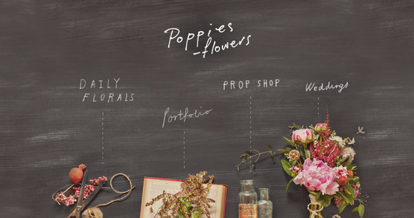
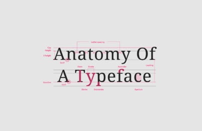
White and negative space are the very same thing (and the terms will be used interchangeably here). The jargon differences come from print publishing versus other types of design. Both terms refer to any unused, or open space in the design.
Print designers – those working with books, newspapers and magazines especially – most commonly use the term “white space” because any unused part of the page is often white, rather than another color. Many other designers just call this negative space.
The term negative space originated with photographers, who refer to positive (the subject of a photo) and negative (the background) in images. Simply, anything that is not drawing attention is considered part of the negative space – this can be part of an image itself (think the sky in the background of a portrait), a patterned background on a website or even just a block of color around text.
Though the terms are interchangeable some web designers especially will confuse white space with negative space that is colored white. So make sure your audience always understands the jargon you are using.
And remember, negative space does not have to be white. It can be a color, a pattern or even a background.
Why Space is Important

With Startup App and Slides App you can build unlimited websites using the online website editor which includes ready-made designed and coded elements, templates and themes.
Try Startup App Try Slides AppOther Products
Space is the thread that holds your design together.
The right amount of space separates objects from each other. It cushions text to make it readable. And spatial relationships define what elements go together, and what elements do not. The right balance of space and elements is what really brings a complete design together and makes it beautiful.
Negative spaces are everywhere, from the halos around objects to the gaps between lines of text. These small spaces are immensely important even though you may not pay that much attention to them. Most designers abide by the “keep blank spaces around content” rule because it makes everything that much more readable.
White space is the one design element that is common among every project, printed piece and website. It is included in the style guide or style sheet for every design outline. When perfected, white space goes almost unnoticed, but when executed poorly it jumps off the screen (or page).
Too little space makes a design feel crammed, busy, cluttered and difficult to read. Even if the effect you are going for is one of chaos, space matters. Think of the space between lines of type, for example, without enough letters can touch and become unreadable.
Too much space does not present as many concerns as too little space but can be equally difficult as a design technique. Exorbitant amounts of white space can make objects feel small or distant and set apart from the rest of the design. At the same time, lots of space can create a great deal of contrast between an object and its setting.
Equal and consistent spacing is one of the best tools you can use to maintain a sense of space and relationships between objects in design projects. As a general rule, spacing should be treated just like every other element and there should be a defined style for it. What is the cushion between objects?
Going to Extremes

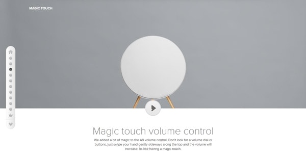
Designers sometimes use extreme amounts of white space as a way to bring focus to a certain part of the design.
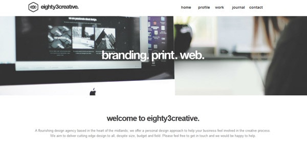
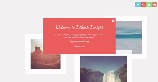
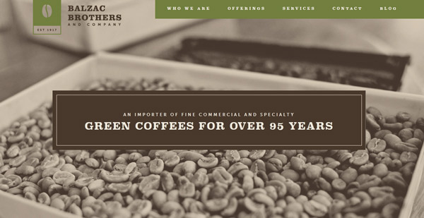
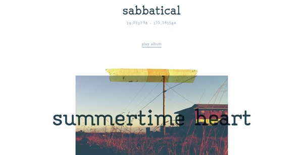
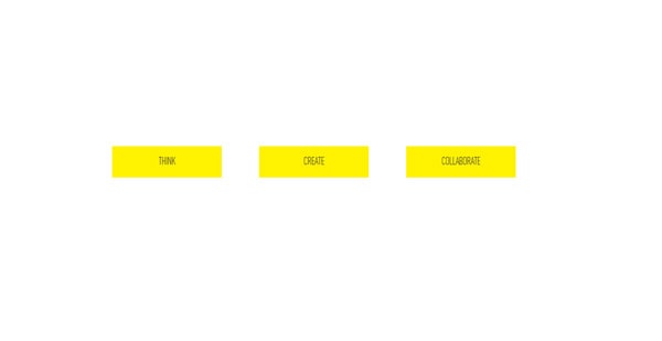
While negative space does not always equate with minimalism, many do make, and design with that connection in mind. Extreme amounts of white space work when the designer uses the technique to create and draw attention to a specific thing. Having a single subject to look at in the middle of a sea of empty space is an effective way to make a user stop, look and read what is on the screen. This technique can work with images or text, as showcased in the examples above.
Be aware though, when overused, the technique can have a negative effect. Using vast amounts of space limits the amount of information you can provide. It is important to balance visuals with information to keep the attention of site users.
Dealing with Breakpoints


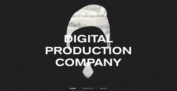
One of the newer places where negative space is showing up is in responsive design. More designers are developing negative spaces to deal with the difference between browser size and various breakpoints in the responsive grid and for oversized browser widths.
Often, these are fairly unnoticeable – just a sliver of space on the left and right sides of the screen — but more designers are getting creative with the space and what appears in it. This is a pretty new trend. Six months to a year ago, many designers were just leaving the space white (or black) but more commonly, sites are filling this space with something extra, most commonly a patterned background.
Is this necessary?
Many would argue no. But it all depends on the project. When it is part of the design, this really works. There are some fun, super-creative sites that are using this “breakpoint white space” to their advantage. The added detail can really impress users and when designed well can be representative of the site and overall design. They key Is for this designed space to be unobtrusive and feel like it really is part of the overall design scheme.
That being said, there’s nothing wrong with using something simple to account from breakpoints. Sometimes what we find is that the best white space is actually space that is white.
Conclusion
White space is one of those topics we, as designers, love to talk about. You either love it and can’t get enough, or consider it overrated.
Personally, I love white space. Nothing is better than giving your design room to breathe. Plus the extra space can help set your work out from the rest of the pack.
But you have to be comfortable with it. You don’t have to go to extremes to use negative space well in a design project. If you aren’t using a lot of white space now, challenge yourself to use more, even just for small detail parts of a project (such as the spacing around photos or other UI elements). You’ll thank me later.