Tips on Using White Backgrounds in Website Design
It seems like everyone is using a white background these days.
Gone are the dark and patterns that have been a big part of the design process for a while.
And while using a white background may seem like the easiest and most safe path to a clean design, that is not always the case.
Export Figma Designs to Live Website – No-Code
With Postcards Email Builder you can create and edit email templates online without any coding skills! Includes more than 100 components to help you create custom emails templates faster than ever before.
Free Email BuilderFree Email TemplatesWhite backgrounds need to work with both your text and image choices. White backgrounds need to work in harmony with the overall design and not look like an afterthought.
White backgrounds need to have a purpose and beauty in the overall design scheme. A study found that consumers may have less eye fatigue while using websites with a high contrast color scheme, such as black text on a white background. Your content’s readability and accessibility can both be increased by using a white website design with text that is highly contrasted.
So what are designer’s doing to make white backgrounds work for them? Let’s take a look.
Why a White Background for Website?


With Pulsetic you’ll be instantly notified the moment your website, API, or server becomes unavailable. Monitor uptime from multiple global locations and respond to incidents before your users are affected.
Create beautiful status pages in minutes to keep customers informed during outages and build trust with transparent communication.
Start Monitoring for FreeWhile using a white background has always been a popular choice – arguably because it is the default setting when working in HTML and CSS – the color has seen a resurgence in use in recent months.
White as a background color for blogs and e-commerce sites is a staple, but what we are seeing more of is that designers are using white backgrounds for all kinds of different (and more creative) projects.
While you can’t directly pinpoint why this is happening, it’s easy to see the number of sites with a light focus. A couple of years ago the trend was to use a black or darkly-colored background.
I have noticed a correlation between white backgrounds and two web design trends:
- Responsive design: Responsive design and grid “stops” for a variety of devices has helped the simple, white background regain popularity because it is easy and always looks natural. In some responsive layouts, sites lock to certain pixel-width grid stops and everything outside of those show a background “edge.” If the overall background is white, this edge becomes invisible without any extra design thought.
- Flat and minimal styling: Simple is still a major trend (as it was for most all of 2013). And a white background is the epitome of simple. White also makes it easy to pair and use many of the bright, bold colors that are symbolic of flat design styles.
What Does White Color Say?


White is a simple color – or the lack of color – and while it has some meanings of its own, it can take on the context of its surroundings.
White, by nature, is the color of purity, faith, light, cleanliness, possibility, softness and is generally positive.
How to Make a White Website Design
As a background color though, white is more of a supporting cast member. White it maintains some of its own color associations, the hue also absorbs what is around it, allowing the full meaning of the design around it to come through. So white as a background color, for example, will take on feminine attributes when paired with pink and script typefaces.
White as a background color emphasizes clarity and removes visual obstacles and clutter in today’s trending use. The hue is used to add visual emphasis to other important parts of the design – color, text or images – and is frequently part of an overall visual aesthetic that is simply designed and minimalistic.
A white backdrop might be a great option if you want to design a website that is simple and elegant. A white backdrop can make your content stand out and improve the professional and contemporary appearance of your website. Here is a quick guide on how to make a website with a white background:
- Choose a backdrop color of white. Selecting the ideal white for your background is the first step. To avoid choosing an off-white or cream color, make sure the white you select is pure white (RGB value of 255,255,255). For the precise RGB value of white, utilize a color picker tool.
- Simple is best. Keep the design simple when making a website with a white background. Avoid utilizing too many elements or images, and use only a few colors. Maintain a straightforward layout that highlights your information.
- Use clashing hues. You should use contrasting colors for your text and other elements because your background is white. Your information will stand out and be simpler to read as a result. Although black is frequently used for lettering, you can also use other dark hues like navy blue or dark gray.
- Include graphics and images. Your website doesn’t have to be dull just because it has a white background. Your website can be enhanced graphically by adding images and graphics. Keep your graphics basic and clear, and choose high-quality photographs and graphics that enhance your content.
- Test the website. It’s critical to test your white background website after creation to ensure that it displays properly across all platforms and browsers. Ensure sure your website loads quickly and is responsive. To make sure that your site appears excellent on all devices, test it on all screen sizes and make any necessary modifications.
These easy steps will help you build a stunning, contemporary website with a white backdrop that effectively displays your content.
Other Shades of White


Other colors or words that represent hues that are white or almost white include snow, milk, ivory, pearl, paper, corn silk, seashell, linen, cream and alabaster.
Other almost white hues include a pinch of another color – typically black – to create a soft white with an undertone for reading on screens.
Some users and designers argue that pure white is harsh on the eye. In print projects, pure white is often the standard.
White Design Recommendations
A white website design can be exactly what you need if you want to establish a website with a clean and contemporary appearance. White is a classic and adaptable hue that can enhance user experience and help your content stand out. The following are some pointers for creating a white website:
- Use empty space wisely: The empty area surrounding your content is referred to as white space or negative space. It makes it simpler for customers to browse and gives your website a neat, uncluttered appearance. To strategically showcase your important content and call-to-action buttons, employ white space.
- Despite the fact that white serves as the website’s primary color, you should still employ complementary colors for accents, headings, and other design components. White can also go nicely with a monochromatic color scheme, such as different tones of grey.
- Make your typography straightforward when utilizing a white website design. You want to use readable fonts that go well with your design. Because they are clear and simple to read on a white background, simple sans-serif fonts are a popular option for white websites.
- Employ high-quality photos: Utilize high-quality photographs that go with your content to make your white website design stand out. Avoid utilizing blurry or pixelated images because they will take away from your design’s overall impact.
Make sure your white website design looks fantastic on all platforms, including PCs, tablets, and mobile phones, by testing it on various ones. To make sure your design looks amazing and works properly, test it on various devices and screen sizes.
These guidelines will help you build a white website design that is sleek, contemporary, and user-friendly. To produce a website that stands out, keep your design simple and concentrate on your content.
Tips for Using White

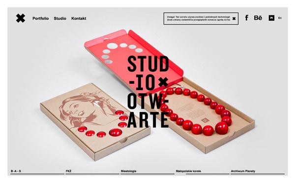


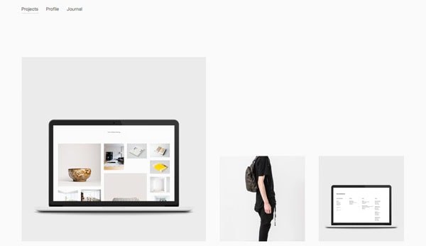
Create contrast: Choose dark or bright colors that will speak to users against the white background. Black is a common choice for type on a white background (dark grays as well) because it is easy to see and read. The same is true of images as well. Select images that aren’t overly white in focus or consider using a black border around images to set them apart from the stark background.
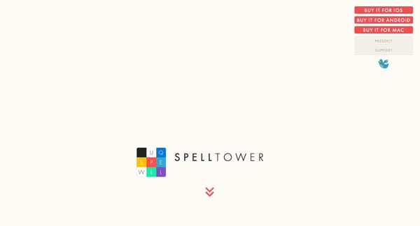
Keep it simple: The essence of white is simplicity. For the most impact, opt for a simple or minimally-styled design scheme.
Use simple images: Photos, graphics and illustrations should mirror the same feel as the overall design. Rather than complex images with a lot going on, keep them simple as well.
Focus on typography: Beautiful type is of the upmost importance in a design outline where everything is simple. This also makes type more of a foal point in the overall design. Pick one or two great fonts and use them well. This will go a long way to creating a visually stunning white-based website.
Space is your friend: Remember, white backgrounds are part of an overall look and trend. Use them well by giving everything on the screen plenty of room. Add extra space around objects, leave wider margins between text and menu items. Try to focus on the space as much as the objects within it.
Focus on an accent color: Pick a color and use it against white backgrounds and black type for a fun. The “pop of color” brings focus to certain parts of the design in a more subtle way. And it works with almost any hue.
Conclusion
While white backgrounds aren’t new, now is the time to design using them in a new way. Working with white backgrounds can bring a modern, sleek and clean feel to almost any type of web design project.
And we’d love to see what you are working on. Share your projects using white backgrounds in the comments.


