Top 10 Mistakes that Make your Website Look Unprofessional
Building your own website can seem like a good idea for money-strapped entrepreneurs. You can just get a designer on board later on, when your startup gains some ground, then you’ll worry about insignificant things like that.
Right?
Actually, design can prove to be much more important for your fledgling business than you may imagine. When you run an online business, visitors’ judgements of it always depend on tiny details in your design.
Customers are distracted. They trust a few major brands already. Why should they suddenly start trusting you? Unless you catch them within the first few seconds, they’re out.
Ultimately, it’s the tiniest details that make the most difference. But these details must be carefully examined and fixed, if you are to build a trustworthy brand and build revenue. In this post, I’ll talk about common web design errors that amateur designers make. Even if you have limited design abilities, you’ll be able to recognize some of the common mistakes that may have also crept into your web design.
Note: the examples used in this post are startups that specifically asked for feedback on their respective websites.
With Postcards Email Builder you can create and edit email templates online without any coding skills! Includes more than 100 components to help you create custom emails templates faster than ever before.
Free Email BuilderFree Email Templates1. Improper Use of Template
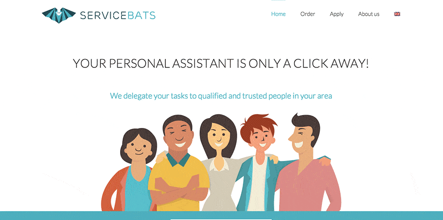
I don’t condone using templates for large businesses, but I can see the need for them in small, bootstrapped startups. However if you end up using one, it’s a good idea to get a designer to properly customize it to your branding. You may even end up with a pretty good product.
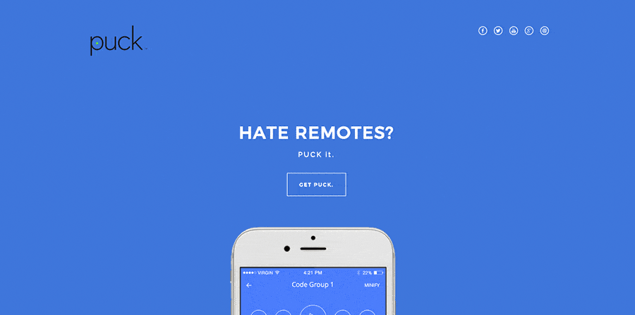
A common problem on websites built with pre-designed templates is a weak visual connection between the logo and the rest of the website. There will be colours used in the logo that aren’t repeated anywhere on the website, or fonts that don’t fit well with ones used in the site.
If you’re saving on branding development package, at least make sure that the template is not obvious.
2. Using Default Bootstrap Look
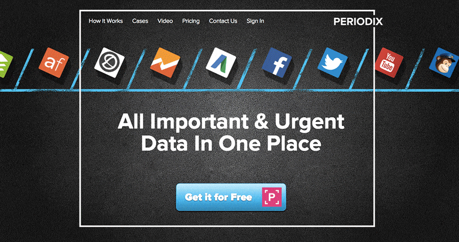
A different, but equally horrifying error is using the default Bootstrap design for your company website.You’re not fooling anyone by using Open Sans. It’s hard to distinguish between all the website that are using the same design and it’s hurting your brand.
One giveaway that your site is built with Bootstrap is Font Awesome. It has (like Bootstrap) gained massive popularity due to its exhaustive library of basically all icons you could possibly want with a consistent visual language. And using it as a helpful addition to complex interfaces if perfectly fine.
Surely, your app’s benefits are more original than three generic icons? Why not try finding another, more detailed icon set to illustrate your main selling points or — wild idea — get an illustrator to do it for you?
3. Typography Contrast Issues
With Pulsetic you’ll be instantly notified the moment your website, API, or server becomes unavailable. Monitor uptime from multiple global locations and respond to incidents before your users are affected.
Create beautiful status pages in minutes to keep customers informed during outages and build trust with transparent communication.
Start Monitoring for FreeFonts are a much bigger deal than most non-designers realize. They will make or break your entire design, even though they are just “letters”.
A common problem on “home-made” web designs is that there is too little contrast between headline and body fonts. Just implementing some size variation mostly doesn’t cut it. Try using a bolder weight for your headline font, and make it very obviously more important than the rest of the text. This will help with hierarchy and gently guide the eye through the website.
4. Using Dark Backgrounds
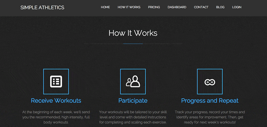
Background color covers the largest part of your website, so better choose it carefully.
As a rule of thumb, entirely black websites almost never look good, unless they’re professionally designed. White color is a safe bet, but even more designers use very light gray. Be aware that the darker the gray, the worse is readability of black letters on this background. It’s best to stay below 15% of black in gray to keep the design light.
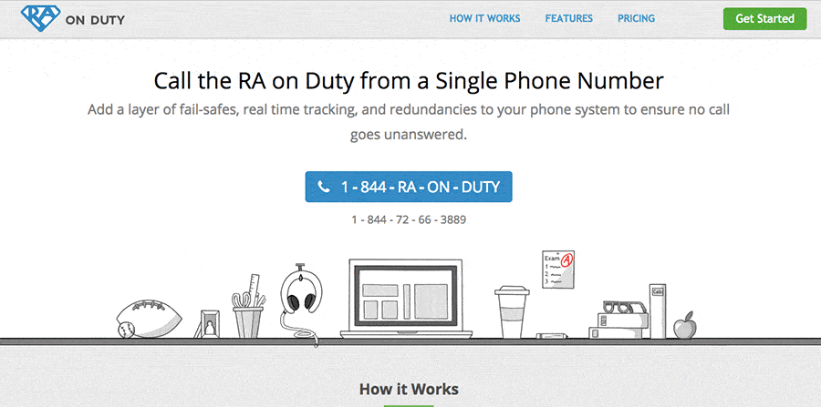
5. Multiple Equal Calls to Action
Each page on your website should only have one main call to action. Visitors are confused — if you don’t give them a single action to complete, they will likely take a longer time to make a decision and then to act on it. They may even leave because of this percieved effort required!
Make sure to eliminate as many calls to action as possible. Make it easy for people to take action without much thinking. Whether it be a sign up button or selecting a plan, make it obvious with graphical accents which is the action you want them to take, while making the rest of options more bland and unappealing.
6. Alignment and Spacing Problems
Spacing is hard. Leaving enough, but not too much white space around elements is probably the hardest part of figuring out design. But it can be simplified with a few rules. First, make sure all elements are properly grouped together, second, leave enough white space around those groups.
7. Unprofessional Copy
Writing well is hard, but it’s necessary to get your point across on the internet. Especially if you’re trying to sell something, you’ll need to make sure your copy is easy to understand, and have it checked by the proofreader to fix any spelling mistakes.
I oftentimes see awkward sentences in the website copy that seems to have been stuck there as a placeholder text from the prototype stages of design. It’s a good idea to have somebody read all the text before the site goes live.
8. Readability Issues
No amount of great copy will save your business if it can’t be read. Many tiny details can be detrimental to how your text is read and, consequentially, can affect the way your company is being perceived.
Be careful to fix problems like too small line height, tiny unreadable font, or too little contrast between background and text. Even though these may not cause actual reading difficulties to most people, just the fact that these problems exist on your website make the website seem much less professional. Can you imagine Facebook with readability issues?
9. Inconsistency

Your branding should ideally be very consistent. Everywhere you turn up, whether it be social media, Facebook ads, or offline, your customers should be able to immediately recognize your brand.
But let’s take a step back and first make sure that your website is consistent with itself. Have you got any legacy ul styles that are overwriting your body font? Are your logo’s colours exactly the same hex as those used on the website? Are you using the same shade everywhere or just “something similar enough”? Usually, just keeping your CSS files organized and deleting all unneeded code will fix these inconsistency problems.
10. Off-trend Design
Like it or not, we have bid adieu skeuomorphism for now and every website still using the gradient – and shadow- heavy web design is bound to look outdated. While you can get away with some 3D effect here and there, it’s best to explore your creative options inside the flat design guidelines.
So here you have it: 10 most common issues I have come across analysing a number of different startup homepages. Now go and review your website against the tips above!
By the way, I’m writing a book on how design can help entrepreneurs build their businesses. Want to be notified when it launches? Get on the list here.


